Software tutorial/Annotating plots: grid lines, arrows, lines, and identifying interesting points
<rst>
<rst-options: 'toc' = False/>
<rst-options: 'reset-figures' = False/>
This part uses the `same dataset <http://openmv.net/info/raw-material-properties>`_ from the previous section.
Grid lines
If we plot the ``density2`` value in sequence order:
.. code-block:: s
rm <- read.csv('http://openmv.net/file/raw-material-properties.csv') plot(rm$density2) # We can add gridlines to the plot: grid() Adding lines to a plot --------------------------- Now, imagine we want to add a horizontal line at the sample *median*. .. code-block:: s median(rm$density2) [1] NA
That isn't what we were expecting - why is the median given as "NA"? In R, the NA stands for a missing value. The ``rm$density2`` data sequence has several missing values. To force R to calculate the median, but ignoring missing values, use this: .. code-block:: s density2.median <- median(rm$density2, na.rm=TRUE) density2.median [1] 13.21
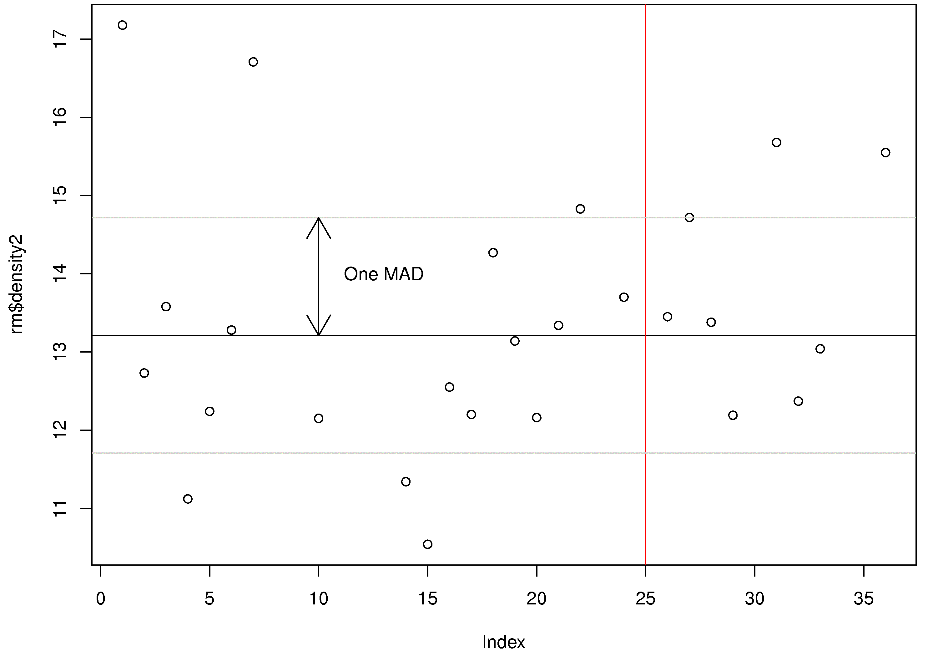
# Now to add a horizontal line at this value: plot(rm$density2) abline(h=density2.median) # You can add a vertical line using the "v" input option. # The "col" argument (option) gives the desired colour. abline(v=25, col="red") So the ``abline`` function adds vertical and horizontal lines to a plot. You can also add sloped lines, by specifying the slope and intercept: use the ``abline(a=..., b=...)`` syntax. At this point you should have the following output: </rst> [[Image:plot-annotations-1.jpg|450px|center]] <rst> <rst-options: 'toc' = False/> <rst-options: 'reset-figures' = False/> Arrows and text --------------------------- You can also add arrows and text. For example, these commands will draw an arrow from the median to the MAD and add some text next to the arrow: .. code-block:: s density2.mad = mad(rm$density2, na.rm=TRUE)
# What are the y-values that are 1 median absolute deviation away from the median? upper = density2.median + density2.mad # 14.71484 lower = density2.median - density2.mad # 11.70516
# Now add these as horizontal lines: abline(h=upper, col="gray80") abline(h=lower, col="gray80")
# Now draw an arrow at x=10, that goes from y=median to y=median+mad # The (x0, y0) is the starting coordinate # The (x1, y1) is the ending coordinate # The code=3 indicates that arrows heads are drawn on both sides. Also try codes 0, 1, and 2
arrows(x0=10, y0=density2.median, x1=10, y1=density2.median+density2.mad, code=3)
# Finally, let's add some text to the plot at the point (x=13, y=14) text(x=13, y=14, labels="One MAD")
This is the plot you should have after these steps: </rst>
<rst> <rst-options: 'toc' = False/> <rst-options: 'reset-figures' = False/>
Identifying interesting points in a plot
A plot should be like a paragraph of text: it should stand on its own and tell the reader something. To help with this, it is often necessary to label interesting points on a plot, not necessarily every point.
We will first plot some data, then add labels to interesting points using the ``identify(...)`` command in R:
.. code-block:: s
# Read in some data rm <- read.csv('http://openmv.net/file/raw-material-properties.csv')
# Plot the data as you normally would plot(rm$size2, ylab="Particle size: level 2", main="Powder raw material") # Now use the identify(...) command, with the same data as you plotted. # Add the "labels" option to let R use label names from "Sample" column. identify(rm$size2, labels=rm$Sample)
# After issuing the "identify(...)" command, click on any interesting points in the # plot. Press "Escape" to stop selecting points.
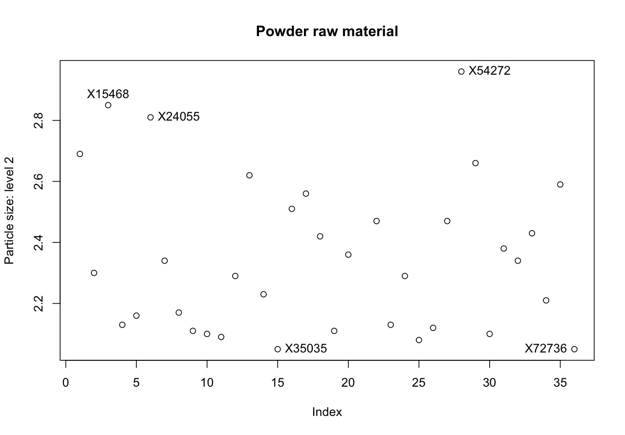
For example, I selected these interesting points in the plot, then in my technical report to my manager and I can refer to those points. </rst>

