Software tutorial/Plots with multiple series, colour, and legends
Before getting started with this next section of the tutorial, I recommend you watch this short video to really understand plotting in R:
<rst> <rst-options: 'toc' = False/> <rst-options: 'reset-figures' = False/>
There are cases when we might need to overlay more than one *series*. A *series* is a sequence of values on the plot, sometimes also called a *trajectory*. We might choose to show each series in a different colour, or use a different marker shape. Finally, we'd like to add a legend to the plot.
Let's look at a dataset, ``brittleness-index``, `available here <http://openmv.net/info/brittleness-index>`_, which contains the data where a single quantity of raw materials was split into 3 parts. Each part is processed in a different reactor, TK104, TK105, and TK107. The data are the final brittleness values from the product produced in the reactor.
We'd like to plot the three series *on the same plot*.
Plot the first series
.. code-block:: s
brittle <- read.csv('http://openmv.net/file/brittleness-index.csv')
summary(brittle) TK104 TK105 TK107 Min. :188.0 Min. :223.0 Min. :240.0 1st Qu.:369.5 1st Qu.:370.0 1st Qu.:425.0 Median :423.5 Median :460.0 Median :479.0 Mean :421.0 Mean :472.2 Mean :470.1 3rd Qu.:482.2 3rd Qu.:549.0 3rd Qu.:548.5 Max. :697.0 Max. :709.0 Max. :733.0 NA's : 3.0 NA's : 2.0
plot(brittle$TK104, type="l", col="red") </rst> [[Image:brittleness-single.jpg|500px|center]] <rst> <rst-options: 'toc' = False/> Note the gap in the plot because the ``TK104`` variable has missing values, as shown in the ``summary`` output: there are 3 ``NA`` (not available) entries in the data set. Also note that we can set the line colour using the ``col`` input. Type ``colours()`` to see a list of all available colours in R. Next, superimpose the other series ---------------------------------- Adding the remaining two series is done using the ``lines`` command. The ``lines`` command cannot be used to *start* a new plot: it is only used to add to an existing ``plot``. .. code-block:: s plot(brittle$TK104, type="l", col="red") lines(brittle$TK105, type="l", col="black") lines(brittle$TK107, type="l", col="darkgreen")
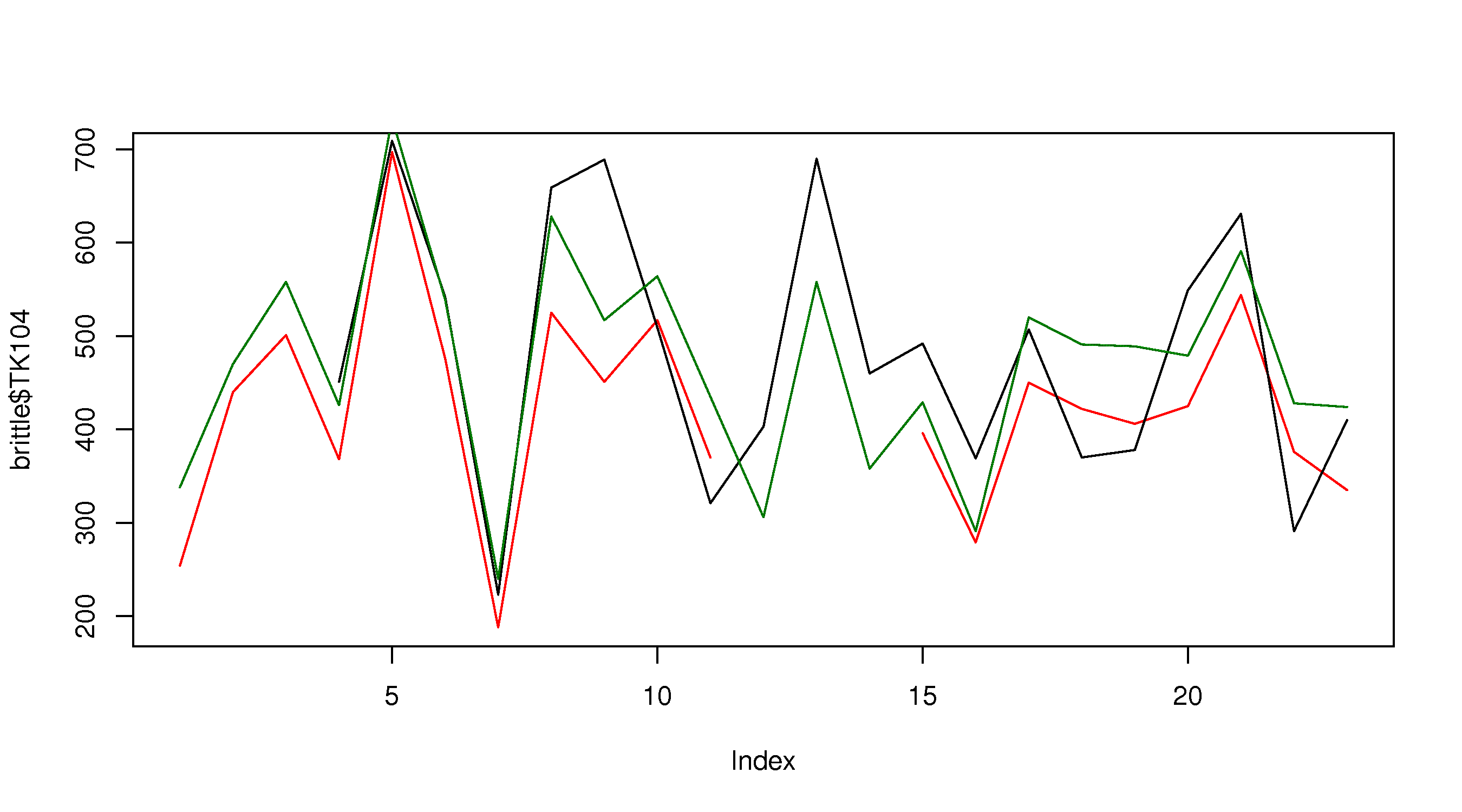
which gives the following plot: </rst>
<rst> <rst-options: 'toc' = False/> This looks OK, but there are two main issues: the y-axis limits are not large enough to accommodate the series (notice how it chops off at the top), and the y-axis label needs to be adjusted. Also the x-axis label can be improved.
Adjusting axis labels
Axis labels are specified using the ``plot(..., xlab="X-axis label", ylab="Y-axis label")`` syntax.
.. code-block:: s
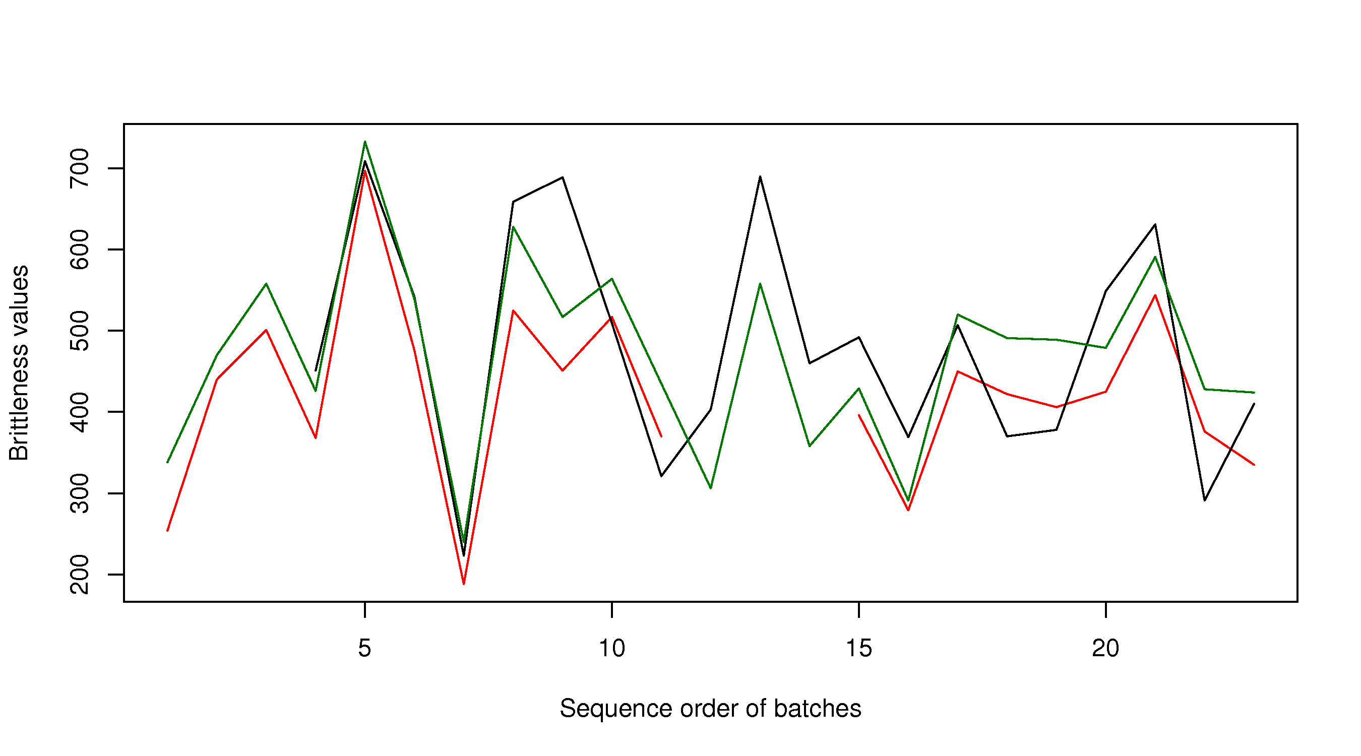
plot(brittle$TK104, type="l", col="red", xlab="Sequence order of batches", ylab="Brittleness values") lines(brittle$TK105, type="l", col="black") lines(brittle$TK107, type="l", col="darkgreen") The result is shown in the next subsection. Adjusting axis limits ---------------------- Axis limits may be specified manually, if you know what they are: .. code-block:: s plot(brittle$TK104, type="l", col="red", xlab="Sequence order of batches", ylab="Brittleness values", ylim=c(180, 740)) lines(brittle$TK105, type="l", col="black") lines(brittle$TK107, type="l", col="darkgreen")
or you can calculate them automatically, with a bit of extra code. One of several possible ways is:
.. code-block:: s
rng.104 <- range(brittle$TK104, na.rm=TRUE) # calculate the ranges first rng.105 <- range(brittle$TK105, na.rm=TRUE) rng.107 <- range(brittle$TK107, na.rm=TRUE) # then take the extremes of each range ylim <- c(min(rng.104, rng.105, rng.107), max(rng.104, rng.105, rng.107)) plot(brittle$TK104, type="l", col="red", xlab="Sequence order of batches", ylab="Brittleness values", ylim=ylim) lines(brittle$TK105, type="l", col="black") lines(brittle$TK107, type="l", col="darkgreen")
The result is: </rst>
<rst> <rst-options: 'toc' = False/>
Other plot input options
You can see the full list of input options to the ``plot`` command by typing ``help(plot.default)``. Other options of interest are:
``type``
A single character indicating the type of plot: "p" for points, "l" for lines, "o" for overplotted points and lines, "s" and "S" for stair steps and "h" for histogram-like vertical lines.
An interesting option is ``"n"`` which just creates an empty axis, but does not add any points or lines.
``xlim`` and ``ylim`` Each a 2-entry list indicating the extent of the x- and y-axes. If the entries are reversed, then the plot axis is reversed.
``log`` A character string: ``"x"`` if the x axis is to be logarithmic, ``"y"`` if the y axis is to be logarithmic and ``"xy"`` if both axes are to be logarithmic.
``main`` The main title for the plot; also see ``help(title)``.
``xlab`` and ``ylab`` Labels for the x- and y-axes.
``ann = FALSE`` Will turn off the default ANNotations: title and x and y axis labels.
``axes``, ``xaxt``, ``yaxt``
Set to ``TRUE`` or ``FALSE`` to suprress both axes or just one of the axes.
``asp`` Set the plots y/x aspect ratio; see ``help(plot.window)`` for more information.
Adding a legend
A legend is added afterwards using the
``legend(x=..., y=..., legend=c("Entry 1", "Entry 2", ...) )`` form of the ``legend`` function, where
``x`` and ``y`` is the ``(x,y)`` location of the legend in the plot
``legend = c(...)`` is a list of strings that contains the legend text
But we need to also tell the legend function what type of line and colour to show with the text. A full example, with the resulting figure is shown below.
.. code-block:: s
plot(brittle$TK104, type="l", col="red", ylim=ylim, ylab="Brittleness values", xlab="Sequence order") lines(brittle$TK105, type="l", col="black") lines(brittle$TK107, type="l", col="darkgreen") legend(x=15, y=720, legend=c("TK104", "TK105", "TK107"), lwd=2, col=c("red", "black", "darkgreen")) Note that there should be a colour specification for each entry in the legend. The ``lwd`` input argument is the line width used in the legend. If you omit this, then you will only get legend labels. Also notice that we only need to specify it once: R will cycle the value of ``2`` over and over for every legend entry. </rst> [[Image:brittleness-best.jpg|500px|center]] <rst> <rst-options: 'toc' = False/> Saving your plots ------------------ .. note:: RStudio users: you do not need to follow these steps. Simply click the ``Export`` button and save the plot to a PNG, JPEG, or PDF file. The instructions below are useful if you want to save the plot directly to a file, without going to the screen. Once you have drawn your plot, you can go to the menu on the top, and click ``File``, then ``Save as``. For example, on Mac systems, this allows you to save the plot as a PDF that can be included into another document. In many cases it is easier to write code to save the plot; that way, when you run your R-script, it saves the plot automatically to your hard drive. Proceed as follows: .. code-block:: s bmp(file='../images/name-of-file.bmp') # various plotting commands go here # Add all your labels, etc dev.off() The above code shows that you must surround your plot with the ``bmp(...)`` function, and terminate it with ``dev.off()``. Similar versions of this function exist for * ``png`` files: use the ``png(...)`` function * ``jpg`` files: use the ``jpeg(...)`` function * ``pdf`` files: use the ``pdf(...)`` function **Advanced users** Plots in this tutorial are saved using the ``bitmap(...)`` function. This required *quite a bit more work* to set up, and the instructions below are for a Mac system. The files can be saved to any format, and the figures often look clearer (in my opinion). * Install Ghostscript. * Edit your R settings file to tell it where your Ghostscript instance is: .. code-block:: s # For 32-bit systems nano /Library/Frameworks/R.framework/Versions/Current/Resources/etc/i386/Renviron # For 64-bit systems nano /Library/Frameworks/R.framework/Versions/Current/Resources/etc/x86_64/Renviron # and set the following line to point to Ghostscript R_GSCMD=${RGSCMD-'/sw/bin/gs'}
* Verify the settings in R: ``Sys.getenv("R_GSCMD")``
* Surround your plotting code with ``bitmap(...)`` and ``dev.off()`` commands as shown above.
</rst>

