1.5. Box plots
Box plots are an efficient summary of one variable (univariate chart), but can also be used effectively to compare variables that are in the same units of measurement.
The box plot shows the so-called five-number summary of a univariate data series:
Minimum sample value
25th percentile (1st quartile)
50th percentile (median)
75th percentile (3rd quartile)
Maximum sample value
The 25th percentile is the value below which 25% of the observations in the sample are found. The distance from the 3rd to the 1st quartile is also known as the interquartile range (IQR) and represents the data’s spread, similar to the standard deviation.
The following data are thickness measurements of 2-by-6 boards (2-by-6 refers for the thickness and depth of a wooden board), taken at six locations around the edge. Here is a sample of the measurements and a summary of the first 100 boards (code in R and Python respectively):
The following box plot is a graphical summary of these numbers.
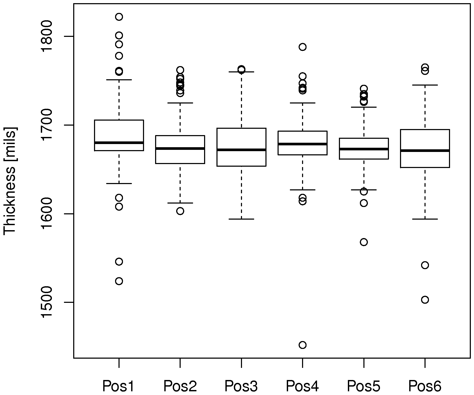
A box plot is great for comparisons. In this figure we see how the thickness at position 1 is greater than at the other positions. It is also the position with high variability, indicating that something about the saw blade at that position is not what it should be. The median is also not balanced between the two quantiles for this box plot, when compared to the others.
Some variations for the box plot are possible:
Show outliers as dots, where an outlier is most commonly defined as any point 1.5 IQR distance units away from the box. The box’s upper bound is at the 25th percentile, and the boxes lower bound is at the 75th percentile.
The whiskers on the plots are drawn at most 1.5 IQR distance units away from the box, however, if the whisker is to be drawn beyond the bound of the data vector, then it is redrawn at the edge of the data instead (i.e. it is clamped, to avoid it exceeding).
Use the mean instead of the median [not too common].
Use the 2% and 98% percentiles rather than the upper and lower hinge values.
Example
In a final exam for a particular course at McMaster University there was an open-ended question. These data values are the grades achieved for the answer to that question, broken down by whether the student used a systematic method, or not. No grades were given for using a systematic method; grades were awarded only for answering the question.
A systematic method is any method that assists the student with problem solving. For example, a strategry could be to: define the problem, identify knowns/unknowns and assumptions, explore alternatives, plan a strategy, implement the strategy and then check the solution.
Draw two box plots next to each other that compare the grades of students who did, or did not use a problem solving strategy. Comment on any features you notice in the comparison.
Answer
Several points are apparent in the box plot:
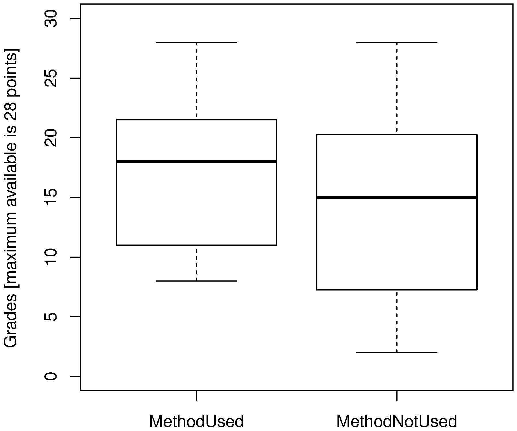
students in either category achieved the highest grade possible
the spread (interquartile distance) when using the problem solving method is smaller
both box plots show a skew to the lower left tail (compare the median to the first and third quartiles)
we will use a confidence interval in a later chapter to judge whether this difference is statistically significant or not.
More readings
You can read more about box plots in the paper by Hadley Wickham and Lisa Stryjewsk. It summarizes variations of this plot, such as the violin plot, and two-dimensional versions of it. It is a power summary plot that has been around since 1970.