6.8. Applications of Latent Variable Models
6.8.1. Improved process understanding
Interpreting the loadings plot from a model is well worth the time spent. At the very least, one will confirm what you already know about the process, but sometimes there are unexpected insights that are revealed. Guide your interpretation of the loadings plot with contributions in the scores, and cross-referencing with the raw data, to verify your interpretation.
There are \(A\) loadings and score plots. In many cases this is far fewer than the \(K\) number of original variables. Furthermore, these \(A\) variables have a much higher signal and lower noise than the original data. They can also be calculated if there are missing data present in the original variables.
In the example shown here the company was interested in how their product performed against that of their competitor. Six variables called A to F were measured on all the product samples, (codes are used, because the actual variables measured are proprietary). The loadings for these 6 variables are labelled below, while the remaining points are the scores. The scores have been scaled and superimposed on the loadings plot, to create what is called a biplot. The square, green points were the competitor’s product, while the smaller purple squares were their own product.

From this single figure the company learned that:
The quality characteristics of this material is not six-dimensional; it is two-dimensional. This means that based on the data used to create this model, there is no apparent way to independently manipulate the 6 quality variables. Products produced in the past land up on a 2-dimensional latent variable plane, rather than a 6-dimensional space.
Variables D, E and F in particular are very highly correlated, while variable C is also somewhat correlated with them. Variable A and C are negatively correlated, as are variables B and C. Variables A and B are positively correlated with each other.
This company’ competitor was able to manufacture the product with much lower variability than they were: there is greater spread in their own product, while the competitor’s product is tightly clustered.
The competitors product is characterized as having lower values of C, D, E, and F, while the values of A and B are around the average.
The company had produced product similar to their competitor’s only very infrequently, but since their product is spread around the competitor’s, it indicates that they could manufacture product of similar characteristics to their competitor. They could go query the score values close those of those of the competitors and using their company records, locate the machine and other process settings in use at that time.
However, it might not just be how they operate the process, but also which raw materials and their consistency, and the control of outside disturbances on the process. These all factor into the final product’s variability.
It it is not shown here, but the competitor’s product points are close to the model plane (low SPE values), so this comparison is valid. This analysis was tremendously insightful, and easier to complete on this single plot, rather than using plots of the original variables.
6.8.2. Troubleshooting process problems
We already saw a troubleshooting example in the section on interpreting scores. In general, troubleshooting with latent variable methods uses this approach:
Collect data from all relevant parts of the process: do not exclude variables that you think might be unimportant; often the problems are due to unexpected sources. Include information on operators, weather, equipment age (e.g. days since pump replacement), raw material properties being processed at that time, raw material supplier (indicator variable). Because the PCA model disregards unimportant or noisy variables, these can later be pruned out, but they should be kept in for the initial analysis. (Note: this does not mean the uninformative variables are not important - they might only be uninformative during the period of data under observation).
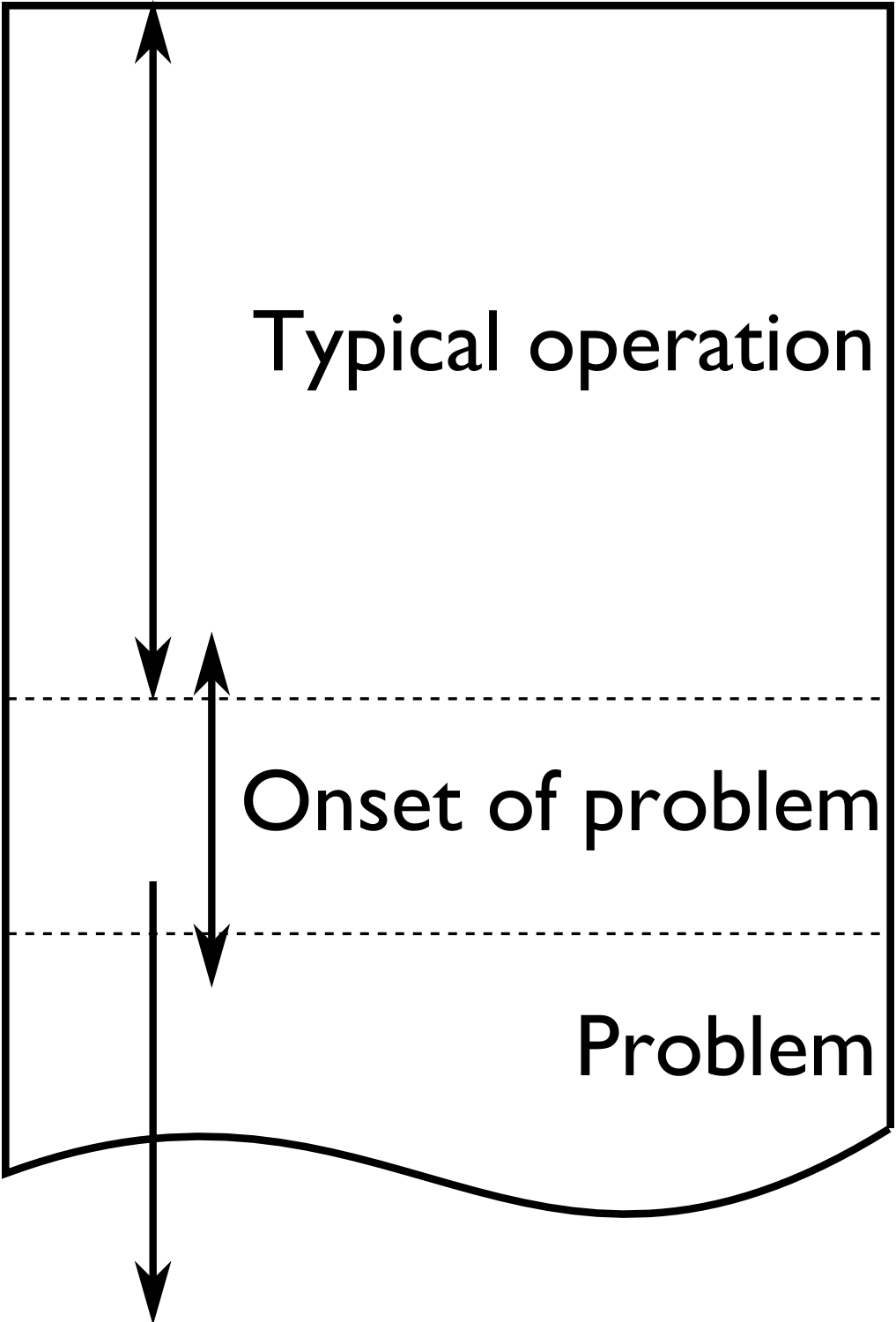
Structure the data so that the majority of the data is from normal, common-cause operation. The reason is that the PCA model plane should be oriented in the directions of normal operation. The rest of the \(\mathbf{X}\) matrix should be from when the problem occurs and develops.
Given the wealth of data present on many processes these days, it is helpful to prune the \(\mathbf{X}\) matrix so that it is only several hundred rows in length. Simply subsample, or using averages of time; e.g. hourly averages. Later we can come back and look at a higher resolution. Even as few as 50 rows can often work well.
Build the PCA model. You should observe the abnormal operation appearing as outliers in the score plots and SPE plots. If not, use colours or different markers to highlight the regions of poor operation in the scores: they might be clustered in a region of the score plot, but not appear as obvious outliers.
Interrogate and think about the model. Use the loadings plots to understand the general trends between the variables. Use contribution plots to learn why clusters of observations are different from others. Use contribution plots to isolate the variables related to large SPE values.
It should be clear that this is all iterative work; the engineer has to be using her/his brain to formulate hypotheses, and then verify them in the data. The latent variable models help to reduce the size of the problem down, but they do not remove the requirement to think about the data and interpret the results.
Here is an example where the yield of a company’s product was declining. They suspected that their raw material was changing in some way, since no major changes had occurred on their process. They measured 6 characteristic values on each lot (batch) of raw materials: 3 of them were a size measurement on the plastic pellets, while the other 3 were the outputs from thermogravimetric analysis (TGA), differential scanning calorimetry (DSC) and thermomechanical analysis (TMA), measured in a laboratory. Also provided was an indication of the yield: “Adequate” or “Poor”. There were 24 samples in total, 17 batches of adequate yield and the rest the had poor yield.
The score plot (left) and loadings plot (right) help isolate potential reasons for the reduced yield. Batches with reduced yield have high, positive \(t_2\) values and low, negative \(t_1\) values. What factors lead to batches having score values with this combination of \(t_1\) and \(t_2\)? It would take batches with a combination of low values of TGA and TMA, and/or above average size5, size10 and size15 levels, and/or high DSC values to get these sort of score values. These would be the generally expected trends, based on an interpretation of the scores and loadings.
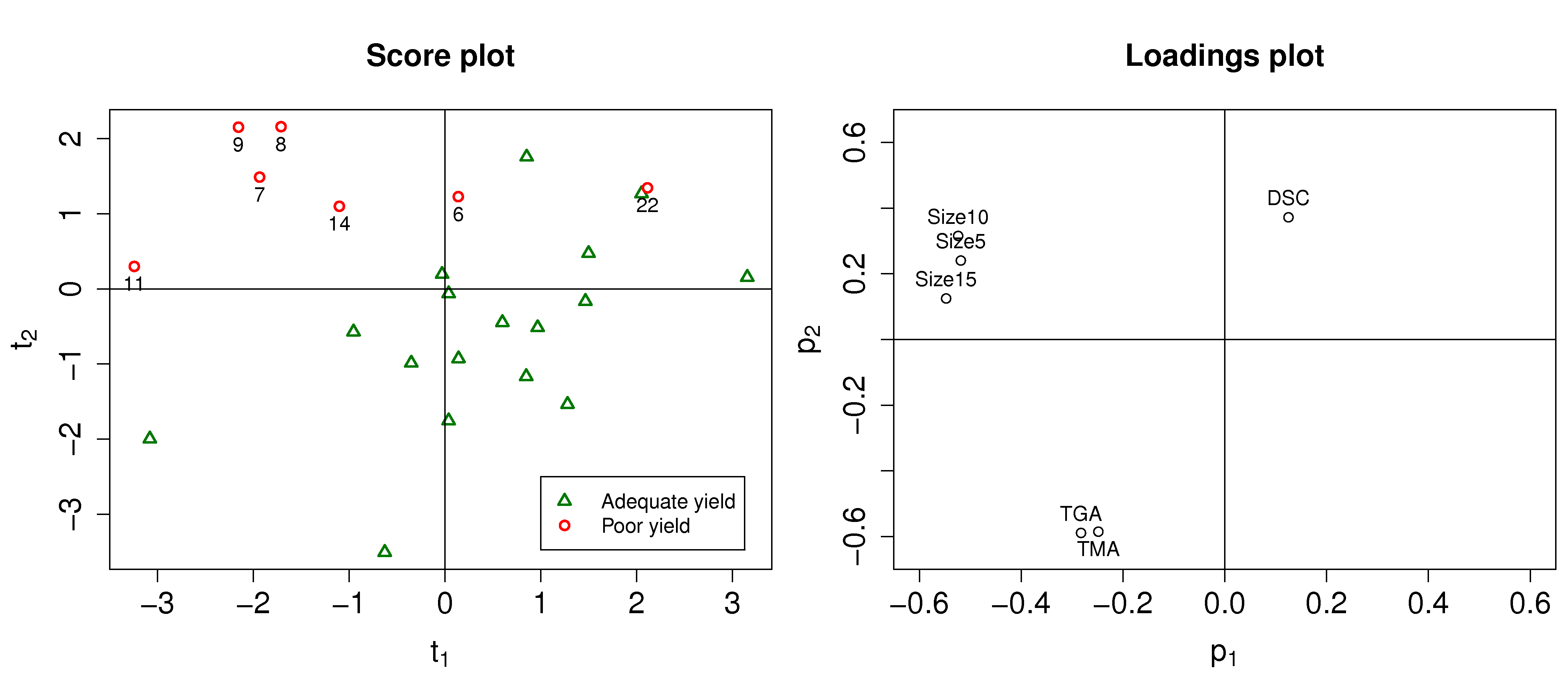
We can investigate specific batches and look at the contribution of each variable to the score values. Let’s look at the contributions for batch 8 for both the \(t_1\) and \(t_2\) scores.
Batch 8 is at its location in the score plot due to the low values of the 3 size variables (they have strong negative contributions to \(t_1\), and strong positive contributions to \(t_2\)); and also because of its very large DSC value (the 0.57 contribution in \(t_2\)).
Batch 22 on the other hand had very low values of TGA and TMA, even though its size values were below average. Let’s take a look at the \(t_2\) value for batch 22 to see where we get this interpretation:
This illustrates that the actual contribution values are a more precise diagnostic tool that just interpreting the loadings.
6.8.3. Optimizing: new operating point and/or new product development
This application area is rapidly growing in importance. Fortunately it is fairly straightforward to get an impression of how powerful this tool is. Let’s return back to the food texture example considered previously, where data from a biscuit/pastry product was considered. These 5 measurements were used:
Percentage oil in the pastry
The product’s density (the higher the number, the more dense the product)
A crispiness measurement, on a scale from 7 to 15, with 15 being more crispy.
The product’s fracturability: the angle, in degrees, through which the pasty can be slowly bent before it fractures.
Hardness: a sharp point is used to measure the amount of force required before breakage occurs.
The scores and loadings plot are repeated here again:
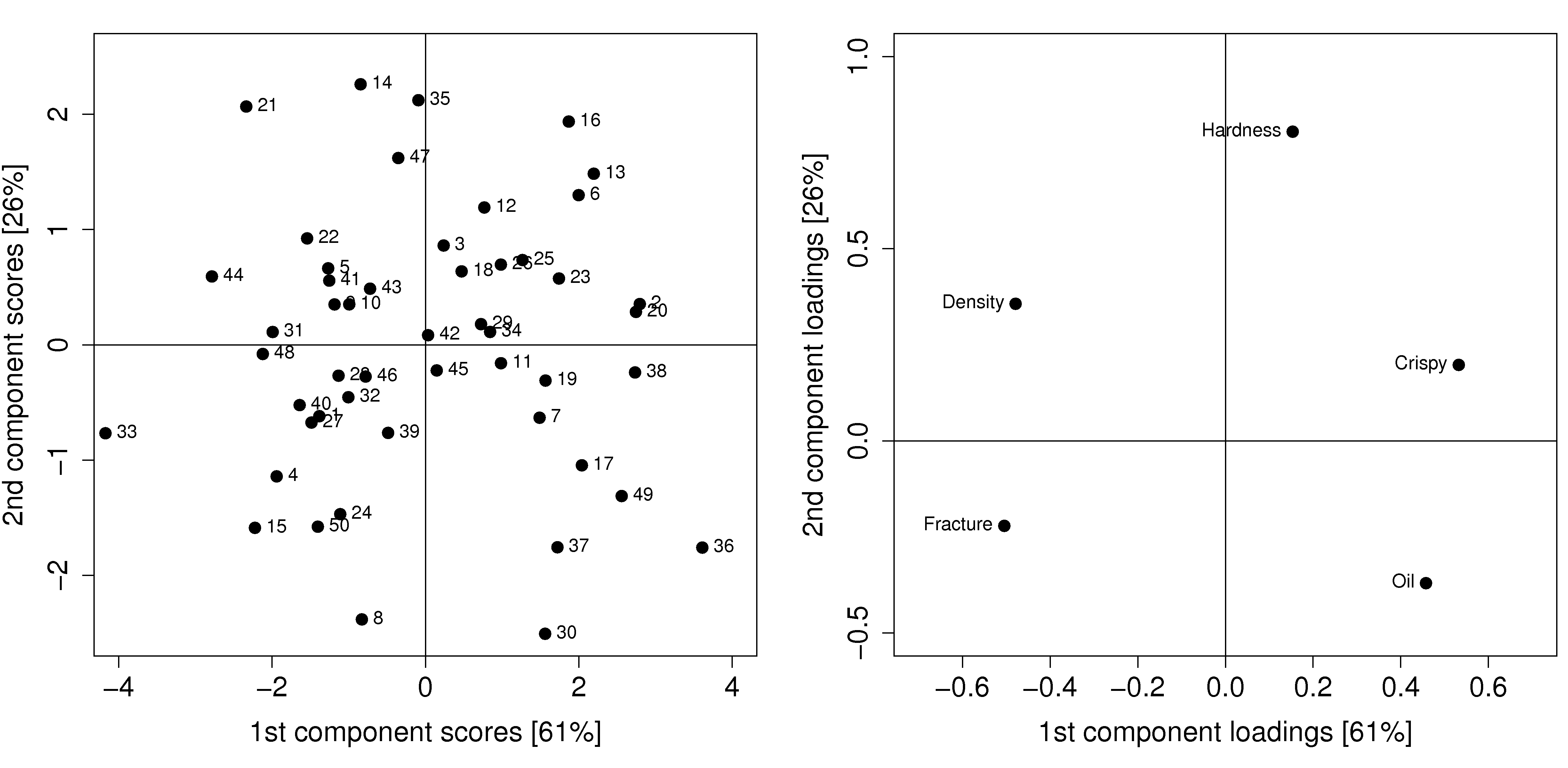
Process optimization follows the principle that certain regions of operation are more desirable than others. For example, if all the pastry batches produced on the score plot are of acceptable quality, there might be regions in the plot which are more economically profitable than others.
For example, pastries produced in the lower right quadrant of the score plot (high values of \(t_1\) and low values of \(t_2\)), require more oil, but might require a lower cooking time, due to the decreased product density. Economically, the additional oil cost is offset by the lower energy costs. All other things being equal, we can optimize the process by moving production conditions so that we consistently produce pastries in this region of the score plot. We could cross-reference the machine settings for the days when batches 17, 49, 36, 37 and 30 were produced and ensure we always operate at those conditions.
New product development follows a similar line of thought, but uses more of a “what-if” scenario. If market research or customer requests show that a pastry product with lower oil, but still with high crispiness is required, we can initially guess from the loadings plot that this is not possible: oil percentage and crispiness are positively correlated, not negatively correlated.
But if our manager asks, can we readily produce a pastry with the 5 variables set at [Oil=14%, Density=2600, Crispy=14, Fracture can be any value, Hardness=100]. We can treat this as a new observation, and following the steps described in the earlier section on using a PCA model, we will find that \(\mathbf{e} = [2.50, 1.57, -1.10, -0.18, 0.67]\), and the SPE value is 10.4. This is well above the 95% limit of SPE, indicating that such a pastry is not consistent with how we have run our process in the past. So there isn’t a quick solution.
Fortunately, there are systematic tools to move on from this step, but they are beyond the level of this introductory material. They involve the inversion and optimization of latent variable models. This paper is a good starting point if you are interested in more information: Christiane Jaeckle and John MacGregor, “Product design through multivariate statistical analysis of process data”. AIChE Journal, 44, 1105-1118, 1998.
The general principle in model inversion problems is to manipulate the any degrees of freedom in the process (variables that can be manipulated in a process control sense) to obtain a product as close as possible to the required specification, but with low SPE in the model. A PLS model built with these manipulated variables, and other process measurements in \(\mathbf{X}\), and collecting the required product specifications in \(\mathbf{Y}\) can be used for these model inversion problems.
6.8.4. Predictive modelling (inferential sensors)
This section will be expanded soon, but we give an outline here of what inferential sensors are, and how they are built. These sensors also go by the names of software sensors or just soft sensors.
The intention of an inferential sensor is to infer a hard-to-measure property, usually a lab measurement or an expensive measurement, using a combination of process data and software-implemented algorithms.
Consider a distillation column where various automatic measurements are used to predict the vapour pressure. The actual vapour pressure is a lab measurement, usually taken 3 or 4 times per week, and takes several hours to complete. The soft sensor can predict the lab value from the real-time process measurements with sufficient accuracy. This is a common soft sensor on distillation columns. The lab values are used to build (train) the software sensor and to update in periodically.
Other interesting examples use camera images to predict hard-to-measure values. In the paper by Honglu Yu, John MacGregor, Gabe Haarsma and Wilfred Bourg (Ind. Eng. Chem. Res., 42, 3036–3044, 2003), the authors describe how machine vision is used to predict, in real-time, the seasoning of various snack-food products. This sensors uses the colour information of the snacks to infer the amount of seasoning dispensed onto them. The dispenser is controlled via a feedback loop to ensure the seasoning is at target.
Once validated, a soft sensor can also reduce costs of a process by allowing for rapid feedback control of the inferred property, so that less off-specification product is produced. They also often have the side-effect that reduced lab sampling is required; this saves on manpower costs.
Soft sensors using latent variables will almost always be PLS models. Once the model has been built, it can be applied in real-time. The \(T^2\) and SPE value for each new observation is checked for consistency with the model before a prediction is made. Contribution plots are used to diagnose unusual observations.
It is an indication that the predictive models need to be updated if the SPE and/or \(T^2\) values are consistently above the limits. This is a real advantage over using an MLR-based model, which has no such consistency checks.
6.8.5. Process monitoring using latent variable methods
Any variable can be monitored using control charts, as we saw in the earlier section on process monitoring. The main purpose of these charts is to rapidly distinguish between two types of operation: in-control and out-of-control. We also aim to have a minimum number of false alarms (type I error: we raise an alarm when one isn’t necessary) and the lowest number of false negatives possible (type II error, when an alarm should be raised, but we don’t pick up the problem with the chart). We used Shewhart charts, CUSUM and EWMA charts to achieve these goals.
Consider the case of two variables, called \(x_1\) and \(x_2\), shown on the right, on the two horizontal axes. These could be time-oriented data, or just measurements from various sequential batches of material. The main point is that each variable’s \(3\sigma\) Shewhart control limits indicate that all observations are within control. It may not be apparent, but these two variables are negatively correlated with each other: as \(x_1\) increases, the \(x_2\) value decreases.
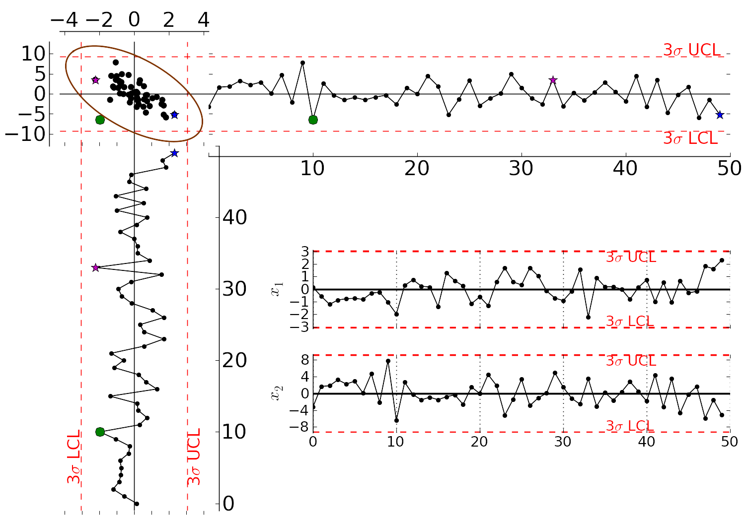
Rearranging the axes at 90 degrees to each other, and plotting the joint scatter plot of the two variables in the upper left corner reveals the negative correlation, if you didn’t notice it initially. Ignore the ellipse for now. It is clear that sample 10 (green closed dot, if these notes are printed in colour) is very different from the other samples. It is not an outlier from the perspective of \(x_1\), nor of \(x_2\), but jointly it is an outlier. This particular batch of materials would result in very different process operation and final product quality to the other samples. Yet a producer using separate control charts for \(x_1\) and \(x_2\) would not pick up this problem.
While using univariate control charts is necessary to pick up problems, univariate charts are not sufficient to pick up all quality problems if the variables are correlated. The key point here is that quality is a multivariate attribute. All our measurements on a system must be jointly within in the limits of common operation. Using only univariate control charts will raise the type II error: an alarm should be raised, but we don’t pick up the problem with the charts.
Let’s take a look at how process monitoring can be improved when dealing with many attributes (many variables). We note here that the same charts are used: Shewhart, CUSUM and EWMA charts, the only difference is that we replace the variables in the charts with variables from a latent variable model. We monitor instead the:
scores from the model, \(t_1, t_2, \ldots, t_A\)
Hotelling’s \(T^2 = \displaystyle \sum_{a=1}^{a=A}{\left(\dfrac{t_{a}}{s_a}\right)^2}\)
SPE value
The last two values are particularly appealing: they measure the on-the-plane and off-the-plane variation respectively, compressing \(K\) measurements into 2 very compact summaries of the process.
There are a few other good reasons to use latent variables models:
The scores are orthogonal, totally uncorrelated to each other. The scores are also unrelated to the SPE: this means that we are not going to inflate our type II error rate, which happens when using correlated variables.
There are far fewer scores than original variables on the process, yet the scores capture all the essential variation in the original data, leading to fewer monitoring charts on the operators’ screens.
We can calculate the scores, \(T^2\) and SPE values even if there are missing data present; conversely, univariate charts have gaps when sensors go off-line.
Rather than waiting for laboratory final quality checks, we can use the automated measurements from our process. There are many more of these measurements, so they will be correlated – we have to use latent variable tools. The process data are usually measured with greater accuracy than the lab values, and they are measured at higher frequency (often once per second). Furthermore, if a problem is detected in the lab values, then we would have to come back to these process data anyway to uncover the reason for the problem.
But by far, one of the most valuable attributes of the process data is the fact that they are measured in real-time. The residence time in complex processes can be in the order of hours to days, going from start to end. Having to wait till much later in time to detect problems, based on lab measurements can lead to monetary losses as off-spec product must be discarded or reworked. Conversely, having the large quantity of data available in real-time means we can detect faults as they occur (making it much easier to decode what went wrong). But we need to use a tool that handles these highly correlated measurements.
A paper that outlines the reasons for multivariate monitoring is by John MacGregor, “Using on-line process data to improve quality: Challenges for statisticians”, International Statistical Review, 65, p 309-323, 1997.
We will look at the steps for phase I (building the monitoring charts) and phase II (using the monitoring charts).
6.8.5.1. Phase I: building the control chart
The procedure for building a multivariate monitoring chart, i.e. the phase I steps:
Collect the relevant process data for the system being monitored. The preference is to collect the measurements of all attributes that characterize the system being monitored. Some of these are direct measurements, others might have to be calculated first.
Assemble these measurements into a matrix \(\mathbf{X}\).
As we did with univariate control charts, remove observations (rows) from \(\mathbf{X}\) that are from out-of control operation, then build a latent variable model (either PCA or PLS). The objective is to build a model using only data that is from in-control operation.
In all real cases the practitioner seldom knows which observations are from in-control operation, so this is an iterative step.
Prune out observations which have high \(T^2\) and SPE (after verifying they are outliers).
Prune out variables in \(\mathbf{X}\) that have low \(R^2\).
The observations that are pruned out are excellent testing data that can be set aside and used later to verify the detection limits for the scores, \(T^2\) and SPE.
The control limits depend on the type of variable:
Each score has variance of \(s_a^2\), so this can be used to derive the Shewhart or EWMA control limits. Recall that Shewhart limits are typically placed at \(\pm 3 \sigma/\sqrt{n}\), for subgroups of size \(n\).
Hotelling’s \(T^2\) and SPE have limits provided by the software (we do not derive here how these limits are calculated, though its not difficult).
However, do not feel that these control limits are fixed. Adjust them up or down, using your testing data to find the desirable levels of type I and type II error.
Keep in reserve some “known good” data to test what the type I error level is; also keep some “known out-of-control” data to assess the type II error level.
6.8.5.2. Phase II: using the control chart
The phase II steps, when we now wish to apply this quality chart on-line, are similar to the phase II steps for univariate control charts. Calculate the scores, SPE and Hotelling’s \(T^2\) for the new observation, \(\mathbf{x}'_\text{new}\), as described in the section on using an existing PCA model. Then plot these new quantities, rather than the original variables. The only other difference is how to deal with an alarm.
The usual phase II approach when an alarm is raised is to investigate the variable that raised the alarm, and use your engineering knowledge of the process to understand why it was raised. When using scores, SPE and \(T^2\), we actually have a bit more information, but the approach is generally the same: use your engineering knowledge, in conjunction with the relevant contribution plot.
A score variable, e.g. \(t_a\) raised the alarm. We derived earlier that the contribution to each score was \(t_{\text{new},a} = x_{\text{new},1} \,\, p_{1,a} + x_{\text{new},2} \,\, p_{2,a} + \ldots + x_{\text{new},k} \,\, p_{k,a} + \ldots + x_{\text{new},K} \,\, p_{K,a}\). It indicates which of the original \(K\) variables contributed most to the very high or very low score value.
SPE alarm. The contribution to SPE for a new observation was derived in an earlier section as well; it is conveniently shown using a barplot of the \(K\) elements in the vector below. These are the variables most associated with the broken correlation structure.
\[\begin{split}\mathbf{e}'_{\text{new}} &= \mathbf{x}'_\text{new} - \hat{\mathbf{x}}'_\text{new} = \mathbf{x}'_\text{new} - \mathbf{t}'_\text{new} \mathbf{P}'\\ &= \begin{bmatrix}(x_{\text{new},1} - \hat{x}_{\text{new},1}) & (x_{\text{new},2} - \hat{x}_{\text{new},2}) & \ldots & (x_{\text{new},k} - \hat{x}_{\text{new},k}) & \ldots & (x_{\text{new},K} - \hat{x}_{\text{new},K})\end{bmatrix}\end{split}\]\(T^2\) alarm: an alarm in \(T^2\) implies one or more scores are large. In many cases it is sufficient to go investigate the score(s) that caused the value of \(T^2_\text{new}\) to be large. Though as long as the SPE value is below its alarm level, many practitioners will argue that a high \(T^2\) value really isn’t an alarm at all; it indicates that the observation is multivariately in-control (on the plane), but beyond the boundaries of what has been observed when the model was built. My advice is to consider this point tentative: investigate it further (it might well be an interesting operating point that still produces good product).
6.8.6. Dealing with higher dimensional data structures
This section just gives a impression how 3-D and higher dimensional data sets are dealt with. Tools such as PCA and PLS work on two-dimensional matrices. When we receive a 3-dimensional array, such as an image, or a batch data set, then we must unfold that array into a (2D) matrix if we want to use PCA and PLS in the usual manner.
The following illustration shows how we deal with an image, such as the one taken from a colour camera. Imagine we have \(I\) rows and \(J\) columns of pixels, on 3 layers (red, green and blue wavelengths). Each entry in this array is an intensity value, a number between 0 and 255. For example, a pure red pixel is has the following 3 intensity values in layer 1, 2 and 3: (255, 0, 0), because layer 1 contains the intensity of the red wavelengths. A pure blue pixel would be (0, 0, 255), while a pure green pixel would be (0, 255, 0) and a pure white pixel is (255, 255, 255). In other words, each pixel is represented as a triplet of 3 intensity values.
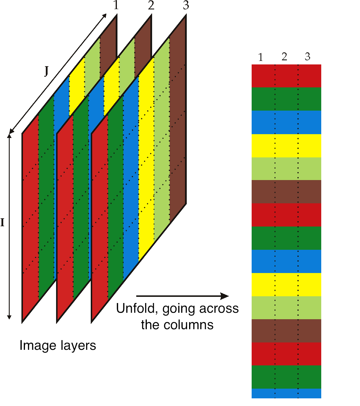
In the unfolded matrix we have \(IJ\) rows and 3 columns. In other words, each pixel in the image is represented in its own row. A digital image with 768 rows and 1024 columns, would therefore be unfolded into a matrix with 786,432 rows and 3 columns. If we perform PCA on this matrix we can calculate score values and SPE values: one per pixel. Those scores can be refolded back into the original shape of the image. It is useful to visualize those scores and SPE values in this way.
You can learn more about using PCA on image data in the manual that accompanies the interactive software that is freely available from http://macc.mcmaster.ca/maccmia.php.