2.8. Normal distribution
Before introducing the normal distribution, we first look at two important concepts: the Central limit theorem, and the concept of independence. Both concepts are used in important derivations, based on the normal distribution.
2.8.1. Central limit theorem
The Central limit theorem plays an important role in the theory of probability and in the derivation of the normal distribution. We don’t prove this theorem here, but we only use the result that:
The average of a sequence of values from any distribution will approach the normal distribution, provided the original distribution has finite variance.
The condition of finite variance is true for almost all systems of practical interest.

The critical requirement for the central limit theorem to be true is that the samples used to compute that average are independent of each together. The average produced from such samples will be more nearly normal though. Note: we do not require the original data to be normally distributed. This is a common misconception though.
Imagine a case where we are throwing dice. The distributions, shown below, are obtained when we throw a die \(M\) times and we plot the distribution of the average of these \(M\) throws.
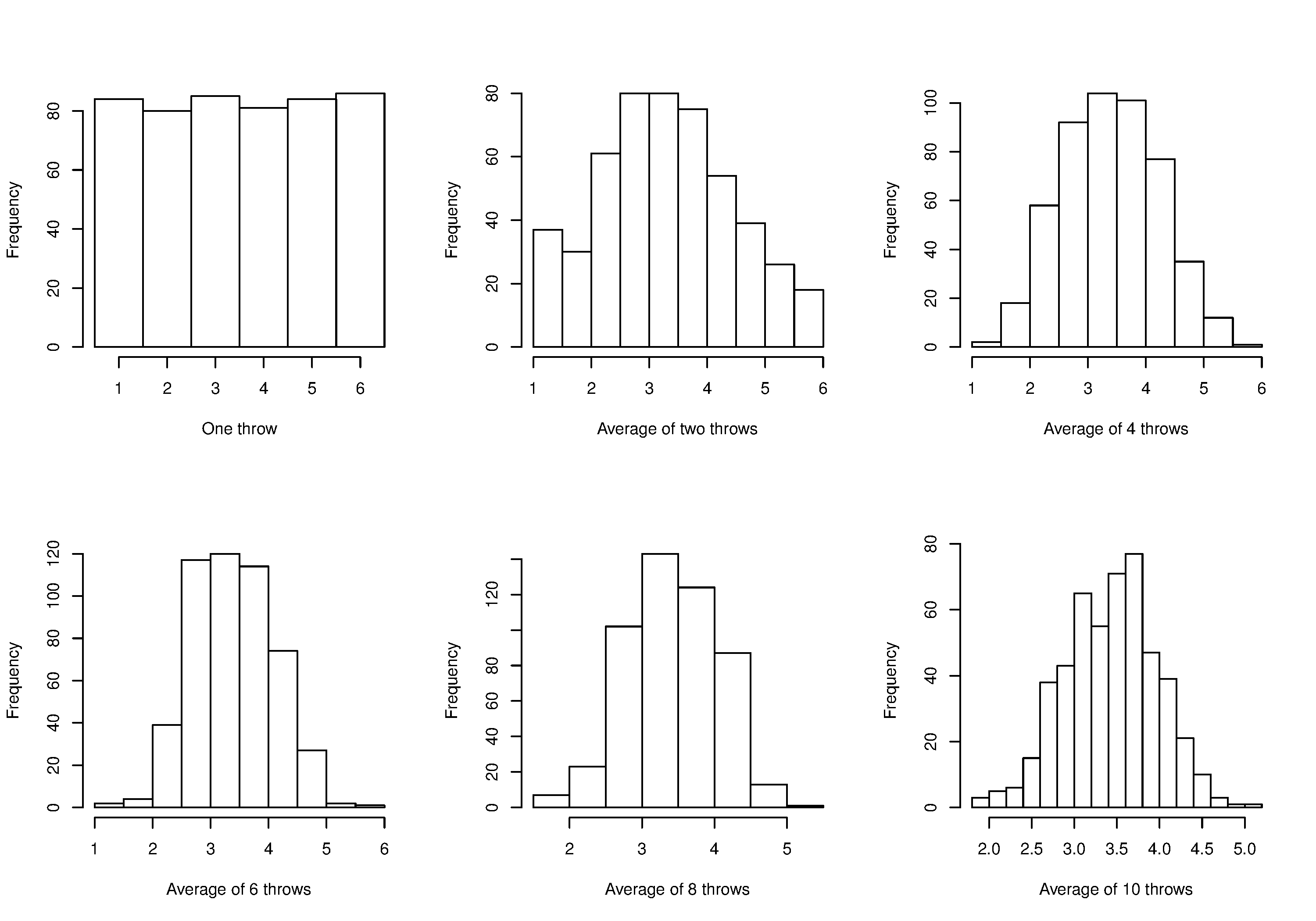
As one sees from the above figures, the distribution from these averages quickly takes the shape of the so-called normal distribution. As \(M\) increases, the y-axis starts to form a peak. Try it yourself:
What is the engineering significance of this averaging process (which is really just a weighted sum)? Many of the quantities we measure are bulk properties, such as viscosity, density, or particle size. We can conceptually imagine that the bulk property measured is the combination of the same property, measured on smaller and smaller components. Even if the value measured on the smaller component is not normally distributed, the bulk property will be as if it came from a normal distribution.
2.8.2. Independence
The assumption of independence is widely used in statistical work and is a condition for using the central limit theorem.
Note
The assumption of independence means that the samples we have in front of us are randomly taken from a population. If two samples are independent, there is no possible relationship between them.
We frequently violate this assumption of independence in engineering applications. Think about these examples for a while:
A questionnaire is given to a group of people. What happens if they discuss the questionnaire in sub-groups prior to handing it in?
We are not going to receive \(n\) independent answers, rather we will receive as many independent opinions as there are sub-groups.
The rainfall amount, recorded every day, over the last 30 days.
These data are not independent: if it rains today, it can likely rain tomorrow as the weather usually stays around for some days. These data are not useful as a representative sample of typical rainfall, however they are useful for complaining about the weather. Think about the case if we had considered rainfall in hourly intervals, rather than daily intervals.
The snowfall, recorded on 3 January for every year since 1976: independent or not?
These sampled data will be independent.
The impurity values in the last 100 batches of product produced is shown below. Which of the 3 time sequences has independent values?
In chemical processes there is often a transfer from batch-to-batch: we usually use the same lot of raw materials for successive batches, the batch reactor may not have been cleaned properly between each run, and so on. It is very likely that two successive batches (\(k\) and \(k+1\)) are somewhat related, and less likely that batch \(k\) and \(k+2\) are related. In the figure below, can you tell which sequence of values are independent?
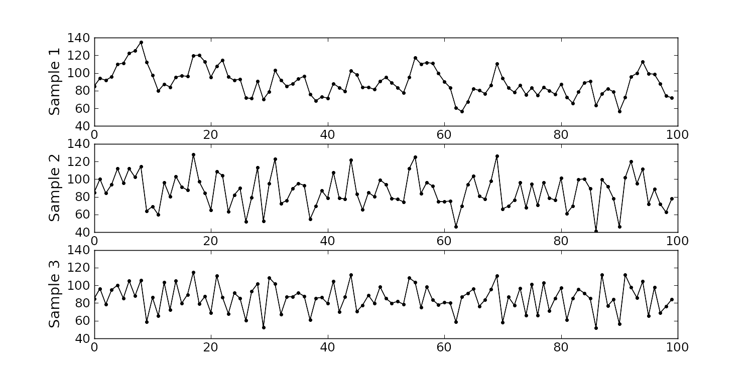
Sequence 2 (sequence 1 is positively correlated, while sequence 3 is negatively correlated).
We need a highly reliable pressure release system. Manufacturer A sells a system that fails 1 in every 100 occasions, and manufacturer B sells a system that fails 3 times in every 1000 occasions. Given this information, answer the following:
The probability that system A fails: \(p(\text{A}_\text{fails}) = 1/100\)
The probability that system B fails:\(p(\text{B}_\text{fails}) = 3/1000\)
The probability that both system A and fail at the same time: \(p(\text{both A and B fail}) = \frac{1}{100} \cdot \frac{3}{1000} = 3 \times 10^{-5}\), but only if system A and B are totally independent.
For the previous question, what does it mean for system A to be totally independent of system B?
It means the 2 systems must be installed in parallel, so that there is no interaction between them at all.
How would the probability of both A and B failing simultaneously change if A and B were not independent?
The probability of both failing simultaneously will increase.
2.8.3. Formal definition for the normal distribution
\(x\) is the variable of interest
\(p(x)\) is the probability of obtaining that value of \(x\)
\(\mu\) is the population average for the distribution (first parameter)
\(\sigma\) is the population standard deviation for the distribution, and is always a positive quantity (second parameter)
Some questions:
What is the maximum value of \(p(x)\) and where does it occur, using the formula above?
What happens to the shape of \(p(x)\) as \(\sigma\) gets larger ?
What happens to the shape of \(p(x)\) as \(\sigma \rightarrow 0\) ?
Fill out this table:
\(x\)
\(\\sigma\)
\(\\mu\)
\(p(x)\)
0
1
0
1
1
0
-1
1
0
To calculate the point on the curve \(p(x)\) we use the dnorm(...) function in R. It requires you specify the two parameters:
Some useful points:
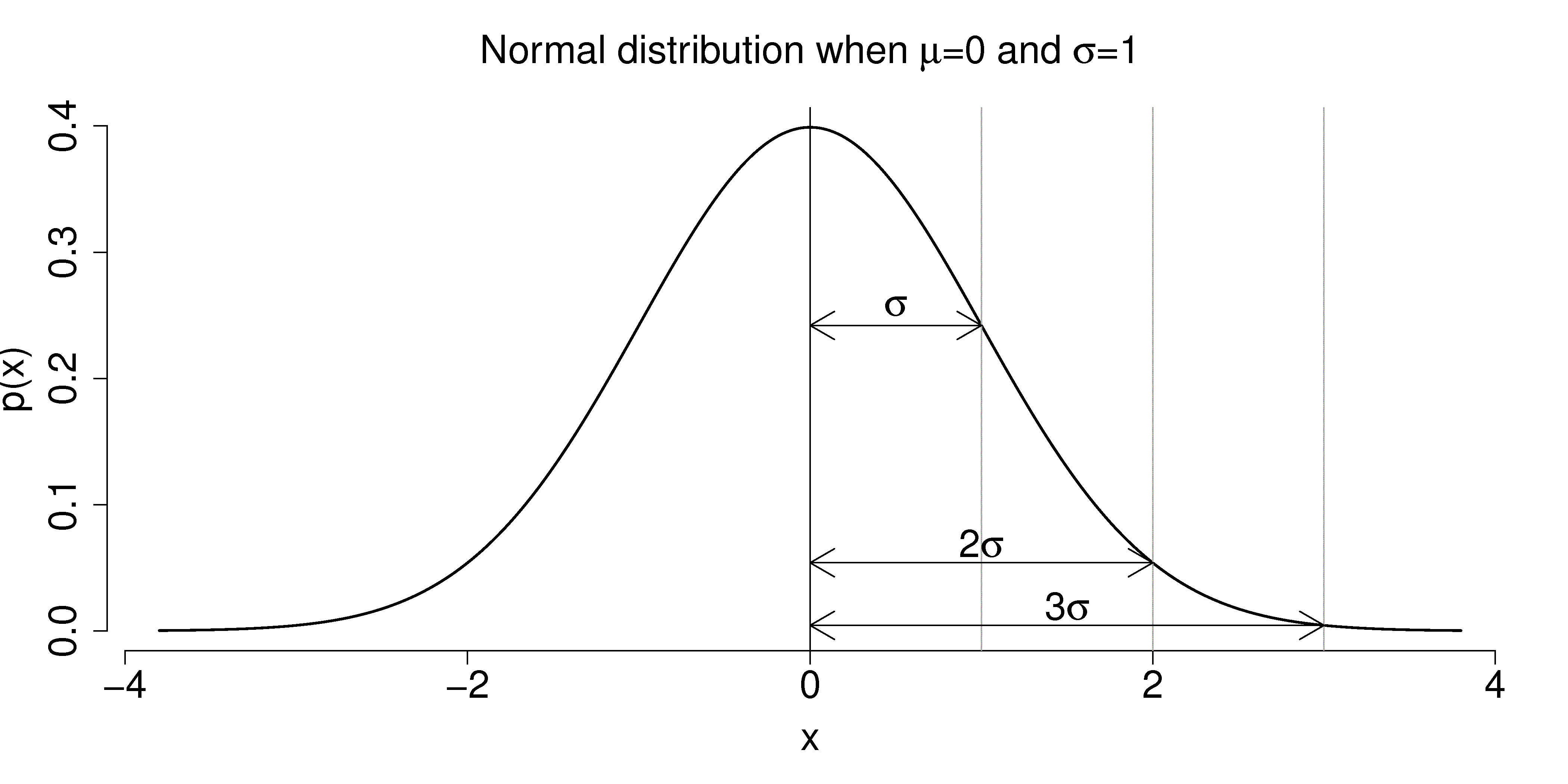
The total area from \(x=-\infty\) to \(x=+\infty\) is 1.0; we cannot calculate the integral of \(p(x)\) analytically.
\(\sigma\) is the distance from the mean, \(\mu\), to the point of inflection
The normal distribution only requires two parameters to describe it: \(\mu\) and \(\sigma\)
The area from \(x= -\sigma\) to \(x = \sigma\) is about 70% (68.3% exactly) of the distribution. So we have a probability of about 15% of seeing an \(x\) value greater than \(x = \sigma\), and also 15% of \(x < -\sigma\)
The tail area outside \(\pm 2\sigma\) is about 5% (2.275 outside each tail)
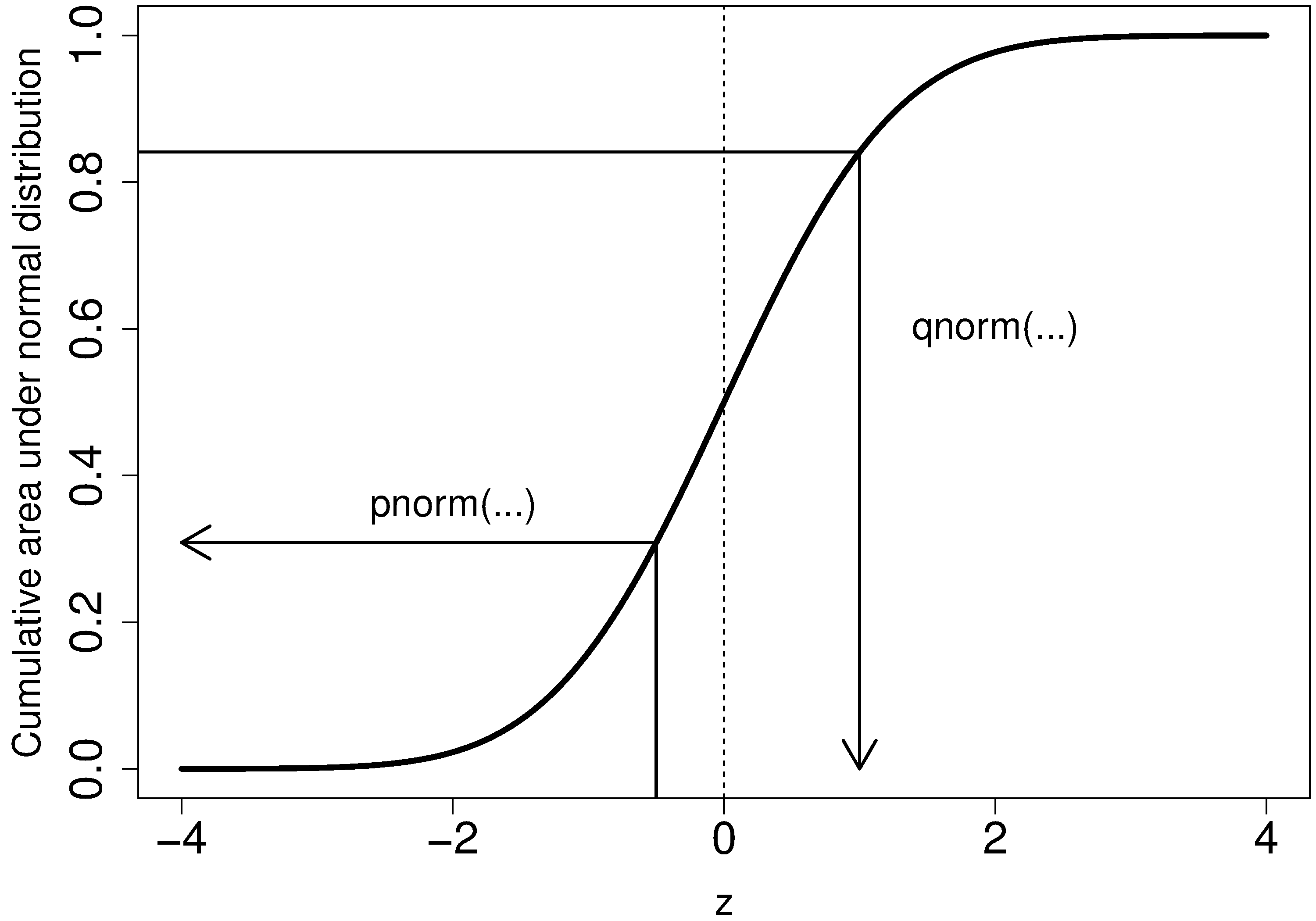
It is more useful to calculate the area under \(p(x)\) from \(x=-\infty\) to a particular point \(x\). This is called the cumulative distribution, and is discussed more fully in the next section.
You might still find yourself having to refer to tables of cumulative area under the normal distribution, instead of using the pnorm() function (for example in a test or exam). If you look at the appendix of most statistical texts you will find these tables, and there is one at the end of this chapter. Since these tables cannot be produced for all combinations of mean and standard deviation parameters, they use what is called standard form.
The values of the mean and standard deviation are either the population parameters, if known, or using the best estimate of the mean and standard deviation from the sampled data.
For example, if our values of \(x_i\) come from a normal distribution with mean of 34.2 and variance of 55. Then we could write \(x \sim \mathcal{N}(34.2, 55)\), which is short-hand notation of saying the same thing. The equivalent \(z\)-values for these \(x_i\) values would be: \(z_i = \dfrac{x_i - 34.2}{\sqrt{55}}\).
This transformation to standard form does not change the distribution of the original \(x\), it only changes the parameters of the distribution. You can easily prove to yourself that \(z\) is normally distributed as \(z \sim \mathcal{N}(0.0, 1.0)\). So statistical tables only report the area under the distribution of a \(z\) value with mean of zero, and unit variance.
This is a common statistical technique, to standardize a variable, which we will see several times. Standardization takes our variable from \(x \sim \mathcal{N}(\text{some mean}, \text{some variance})\) and converts it to \(z \sim \mathcal{N}(0.0, 1.0)\). It is just as easy to go backwards, from a given \(z\)-value and return back to our original \(x\)-value.
The units of \(z\) are dimensionless, no matter what the original units of \(x\) were. Standardization also allows us to straightforwardly compare 2 variables that may have different means and spreads. For example if our company has two reactors at different locations, producing the same product. We can standardize a variable of interest, e.g. viscosity, from both reactors and then proceed to use the standardized variables to compare performance.
Consult a statistical table found in most statistical textbooks for the normal distribution, such as the one found at the end of this chapter. Make sure you can firstly understand how to read the table. Secondly, duplicate a few entries in the table using R. Complete these small exercises by estimating what the rough answer should be. Use the tables first, then use R to get a more accurate estimate.
Assume \(x\), the measurement of biological activity for a drug, is normally distributed with mean of 26.2 and standard deviation of 9.2. What is the probability of obtaining an activity reading less than or equal to 30.0?
Assume \(x\) is the yield for a batch process, with mean of 85 g/L and variance of 16 \(\text{g}^2.\text{L}^{-2}\). What proportion of batch yield values lie between 75 and 95 g/L?
2.8.4. Checking for normality: using a q-q plot
Often we are not sure if a sample of data can be assumed to be normally distributed. This section shows you how to test whether the data are normally distributed, or not.
Before we look at this method, we need to introduce the concept of the inverse cumulative distribution function (inverse CDF). Recall the cumulative distribution is the area underneath the distribution function, \(p(z)\), which goes from \(-\infty\) to \(z\). For example, the area from \(-\infty\) to \(z=-1\) is about 15%, as we showed earlier, and we can use the pnorm() function in R to verify that.
Now the inverse cumulative distribution is used when we know the area, but want to get back to the value along the \(z\)-axis. For example, below which value of \(z\) does 95% of the area lie for a standardized normal distribution? Answer: \(z=1.64\). In R we use the qnorm(0.95, mean=0, sd=1) to calculate this value. The q stands for quantile, because we give it the quantile and it returns the \(z\)-value: e.g. qnorm(0.5) gives 0.0.
On to checking for normality. We start by first constructing some quantities that we would expect for truly normally distributed data. Secondly, we construct the same quantities for the actual data. A plot of these 2 quantities against each other will reveal if the data are normal, or not.
Imagine we have \(N\) observations which are normally distributed. Sort the data from smallest to largest. The first data point should be the \((1/N \times 100)\) quantile, the next data point is the \((2/N \times 100)\) quantile, the middle, sorted data point is the 50th quantile, \((1/2 \times 100)\), and the last, sorted data point is the \((N/N \times 100)\) quantile.
The middle, sorted data point from this truly normal distribution must have a \(z\)-value on the standardized scale of 0.0 (we can verify that by using
qnorm(0.5)). By definition, 50% of the data should lie below this mid point. The first data point will be atqnorm(1/N), the second atqnorm(2/N), the middle data point atqnorm(0.5), and so on. In general, the \(i^\text{th}\) sorted point should be atqnorm((i-0.5)/N), for values of \(i = 1, 2, \ldots, N\). We subtract off 0.5 by convention to account for the fact thatqnorm(1.0) = Inf. So we construct this vector of theoretically expected quantities from the inverse cumulative distribution function.N = 10 index = seq(1, N) P = (index - 0.5) / N P [1] 0.05 0.15 0.25 0.35 0.45 0.55 0.65 0.75 0.85 0.95 theoretical.quantity = qnorm(P) [1] -1.64 -1.04 -0.674 -0.385 -0.126 0.125 0.385 0.6744 1.036 1.64
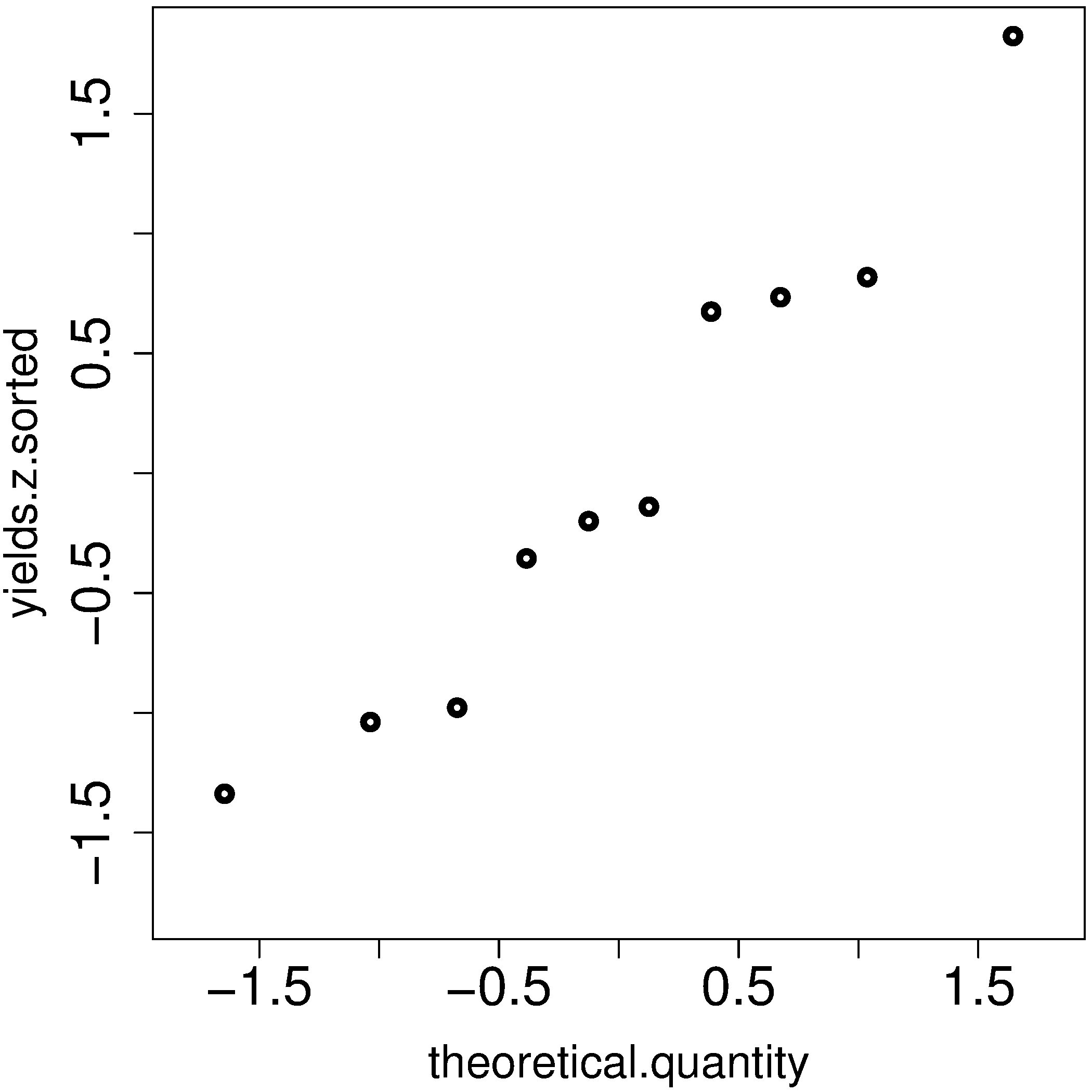
We also construct the actual quantiles for the sampled data. First, standardize the sampled data by subtracting off its mean and dividing by its standard deviation. Here is an example of 10 batch yields (see actual values below). The mean yield is 80.0 and the standard deviation is 8.35. The standardized yields are found by subtracting off the mean and dividing by the standard deviation. Then the standardized values are sorted. Compare them to the theoretical quantities.
yields <- c(86.2, 85.7, 71.9, 95.3, 77.1, 71.4, 68.9, 78.9, 86.9, 78.4)
mean.yield <- mean(yields)              # 80.0
sd.yield <- sd(yields)                  # 8.35

yields.z = (yields - mean.yield)/sd.yield
[1] 0.734  0.674 -0.978  1.82 -0.35 -1.04 -1.34 -0.140  0.818 -0.200

yields.z.sorted = sort(yields.z)
[1] -1.34 -1.04 -0.978 -0.355 -0.200 -0.140  0.674  0.734  0.818  1.82

theoretical.quantity  # numbers are rounded in the printed output
[1] -1.64 -1.04 -0.674 -0.385 -0.126  0.125  0.385  0.6744 1.036  1.64
The final step is to plot this data in a suitable way. If the sampled quantities match the theoretical quantities, then a scatter plot of these numbers should form a 45 degree line.
plot(theoretical.quantity, yields.z.sorted, type="p")
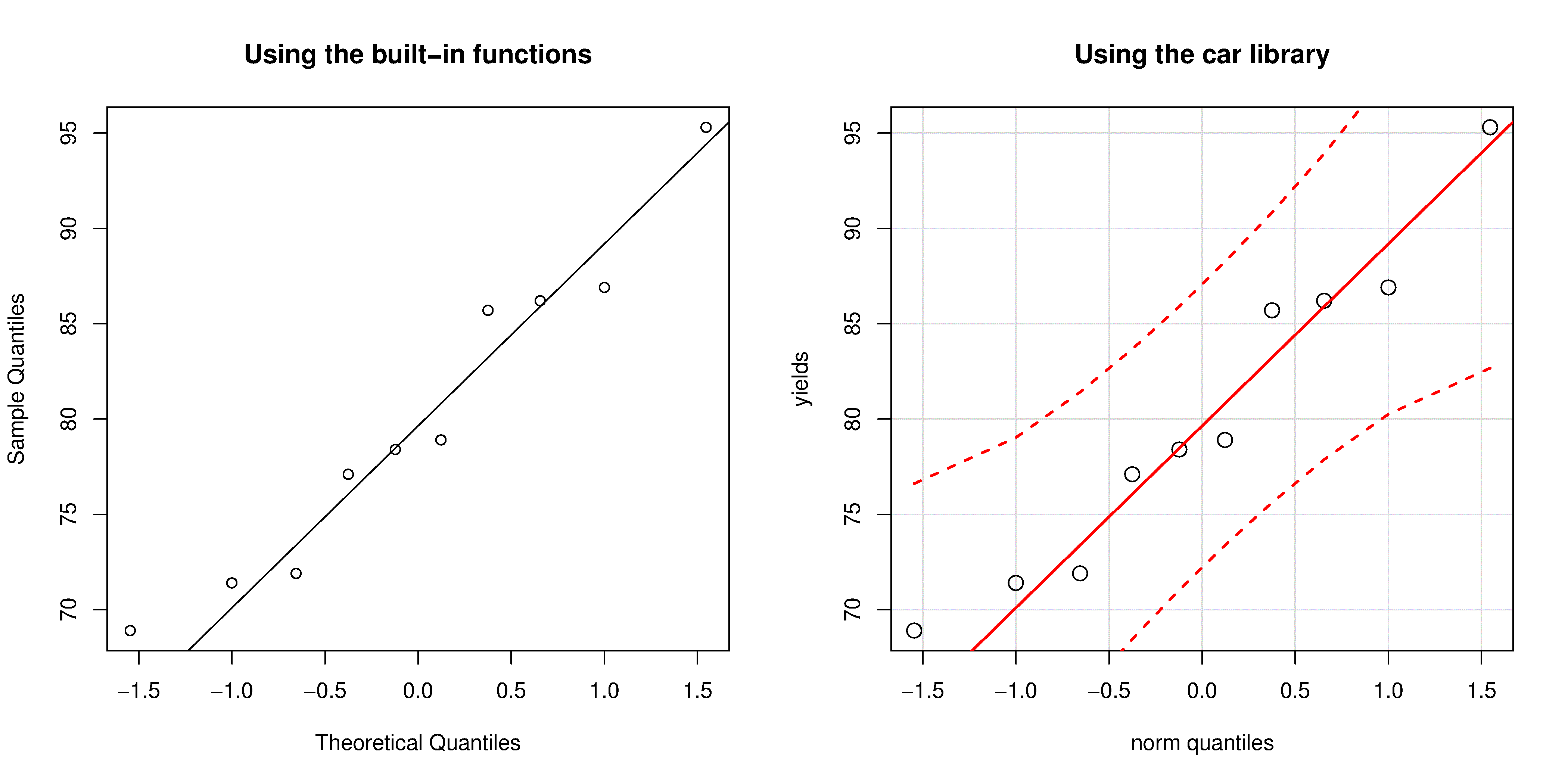
A built-in function exists in R that runs the above calculations and shows a scatter plot. The 45 degree line is added using the qqline(...) function. However, a better function that adds a confidence limit envelope is included in the car library (see the Package Installer menu in R for adding libraries from the internet).
qqnorm(yields)
qqline(yields)

# or, using the ``car`` library
library(car)
qqPlot(yields)
All the above code together in one script for you to test out:
The R plot rescales the \(y\)-axis (sample quantiles) back to the original units to make interpretation easier. We expect some departure from the 45 degree line due to the fact that these are only a sample of data. However, large deviations indicates the data are not normally distributed. An error region, or confidence envelope, may be superimposed around the 45 degree line.
The q-q plot, quantile-quantile plot, shows the quantiles of 2 distributions against each other. In fact, we can use the horizontal axis for any distribution, it need not be the theoretical normal distribution. We might be interested if our data follow an \(F\)-distribution then we could use the quantiles for that theoretical distribution on the horizontal axis.
We can use the q-q plot to compare any 2 samples of data, even if they have different values of \(N\), by calculating the quantiles for each sample at different step quantiles (e.g. 1, 2, 3, 4, 5, 10, 15, …. 95, 96, 97, 98, 99), then plot the q-q plot for the two samples. You can calculate quantiles for any sample of data using the quantile function in R. The simple example below shows how to compare the q-q plot for 1000 normal distribution samples against 2000 \(F\)-distribution samples.
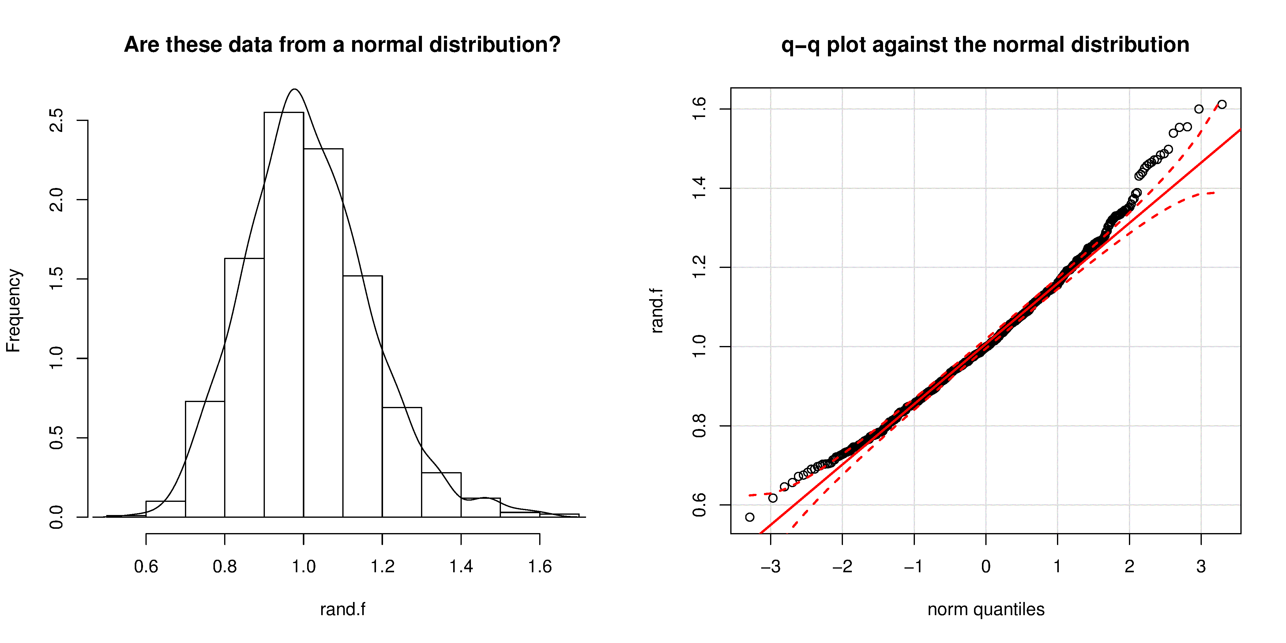
Even though the histogram of the \(F\)-distribution samples looks normal to the eye (left), the q-q plot (right) quickly confirms it is definitely not normal, particularly, that the right-tail is too heavy.
2.8.5. Introduction to confidence intervals from the normal distribution
We introduce the concept of confidence intervals here as a straightforward application of the normal distribution, Central limit theorem, and standardization.
Suppose we have a quantity of interest from a process, such as the daily profit. We have many measurements of this profit, and we can easily calculate the average profit. But we know that if we take a different data set of profit values and calculate the average, we will get a similar, but different average. Since we will never know the true population average, the question we want to answer is:
What is the range within which the true (population) average value lies? E.g. give a range for the true, but unknown, daily profit.
This range is called a confidence interval, and we study them in more depth later on. We will use an example to show how to calculate this range.
Let’s take \(n\) values of this daily profit value, let’s say \(n=5\).
An estimate of the population mean is given by \(\overline{x} = \displaystyle \dfrac{1}{n} \sum_i^{i=n}{x_i}\qquad\qquad\) (we saw this before)
The estimated population variance is \(s^2 =\displaystyle \frac{1}{n-1}\sum_i^{i=n}{(x_i - \overline{x})^2}\qquad\) (we also saw this before)
This is new: the estimated mean, \(\overline{x}\), is a value that is also normally distributed with mean of \(\mu\) and variance of \(\sigma^2/n\), with only one requirement: this result holds only if each of the \(x_i\) values are independent of each other.
Mathematically we write: \(\displaystyle \overline{x} \sim \mathcal{N}\left(\mu, \sigma^2/n\right)\).
This important result helps answer our question above. It says that repeated estimates of the mean will be an accurate, unbiased estimate of the population mean, and interestingly, the variance of that estimate is decreased by using a greater number of samples, \(n\), to estimate that mean. This makes intuitive sense: the more independent samples of data we have, the better our estimate (“better” in this case implies lower error, i.e. lower variance).
We can illustrate this result as shown below:
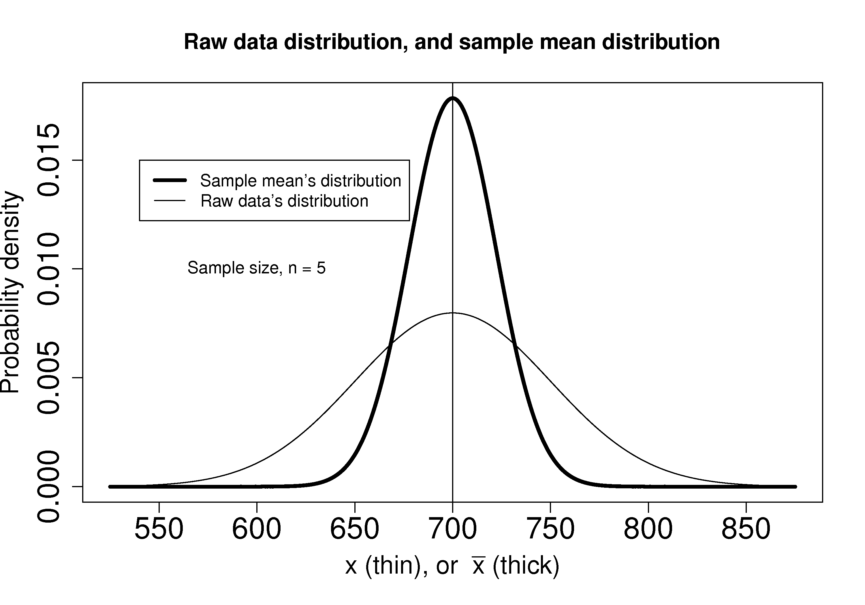
The true population (but unknown to us) profit value is $700.
The 5 samples come from the distribution given by the thinner line: \(\displaystyle x \sim \mathcal{N}\left(\mu, \sigma^2\right)\)
The \(\overline{x}\) average comes from the distribution given by the thicker line: \(\displaystyle \overline{x} \sim \mathcal{N}\left(\mu, \sigma^2/n\right)\).
Creating \(z\) values for each \(x_i\) raw sample point:
\[z_i = \frac{x_i - \mu}{\sigma}\]The \(z\)-value for \(\overline{x}\) would be:
\[z = \dfrac{\overline{x} - \mu}{\sigma / \sqrt{n}}\]which subtracts off the unknown population mean from our estimate of the mean, and divides through by the standard deviation for \(\overline{x}\). We can illustrate this as:
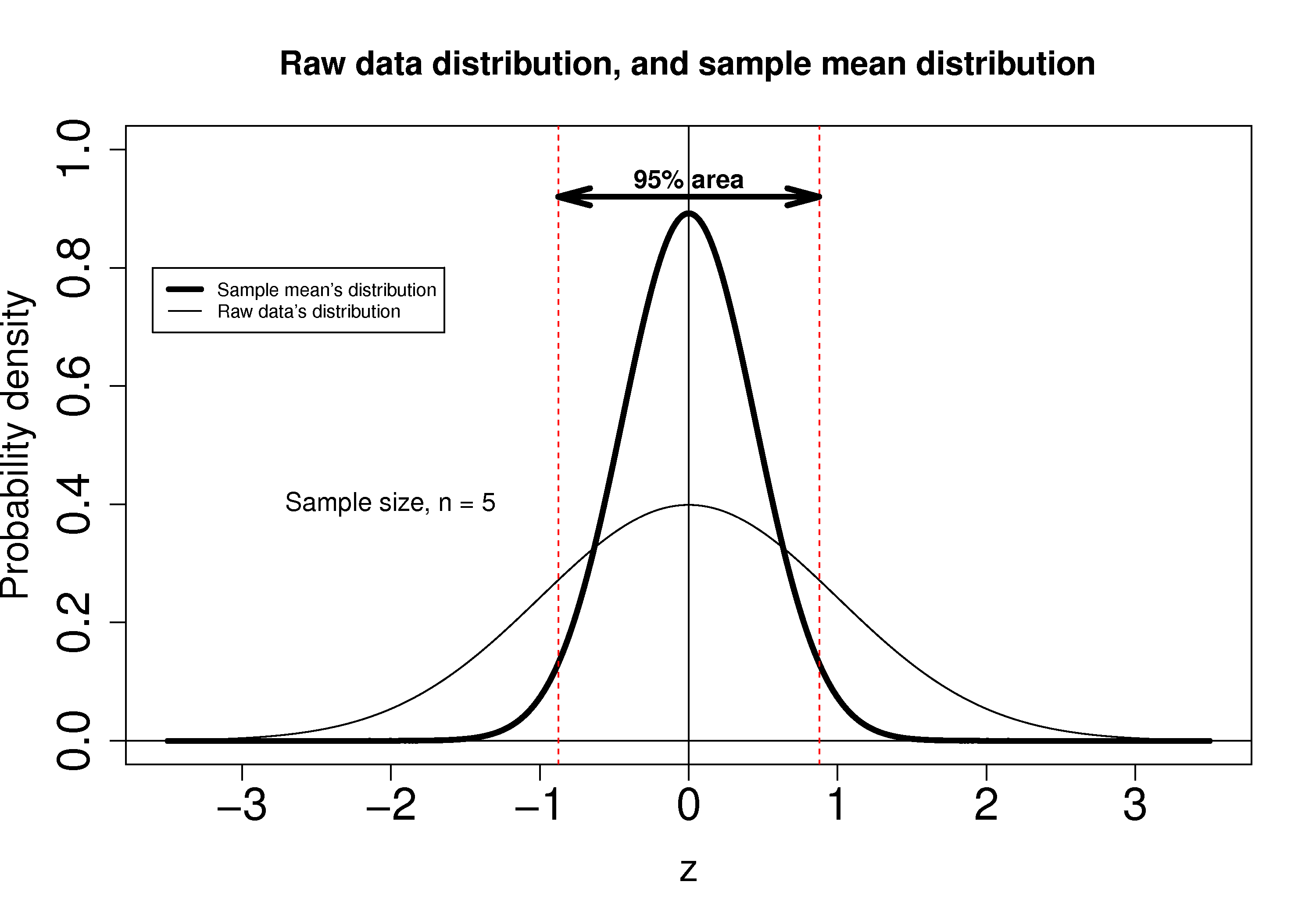
Using the known normal distribution for \(\displaystyle \overline{x} \sim \mathcal{N}\left(\mu, \sigma^2/n\right)\), we can find the vertical, dashed red lines shown in the previous figure, that contain 95% of the area under the distribution for \(\overline{x}\).
These vertical lines are symmetrical about 0, and we will call them \(-c_n\) and \(+c_n\), where the subscript \(n\) refers to the fact that they are from the normal distribution (it doesn’t refer to the \(n\) samples). From the preceding section on q-q plots we know how to calculate the \(c_n\) value from R: using
qnorm(1 - 0.05/2), so that there is 2.5% area in each tail.Finally, we construct an interval for the true population mean, \(\mu\), using the standard form:
(1)¶\[\begin{split}\begin{array}{rcccl} - c_n &\leq& z &\leq & +c_n\\ - c_n &\leq& \displaystyle \frac{\overline{x} - \mu}{\sigma/\sqrt{n}} &\leq & +c_n\\ \overline{x} - c_n \dfrac{\sigma}{\sqrt{n}} &\leq& \mu &\leq& \overline{x} + c_n\dfrac{\sigma}{\sqrt{n}} \\ \text{LB} &\leq& \mu &\leq& \text{UB} \end{array}\end{split}\]Notice that the lower and upper bound are a function of the known sample mean, \(\overline{x}\), the values for \(c_n\) which we chose, the known sample size, \(n\), and the unknown population standard deviation, \(\sigma\).
So to estimate our bounds we must know the value of this population standard deviation. This is not very likely, (I can’t think of any practical cases where we know the population standard deviation, but not the population mean, which is the quantity we are constructing this range for), however there is a hypothetical example in the next section to illustrate the calculations.
The \(t\)-distribution is required to remove this impractical requirement of knowing the population standard deviation.