1.1. Data visualization in context
This is the first chapter in the book. Why? Many of you have heard the phrase “plot your data,” but seldom are we shown what appropriate plots look like.
In this section we consider quantitative plots – plots that show numbers. We cover various plots that will help you gain more insight from your data. We end with a list of tips for effective data visualization.
Usage examples
You can use the material in this chapter when you must learn more about your system from the data. For example, you may get these questions:
Co-worker: Here are the yields (final output value) from a given system for the last 3 years (1256 data points). Can you help me:
effectively communicate what the time trends are in the data?
summarize the yield values?
Manager: How can we effectively summarize the (a) number and (b) types of defects on our 17 products for the last 12 months?
Yourself: We produce products in a batchwise manner. For each batch we have 25 different sensors that we record a value for at a rate of 5 readings per minute, over a total interval of 300 minutes. How can we visualize these \(25 \times 5 \times 300 = 37500\) data points?
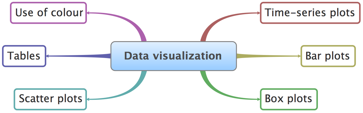
What we will cover
1.2. References and readings
Edward Tufte, Envisioning Information, Graphics Press, 1990. (10th printing in 2005)
Edward Tufte, The Visual Display of Quantitative Information, Graphics Press, 2001.
Edward Tufte, Visual Explanations: Images and Quantities, Evidence and Narrative, 2nd edition, Graphics Press, 1997.
Stephen Few, Show Me the Numbers and Now You See It: Simple Visualization Techniques for Quantitative Analysis; both from Analytics Press.
William Cleveland, Visualizing Data, 1st edition, Hobart Press, 1993.
William Cleveland, The Elements of Graphing Data, 2nd edition, Hobart Press, 1994.
Su, It’s Easy to Produce Chartjunk Using Microsoft Excel 2007 but Hard to Make Good Graphs, Computational Statistics and Data Analysis, 52 (10), 4594-4601, 2008.