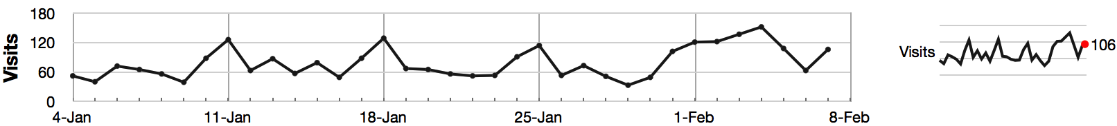
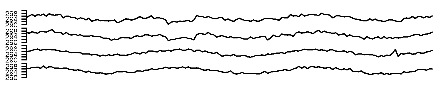
The plots are a time-series plot and a sparkline. The sparkline shows exactly the same data, just a more compact form (without the labelling on the axes).
Features shown in the data are:
A noticeable weekly cycle; probably assignments are due the next day!
A sustained, high level of traffic in the first week February - maybe a midterm test.
Some days have more than 90 visits, indicating that students visit the site more than once per day, or due to external visitors to the site.
Features such as sinusoids, spikes, gaps (missing values), upward and downward trends are quickly picked out by the human eye, even in a poorly drawn plot.
Question 4
Why is the principle of minimizing “data ink” so important in an effective visualization? Give an scientific or engineering example of why this important.
It reduces the time or work to interpret that plot, by eliminating elements that are non-essential to the plot’s interpretation. Situations which are time or safety critical are examples, for example in an operator control room, or medical facility (operating room).
Question 5
Describe what the main difference(s) between a bar chart and a histogram are.
Histograms are used to show distributions of variables while bar charts are used to compare variables.
Histograms plot quantitative data with ranges of the data grouped into bins or intervals while bar charts plot categorical data.
Bars can be reordered in bar charts but not in histograms.
There are no spaces between the bars of a histogram since there are no gaps between the bins. An exception would occur if there were no values in a given bin but in that case the value is zero rather than a space. On the other hand, there are spaces between the variables of a bar chart.
The bars of bar charts typically have the same width. The widths of the bars in a histogram need not be the same as long as the total area is one hundred percent if percents are used or the total count if counts are used. Therefore, values in bar charts are given by the length of the bar while values in histograms are given by areas.
Question 6
Write out a list of any features that can turn a plot into a poor visualization. Think carefully about plots you encountered in textbooks and scientific publications, or the lab reports you might have recently created for a university or college course.
Question 7
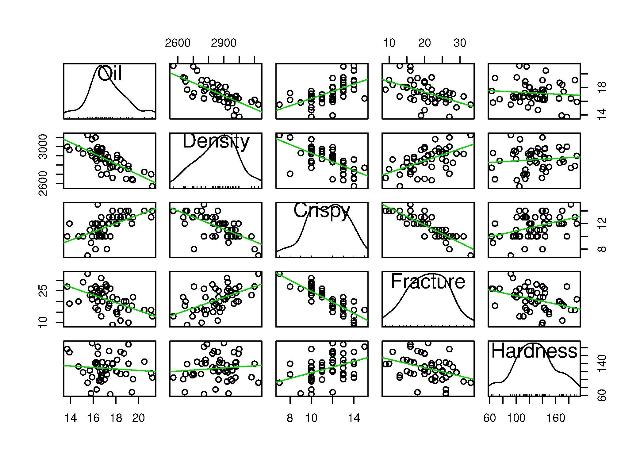
This question is an extension to visualizing more than 3 variables. Investigate on your own the term “scatterplot matrix”, and draw one for the Food texture data set. See the car library in R to create an effective scatterplot matrix with the scatterplotMatrix function. List some bullet-points that interpret the plot.
From this plot we see histograms of the 5 univariate distributions on the diagonal plots; the off-diagonal plots are the bivariate correlations between each combination of variable. The trend line (solid light green) shows the linear regression between the two variables. The lower diagonal part of the plot is a 90 degree rotation of the upper diagonal part. Some software packages will just draw either the upper or lower part.
From these plots we quickly gain an insight into the data:
Most of the 5 variables have a normal-like distribution, except for Crispy, but notice the small notches on the middle histogram: they are equally spaced, indicating the variable is not continuous; it is quantized. The Fracture variable also displays this quantization.
There is a strong negative correlation with oiliness and density: oilier pastries are less dense (to be expected).
There is a positive correlation with oiliness and crispiness: oilier pastries are more crisp (to be expected).
There is no relationship between the oiliness and hardness of the pastry.
There is a negative correlation between density and crispiness (based on the prior relationship with Oil): less dense pastries (e.g. more air in them) and crispier.
There is a positive correlation between Density and Fracture. As described in the dataset file, Fracture is the angle by which the pastry can be bent, before it breaks; more dense pastries have a higher fracture angle.
Similarly, a very strong negative correlation between Crispy and Fracture, indicating the expected effect that very crispy pastries have a low fracture angle.
The pastry’s hardness seems to be uncorrelated to all the other 4 variables.
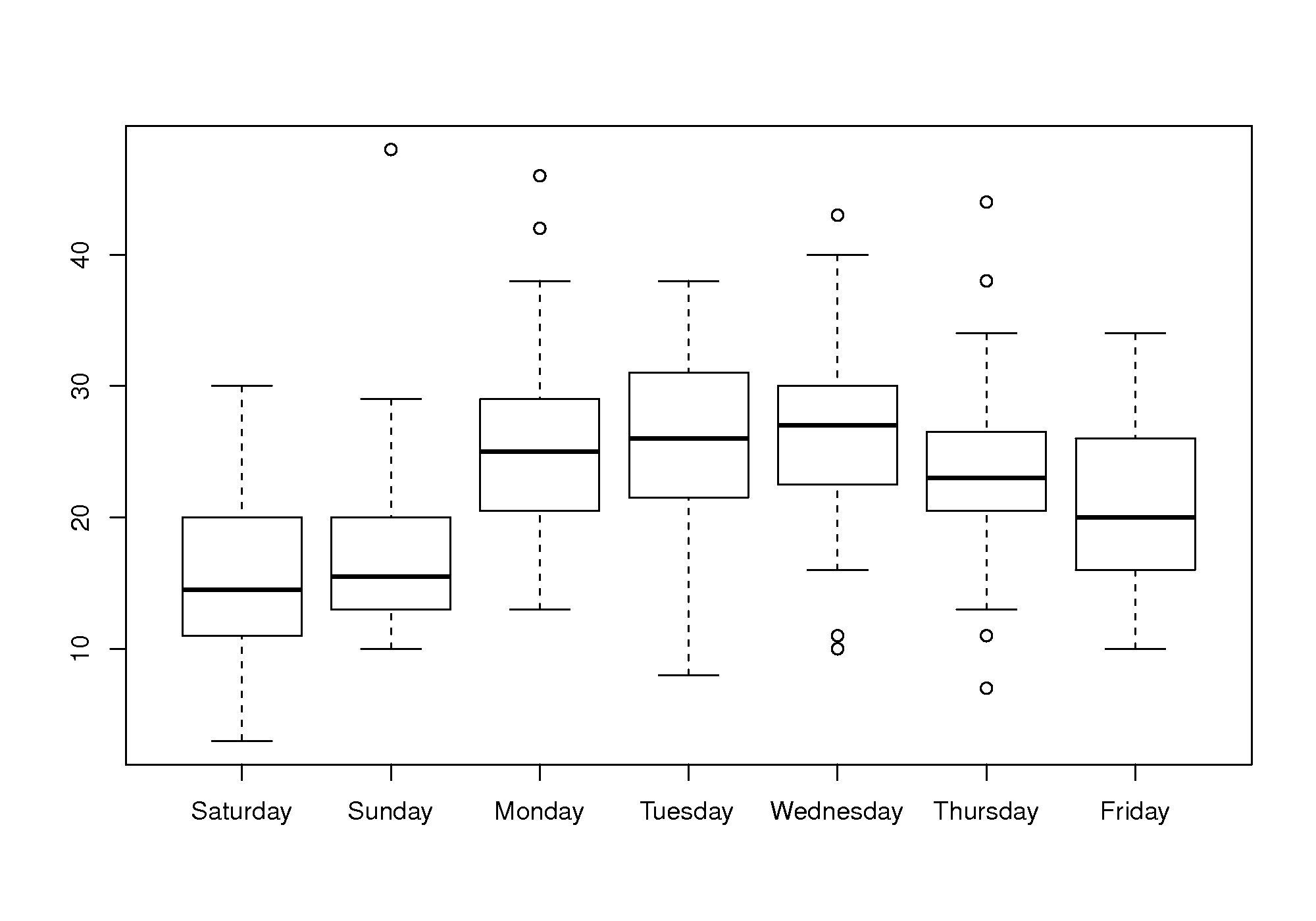
A suitable chart for displaying variability on a per-day basis is the boxplot, one box for each day of the week. This allows you to see between-day variation when comparing the boxes side by side, and get an impression of the variability within each variable, by examining how the box’s horizontal lines are spread out (25th, 50th and 75th percentiles).
A box plot is an effective way to summarize and compare the data for each day of the week.
The box plot shows:
Much less website traffic on Saturdays and Sundays, especially Sunday which has less spread than Saturday.
Visits increase during the weekday, peaking on Wednesday and then dropping down by Friday.
All week days seem to have about the same level of spread, except Friday, which is more variable.
This is a website of academic interest, so these trends are expected.
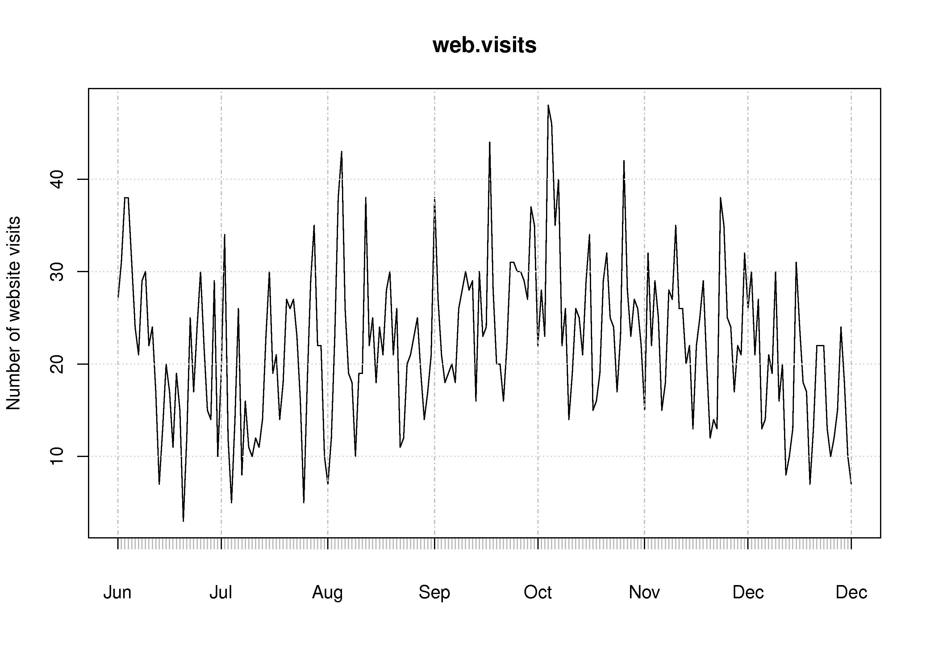
A time-series plot of the data shows increased visits in September and October, and declining visits in November and December. This coincides with the phases of the academic term. A plot of the total number of visits within each month will show this effect clearly. The lowest number of visits were recorded in late June and July.
The best way to draw the time-series plot is to use proper time-based labelling on the x-axis, but we won’t cover that topic here. If you are interested, read up about the xts package (see the R tutorial) and it’s plot command. See how it is used in the code below:
Question 9
Load the room temperature dataset into R, Python or MATLAB, or whichever software tool you prefer to plot with.
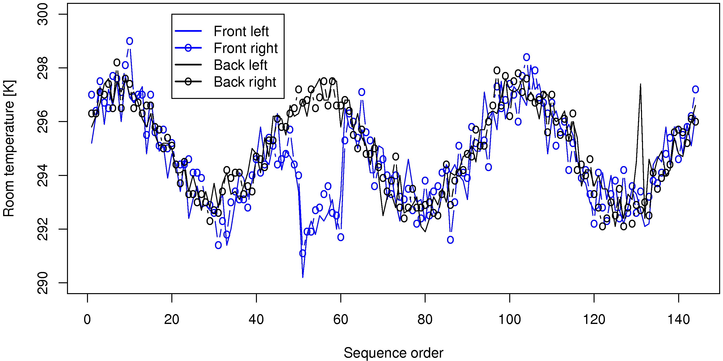
Plot the 4 trajectories, FrontLeft, FrontRight, BackLeft and BackRight on the same plot.
Comment on any features you observe in your plot.
Be specific and describe how sparklines of these same data would improve the message the data is showing.
You could use the following code to plot the data:
A sequence plot of the data is good enough, though a time-based plot is better.
Oscillations, with a period of roughly 48 to 50 samples (corresponds to 24 hours) shows a daily cycle in the temperature.
All 4 temperatures are correlated (move together).
There is a break in the correlation around samples 50 to 60 on the front temperatures (maybe a door or window was left open?). Notice that the oscillatory trend still continues within the offset region - just shifted lower.
A spike up in the room’s back left temperature, around sample 135.
The above plot was requested to be on one axis, which leads to some clutter in the presentation. Sparklines show each trajectory on their own axis, so it is less cluttered, but the same features would still be observed when the 4 tiny plots are stacked one on top of each other.
If you looked around for how to generate sparklines in R you may have come across this website. Notice in the top left corner that the sparklines function comes from the YaleToolkit, which is an add-on package to R. We show how to install packages in the tutorial. Once installed, you can try out that sparklines function:
First load the library: library(YaleToolkit)
Then see the help for the function: help(sparklines) to see how to generate your sparklines
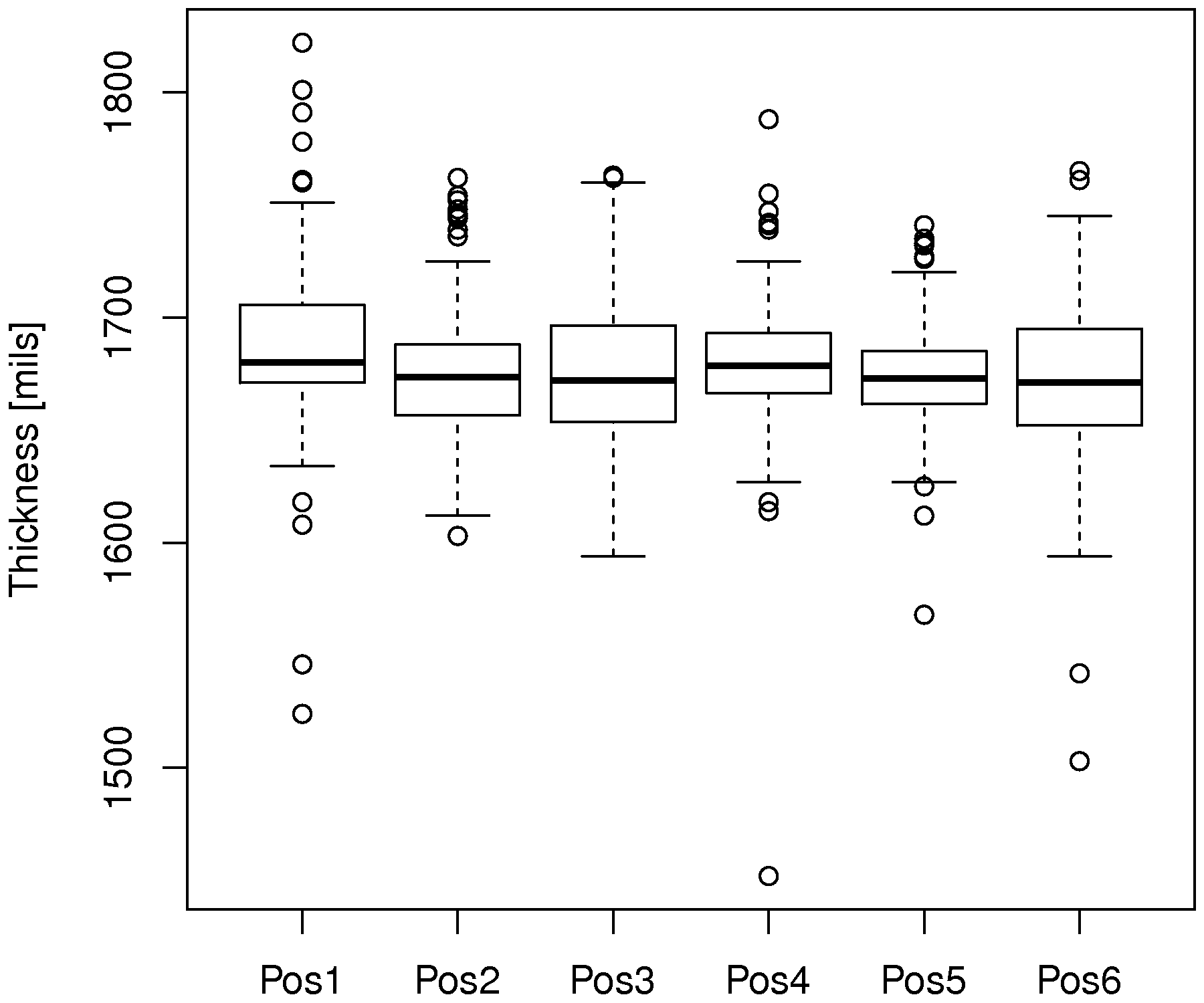
The following code will load the data, and plot a boxplot for the first 100 rows:
The thick center line on each boxplot is the median (50th percentile) of that variable. The top and bottom edges of the box are the 25th and 75th percentile, respectively. If the data are from a symmetric distribution, such as the \(t\) or normal distribution, then the median should be approximately centered with respect to those 2 percentiles. The fact that it is not, especially for position 1, indicates the data are skewed either to the left (median is closer to upper edge) or the the right (median closer to the lower edge).