6.5.6. Interpreting score plots
Before summarizing some points about how to interpret a score plot, let’s quickly repeat what a score value is. There is one score value for each observation (row) in the data set, so there are are \(N\) score values for the first component, another \(N\) for the second component, and so on.
The score value for an observation, for say the first component, is the distance from the origin, along the direction (loading vector) of the first component, up to the point where that observation projects onto the direction vector. We repeat an earlier figure here, which shows the projected values for 2 of the observations.
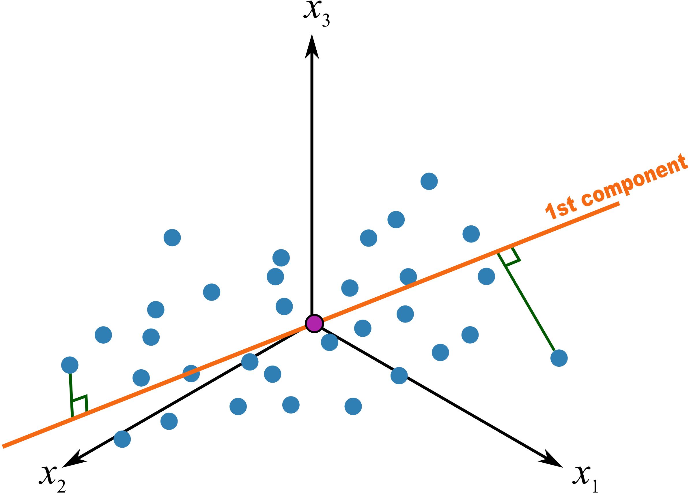
We used geometric concepts in another section that showed we can write: \(\mathbf{T} = \mathbf{X}\mathbf{P}\) to get all the scores value in one go. In this section we are plotting values from the columns of \(\mathbf{T}\). In particular, for a single observation, for the \(a^\text{th}\) component:
The first score vector, \(\mathbf{t}_1\),explains the greatest variation in the data; it is considered the most important score from that point of view, at least when we look at a data set for the first time. (After that we may find other scores that are more interesting). Then we look at the second score, which explains the next greatest amount of variation in the data, then the third score, and so on. Most often we will plot:
time-series plots of the scores, or sequence order plots, depending on how the rows of \(\mathbf{X}\) are ordered
scatter plots of one score against another score
An important point with PCA is that because the matrix \(\mathbf{P}\) is orthonormal (see the later section on PCA properties), any relationships that were present in \(\mathbf{X}\) are still present in \(\mathbf{T}\). We can see this quite easily using the previous equation. Imagine two observations taken from a process at different points in time. It would be quite hard to identify those similar points by looking at the \(K\) columns of raw data, especially when the two rows are not close to each other. But with PCA, these two similar rows are multiplied by the same coefficients in \(\mathbf{P}\) and will therefore give similar values of \(t\). So score plots allow us to rapidly locate similar observations.
When investigating score plots we look for clustering, outliers, time-based patterns. We can also colour-code our plots to be more informative. Let’s take a look at each of these.
Clustering
We usually start by looking at the \((\mathbf{t}_1, \mathbf{t}_2)\) scatterplot of the scores, the two directions of greatest variation in the data. As just previously explained, observations in the rows of \(\mathbf{X}\) that are similar will fall close to each other, i.e. they cluster together, in these score plots. Here is an example of a score plot, calculated from data from a fluidized catalytic cracking (FCC) process [Taken from the Masters thesis of Carol Slama (McMaster University, p 78, 1991)].
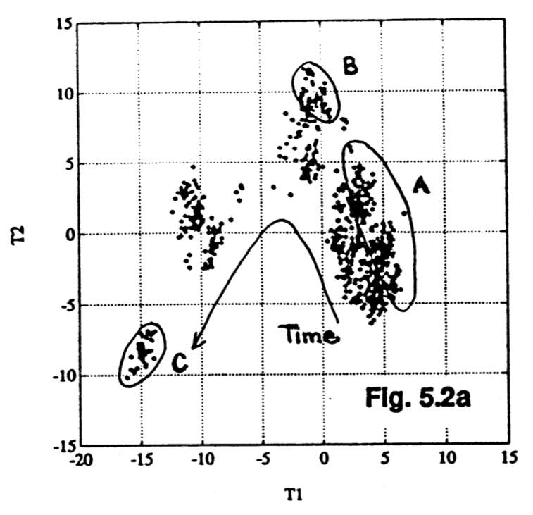
It shows how the process was operating in region A, then moved to region B and finally region C. This provides a 2-dimensional window into the movements from the \(K=147\) original variables.
Outliers
Outliers are readily detected in a score plot, and using the equation below we can see why. Recall that the data in \(\mathbf{X}\) have been centered and scaled, so the \(x\)-value for a variable that is operating at the mean level will be roughtly zero. An observation that is at the mean value for all \(K\) variables will have a score vector of \(\mathbf{t}_i = [0, 0, \ldots, 0]\). An observation where many of the variables have values far from their average level is called a multivariate outlier. It will have one or more score values that are far from zero, and will show up on the outer edges of the score scatterplots.
Sometimes all it takes is for one variable, \(x_{i,k}\) to be far away from its average to cause \(t_{i,a}\) to be large:
But usually it is a combination of more than one \(x\)-variable. There are \(K\) terms in this equation, each of which contribute to the score value. A bar plot of each of these \(K\) terms, \(x_{i,k} \,\, p_{k,a}\), is called a contribution plot. It shows which variable(s) most contribute to the large score value.
As an example from the food texture data from earlier, we saw that observation 33 had a large negative \(\mathbf{t}_1\) value. From that prior equation:
The \(K=5\) terms that contribute to this value are illustrated as a bar plot, where the sum of the bar heights add up to \(-4.2\):
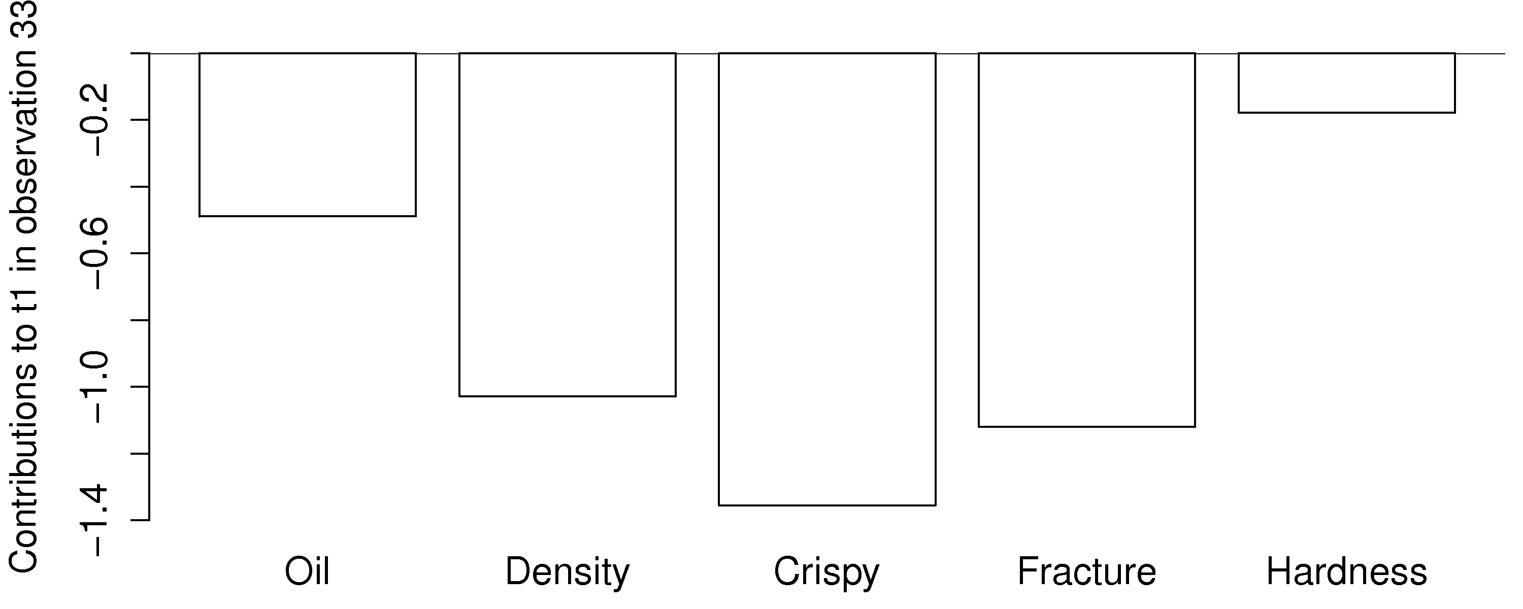
This gives a more accurate indication of exactly how the low \(t_i\) value was achieved. Previously we had said that pastry 33 was denser than the other pastries, and had a higher fracture angle; now we can see the relative contributions from each variable more clearly.
In the figure from the FCC process (in the preceding subsection on clustering), the cluster marked C was far from the origin, relative to the other observations. This indicates problematic process behaviour around that time. Normal process operation is expected to be in the center of the score plot. These outlying observations can be investigated as to why they are unusual by constructing contribution bar plots for a few of the points in cluster C.
Time-based or sequence-based trends
Any strong and consistent time-based or sequence-order trends in the raw data will be reflected in the scores also. Visual observation of each score vector may show interesting phenomena such as oscillations, spikes or other patterns of interest. As just described, contribution plots can be used to see which of the original variables in \(\mathbf{X}\) are most related with these phenomena.
Colour-coding
Plotting any two score variables on a scatter plot provides good insight into the relationship between those independent variables. Additional information can be provided by colour-coding the points on the plot by some other, 3rd variable of interest. For example, a binary colour scheme could denote success of failure of each observation.
A continuous 3rd variable can be implied using a varying colour scheme, going from reds to oranges to yellows to greens and then blue, together with an accompanying legend. For example profitability of operation at that point, or some other process variable. A 4th dimension could be inferred by plotting smaller or larger points. We saw an example of these high-density visualizations earlier.
Summary
Points close the average appear at the origin of the score plot.
Scores further out are either outliers or naturally extreme observations.
We can infer, in general, why a point is at the outer edge of a score plot by cross-referencing with the loadings. This is because the scores are a linear combination of the data in \(\mathbf{X}\) as given by the coefficients in \(\mathbf{P}\).
We can determine exactly why a point is at the outer edge of a score plot by constructing a contribution plot to see which of the original variables in \(\mathbf{X}\) are most related with a particular score. This provides a more precise indication of exactly why a score is at its given position.
Original observations in \(\mathbf{X}\) that are similar to each other will be similar in the score plot, while observations much further apart are dissimilar. This comes from the way the scores are computed: they are found so that span the greatest variance possible. But it is much easier to detect this similarity in an \(A\)-dimensional space than the original \(K\)-dimensional space.
6.5.7. Interpreting loading plots
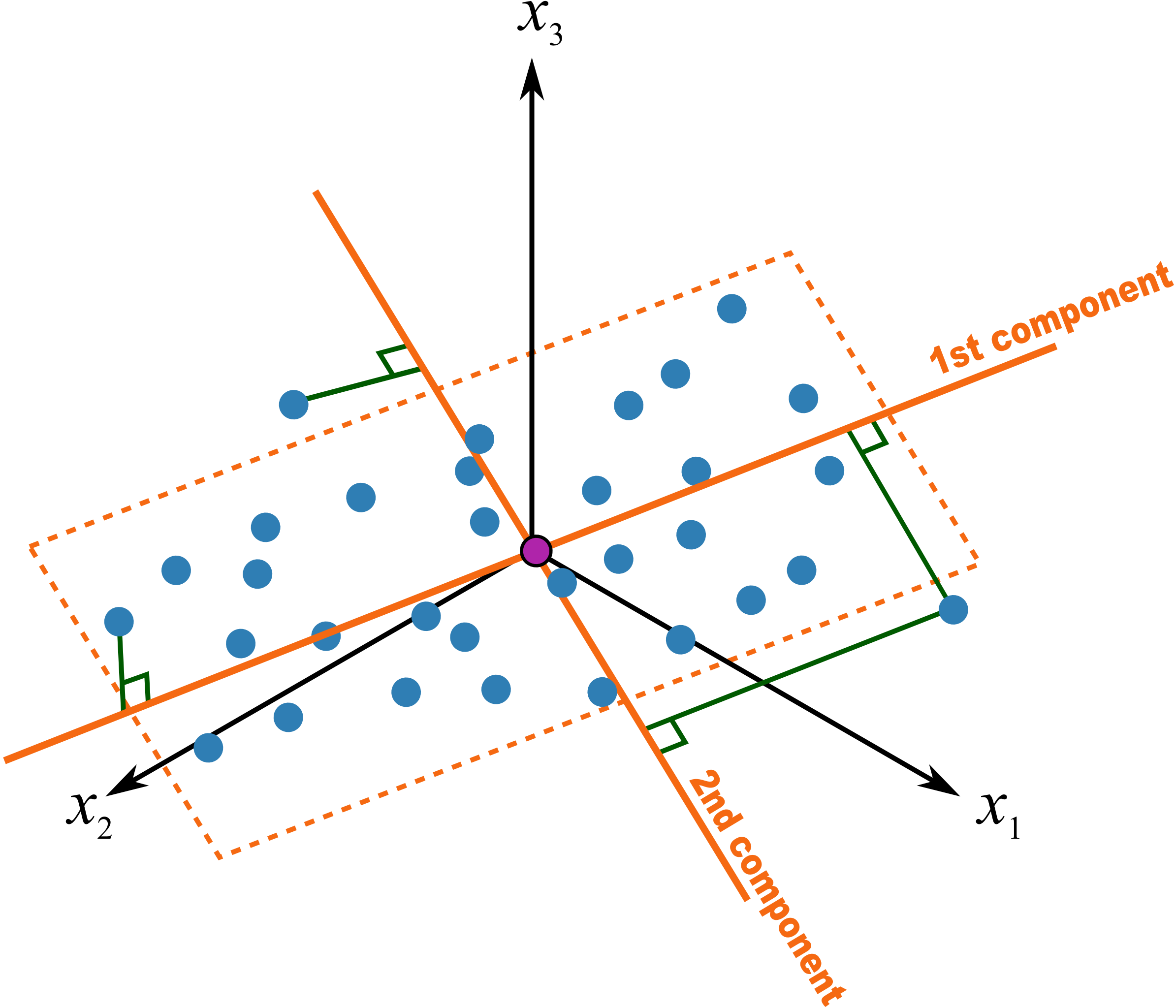
Recall that the loadings plot is a plot of the direction vectors that define the model. Returning back to a previous illustration:
In this system the first component, \(\mathbf{p}_1\), is oriented primarily in the \(x_2\) direction, with smaller amounts in the other directions. A loadings plot would show a large coefficient (negative or positive) for the \(x_2\) variable and smaller coefficients for the others. Imagine this were the only component in the model, i.e. it is a one-component model. We would then correctly conclude the other variables measured have little importance or relevance in understanding the total variability in the system. Say these 3 variables represented the quality of our product, and we had been getting complaints about the variability of it. This model indicates we should focus on whatever aspect causes in variance in \(x_2\), rather than other variables.
Let’s consider another visual example where two variables, \(x_1\) and \(x_2\), are the predominant directions in which the observations vary; the \(x_3\) variable is only “noise”. Further, let the relationship between \(x_1\) and \(x_2\) have a negative correlation.
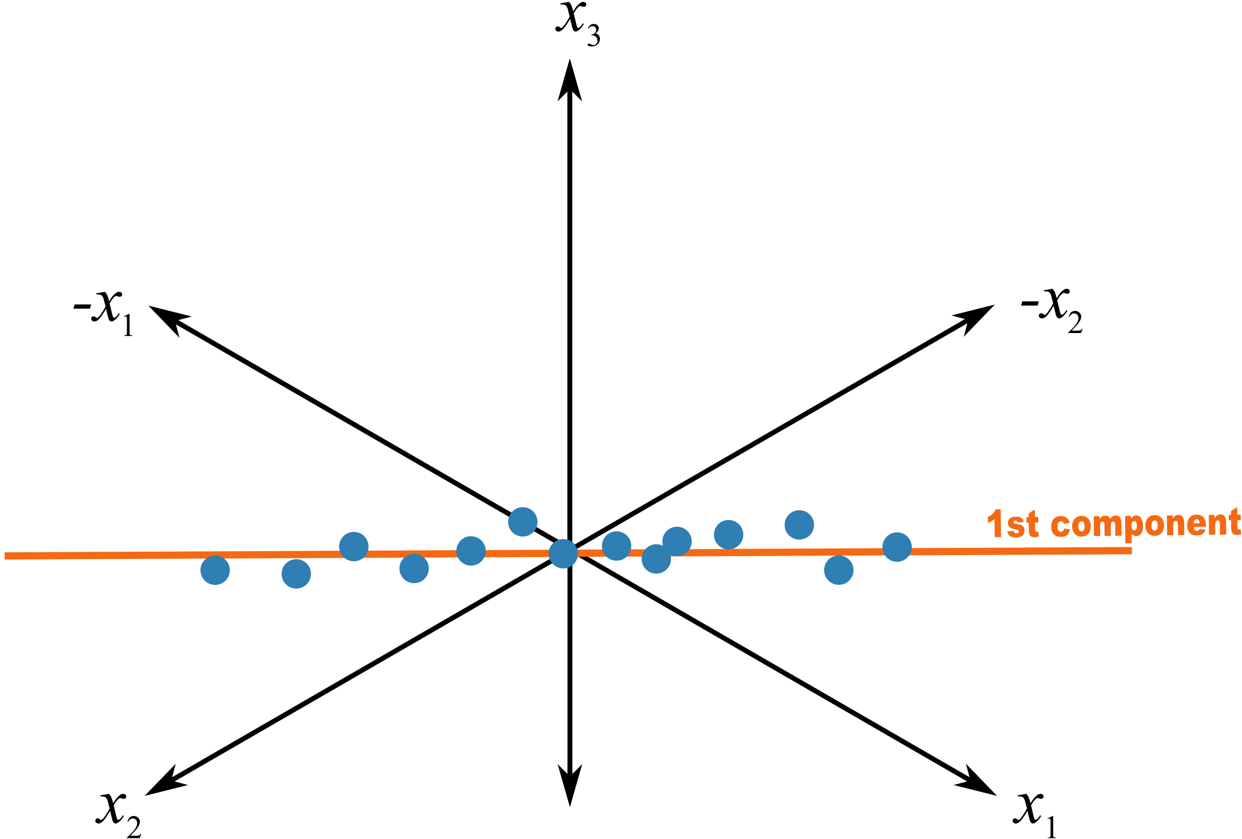
A model of such a system would have a loading vector with roughly equal weight in the \(+x_1\) direction as it has in the \(-x_2\) direction. The direction could be represented as \(p_1 = [+1,\, -1,\, 0]\), or rescaled as a unit vector: \(p_1 = [+0.707,\, -0.707,\, 0]\). An equivalent representation, with exactly the same interpretation, could be \(p_1 = [-0.707,\, +0.707,\, 0]\).
This illustrates two points:
Variables which have little contribution to a direction have almost zero weight in that loading.
Strongly correlated variables, will have approximately the same weight value when they are positively correlated. In a loadings plot of \(p_i\) vs \(p_j\) they will appear near each other, while negatively correlated variables will appear diagonally opposite each other.
Signs of the loading variables are useful to compare within a direction vector; but these vectors can be rotated by 180° and still have the same interpretation.
This is why they are called loadings: they show how the original variables load, (contribute), to creating the component.
Another issue to consider is the case when one has many highly correlated variables. Consider the room temperature example where the four temperatures are highly correlated with each other. The first component from the PCA model is shown here:
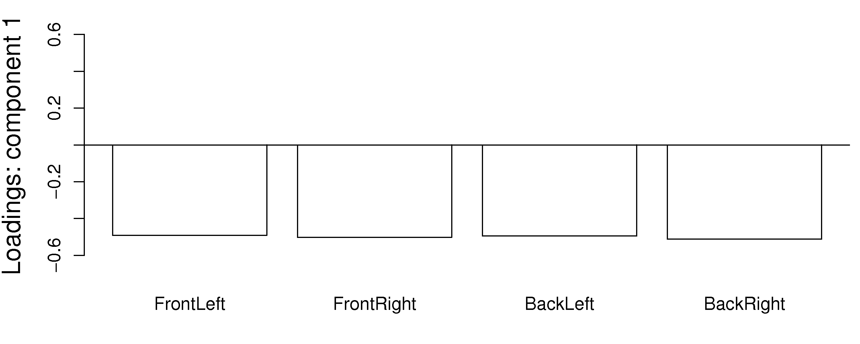
Notice how the model spreads the weights out evenly over all the correlated variables. Each variable is individually important. The model could well have assigned a weight of 1.0 to one of the variables and 0.0 to the others. This is a common feature in latent variable models: variables which have roughly equal influence on defining a direction are correlated with each other and will have roughly equal numeric weights.
Finally, one way to locate unimportant variables in the model is by finding which variables have small weights in all components. These variables can generally be removed, as they show no correlation to any of the components or with other variables.
6.5.8. Interpreting loadings and scores together
It is helpful to visualize any two score vectors, e.g. \(\mathbf{t}_1\) vs \(\mathbf{t}_2\), in a scatterplot: the \(N\) points in the scatterplot are the projection of the raw data onto the model plane described by the two loadings vectors, \(\mathbf{p}_1\) and \(\mathbf{p}_2\).
Any two loadings can also be shown in a scatterplot and interpreted by recalling that each loading direction is orthogonal and independent of the other direction.
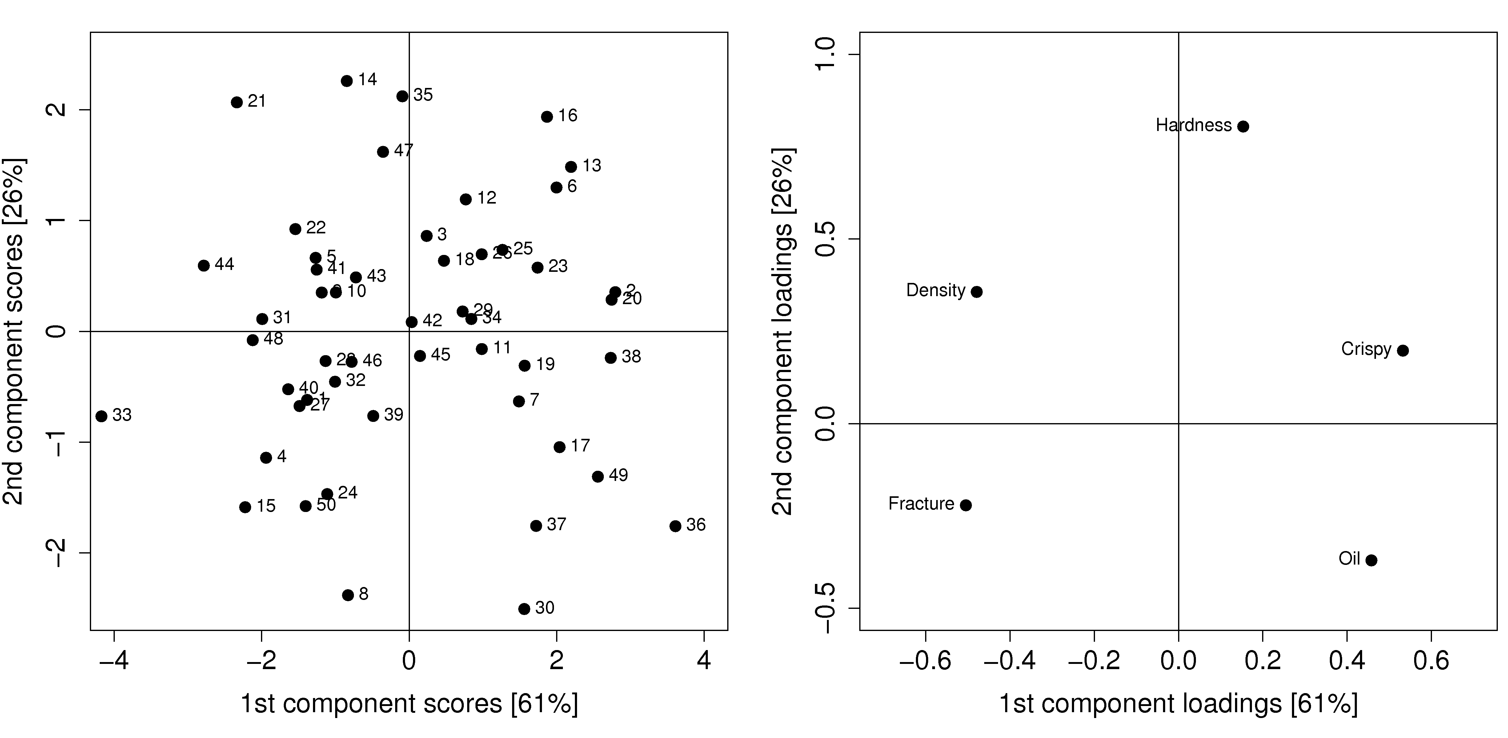
Side-by-side, these 2 plots very helpfully characterize all the observations in the data set. Recall observation 33 had a large, negative \(t_1\) value. It had an above average fracture angle, an above average density, a below average crispiness value of 7, and below average oil level of 15.5.
It is no coincidence that we can mentally superimpose these two plots and come to exactly the same conclusions, using only the plots. This result comes from the fact that the scores (left) are just a linear combination of the raw data, with weighting given by the loadings (right).
Use these two plots to characterize what values the 5 measurements would have been for these observations:
sample 8:
sample 20:
sample 35:
sample 42: