
 Download PDF of entire book
1.5. Box plots
Box plots are an efficient summary of one variable (univariate chart), but can also be used effectively to compare variables that are in the same units of measurement.
The box plot is built around the so-called five-number summary of a univariate data series:
Minimum sample value
25th percentile (1st quartile)
50th percentile (median)
75th percentile (3rd quartile)
Maximum sample value
The 25th percentile is the value below which 25% of the observations in the sample are found. The box spans from the 25th percentile (the box’s lower edge) to the 75th percentile (the box’s upper edge). The distance between those two edges, from the 1st to the 3rd quartile, is known as the interquartile range (IQR). The IQR is a measure of the data’s spread, playing a similar role to the standard deviation, but it is less influenced by extreme values. In the simplest form of the plot the whiskers span the entire data range, from minimum to maximum; most software packages instead draw the whiskers by the convention described at the end of this section.
The following data are thickness measurements of 2-by-6 boards (2-by-6 refers to the nominal thickness and width of the wooden board, in inches), taken at six locations around the edge. Here is a sample of the measurements and a summary of the first 100 boards (code in Python and R respectively):
Python, 17 lines
import pandas as pd

pd.options.plotting.backend = "plotly"

all_boards = pd.read_csv("http://openmv.net/file/six-point-board-thickness.csv")
boards = all_boards.iloc[0:100, 1:7]

# Look at the start and end of the data.
# Examine and summarize your data before
# doing anything else.
boards.head()
boards.tail()
boards.describe()

fig = boards.plot.box()
fig.update_layout(yaxis_title_text="Thickness [mils]")
fig.show()
R, 12 lines
all.boards = read.csv("http://openmv.net/file/six-point-board-thickness.csv")
boards = all.boards[1:100, 2:7]

# Look at the start and end of the data
# Examine and summarize your data before
# doing anything else
head(boards)
tail(boards)

summary(boards)

boxplot(boards)
The following box plot is a graphical summary of these numbers.
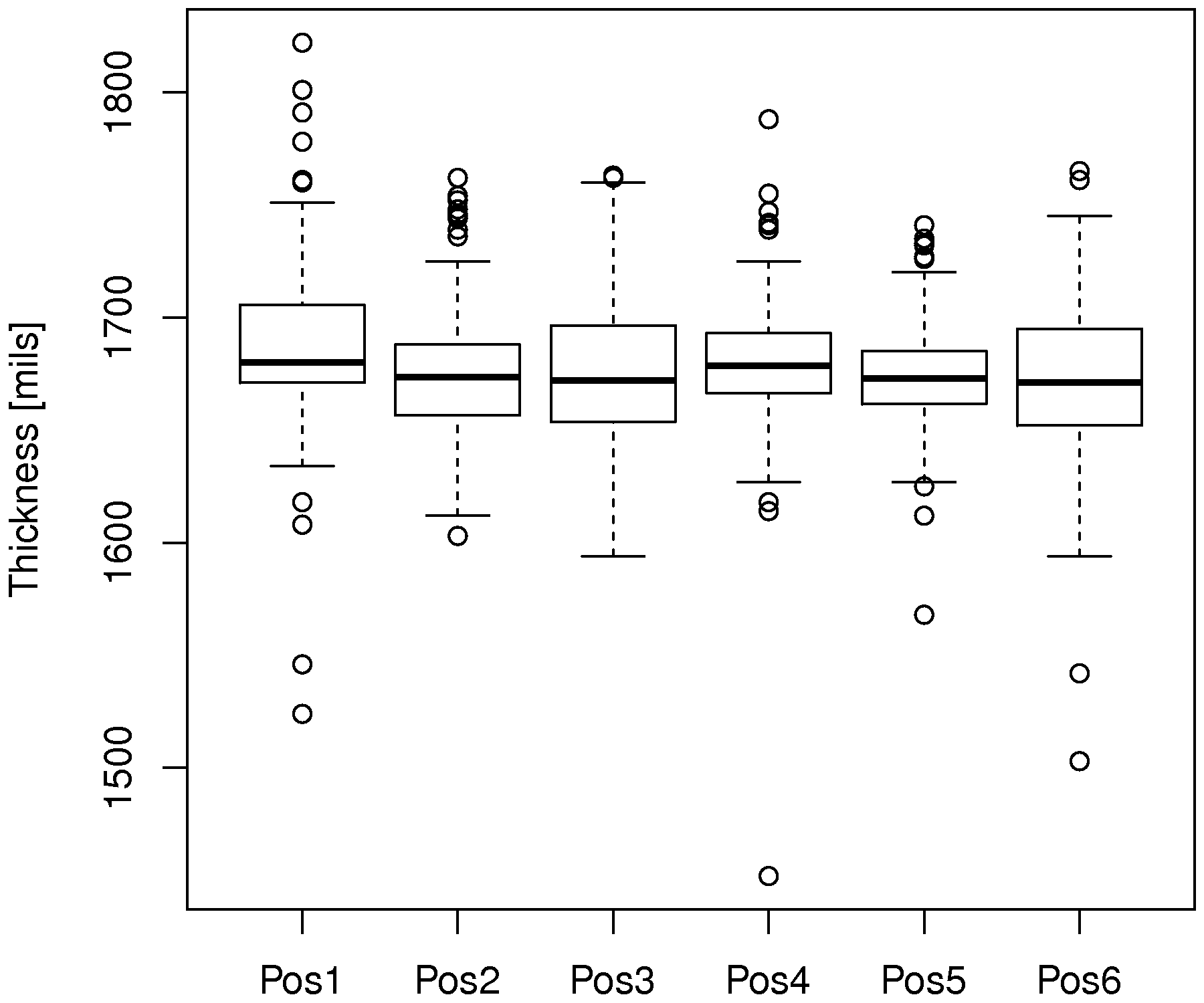
A box plot is great for comparisons. In this figure we see how the thickness at position 1 is greater than at the other positions. Position 1 also shows high variability: its whiskers span a wide range and several points lie beyond them. This indicates that something about the saw blade at that position is not what it should be. The median is also not centered between the two quartiles for this box plot, when compared to the others.
Some variations for the box plot are possible:
Show suspected outliers as individual dots. The most common rule, due to John Tukey, flags any point lying more than 1.5 IQR units beyond the edges of the box: below the box’s lower edge (the 25th percentile), or above the box’s upper edge (the 75th percentile). Points beyond these fences are worth investigating, but they are not necessarily errors: for normally distributed data about 0.7% of the observations fall outside the fences, so a few flagged points are expected in large samples.
When that rule is used, the whiskers are not drawn to the sample minimum and maximum. Each whisker extends to the most extreme data point that still lies within 1.5 IQR units of the box’s edge, and the flagged points are drawn individually beyond the whiskers. This is the default in most software packages.
Use the mean instead of the median [not too common].
Draw the whiskers at fixed percentiles instead, such as the 2nd and 98th percentiles, rather than at the most extreme points within the 1.5 IQR fences.
A more recent variation is the raincloud plot, which
combines three views of the same variable: a one-sided density curve (the “cloud”), the box plot,
and the jittered raw observations (the “rain”). Showing the raw points guards against the box
plot’s main weakness: distributions that differ in important ways can still produce the same
five-number summary. The accompanying process_improve library draws one raincloud per group with
a single function call, reusing the boards data frame loaded above. The library is installed
with pip install 'process-improve[all]', which includes the plotting extra (Plotly) needed for
the figures in this book:
Python, 6 lines
from process_improve.visualization import raincloud

stacked = boards.melt(var_name="Position", value_name="Thickness")
fig = raincloud(stacked, value="Thickness", group="Position")
fig.update_layout(xaxis_title_text="Thickness [mils]")
fig.show()

The rainclouds confirm what the box plot showed, and add to it: the rain under position 1 shows the raw observations bunched around 1680 mils with stray points on both sides, and no second cluster hiding inside the box.
Example
In a final exam for a particular course at McMaster University there was an open-ended question. These data values are the grades achieved for the answer to that question, broken down by whether the student used a systematic method, or not. No grades were given for using a systematic method; grades were awarded only for answering the question.
A systematic method is any method that assists the student with problem solving. For example, a strategy could be to: define the problem, identify knowns/unknowns and assumptions, explore alternatives, plan a strategy, implement the strategy and then check the solution.
Draw two box plots next to each other that compare the grades of students who did, or did not use a problem solving strategy. Comment on any features you notice in the comparison.
Answer
Several points are apparent in the box plot:
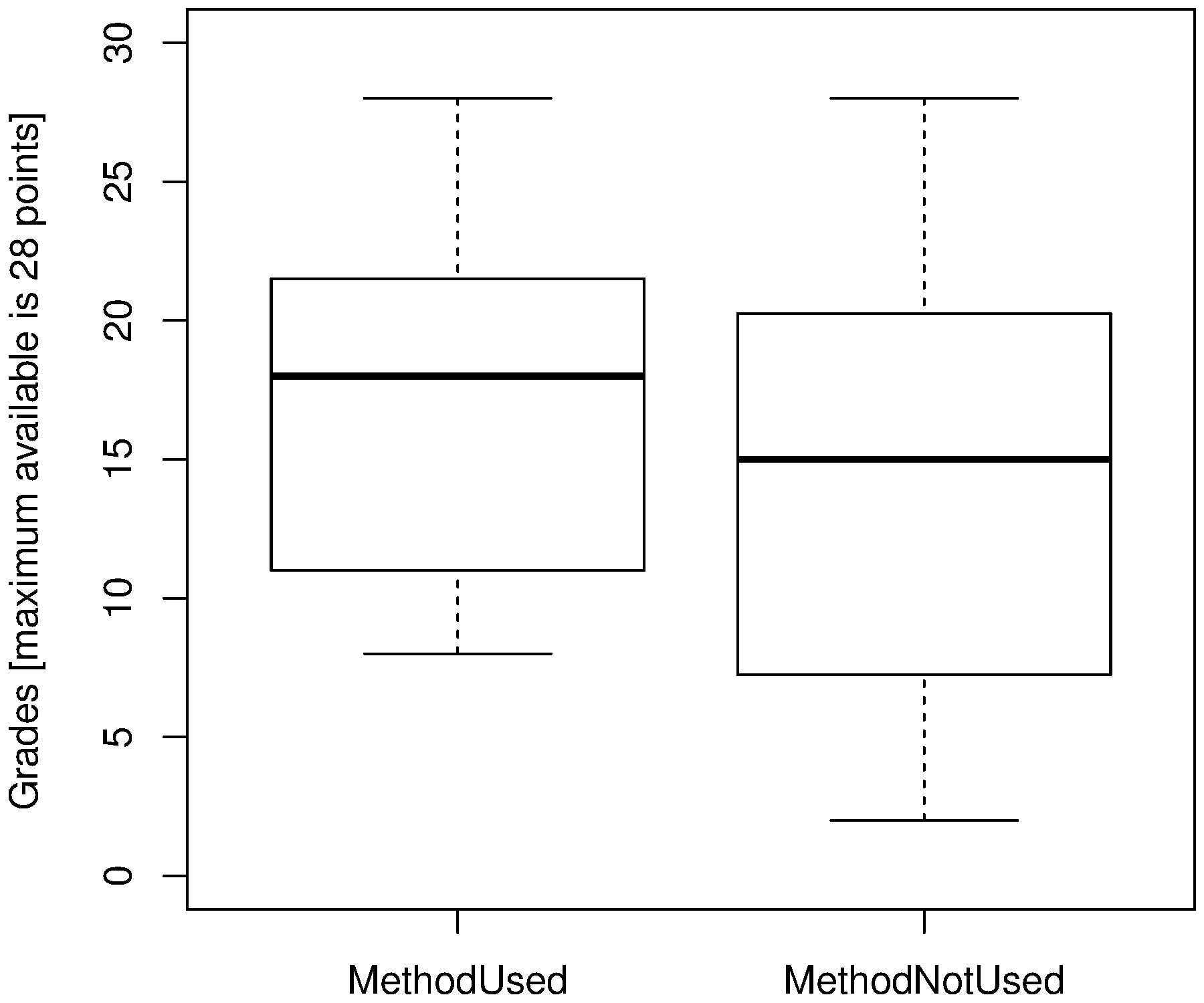
students in either category achieved the highest grade possible
the spread (interquartile distance) when using the problem solving method is smaller
both box plots show a skew towards the lower grades (compare the distance from the median to each of the first and third quartiles)
we will use a confidence interval in a later chapter to judge whether this difference is statistically significant or not.
More readings
You can read more about box plots in the paper by Hadley Wickham and Lisa Stryjewski. It summarizes variations of this plot, such as the violin plot, and two-dimensional versions of it. The box plot is a powerful summary plot, introduced by John Tukey around 1970.