
 Download PDF of entire book
4.13. Exercises
Question
Use the distillation column data set and choose any two variables, one for \(\mathrm{x}\) and one as \(\mathrm{y}\). Then fit the following models by least squares in any software package you prefer:
\(y_i = b_0 + b_1 x_i\)
\(y_i = b_0 + b_1 (x_i - \overline{x})\) (what does the \(b_0\) coefficient represent in this case?)
\((y_i - \overline{y}) = b_0 + b_1 (x_i - \overline{x})\)
Prove to yourself that centering the \(\mathrm{x}\) and \(\mathrm{y}\) variables gives the same model for the 3 cases in terms of the \(b_1\) slope coefficient, standard errors and other model outputs.
Solution
Once you have created an x and y variable in R, compare the output from these 3 models:
S, 10 lines
# Model 1
summary(lm(y ~ x))

# Model 2
x.mc <- x - mean(x)
summary(lm(y ~ x.mc))

# Model 3
y.mc <- y - mean(y)
summary(lm(y.mc ~ x.mc))
The same comparison in Python, using statsmodels, would be:
Python, 19 lines
import pandas as pd
import statsmodels.api as sm

distill = pd.read_csv(
    "https://openmv.net/file/distillation-tower.csv"
)
x = distill["TempC2"].values
y = distill["VapourPressure"].values

# Model 1: y ~ x
print(sm.OLS(y, sm.add_constant(x)).fit().summary())

# Model 2: y ~ (x - mean(x))
x_mc = x - x.mean()
print(sm.OLS(y, sm.add_constant(x_mc)).fit().summary())

# Model 3: (y - mean(y)) ~ (x - mean(x))
y_mc = y - y.mean()
print(sm.OLS(y_mc, sm.add_constant(x_mc)).fit().summary())
Question
For a \(x_{\text{new}}\) value and the linear model \(y = b_0 + b_1 x\) the prediction interval for \(\hat{y}_\text{new}\) is:
\[\hat{y}_i \pm c_t \sqrt{V\{\hat{y}_i\}}\]where \(c_t\) is the critical t-value, for example at the 95% confidence level.
Use the distillation column data set and with \(\mathrm{y}\) as VapourPressure (units are kPa) and \(\mathrm{x}\) as TempC2 (units of degrees Fahrenheit) fit a linear model. Calculate the prediction interval for vapour pressure at these 3 temperatures: 430, 480, 520 °F.
Solution
The prediction interval is dependent on the value of \(x_\text{new, i}\) used to make the prediction. For this model, \(S_E = 2.989\) kPa, \(n=253\), \(\sum_j{(x_j - \overline{x})^2} = 86999.6\), and \(\overline{x} = 480.82\).
Calculating this term manually, or using the predict(model, newdata=..., int="p") function in R gives the 95% prediction interval:
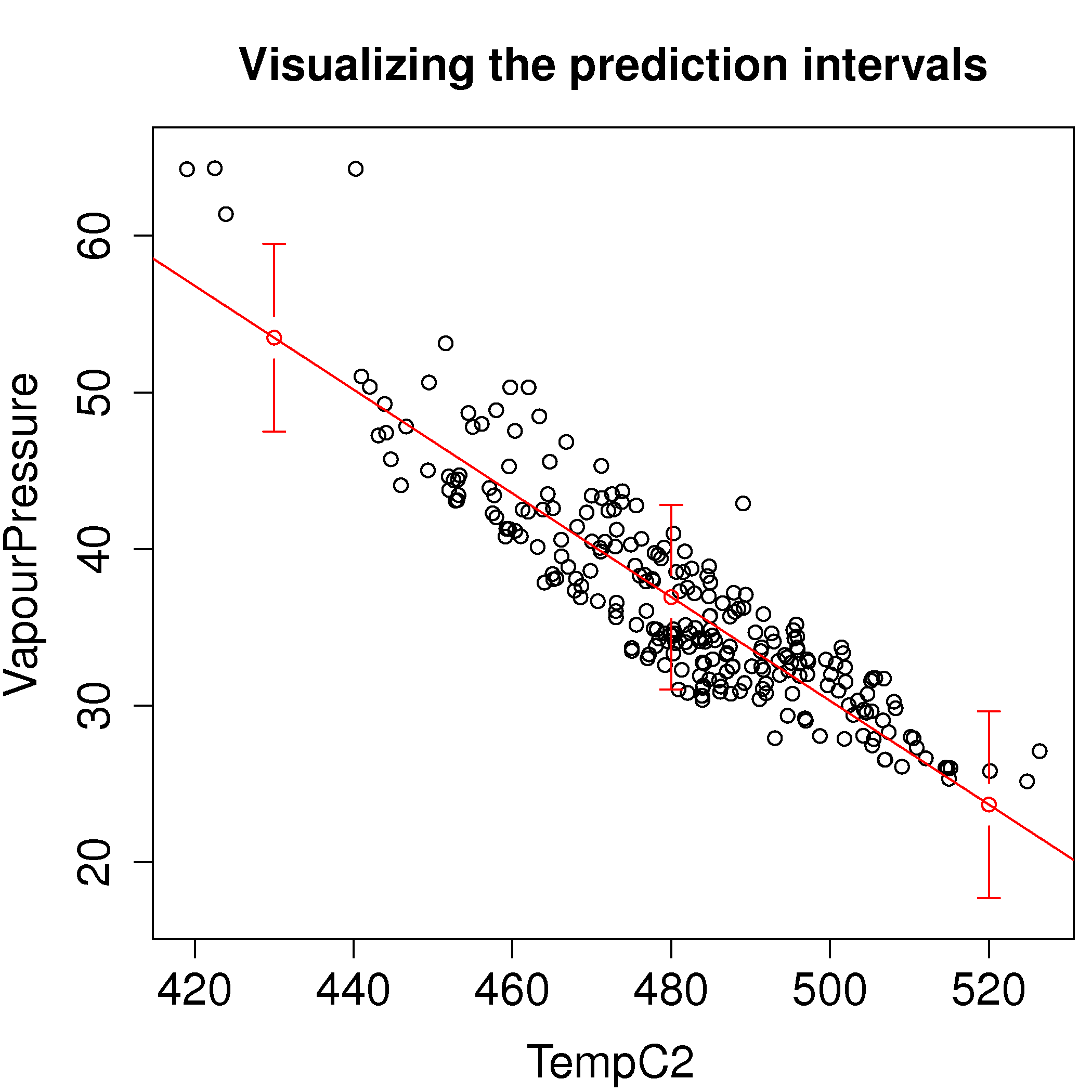
\(x_\text{new} = 430\) °F: \(\hat{y}_\text{new} = 53.49 \pm 5.99\), or [47.50, 59.47]
\(x_\text{new} = 480\) °F: \(\hat{y}_\text{new} = 36.92 \pm 5.90\), or [31.02, 42.82]
\(x_\text{new} = 520\) °F: \(\hat{y}_\text{new} = 23.67 \pm 5.95\), or [17.72, 29.62]
Python, 33 lines
# Prediction intervals at three new temperatures.
import numpy as np
import pandas as pd
from scipy import stats

pd.options.plotting.backend = "plotly"

tower = pd.read_csv("https://openmv.net/file/distillation-tower.csv")
x = tower["TempC2"].to_numpy(float)
y = tower["VapourPressure"].to_numpy(float)
n = len(x)

b1, b0 = np.polyfit(x, y, 1)
residuals = y - (b0 + b1 * x)
SE = np.sqrt((residuals ** 2).sum() / (n - 2))
Sxx = ((x - x.mean()) ** 2).sum()
critical = stats.t.ppf(0.975, df=n - 2)

new = np.array([430.0, 480.0, 520.0])
fit = b0 + b1 * new
# The extra 1 inside the square root is what makes this a prediction
# interval for a new observation, not a confidence interval for the line.
spread = SE * np.sqrt(1 + 1 / n + (new - x.mean()) ** 2 / Sxx)
for t, f, s in zip(new, fit, spread):
    print(f"T = {t:.0f}: {f:.2f}, 95% PI {f - critical * s:.2f} to {f + critical * s:.2f}")

fig = tower.plot.scatter(x="TempC2", y="VapourPressure")
fig.add_scatter(x=x, y=b0 + b1 * x, mode="lines", name="Least squares fit")
fig.add_scatter(x=new, y=fit, mode="markers", name="Prediction intervals",
                error_y={"type": "data", "array": critical * spread})
fig.update_layout(xaxis_title_text="Tray temperature [°F]",
                  yaxis_title_text="Vapour pressure [kPa]")
fig.show()
or the equivalent in R:
S, 29 lines
dist <- read.csv('http://openmv.net/file/distillation-tower.csv')
attach(dist)
model <- lm(VapourPressure ~ TempC2)
summary(model)

# From the above output
SE = sqrt(sum(resid(model)^2)/model$df.residual)
n = length(TempC2)
k = model$rank
x.new = data.frame(TempC2 = c(430, 480, 520))
x.bar = mean(TempC2)
x.variance = sum((TempC2-x.bar)^2)
var.y.hat = SE^2 * (1 + 1/n + (x.new-x.bar)^2/x.variance)
c.t = -qt(0.025, df=n-k)
y.hat = predict(model, newdata=x.new, int="p")
PI.LB = y.hat[,1] - c.t*sqrt(var.y.hat)
PI.UB = y.hat[,1] + c.t*sqrt(var.y.hat)

# Results from y.hat agree with PI.LB and PI.UB
y.hat
#        fit      lwr      upr
# 1 53.48817 47.50256 59.47379
# 2 36.92152 31.02247 42.82057
# 3 23.66819 17.71756 29.61883
y.hat[,3] - y.hat[,2]
plot(TempC2, VapourPressure, ylim = c(17, 65), main="Visualizing the prediction intervals")
abline(model, col="red")
library(gplots)
plotCI(x=c(430, 480, 520), y=y.hat[,1], li=y.hat[,2], ui=y.hat[,3], add=TRUE, col="red")
Question
Refit the distillation model from the previous question with a transformed temperature variable. Use \(1/T\) instead of the actual temperature.
Does the model fit improve?
Are the residuals more normally distributed with the untransformed or transformed temperature variable?
How do you interpret the slope coefficient for the transformed temperature variable?
Use the model to compute the predicted vapour pressure at a temperature of 480 °F, and also calculate the corresponding prediction interval at that new temperature.
Solution
Using the
model.inv <- lm(VapourPressure ~ I(1/TempC2))instruction, one obtains the model summary below. The model fit has improved slightly: the standard error is 2.88 kPa, reduced from 2.99 kPa.Output, 17 lines
Call:
lm(formula = VapourPressure ~ I(1/TempC2))

Residuals:
     Min       1Q   Median       3Q      Max
-5.35815 -2.27855 -0.08518  1.95057 13.38436

Coefficients:
             Estimate Std. Error t value Pr(>|t|)
(Intercept)  -120.760      4.604  -26.23   <2e-16 ***
I(1/TempC2) 75571.306   2208.631   34.22   <2e-16 ***
---
Signif. codes:  0 ‘***’ 0.001 ‘**’ 0.01 ‘*’ 0.05 ‘.’ 0.1 ‘ ’ 1

Residual standard error: 2.88 on 251 degrees of freedom
Multiple R-squared: 0.8235,     Adjusted R-squared: 0.8228
F-statistic:  1171 on 1 and 251 DF,  p-value: < 2.2e-16
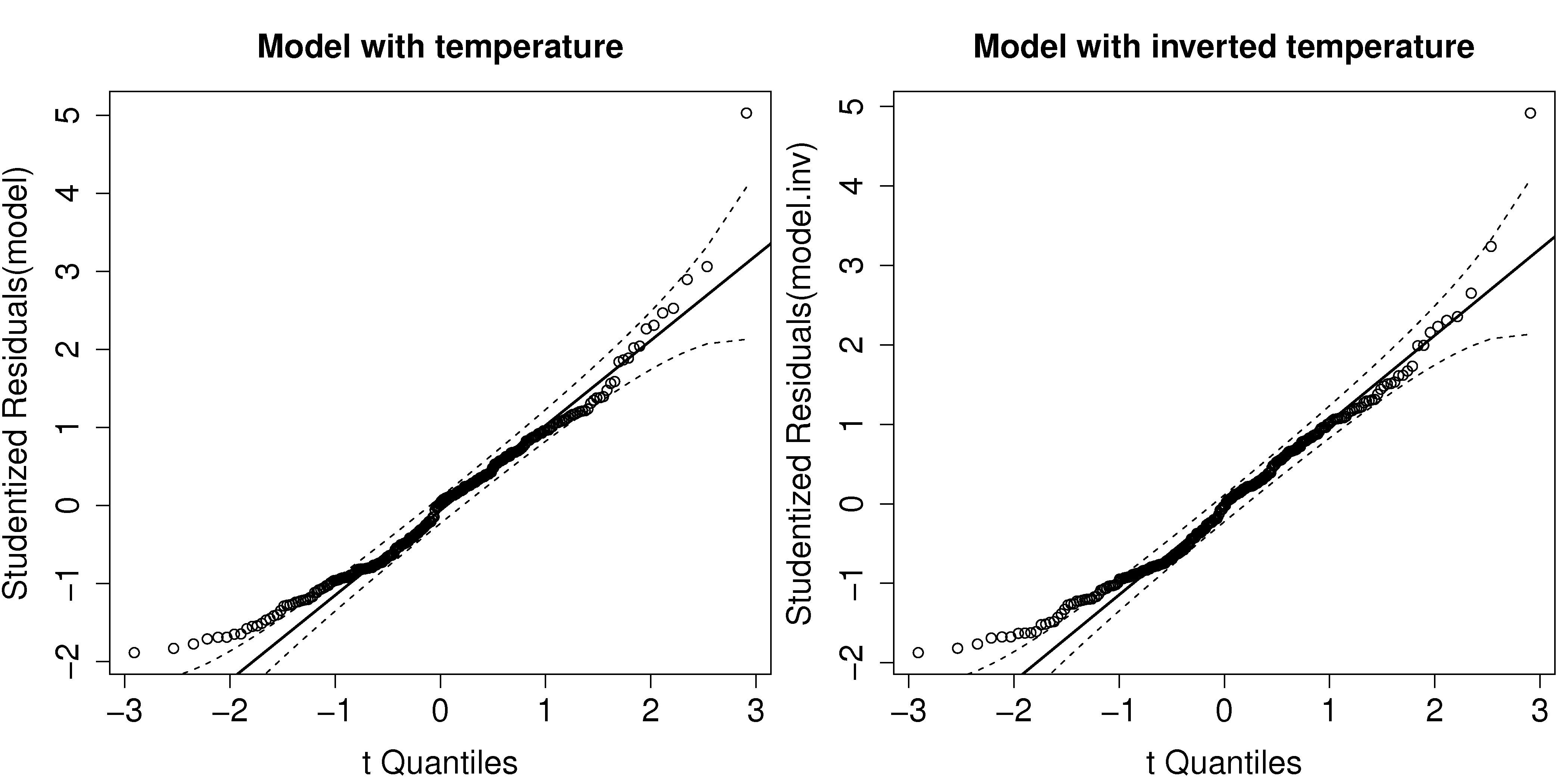
The residuals have roughly the same distribution as before, maybe a little more normal on the left tail, but hardly noticeable.
The slope coefficient of 75571 has units of
kPa.°F, indicating that each one unit decrease in temperature results in an increase in vapour pressure. Since division is not additive, the change in vapour pressure when decreasing 10 degrees from 430 °F is a different decrease to that when temperature is 530 °F. The interpretation of transformed variables in linear models is often a lot harder. The easiest interpretation is to show a plot of 1/T against vapour pressure.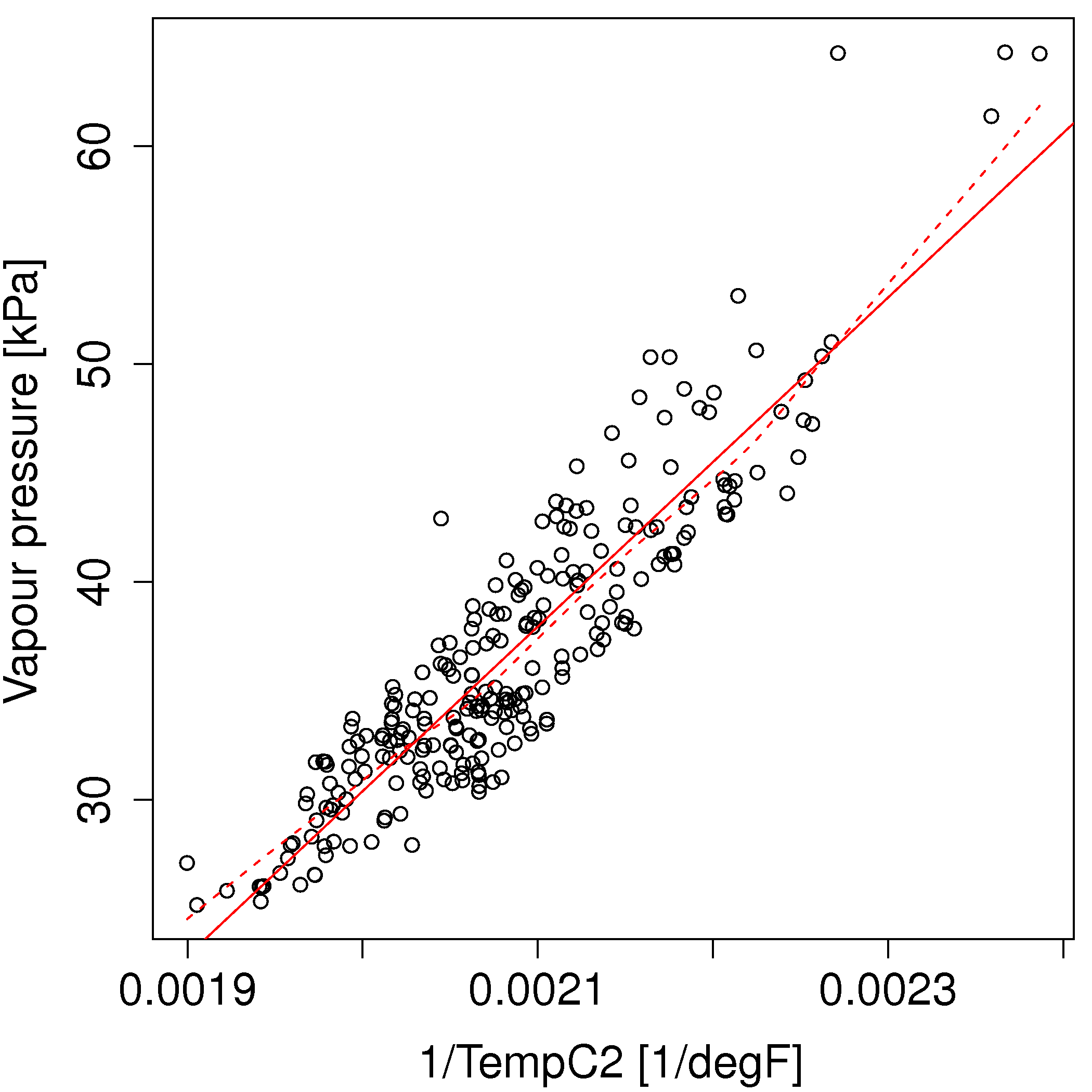
The predicted vapour pressure at 480 °F is 36.68 kPa \(\pm 5.68\), or within the range [31.0 to 42.4] with 95% confidence, very similar to the prediction interval from question 2.
S, 20 lines
# Model with inverted temperature
model.inv <- lm(VapourPressure ~ I(1/TempC2))
summary(model.inv)

plot(1/TempC2, VapourPressure, xlab="1/TempC2 [1/degF]", ylab="Vapour pressure [kPa]")
abline(model.inv, col="red")
lines(lowess(1/TempC2, VapourPressure), lty=2, col="red")

x.new = data.frame(TempC2 = c(430, 480, 520))
y.hat = predict(model.inv, newdata=x.new, int="p")
y.hat
#        fit      lwr      upr
# 1 54.98678 49.20604 60.76751
# 2 36.67978 30.99621 42.36334
# 3 24.56899 18.84305 30.29493

layout(matrix(c(1,2), 1, 2))
library(car)
qqPlot(model, main="Model with temperature", col=c(1, 1))
qqPlot(model.inv, main="Model with inverted temperature",col=c(1, 1))
Question
Again, for the distillation model, use the data from 2000 and 2001 to build the model (the first column in the data set contains the dates). Then use the remaining data to test the model. Use \(\mathrm{x}\) = TempC2 and \(\mathrm{y}\) = VapourPressure in your model.
Calculate the RMSEP for the testing data. How does it compare to the standard error from the model?
Now use the
influencePlot(...)function from thecarlibrary, to highlight the influential observations in the model building data (2000 and 2001). Show your plot with observation labels (observation numbers are OK). See part 5 of the R tutorial for some help.Explain how the points you selected are influential on the model?
Remove these influential points, and refit the model on the training data. How has the model’s slope and standard error changed?
Recalculate the RMSEP for the testing data; how has it changed?
Solution
The testing data starts at index 160. The code at the end of this question shows how RMSEP was calculated as 4.18 kPa, as compared to the standard error from the model building data (observations 1 to 159) of 2.679 kPa. This indicates the predictions on totally new data have greater error than those observations used to build the model - an expected result.
The influence plot from the model building data is given below.

The points considered as influential would be 38 and 84, which have both high leverage and high discrepancy. Points 53 and 101 would also be considered influential: they have high leverage, though moderately sized residuals. The other points marked in red have a large Cook’s D value, however, their leverage is low, so it is unlikely that their removal will change the plot and its interpretation by very much.
The points selected for removal are [38, 53, 84, 101]. The model was rebuilt and the slope coefficient changed from -0.368 to -0.358, while the standard error decreased from 2.679 to 2.455. So their removal has decreased the size of the confidence intervals (before: \(-0.395 \leq \beta_T \leq - 0.342\), and after: \(-0.385 \leq \beta_T \leq -0.332\)), however the slope coefficient is roughly comparable to that from before.
The RMSEP has reduced from 4.18kPa to 3.92 kPa, a smallish reduction, given the range of the \(\mathrm{y}\) variable.
S, 43 lines
dist <- read.csv('http://openmv.net/file/distillation-tower.csv')
attach(dist)
model <- lm(VapourPressure ~ TempC2)
n = length(TempC2)
# Training and testing
# ---------------------

# Poor choice
build = seq(1,n,2); test = seq(2,n,2)

# Better choice
build = seq(1,159)  # sample 159 is the last sample for 2001
test = seq(160,n)   # first sample for 2002

model.sub <- lm(model, subset=build)
summary(model.sub)
confint(model.sub)
SE = sqrt(sum(resid(model.sub)^2)/model.sub$df.residual)

x.new = data.frame(TempC2 = TempC2[test])
y.hat = predict(model.sub, newdata=x.new)
y.actual = VapourPressure[test]
errors <- (y.actual - y.hat)
RMSEP <- sqrt(mean(errors^2))
c(RMSEP, SE)

# Find influential observations and remove them
#-----------------------------------------------
library(car)
influencePlot(model.sub, identify="auto")

remove = -c(38, 53, 84, 101)
model.update <- lm(model, subset=build[remove])
summary(model.update)
confint(model.update)
SE = sqrt(sum(resid(model.update)^2)/model.update$df.residual)
influencePlot(model.update, identify="auto")

y.hat = predict(model.update, newdata=x.new)
y.actual = VapourPressure[test]
errors <- (y.actual - y.hat)
RMSEP <- sqrt(mean(errors^2))
c(RMSEP, SE)
Question
The Kappa number data set was used in an earlier question to construct a Shewhart chart. The “Mistakes to avoid” section (Process Monitoring), warns that the subgroups for a Shewhart chart must be independent to satisfy the assumptions used to derived the Shewhart limits. If the subgroups are not independent, then it will increase the type I (false alarm) rate.
This is no different to the independence required for least squares models. Use the autocorrelation tool to determine a subgroup size for the Kappa variable that will satisfy the Shewhart chart assumptions. Show your autocorrelation plot and interpret it as well.
Solution
The autocorrelation plot shows significant lags up to lag 3, or even 4. So subsampling the vector with every 4th or 5th element should yield independent samples. The autocorrelation with every 5th observation confirms this. You could also use every 6th, 7th, etc observation. Using every 30th observation though is not too useful, since it would lead to a long delay before the control chart showed any problems.

The ACF plot indicates that there is significant reappearance of correlation around lags 9 to 15. It wasn’t required for you to identify why for this assignment, but usually this would be related to a recycle stream that reenters a reactor, or due to an oscillation in a control loop.
You can also verify the autocorrelation by plotting scatterplots of the vector against itself. The first plot below shows what an ACF coefficient of 1.0 means, while the second plot shows what it means to use a lag offset of 1 position. The correlation value = \(\sqrt{R^2}\) is shown on each plot. Compare that value shown to the y-axis of the ACF plots.

Python, 29 lines
# How far apart must samples be before they stop being correlated?
import numpy as np
import pandas as pd
import plotly.graph_objects as go

kappa = pd.read_csv("https://openmv.net/file/kappa-number.csv")["Kappa"].to_numpy(float)
jumps = 5
subsampled = kappa[::jumps]


def acf(series, lags=50):
    centred = series - series.mean()
    denominator = (centred ** 2).sum()
    return np.array([1.0] + [(centred[:-k] * centred[k:]).sum() / denominator
                             for k in range(1, lags + 1)])


for label, series in (("raw", kappa), (f"every {jumps}th value", subsampled)):
    values = acf(series)
    print(f"{label}: lag-1 autocorrelation {values[1]:.3f}")
    fig = go.Figure()
    fig.add_bar(x=np.arange(len(values)), y=values)
    band = 1.96 / np.sqrt(len(series))
    for sign in (1, -1):
        fig.add_hline(y=sign * band, line_dash="dash")
    fig.update_layout(xaxis_title_text="Lag",
                      yaxis_title_text="Autocorrelation",
                      title_text=f"Autocorrelation: {label}")
    fig.show()
or the equivalent in R:
S, 29 lines
kappa <- read.csv('http://openmv.net/file/kappa-number.csv')
summary(kappa)
attach(kappa)
N = length(Kappa)

n.jumps = 5
sub = seq(1, N, n.jumps)
Kappa.sub <- Kappa[sub]

layout(matrix(seq(1, 2),2, 1))
acf(kappa, 50, main="Autocorrelation for the Kappa number variable", xlab="")
acf(Kappa.sub, 50, main="Autocorrelation of subsampled Kappa number vector")


layout(matrix(seq(1, n.jumps+1),1, n.jumps+1))
for (jump in 0:n.jumps){

    plot(Kappa[seq(1,N-jump)], Kappa[seq(jump+1, N)],
         xlab=paste("Kappa[seq(1, N-", substitute(jump, list(jump=jump)),")]", sep=""),
         ylab=paste("Kappa[seq(", substitute(jump, list(jump=jump)), "+1,N)]", sep=""),
         main=paste("Subsample every ", substitute(jump, list(jump=jump)), " element")
    )
    lines(lowess(Kappa[seq(1,N-jump)], Kappa[seq(jump+1, N)]), col="red")

    correl = cor(Kappa[seq(jump+1, N)], Kappa[seq(1, N-jump)])
    correl = round(correl, 2)
    text(10, 35,
         paste("Correlation = ", substitute(correl, list(correl=correl)), "", sep=""),
         pos=4, cex=1.3)
Question
You presume the yield from your lab-scale bioreactor, \(y\), is a function of reactor temperature, batch duration, impeller speed and reactor type (one with with baffles and one without). You have collected these data from various experiments.
Temp = \(T\) [°C] |
Duration = \(d\) [minutes] |
Speed = \(s\) [RPM] |
Baffles = \(b\) [Yes/No] |
Yield = \(y\) [%] |
|---|---|---|---|---|
82 |
260 |
4300 |
No |
51 |
90 |
260 |
3700 |
Yes |
30 |
88 |
260 |
4200 |
Yes |
40 |
86 |
260 |
3300 |
Yes |
28 |
80 |
260 |
4300 |
No |
49 |
78 |
260 |
4300 |
Yes |
49 |
82 |
260 |
3900 |
Yes |
44 |
83 |
260 |
4300 |
No |
59 |
64 |
260 |
4300 |
No |
60 |
73 |
260 |
4400 |
No |
59 |
60 |
260 |
4400 |
No |
57 |
60 |
260 |
4400 |
No |
62 |
101 |
260 |
4400 |
No |
42 |
92 |
260 |
4900 |
Yes |
38 |
Use software to fit a linear model that predicts the yield from these variables (the data set is available from the website). See the R tutorial for building linear models with integer variables in R.
Interpret the meaning of each effect in the model. If you are using R, then the
confint(...)function will be helpful as well. Show plots of each \(\mathrm{x}\) variable in the model against yield. Use a box plot for the baffles indicator variable.Now calculate the \(\mathbf{X}^T\mathbf{X}\) and \(\mathbf{X}^T\mathbf{y}\) matrices; include a column in the \(\mathbf{X}\) matrix for the intercept. Since you haven’t mean centered the data to create these matrices, it would be misleading to try interpret them.
Calculate the least squares model estimates from these two matrices. See the R tutorial for doing matrix operations in R, but you might prefer to use MATLAB for this step. Either way, you should get the same answer here as in the first part of this question.
Solution
After importing the data, just make sure the
bafflesvariable is imported as a factor. Then build the model as usual. The computer output below shows the linear model’s coefficients.S, 28 lines
bio <- read.csv('http://openmv.net/file/bioreactor-yields.csv')
attach(bio)
summary(bio)
is.factor(baffles)
# [1] TRUE

model <- lm(yield ~ speed + baffles + temperature )
summary(model)

# Call:
# lm(formula = yield ~ speed + baffles + temperature)
#
# Residuals:
#     Min      1Q  Median      3Q     Max
# -5.5521 -3.2543 -0.4356  2.2953  8.1519
#
# Coefficients:
#              Estimate Std. Error t value Pr(>|t|)
# (Intercept) 52.483652  18.421511   2.849  0.01728 *
# speed        0.008711   0.003757   2.319  0.04288 *
# bafflesYes  -9.090700   3.048811  -2.982  0.01377 *
# temperature -0.470997   0.119242  -3.950  0.00273 **
# ---
# Signif. codes:  0 ‘***’ 0.001 ‘**’ 0.01 ‘*’ 0.05 ‘.’ 0.1 ‘ ’ 1
#
# Residual standard error: 4.651 on 10 degrees of freedom
# Multiple R-squared: 0.8659,   Adjusted R-squared: 0.8256
# F-statistic: 21.52 on 3 and 10 DF,  p-value: 0.0001108
The confidence intervals for each variable is significant at the 95% level. The duration variable must be omitted from the model, because it has no variation. While it might affect the yield, there is no variability in this data set to assess that.
\(0.00034 \leq b_\text{speed} \leq 0.017\): a 100 rpm increase in impeller speed serves to increase yield by 0.87 percentage points on average, keeping all other variables constant
\(-15.9 \leq b_\text{baffles} \leq -2.30\): the use of baffles decreases yield, on average, by 9.1 percentage points, keeping all other variables constant
\(-0.74 \leq b_\text{temp} \leq -0.21\): each one degree increase in temperature lowers yield by 0.47 percentage points on average, keeping all other variables constant
We cannot say anything about the effect of batch duration
The plots are not shown here, they can be drawn with
plot(bio)to obtain a scatterplot matrix of plots.For the model \(y = b_0 + b_\text{speed}x_\text{speed} + b_\text{baffles}x_\text{baffles} + b_\text{temp}x_\text{temp}\) let the coefficient vector be \(\mathrm{b} = [b_0, b_\text{speed}, b_\text{baffles}, b_\text{temp}]\), then we can write down the following X matrix to estimate it:
\[\begin{split}\mathrm{X} = \begin{bmatrix} 1 & 4300 & 0 & 82 \\ 1 & 3700 & 1 & 90 \\ 1 & 4200 & 1 & 88 \\ 1 & 3300 & 1 & 86 \\ 1 & 4300 & 0 & 80 \\ 1 & 4300 & 1 & 78 \\ 1 & 3900 & 1 & 82 \\ 1 & 4300 & 0 & 83 \\ 1 & 4300 & 0 & 64 \\ 1 & 4400 & 0 & 73 \\ 1 & 4400 & 0 & 60 \\ 1 & 4400 & 0 & 60 \\ 1 & 4400 & 0 & 101 \\ 1 & 4900 & 1 & 92 \end{bmatrix}\end{split}\]You can obtain the above \(\mathrm{X}\) matrix in R using the
model.matrix(model)function. The \(\mathrm{X}^T\mathrm{X}\) and \(\mathrm{X}^T\mathrm{y}\) matrices are:\[\begin{split}\mathrm{X}^T\mathrm{X} = \begin{bmatrix} 14 & 59100 & 6 & 1119 \\ 59100 & 251330000 & 24300 & 4714700 \\ 6 & 24300 & 6 & 516 \\ 1119 & 4714700 & 516 & 91351 \end{bmatrix} \qquad \text{and} \qquad \mathrm{X}^T\mathrm{y} = \begin{bmatrix} 668 \\ 2849600 \\ 229 \\ 52082 \end{bmatrix}\end{split}\]Using these matrices to solve for \(\mathrm{b}\)
\[\begin{split}\mathrm{b} = \left(\mathrm{X}^T\mathrm{X} \right)^{-1}\mathrm{X}^T\mathrm{y} = \begin{bmatrix} 52.48 \\ 0.00871 \\ -9.09 \\ -0.471 \end{bmatrix}\end{split}\]This result matches the results from R. Note however that R, like most decent software packages, will not solve for the inverse of \(\left(\mathrm{X}^T\mathrm{X} \right)^{-1}\) directly to compute \(\mathrm{b}\); instead it uses the QR decomposition.
S, 21 lines
# Calculate confidence intervals
confint(model)
#                     2.5 %      97.5 %
# (Intercept)  1.143797e+01 93.52933596
# speed        3.396812e-04  0.01708227
# bafflesYes  -1.588388e+01 -2.29752465
# temperature -7.366849e-01 -0.20530879

# Show a scatterplot matrix
plot(bio)

# Computing the model's coefficients using inv(X' * X) * X' * y
X <- model.matrix(model)
XtX <- t(X) %*% X
Xty <- t(X) %*% yield
b = solve(XtX) %*% Xty
#                     [,1]
# (Intercept) 52.483652163
# speed        0.008710973
# bafflesYes  -9.090699955
# temperature -0.470996834
Question
In the section on comparing differences between two groups we used, without proof, the fact that:
Prove this statement, and clearly explain all steps in your proof.
Solution
I don’t normally concentrate on proofs in the book, unless they show something interesting, or are used over and over. This short mathematical statement fits both criteria.
The important point with this proof is that \(\overline{x}_A\) and \(\overline{x}_B\) are the variables, not \(x\). These variables come from a normal distribution (Central limit theorem), as long as we assume independent sampling: \(\overline{x}_A \sim \mathcal{N} \left(\mu; \sigma^2/n_A\right)\), and similarly for \(\overline{x}_B\).
The second line is a result shown earlier. The third line requires that we assume the between-group means \(\overline{x}_B\) and \(\overline{x}_A\) are independent, and so they are uncorrelated (their covariance is zero). This was one of the key assumptions when we studied between-group differences; and is one assumption that is often true in many real cases.
Question
The production of low density polyethylene is carried out in long, thin pipes at high temperature and pressure (1.5 kilometres long, 50mm in diameter, 500 K, 2500 atmospheres). One quality measurement of the LDPE is its melt index. Laboratory measurements of the melt index can take between 2 to 4 hours. Being able to predict this melt index, in real time, allows for faster adjustment to process upsets, reducing the product’s variability. There are many variables that are predictive of the melt index, but in this example we only use a temperature measurement that is measured along the reactor’s length.
These are the data of temperature (K) and melt index (units of melt index are “grams per 10 minutes”).
Temperature = \(T\) [Kelvin] |
441 |
453 |
461 |
470 |
478 |
481 |
483 |
485 |
499 |
500 |
506 |
516 |
Melt index = \(m\) [g per 10 mins] |
9.3 |
6.6 |
6.6 |
7.0 |
6.1 |
3.5 |
2.2 |
3.6 |
2.9 |
3.6 |
4.2 |
3.5 |
The following calculations have already been performed:
Number of samples, \(n = 12\)
Average temperature = \(\overline{T} = 481\) K
Average melt index, \(\overline{m} = 4.925\) g per 10 minutes.
The summed product, \(\sum_i{\left(T_i-\overline{T}\right)\left(m_i - \overline{m}\right)} = -422.1\)
The sum of squares, \(\sum_i{\left(T_i-\overline{T}\right)^2} = 5469.0\)
Use this information to build a predictive linear model for melt index from the reactor temperature.
What is the model’s standard error and how do you interpret it in the context of this model? You might find the following software software output helpful, but it is not required to answer the question.
Output, 15 lines
Call:
lm(formula = Melt.Index ~ Temperature)

Residuals:
    Min      1Q  Median      3Q     Max
-2.5771 -0.7372  0.1300  1.2035  1.2811

Coefficients:
            Estimate Std. Error t value Pr(>|t|)
(Intercept) --------    8.60936   4.885 0.000637
Temperature --------    0.01788  -4.317 0.001519

Residual standard error: 1.322 on 10 degrees of freedom
Multiple R-squared: 0.6508,     Adjusted R-squared: 0.6159
F-statistic: 18.64 on 1 and 10 DF,  p-value: 0.001519
Quote a confidence interval for the slope coefficient in the model and describe what it means. Again, you may use the above software output to help answer your question.
Solution
The simplest linear predictive model possible is \(m = \beta_0 + \beta_1 T + \varepsilon\), predicting the melt index from temperature. Once we find estimates for these coefficients we write: \(m = b_0 + b_1 T + e\). And one way to calculate these coefficients is by least squares. In the class notes we showed that for a variable \(x\) used to predict a variable \(y\) that:
Using the pre-calculated values, and that in our case \(T = x\), and that \(m = y\)
A predictive model of melt flow is: \(\hat{m} = 42.0 - 0.0772 \times T\)
The standard error, \(S_E\) can be read directly from the software output as 1.322 g per 10 minutes. If you like, you could also have calculated it by hand, using the above predictive model, calculating residuals (\(e_i = m_i - \hat{m}_i\)), from which the standard error is \(\sqrt{\dfrac{\sum_i^n{e_i^2}}{n-k}}\), where \(n=12\) and \(k=2\) (there are 2 parameters in the model). However I recommend you always use the software output and avoid these tedious hand calculations.
The interpretation of the standard error for this model is that the approximate prediction error of melt index has a standard deviation of 1.322 grams per 10 minutes (if the residuals are normally distributed).
The slope coefficient estimate, \(b_1\) has standard error of 0.01788 (from the software output), or it could be calculated as \(S_E^2(b_1) = \dfrac{S_E^2}{\sum_j{\left( T_j - \overline{T} \right)^2}} = \dfrac{1.322^2}{5469.0} = 0.01788^2 = 3.19 \times 10^{-4}\).
From this we can construct the confidence interval for the actual slope coefficient, \(\beta_1\). I have used the 95% confidence level, but you could use any level you prefer. The degrees of freedom to use for the \(t\)-distribution are \(n-k = 12 -2 = 10\).
You may also have chosen to answer at the 99% confidence level:
This shows, at which ever confidence level (95% or 99%), the range within which we can expect to find the true slope coefficient. This slope represents the magnitude by which the melt index changes, on average, for a one degree change in temperature. If we plan to manipulate the melt index using temperature, then this range will help us estimate an upper and lower bound for the effort required to adjust the melt index.
Question
For a distillation column, it is well known that the column temperature directly influences the purity of the product, and this is used in fact for feedback control, to achieve the desired product purity. Use the distillation data set , and build a least squares model that predicts VapourPressure from the temperature measurement, TempC2. Report the following values:
the slope coefficient, and describe what it means in terms of your objective to control the process with a feedback loop
the interquartile range and median of the model’s residuals
the model’s standard error
a confidence interval for the slope coefficient, and its interpretation.
You may use any computer package to build the model and read these values off the computer output.
Solution
The solution to this question can be almost entirely solved using R, though any other language could be used. These commands, with the output that follows, were used:
Output, 21 lines
> distillation <- read.csv('https://openmv.net/file/distillation-tower.csv')
> model <- lm(distillation$VapourPressure ~ distillation$TempC2)
> summary(model)

Call:
lm(formula = distillation$VapourPressure ~ distillation$TempC2)

Residuals:
     Min       1Q   Median       3Q      Max
-5.59621 -2.37597  0.06674  2.00212 14.18660

Coefficients:
                     Estimate Std. Error t value Pr(>|t|)
(Intercept)         195.96141    4.87669   40.18   <2e-16 ***
distillation$TempC2  -0.33133    0.01013  -32.69   <2e-16 ***
---
Signif. codes:  0 '***' 0.001 '**' 0.01 '*' 0.05 '.' 0.1 ' ' 1

Residual standard error: 2.989 on 251 degrees of freedom
Multiple R-squared: 0.8098,     Adjusted R-squared: 0.8091
F-statistic:  1069 on 1 and 251 DF,  p-value: < 2.2e-16
This predictive model allows us to achieve better control of the vapour pressure, because we can predict it from temperature (measured in real-time), rather than wait several hours for the laboratory vapour pressure value. The slope coefficient is -0.331, and since no units were given, I can’t expect any in your solution; however one should report the units, which is this case would be units of pressure divided by units temperature (e.g. psi/K). What this means, in terms of feedback control of the vapour pressure is that we must decrease the temperature to raise the vapour pressure. This is important when tuning the feedback control loop in 2 ways: (a) firstly, the sign of the gain in the feedback controller (i.e. negative gain) must be the same as the process gain to achieve a stable feedback loop, (b) the magnitude of the slope provides an estimate of how sensitive the vapour pressure is to temperature. For example: do we have to add a large amount of energy into the distillation column to achieve a smallish reduction in vapour pressure? The answer depends heavily on the units, which I omitted to provide.
These are reported in the above software output: (a) the residual IQR is 2.00 - (-2.38) = 4.38 units of vapour pressure, while (b) the median residual is close to zero, as expected.
The model’s standard error is 2.989 in the output, or around 3.00 units of vapour pressure.
The slope coefficient’s confidence interval can be calculated from its \(z\)-value = \(\dfrac{b_1 - \beta_1}{S_E(b_1)}\); but we require the standard error of the slope coefficient, which is \(S_E(b_1) = 0.01013\) from the software output. The value for \(c_t = 1.969\) from the \(t\)-distribution at the 95% confidence level, with \(n-k = 253 - 2 = 251\) degrees of freedom (a normal distribution would work equally well in this case).
\[\begin{split}\begin{array}{rcccl} - c_t &\leq& \dfrac{b_1 - \beta_1}{S_E(b_1)} &\leq & +c_t\\ -0.33133 - 1.969 \times 0.01013 &\leq& \beta_1 &\leq& -0.33133 + 1.969 \times 0.01013 \\ -0.35 &\leq& \beta_1 &\leq& -0.31 \end{array}\end{split}\]This shows, at the 95% confidence level, the range within which we can expect to find the true slope coefficient. This range is remarkably narrow; i.e. our feedback controller gain is unlikely to change on either extreme. So we can likely design our control loop at the center point, and be sure it will work over the entire range of expected operation. Please also cross reference the solutions to question 2.4 in the written midterm to correctly understand what a confidence interval is.
If you used 99% confidence levels, the answer should be: \(-0.358 \leq \beta_1 \leq -0.305\).
We have illustrated the actual slope (thick, solid line) at the upper and lower bounds of the slope coefficient (thin, dashed lines) in the accompanying figure. Not required for this question, but added nevertheless, are the prediction intervals for \(\hat{y}_i\).

I recommended that you reproduce R’s output yourself. The code below calculates these same values.
Python, 44 lines
# Least squares by hand, and with a library, on the distillation data.
import numpy as np
import pandas as pd
from scipy import stats

pd.options.plotting.backend = "plotly"

tower = pd.read_csv("https://openmv.net/file/distillation-tower.csv")
x = tower["TempC2"].to_numpy(float)
y = tower["VapourPressure"].to_numpy(float)
n = len(x)

# Model coefficients, straight from the definitions.
x_bar, y_bar = x.mean(), y.mean()
numerator = ((x - x_bar) * (y - y_bar)).sum()
denominator = ((x - x_bar) ** 2).sum()
b1 = numerator / denominator
b0 = y_bar - b1 * x_bar
print(f"VapourPressure = {b0:.1f} {b1:+.4f} TempC2")

predictions = b0 + b1 * x
residuals = y - predictions

# The three standard errors.
SE = np.sqrt((residuals ** 2).sum() / (n - 2))
SE_b1 = np.sqrt(SE ** 2 / denominator)
SE_b0 = np.sqrt(SE ** 2 * (1 / n + x_bar ** 2 / denominator))
print(f"S_E = {SE:.3f}, SE(b0) = {SE_b0:.2f}, SE(b1) = {SE_b1:.5f}")

# 99% confidence intervals for the two coefficients.
critical = stats.t.ppf(0.995, df=n - 2)
print(f"b0 in {b0 - critical * SE_b0:.1f} to {b0 + critical * SE_b0:.1f}")
print(f"b1 in {b1 - critical * SE_b1:.4f} to {b1 + critical * SE_b1:.4f}")

# R2 and the sums of squares.
TSS = ((y - y_bar) ** 2).sum()
RSS = (residuals ** 2).sum()
print(f"TSS = {TSS:.0f}, RSS = {RSS:.0f}, R2 = {1 - RSS / TSS:.3f}")

fig = tower.plot.scatter(x="TempC2", y="VapourPressure")
fig.add_scatter(x=x, y=predictions, mode="lines", name="Least squares fit")
fig.update_layout(xaxis_title_text="Tray temperature [°F]",
                  yaxis_title_text="Vapour pressure [kPa]")
fig.show()
or the equivalent in R:
S, 80 lines
# Calcuations with R

distillation <- read.csv('http://openmv.net/file/distillation-tower.csv')
model <- lm(distillation$VapourPressure ~ distillation$TempC2)
summary(model)

# Calculations by hand
# -----------------------

# Confidence level
alpha = 0.99

# Raw data
x <- distillation$TempC2
y <- distillation$VapourPressure
n = length(x)

# Some intermediate values
x.bar = mean(x)
y.bar = mean(y)
num <- sum((x - x.bar) * (y - y.bar))
den <- sum((x - x.bar) * (x - x.bar))

# Model coefficients
b1 <- num/den
b0 <- y.bar - b1 * x.bar
c(b0, b1)

# Model predictions and residuals, with their summary (IQR and median)
predictions <- b0 + x*b1
residuals <- y - predictions
summary(residuals)

# Calculate the 3 standard errors
SE <- sqrt(sum(residuals^2) / (n-2))
SE.b1 <- sqrt(SE^2 / den)
SE.b0 <- sqrt(SE^2 *(1/n + (x.bar^2)/den))
c(SE, SE.b0, SE.b1)

# Confidence intervals for the least squares parameters
z.b0 = b0/SE.b0
z.b1 = b1/SE.b1
c(z.b0, z.b1)
t.critical = qt(1-(1-alpha)/2, df=(n-2))
t.critical
b0.LB <- b0 - t.critical*SE.b0
b0.UB <- b0 + t.critical*SE.b0
b1.LB <- b1 - t.critical*SE.b1
b1.UB <- b1 + t.critical*SE.b1
c(b0.LB, b0.UB)
c(b1.LB, b1.UB)

# R2, TSS, RegSS, RSS, Adjusted R2
TSS <- sum((y - y.bar)^2)
RegSS <- sum((predictions-y.bar)^2)
RSS <- sum(residuals^2)
R2 <- RegSS/TSS
RSS.adj <- 1- (RSS/(n-2)) / (TSS/(n-1))
c(TSS, RegSS, RSS, R2, RSS.adj)

# Error bounds for y-hat
x.new = seq(min(x), max(x), diff(range(x))/100)
y.new = b0 + x.new*b1
error.delta <- t.critical*SE*sqrt(1+ 1/n + ((x.new-x.bar)^2)/den)

# Plot of the raw data, least squares line, prediction interval for yhat,
# slope coefficient confidence interval range
plot(x,y, cex.lab=1.5, cex.main=1.8, cex.sub=1.8, cex.axis=1.8, main="",
          xlab="Temperature (TempC2)", ylab="VapourPressure")
grid(lwd=2)
points(x, y)
lines(x.new, y.new + error.delta, col="gray40", lty=3)
lines(x.new, y.new - error.delta, col="gray40", lty=3)

abline(a=b0, b=b1, col="red", lty=1, lwd=3)

# One extreme of the beta_1 slope CI
abline(a=(y.bar-b1.UB*x.bar), b=b1.UB, col="red", lty=2, lwd=1)
# Other extreme of the beta_1 slope CI
abline(a=(y.bar-b1.LB*x.bar), b=b1.LB, col="red", lty=2, lwd=1)
Question
Use the bioreactor data, which shows the percentage yield from the reactor when running various experiments where temperature was varied, impeller speed and the presence/absence of baffles were adjusted.
Build a linear model that uses the reactor temperature to predict the yield. Interpret the slope and intercept term.
Build a linear model that uses the impeller speed to predict yield. Interpret the slope and intercept term.
Build a linear model that uses the presence (represent it as 1) or absence (represent it as 0) of baffles to predict yield. Interpret the slope and intercept term.
Note: if you use R it will automatically convert the
bafflesvariable to 1’s and 0’s for you. If you wanted to make the conversion yourself, to verify what R does behind the scenes, try this:S, 5 lines
# Read in the data frame
bio <- read.csv('https://openmv.net/file/bioreactor-yields.csv')

# Force the baffles variables to 0's and 1's
bio$baffles <- as.numeric(bio$baffles) - 1
Which variable(s) would you change to boost the batch yield, at the lowest cost of implementation?
Use the
plot(bio)function in R, wherebiois the data frame you loaded using theread.csv(...)function. R notices thatbiois not a single variable, but a group of variables, i.e. a data frame, so it plots what is called a scatterplot matrix instead. Describe how the scatterplot matrix agrees with your interpretation of the slopes in parts 1, 2 and 3 of this question.
Solution
The R code (below) was used to answer all questions.
The model is: \(\hat{y} = 102.5 - 0.69T\), where \(T\) is tank temperature.
Intercept = \(102.5\) % points is the yield when operating at 0 \(^\circ \text{C}\). Obviously not a useful interpretation, because data have not been collected in a range that spans, or is even close to 0 \(^\circ \text{C}\). It is likely that this bioreactor system won’t yield any product under such cold conditions. Further, a yield greater than 100% is not realizable.
Slope = -0.69 \(\frac{[\%]}{[^\circ \text{C}]}\), indicating the yield decreases, on average, by about 0.7 units for every degree increase in tank temperature.
The model is: \(\hat{y} = -20.3 + 0.016S\), where \(S\) is impeller speed.
Intercept = \(-20.3\) % points is the yield when operating no agitation. Again, obviously not a useful interpretation, because the data have not been collected under these conditions, and yield can’t be a negative quantity.
Slope = 0.016 \(\frac{[\%]}{[\text{RPM}]}\), indicating the yield increases, on average, by about 1.6 percentage points per 100 RPM increase.
The model is: \(\hat{y} = 54.9 - 16.7B\), where \(B\) is 1 if baffles are present and \(B=0\) with no baffles.
Intercept = \(54.9\) % points yield is the yield when operating with no baffles (it is in fact the average yield of all the rows that have “No” as their baffle value).
Slope = -16.7 %, indicating the presence of baffles decreases the yield, on average, by about 16.7 percentage points.
This is an open-ended, and case specific. Some factors you would include are:
Remove the baffles, but take into account the cost of doing so. Perhaps it takes a long time (expense) to remove them, especially if the reactor is used to produce other products that do require the baffles.
Operate at lower temperatures. The energy costs of cooling the reactor would factor into this.
Operate at higher speeds and take that cost into account. Notice however there is one observation at 4900 RPM that seems unusual: was that due to the presence of baffles, or due to temperature in that run? We’ll look into this issue with multiple linear regression later on.
Note
Please note that our calculations above are not the true effect of each of the variables (temperature, speed and baffles) on yield. Our calculations assume that there is no interaction between temperature, speed and baffles, and that each effect operates independent of the others. That’s not necessarily true. See the section on interpreting MLR coefficients to learn how to “control for the effects” of other variables.
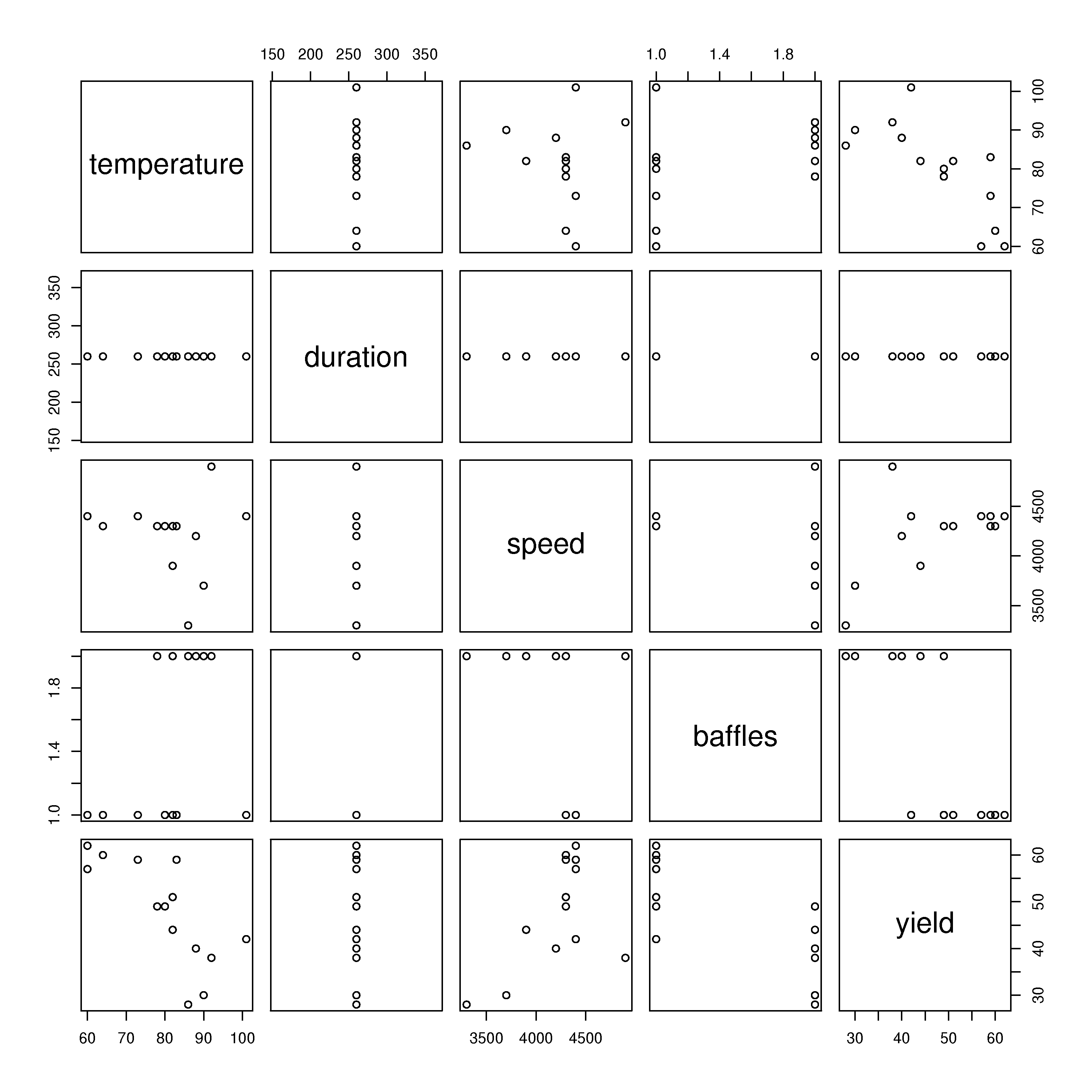
The scatterplot matrix, shown below, agrees with our interpretation. This is an information rich visualization that gives us a feel for the multivariate relationships and really summarizes all the variables well (especially the last row of plots).
The yield-temperature relationship is negative, as expected.
The yield-speed relationship is positive, as expected.
The yield-baffles relationship is negative, as expected.
We can’t tell anything about the yield-duration relationship, as it doesn’t vary in the data we have (there could/should be a relationship, but we can’t tell).
S, 20 lines
bio <- read.csv('http://openmv.net/file/bioreactor-yields.csv')
summary(bio)

# Temperature-Yield model
model.temp <- lm(bio$yield ~ bio$temperature)
summary(model.temp)

# Impeller speed-Yield model
model.speed <- lm(bio$yield ~ bio$speed)
summary(model.speed)

# Baffles-Yield model
model.baffles <- lm(bio$yield ~ bio$baffles)
summary(model.baffles)

# Scatterplot matrix
bitmap('bioreactor-scatterplot-matrix.png', type="png256",
        width=10, height=10, res=300)
plot(bio)
dev.off()
Question
Use the gas furnace data from the website to answer these questions. The data represent the gas flow rate (centered) from a process and the corresponding CO2 measurement.
Make a scatter plot of the data to visualize the relationship between the variables. How would you characterize the relationship?
Calculate the variance for both variables, the covariance between the two variables, and the correlation between them, \(r(x,y)\). Interpret the correlation value; i.e. do you consider this a strong correlation?
Now calculate a least squares model relating the gas flow rate as the \(x\) variable to the CO2 measurement as the \(y\)-variable. Report the intercept and slope from this model.
Report the \(R^2\) from the regression model. Compare the squared value of \(r(x,y)\) to \(R^2\). What do you notice? Now reinterpret what the correlation value means (i.e. compare this interpretation to your answer in part 2).
Advanced: Switch \(x\) and \(y\) around and rebuild your least squares model. Compare the new \(R^2\) to the previous model’s \(R^2\). Is this result surprising? How do interpret this?
Solution
Relationship: the data are negatively correlated.

I’ve chosen to use the
sporscatterplotfunction from thecarlibrary. It shows the scatterplot smoother (a.k.a. loess line) as solid red, the spread around the smoother (dashed red), the least squares regression line (black) and boxplots for each axis.This is a great example of an information-rich visualization: packing the maximum amount of information into a small space. This plot answers so many questions we might have about the data.
The
cov(...)command supplies the variance and covariance, and thecor(...)command gives the correlation.Variance of input gas flow rate = 1.15 [gas flow units] \(^2\)
Variance of CO2 = 10.3 [CO2 units] \(^2\)
Covariance between input gas flow and CO2 = -1.66 [gas flow units][CO2 units]
Correlation = -0.48, i.e. around -0.5.
From my experience with data, I personally would interpret this as a reasonably strong correlation. There is reasonably strong linear behaviour in the data cloud shown above, enough of a relationship to confidently say that “the CO2 output does decrease at higher gas flow rates”.
From the R model output:
intercept is -1.44 units of CO2
slope is 53.4 \(\frac{[\text{units of CO}_2]}{[\text{units of gas flow}]}\)
From the R model output: \(R^2 = 0.2347\)
From earlier, the squared correlation is \((-0.484)^2 = 0.2347\), the same value.
Correlation can be interpreted as the square root of the \(R^2\) value when regressing \(y\) on \(x\) (i.e. fitting a linear model to \(y\) using \(x\) as the input), with the sign taken from the slope: here \(r = -\sqrt{0.2347} = -0.484\).
Most novices would be misled and consider an \(R^2\) value of 0.23 quite low. But notice that there is a repeatable and consistent negative linear relationship between \(x\) and \(y\) in this data.
This shows the interesting result that when regressing \(x\) on \(y\) (instead of the usual regression of \(y\) on \(x\)), that we get the same \(R^2\) value. Note however that the intercept and slope are different between the two regressions. This symmetry, and what follows from it, is covered in the section on the two properties of R-squared.
This also calls into question the interpretation of the \(R^2\) value in regression. \(R^2\) is just the square of the correlation coefficient. Recall from class the slide on the Wikipedia examples of correlation: there were examples where \(r(x,y) = \sqrt{R^2}\) was zero, but still a strong relationship existing in the data. So we should interpret \(R^2\) as a measure only of the linear relationship between two variables. And bear its quadratic nature in mind - interpreting the correlation is actually easier, and more “linear”, in that a 0.2 improvement in correlation means the same thing when going from \(r=0.2\) to 0.4, as it does when going from \(r=0.7\) to 0.9 (not so for \(R^2\)).

S, 33 lines
gas <- read.csv('http://openmv.net/file/gas-furnace.csv')
summary(gas)

library(car)
bitmap('CO2-gas-furnace-raw-data.png', type="png256",
        width=6, height=6, res=300, pointsize=14)

# Use the "sp" (scatterplot) function from the "car" library
sp(gas$InputGasRate, gas$CO2, xlab="Gas flow rate", ylab="CO2",
   main="Scatterplot with smoother, spread, and L/S line")
dev.off()

# (Co)variance and correlation
cov(gas)
cor(gas)

# Linear model:
model <- lm(gas$CO2 ~ gas$InputGasRate)
summary(model)

# ANOVA values
y.mean <- mean(gas$CO2)
RegSS <- sum((predict(model) - y.mean)^2)
RSS <- sum(residuals(model)^2)
TSS <- sum((gas$CO2 - y.mean)^2)
mean.square.residual <- RSS / model$df.residual

# Test normality of residuals
bitmap('CO2-gas-furnace-residuals.png', type="png256",
        width=6, height=6, res=300, pointsize=14)
par(mar=c(4.2, 4.2, 0.5, 0.5))
qqPlot(model)  # the qqPlot "knows" what to do with a model object
dev.off()
Question
A new type of thermocouple is being investigated by your company’s process control group. These devices produce an almost linear voltage (millivolt) response at different temperatures. In practice though it is used the other way around: use the millivolt reading to predict the temperature. The process of fitting this linear model is called calibration.
Use the following data to calibrate a linear model:
Temperature [K]
273
293
313
333
353
373
393
413
433
453
Reading [mV]
0.01
0.12
0.24
0.38
0.51
0.67
0.84
1.01
1.15
1.31
Show the linear model and provide the predicted temperature when reading 1.00 mV.
Are you satisfied with this model, based on the coefficient of determination (\(R^2\)) value?
What is the model’s standard error? Now, are you satisfied with the model’s prediction ability, given that temperatures can usually be recorded to an accuracy of \(\pm 0.5\) K with most inexpensive thermocouples.
What is your (revised) conclusion now about the usefulness of the \(R^2\) value?
Note: This example explains why we don’t use the terminology of independent and dependent variables in this book. Here the temperature truly is the independent variable, because it causes the voltage difference that we measure. But the voltage reading is the independent variable in the least squares model. The word independent is being used in two different senses (its English meaning vs its mathematical meaning), and this can be misleading.
Solution
The linear model is used to predict temperature given the reading in millivolts. The reason is that in modelling, in general, we specify as \(x\) the variable(s) we always have available, while \(y\) is the variable we would like to predict from the \(x\).
The model has the form: \(T = b_0 + b_1V\), where \(T\) is temperature and \(V\) is the voltage reading. Coefficients in the linear model are:
\[T = 278.6 + 135.3 V\]implies that recording an increase in 0.1 mV means, on average, the temperature has increased by 13.5 K in the system.
The temperature prediction at 1.00 mV would be 413.9 K.

The following Python code was used to fit the model and draw the plot.
Python, 47 lines
"""Thermocouple calibration: temperature against voltage, by least squares.

Writes ``voltage-linear-model.png`` for the least-squares chapter of the
PID book. This script is shown to the reader in
``least-squares-modelling/least-squares-exercises.rst``, so it is kept
short and explicit.

Usage
-----
    uv run --with numpy --with matplotlib python voltage_linear_model.py
"""

import matplotlib.pyplot as plt
import numpy as np

# Measured thermocouple voltage [mV] and the reference temperature [K].
x = np.array([0.01, 0.12, 0.24, 0.38, 0.51, 0.67, 0.84, 1.01, 1.15, 1.31])
y = np.array([273, 293, 313, 333, 353, 373, 393, 413, 433, 453])

n = len(x)
X = np.column_stack([np.ones(n), x])       # intercept and slope columns

# Solve the normal equations for the two coefficients.
coefficients, *_ = np.linalg.lstsq(X, y, rcond=None)
predictions = X @ coefficients

residuals = y - predictions                # e = y - Xb
RSS = np.sum(residuals**2)                 # residual sum of squares
TSS = np.sum((y - np.mean(y)) ** 2)        # total sum of squares
R2 = 1 - RSS / TSS
standard_error = np.sqrt(RSS / (n - len(coefficients)))

print(f"Temperature = {coefficients[0]:.1f} + {coefficients[1]:.1f} x voltage")
print(f"R2 = {R2:.4f}, standard error = {standard_error:.1f} K")

fig, ax = plt.subplots(figsize=(8, 6))
ax.grid(color="#DDDDDD", linewidth=0.8)
ax.plot(x, y, "o", color="#0072B2", markersize=9, label="Original data")
ax.plot(x, predictions, color="#D55E00", linewidth=2.5, label="Fitted line")
ax.plot(x, predictions + 2 * standard_error, "--", color="#D55E00", linewidth=1.5)
ax.plot(x, predictions - 2 * standard_error, "--", color="#D55E00", linewidth=1.5)
ax.text(0.75, 320, f"Standard error = {standard_error:.1f} K")
ax.set_xlabel("Voltage [mV]")
ax.set_ylabel("Temperature [K]")
ax.legend(loc="upper left", frameon=False)
fig.tight_layout()
fig.savefig("voltage-linear-model.png", dpi=300)
If you used
Rto fit the model, you would written something like this:Code, 22 lines
> V <- c(0.01, 0.12, 0.24, 0.38, 0.51, 0.67, 0.84, 1.01, 1.15, 1.31)
> T <- c(273, 293, 313, 333, 353, 373, 393, 413, 433, 453)
> model <- lm(T ~ V)
> summary(model)

Call:
lm(formula = T ~ V)

Residuals:
    Min      1Q  Median      3Q     Max
-6.9272 -2.1212 -0.1954  2.7480  5.4239

Coefficients:
            Estimate Std. Error t value Pr(>|t|)
(Intercept)  278.574      2.204  126.39 1.72e-14 ***
V            135.298      2.922   46.30 5.23e-11 ***
---
Signif. codes:  0 ‘***’ 0.001 ‘**’ 0.01 ‘*’ 0.05 ‘.’ 0.1 ‘ ’ 1

Residual standard error: 3.916 on 8 degrees of freedom
Multiple R-squared: 0.9963,     Adjusted R-squared: 0.9958
F-statistic:  2144 on 1 and 8 DF,  p-value: 5.229e-11
The \(R^2\) value from this linear fit is \(R^2 = 0.996\), which being so close to 1.0, implies the linear relationship in the data is strong (the linear model fits the data very well) - that’s all.
One cannot be satisfied with only an \(R^2\) value: it has nothing to do with whether the model’s prediction accuracy is any good. So we can’t tell anything from this number.
The model’s standard error is 3.9 K. If we assume the prediction error is normally distributed around the linear fit, this corresponds to one standard deviation. So 95% of our prediction error lies roughly within a range of \(\pm 2\times 3.92\) or \(\pm 7.8\) K. These are the dashed red lines drawn on the figure. (Please note: the true error intervals are not parallel to the regression line, they are curved; however the \(\pm 2S_E\) limits are a good-enough approximation for most engineering applications.
This prediction ability of \(\pm 8\) K is probably not satisfying for most engineering applications, since we can predict temperatures far more accurately, over the range from 273K to 453K, using off-the-shelf commercial thermocouples.
The purpose of this question is to mainly point out the misleading nature of \(R^2\) - this value looks really good: 99.6%, yet the actual purpose of the model, the ability to predict temperature from the millivolt reading, has no relationship at all to this \(R^2\) value.
Question
Use the linear model you derived in the gas furnace question, where you used the gas flow rate to predict the CO2 measurement, and construct the analysis of variance table (ANOVA) for the dataset. Use your ANOVA table to reproduce the residual standard error, \(S_E\) value, that you get from the R software output.
Go through the R tutorial to learn how to efficiently obtain the residuals and predicted values from a linear model object.
Also for the above linear model, verify whether the residuals are normally distributed.
Use the linear model you derived in the thermocouple question, where you used the voltage measurement to predict the temperature, and construct the analysis of variance table (ANOVA) for that dataset. Use your ANOVA table to reproduce the residual standard error, \(S_E\) value, that you get from the R software output.
Solution
The ANOVA table values were calculated in the code solutions for question 2:
Type of variance
Distance
Degrees of freedom
SSQ
Mean square
Regression
\(\hat{y}_i - \overline{\mathrm{y}}\)
\(k-1 = 1\)
709.9
709.9
Error
\(y_i - \hat{y}_i\)
\(n-k = 294\)
2314.9
7.87
Total
\(y_i - \overline{\mathrm{y}}\)
\(n-1 = 295\)
3024.8
10.3
The residual standard error, or just standard error, \(S_E = \sqrt{\frac{2314.9}{296-2}} = 2.8\) %CO2, which agrees with the value from R.
These residuals were normally distributed, as verified in the q-q plot:
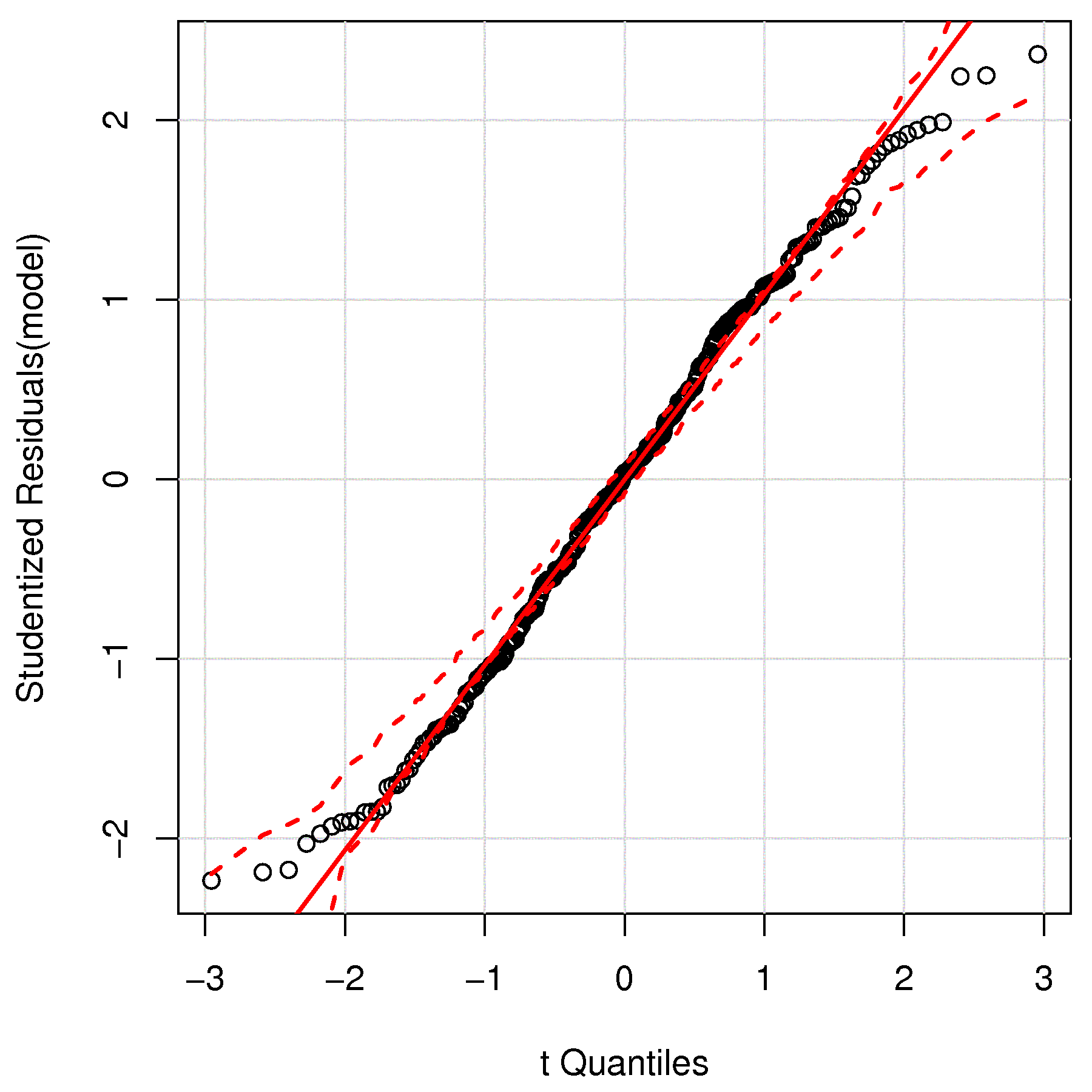
As mentioned in the
help(qqPlot)output, the dashed red line is the confidence envelope at the 95% level. The single point just outside the confidence envelope is not going to have any practical effect on our assumption of normality. We expect 1 point in 20 to lie outside the limits.Read ahead, if required, on the meaning of studentized residuals, which are used on the \(y\)-axis.
For the thermocouple data set:
Type of variance
Distance
Degrees of freedom
SSQ
Mean square
Regression
\(\hat{y}_i - \overline{\mathrm{y}}\)
\(k-1 = 1\)
32877
32877
Error
\(y_i - \hat{y}_i\)
\(n-k = 8\)
122.7
15.3
Total
\(y_i - \overline{\mathrm{y}}\)
\(n-1 = 9\)
33000
3667
The residual standard error, or just standard error, \(S_E = \sqrt{\frac{122.7}{10-2}} = 3.9\) K, which agrees with the value from R.
Question
Use the mature cheddar cheese data set for this question.
Choose any \(x\)-variable, either
Aceticacid concentration (already log-transformed),H2Sconcentration (already log-transformed), orLacticacid concentration (in original units) and use this to predict theTastevariable in the data set. TheTasteis a subjective measurement, presumably measured by a panel of tasters.Prove that you get the same linear model coefficients, \(R^2\), \(S_E\) and confidence intervals whether or not you first mean center the \(x\) and \(y\) variables.
What is the level of correlation between each of the \(x\)-variables. Also show a scatterplot matrix to learn what this level of correlation looks like visually.
Report your correlations as a \(3 \times 3\) matrix, where there should be 1.0’s on the diagonal, and values between \(-1\) and \(+1\) on the off-diagonals.
Build a linear regression that uses all three \(x\)-variables to predict \(y\).
Report the slope coefficient and confidence interval for each \(x\)-variable
Report the model’s standard error. Has it decreased from the model in part 1?
Report the model’s \(R^2\) value. Has it decreased?
Solution
We used the acetic acid variable as \(x\) and derived the following two models to predict taste, \(y\):
No mean centering of \(x\) and \(y\): \(y = -61.5 + 15.65x\)
With mean centering of \(x\) and \(y\): \(y = 0 + 15.65x\)
These results were found from both models:
Residual standard error, \(S_E\) = 13.8 on 28 degrees of freedom
Multiple R-squared, \(R^2\) = 0.30
Confidence interval for the slope, \(b_a\) was: \(6.4 \leq b_A \leq 24.9\).
Please see the R code at the end of this question.
If you had used \(x\) =
H2S, then \(S_E = 10.8\) and if used \(x\) =Lactic, then \(S_E = 11.8\).The visual level of correlation is shown in the first \(3 \times 3\) plots below, while the relationship of each \(x\) to \(y\) is shown in the last row and column:
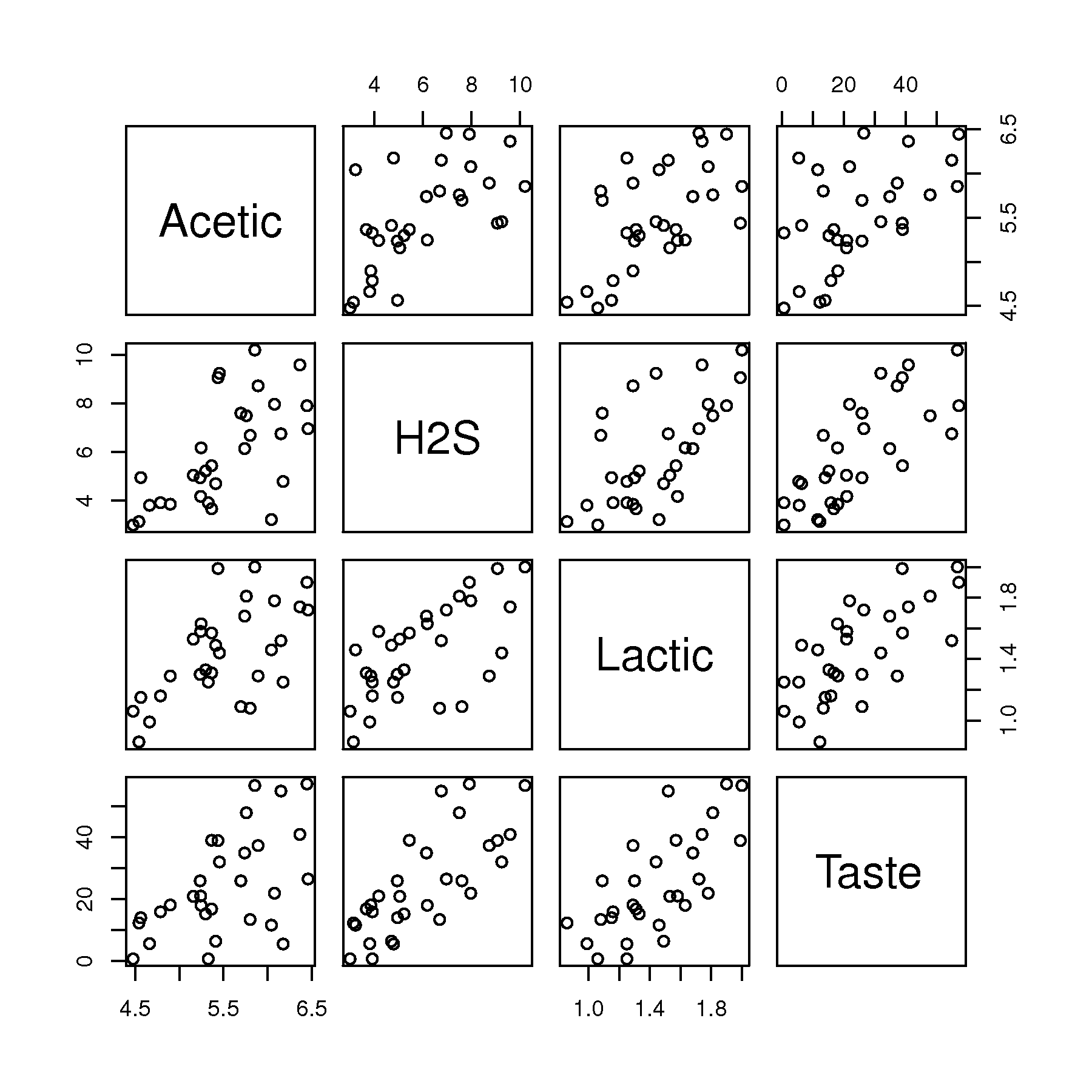
The numeric values for the correlation between the \(x\)-variables are:
\[\begin{split}\begin{bmatrix} 1.0 & 0.618 & 0.604\\ 0.618 & 1.0 & 0.644\\ 0.604 & 0.644 & 1.0 \end{bmatrix}\end{split}\]There is about a 60% correlation between each of the \(x\)-variables in this model, and in each case the correlation is positive.
A combined linear regression model is \(y = -28.9 + 0.31 x_A + 3.92 x_S + 19.7 x_L\) where \(x_A\) is the log of the acetic acid concentration, \(x_S\) is the log of the hydrogen sulphide concentration and \(x_L\) is the lactic acid concentration in the cheese. The confidence intervals for each coefficient are:
\(-8.9 \leq b_A \leq 9.5\)
\(1.4 \leq b_S \leq 6.5\)
\(1.9 \leq b_L \leq 37\)
The \(R^2\) value is 0.65 in the MLR, compared to the value of 0.30 in the single variable regression. The \(R^2\) value, computed on the building data, never decreases when adding a new variable to the model, even if that variable has little value to the regression model (yet another caution related to \(R^2\)).
The MLR standard error is 10.13 on 26 degrees of freedom, a decrease of about 3 units from the individual regression in part 1; a small decrease given the \(y\)-variable’s range of about 50 units.
Since each \(x\)-variable is about 60% correlated with the others, we can loosely interpret this by inferring that either
lactic, oraceticorH2Scould have been used in a single-variable regression. In fact, if you compare \(S_E\) values for the single-variable regressions, (13.8, 10.8 and 11.8), to the combined regression \(S_E\) of 10.13, there isn’t much of a reduction in the MLR’s standard error.This interpretation can be quite profitable: it means that we get by with one only one \(x\)-variable to make a reasonable prediction of taste in the future, however, the other two measurements must be consistent. In other words we can pick lactic acid as our predictor of taste (it might be the cheapest of the 3 to measure). But a new cheese with high lactic acid, must also have high levels of
H2Sandaceticacid for this prediction to work. If those two, now unmeasured variables, had low levels, then the predicted taste may not be an accurate reflection of the true cheese’s taste! We say “the correlation structure has been broken” for that new observation.Other, advanced explanations:
Highly correlated \(x\)-variables are problematic in least squares, because the confidence intervals and slope coefficients are not independent anymore. This leads to the problem we see above: the acetic acid’s effect is shown to be insignificant in the MLR, yet it was significant in the single-variable regression! Which model do we believe?
This resolution to this problem is simple: look at the raw data and see how correlated each of the \(x\)-variables are with each other. One of the shortcomings of least squares is that we must invert \(\mathbf{X}'\mathbf{X}\). For highly correlated variables this matrix is unstable in that small changes in the data lead to large changes in the inversion. What we need is a method that handles correlation.
One quick, simple, but suboptimal way to deal with high correlation is to create a new variable, \(x_\text{avg} = 0.33 x_A + 0.33 x_S + 0.33 x_L\) that blends the 3 separate pieces of information into an average. Averages are always less noisy than the separate variables the make up the average. Then use this average in a single-variable regression. See the code below for an example.
Python, 22 lines
# Correlation among the cheese predictors, and what it does to a model.
import numpy as np
import pandas as pd

pd.options.plotting.backend = "plotly"

cheese = pd.read_csv("https://openmv.net/file/cheddar-cheese.csv")
print(cheese[["Acetic", "H2S", "Lactic", "Taste"]].corr().round(2))

fig = cheese.plot.scatter(x="Acetic", y="Taste")
fig.show()

# Mean-centering changes the intercept, not the slope.
x, y = cheese["Acetic"].to_numpy(float), cheese["Taste"].to_numpy(float)
print(np.polyfit(x, y, 1))
print(np.polyfit(x - x.mean(), y - y.mean(), 1))

# All three predictors together.
X = np.column_stack([np.ones(len(cheese)), cheese["Acetic"],
                     cheese["H2S"], cheese["Lactic"]])
coefficients, *_ = np.linalg.lstsq(X, y, rcond=None)
print("Taste =", " + ".join(f"{c:.2f}" for c in coefficients))
or the equivalent in R:
S, 31 lines
cheese <- read.csv('http://openmv.net/file/cheddar-cheese.csv')
summary(cheese)

# Proving that mean-centering has no effect on model parameters
x <- cheese$Acetic
y <- cheese$Taste
summary(lm(y ~ x))
confint(lm(y ~ x))

x.mc <- x - mean(x)
y.mc <- y - mean(y)
summary(lm(y.mc ~  x.mc))
confint(lm(y.mc ~  x.mc ))

# Correlation amount in the X's.  Also plot it
cor(cheese[,2:5])
bitmap('cheese-data-correlation.png', type="png256",
        width=6, height=6, res=300, pointsize=14)
plot(cheese[,2:5])
dev.off()

# Linear regression that uses all three X's
model <- lm(cheese$Taste ~ cheese$Acetic + cheese$H2S + cheese$Lactic)
summary(model)
confint(model)

# Use an "average" x
x.avg <- 1/3*cheese$Acetic + 1/3*cheese$H2S + 1/3*cheese$Lactic
model.avg <- lm(cheese$Taste ~ x.avg)
summary(model.avg)
confint(model.avg)
A Pandas / process_improve version of the same workflow is given below for reference:
Python, 41 lines
import pandas as pd
from pandas.plotting import scatter_matrix
from process_improve.regression import OLS

cheese = pd.read_csv(
    "https://openmv.net/file/cheddar-cheese.csv"
)

# Drop the case identifier; it is not a
# variable to model with.
cheese = cheese.drop(columns="Case")

# Correlation matrix and scatter plot matrix:
cheese.corr()
scatter_matrix(
    cheese,
    alpha=0.8,
    marker="s",
    figsize=(8, 8),
    diagonal="kde",
)

# Single-variable model: predict Taste from
# acetic acid concentration.
X = cheese[["Acetic"]].values
y = cheese["Taste"].values
single = OLS().fit(X, y)
print(
    f"Intercept = {single.intercept_:.3f}, "
    f"slope = {single.coefficients_[0]:.3f}"
)

# Multiple linear regression with all three
# x-variables:
X_mlr = cheese[["Acetic", "H2S", "Lactic"]].values
mlr = OLS().fit(X_mlr, y)
print(
    f"Intercept = {mlr.intercept_:.3f}, "
    f"coefficients = {mlr.coefficients_}"
)
print(f"R^2 = {mlr.score(X_mlr, y):.3f}")
Question
The Kamyr digester data set comes from a pulp and paper plant. Use it to practise the early steps of the data-analysis workflow before fitting a least squares model.
Read the data, drop any non-numeric identifier columns, and produce a histogram of every variable. Find two variables with a clearly bimodal distribution, and two that are roughly normally distributed.
For each bimodal variable, plot it in time order. Does the bimodal histogram now make sense?
Find the three columns most strongly positively correlated, and the three most strongly negatively correlated, with the outcome variable
Y-Kappa. Build a 7-column data frame that combines those six predictors withY-Kappa, and produce a scatter plot matrix for that subset only.If you needed to increase the Kappa number for this process, which variables would you change, and in which direction?
Solution
Starter code for the exploration:
Python, 42 lines
import pandas as pd
import plotly.express as px

digester = pd.read_csv(
    "https://openmv.net/file/kamyr-digester.csv"
)
# The first column is a row identifier, not a
# measurement; drop it before any arithmetic.
digester = digester.drop(columns="Observation")

# A histogram per column, one panel each.
# Adjust nbins to taste:
px.histogram(digester.melt(), x="value", nbins=30,
             facet_col="variable", facet_col_wrap=5
             ).update_xaxes(matches=None).show()

# Correlation matrix.
# Sort by the column we care about,
# from most negative to most positive:
correlations = digester.corr()["Y-Kappa"]
correlations.sort_values()

# Pick the 3 strongest positive and 3
# strongest negative correlations, then
# build a 7-column subset:
positives = (
    correlations.drop("Y-Kappa")
    .sort_values(ascending=False)
    .head(3)
    .index.tolist()
)
negatives = (
    correlations.drop("Y-Kappa")
    .sort_values()
    .head(3)
    .index.tolist()
)
subset = digester[positives + negatives + ["Y-Kappa"]]

from pandas.plotting import scatter_matrix
scatter_matrix(subset, alpha=0.4,
               figsize=(12, 12), diagonal="kde")
Question
In this question we will revisit the bioreactor yield data set and fit a linear model with all \(x\)-variables to predict the yield. (This data was also used in a previous question.)
Provide the interpretation for each coefficient in the model, and also comment on each one’s confidence interval when interpreting it.
Compare the 3 slope coefficient values you just calculated, to those from the previous question:
\(\hat{y} = 102.5 - 0.69T\), where \(T\) is tank temperature
\(\hat{y} = -20.3 + 0.016S\), where \(S\) is impeller speed
\(\hat{y} = 54.9 - 16.7B\), where \(B\) is 1 if baffles are present and \(B=0\) with no baffles
Explain why your coefficients do not match.
Are the residuals from the multiple linear regression model normally distributed?
In this part we are investigating the variance-covariance matrices used to calculate the linear model.
First center the \(x\)-variables and the \(y\)-variable that you used in the model.
Note: feel free to use MATLAB, or any other tool to answer this question. If you are using R, then you will benefit from this page in the R tutorial. Also, read the help for the
model.matrix(...)function to get the \(\mathbf{X}\)-matrix. Then read the help for thesweep(...)function, or more simply use thescale(...)function to do the mean-centering.Show your calculated \(\mathbf{X}^T\mathbf{X}\) and \(\mathbf{X}^T\mathbf{y}\) variance-covariance matrices from the centered data.
Explain why the interpretation of covariances in \(\mathbf{X}^T\mathbf{y}\) match the results from the full MLR model you calculated in part 1 of this question.
Calculate \(\mathbf{b} =\left(\mathbf{X}^T\mathbf{X}\right)^{-1}\mathbf{X}^T\mathbf{y}\) and show that it agrees with the estimates that R calculated (even though R fits an intercept term, while your \(\mathbf{b}\) does not).
What would be the predicted yield for an experiment run without baffles, at 4000 rpm impeller speed, run at a reactor temperature of 90 °C?
Solution
The full linear model that relates bioreactor yield to 3 factors is:
\[y = 52.5 - 0.47 x_T + 0.0087 x_S -9.1 x_B\]where \(x_T\) is the temperature value in °C, \(x_S\) is the speed in RPM and \(x_B\) is a coded variable, 0=no baffles and 1=with baffles.
Temperature effect: \(-0.74 < \beta_T < -0.21\), with \(b_T = -0.47\) indicates that increasing the temperature by 1 °C will decrease the yield on average by 0.47 units, holding the speed and baffle effects constant. The confidence interval does not span zero, indicating this coefficient is significant. An ad-hoc way I sometimes use to gauge the effect of a variable is to ask what is the effect over the entire range of temperature, \(\sim 40 \text{°C}\):
\(\Delta y = -0.74 \times 40 = -29.6\) % decrease in yield
\(\Delta y = -0.21 \times 40 = -8.4\) % decrease in yield
A tighter confidence interval will have these two values even closer, but given the range of the y’s in the data cover about 35% units, this temperature effect is important, and will have a noticeable effect at either end of the confidence interval.
Speed effect: \(0.34 < \beta_S < 17.1\) with \(b_S = 8.7\), all expressed per 1000 RPM: increasing the impeller speed by 1000 RPM will increase the yield by about 8.7 percentage points, holding the other factors constant. While the confidence interval does not span zero, it is quite wide.
Baffles effect: \(-15.9 < \beta_B < -2.29\) with \(b_B = -9.1\) indicates the presence of baffles decreases yield on average by 9.1 units, holding the temperature and speed effects constant. The confidence interval does not span zero, indicating this coefficient is significant. It is an important effect to consider when wanting to change yield.
In the previous question we considered the separate effects:
\(\hat{y} = 102.5 - 0.69T\), where \(T\) is tank temperature
\(\hat{y} = -20.3 + 0.016S\), where \(S\) is impeller speed
\(\hat{y} = 54.9 - 16.7B\), where \(B\) is 1 if baffles are present and \(B=0\) with no baffles
The signs of the coefficients between MLR and OLS (ordinary least squares) are in agreement, but not the magnitudes. The problem is that when building the single-variable regression model we place all the other effects into the residuals. For example, a model considering only temperature, but ignoring speed and baffles is essentially saying:
\[\begin{split}y &= b_0 + b_T x_T + e \\ y &= b_0 + b_T x_T + (e' + b_S' x_S + b_B' x_B)\end{split}\]i.e. we are lumping the effect of speed and baffles which we have omitted from the model, into the residuals, and we should see structure in our residuals due to these omitted effects.
Since the objective function for least squares is to minimize the sum of squares of the residuals, the effect of speed and baffles can be “smeared” into the coefficient we are estimating, the \(b_T\) coefficient, and this is even more so when any of the \(x\)-variables are correlated with each other.
The residuals from the multiple linear regression model are normally distributed. This can be verified in the q-q plot below:

The \(\mathbf{X}^T\mathbf{X}\) and \(\mathbf{X}^T\mathbf{y}\) variance-covariance matrices from the centered data, where the order of the variables is: temperature, speed and then baffles:
\[\begin{split}\mathbf{X}^T\mathbf{X} &= \begin{bmatrix} 1911 & -9079 & 36.43 \\ -9079 & 1844000 & -1029 \\ 36.43& -1029 & 3.43 \end{bmatrix} \\ \mathbf{X}^T\mathbf{y} &= \begin{bmatrix} -1310 \\ 29690 \\-57.3 \end{bmatrix}\end{split}\]The covariances show a negative relationship between temperature and yield (\(-1310\)), a positive relationship between speed and yield (\(29690\)) and a negative relationship between baffles and yield (\(-57.3\)). Unfortunately, covariances are unit-dependent, so we cannot interpret the relative magnitude of these values: i.e. it would be wrong to say that speed has a greater effect than temperature because its covariance magnitude is larger. If we had two \(x\)-variables with the same units, then we could compare them fairly, but not in this case where all 3 units are different.
We can calculate
\[\begin{split}\mathbf{b} =\left(\mathbf{X}^T\mathbf{X}\right)^{-1}\mathbf{X}^T\mathbf{y} = \begin{bmatrix} -0.471 \\ 0.0087 \\ -9.1 \end{bmatrix}\end{split}\]which agrees with the estimates that R calculated (even though R fits an intercept term, while we do not estimate an intercept).
The predicted yield for an experiment run without baffles, at 4000 rpm impeller speed, run at a reactor temperature of 90 °C would be 45%:
\[\begin{split}\hat{y} &= 52.5 - 0.47 x_T + 0.0087 x_S -9.1 x_B \\ \hat{y} &= 52.5 - 0.47 (90) + 0.0087 (4000) - 9.1 (0) = \bf{45.0}\end{split}\]
All the code for this question is given below:
S, 42 lines
bio <- read.csv('http://openmv.net/file/bioreactor-yields.csv')
summary(bio)

# Temperature-Yield model
model.temp <- lm(bio$yield ~ bio$temperature)
summary(model.temp)

# Impeller speed-Yield model
model.speed <- lm(bio$yield ~ bio$speed)
summary(model.speed)

# Baffles-Yield model
model.baffles <- lm(bio$yield ~ bio$baffles)
summary(model.baffles)

# Model of everything
model.all <- lm(bio$yield ~ bio$temperature + bio$speed + bio$baffles)
summary(model.all)
confint(model.all)

# Residuals normally distributed? Yes
library(car)
bitmap('bioreactor-residuals-qq-plot.png', type="png256",
         width=6, height=6, res=300, pointsize=14)
par(mar=c(4.2, 4.2, 1.5, 0.5))
qqPlot(resid(model.all))
dev.off()

# Calculate X matrix and y vector
data <- model.matrix(model.all)
X <- data[,2:4]
y <- matrix(bio$yield)

# Center the data first
X <- scale(X, scale=FALSE)
y <- scale(y, scale=FALSE)

# Now calculate variance-covariance matrices
XTy <- t(X) %*% y
XTX <- t(X) %*% X
b <- solve(XTX) %*% XTy
# b agrees with R's calculation from ``model.all``
Question
In this question we will use the LDPE data which is data from a high-fidelity simulation of a low-density polyethylene reactor. LDPE reactors are very long, thin tubes. In this particular case the tube is divided in 2 zones, since the feed enters at the start of the tube, and some point further down the tube (start of the second zone). There is a temperature profile along the tube, with a certain maximum temperature somewhere along the length. The maximum temperature in zone 1, Tmax1 is reached some fraction z1 along the length; similarly in zone 2 with the Tmax2 and z2 variables.
We will build a linear model to predict the SCB variable, the short chain branching (per 1000 carbon atoms) which is an important quality variable for this product. Note that the last 4 rows of data are known to be from abnormal process operation, when the process started to experience a problem. However, we will pretend we didn’t know that when building the model, so keep them in for now.
Use only the following subset of \(x\)-variables:
Tmax1,Tmax2,z1andz2and the \(y\) variable =SCB. Show the relationship between these 5 variables in a scatter plot matrix.Use this code to get you started (make sure you understand what it is doing):
Code, 3 lines
LDPE <- read.csv('https://openmv.net/file/ldpe.csv')
subdata <- data.frame(cbind(LDPE$Tmax1, LDPE$Tmax2, LDPE$z1, LDPE$z2, LDPE$SCB))
colnames(subdata) <- c("Tmax1", "Tmax2", "z1", "z2", "SCB")
Using bullet points, describe the nature of relationships between the 5 variables, and particularly the relationship to the \(y\)-variable.
Let’s start with a linear model between
z2andSCB. We will call this thez2model. Let’s examine its residuals:Are the residuals normally distributed?
What is the standard error of this model?
Are there any time-based trends in the residuals (the rows in the data are already in time-order)?
Use any other relevant plots of the predicted values, the residuals, the \(x\)-variable, as described in class, and diagnose the problem with this linear model.
What can be done to fix the problem? (You don’t need to implement the fix yet).
Show a plot of the hat-values (leverage) from the
z2model.Add suitable horizontal cut-off lines to your hat-value plot.
Identify on your plot the observations that have large leverage on the model
Remove the high-leverage outliers and refit the model. Call this the
z2.updatedmodelShow the updated hat-values and verify whether the problem has mostly gone away
Note: see the R tutorial on how to rebuild a model by removing points
Use the
influenceIndexPlot(...)function in thecarlibrary on both thez2model and thez2.updatedmodel. Interpret what each plot is showing for the two models. You may ignore the Bonferroni p-values subplot.
Solution
A scatter plot matrix of the 5 variables is
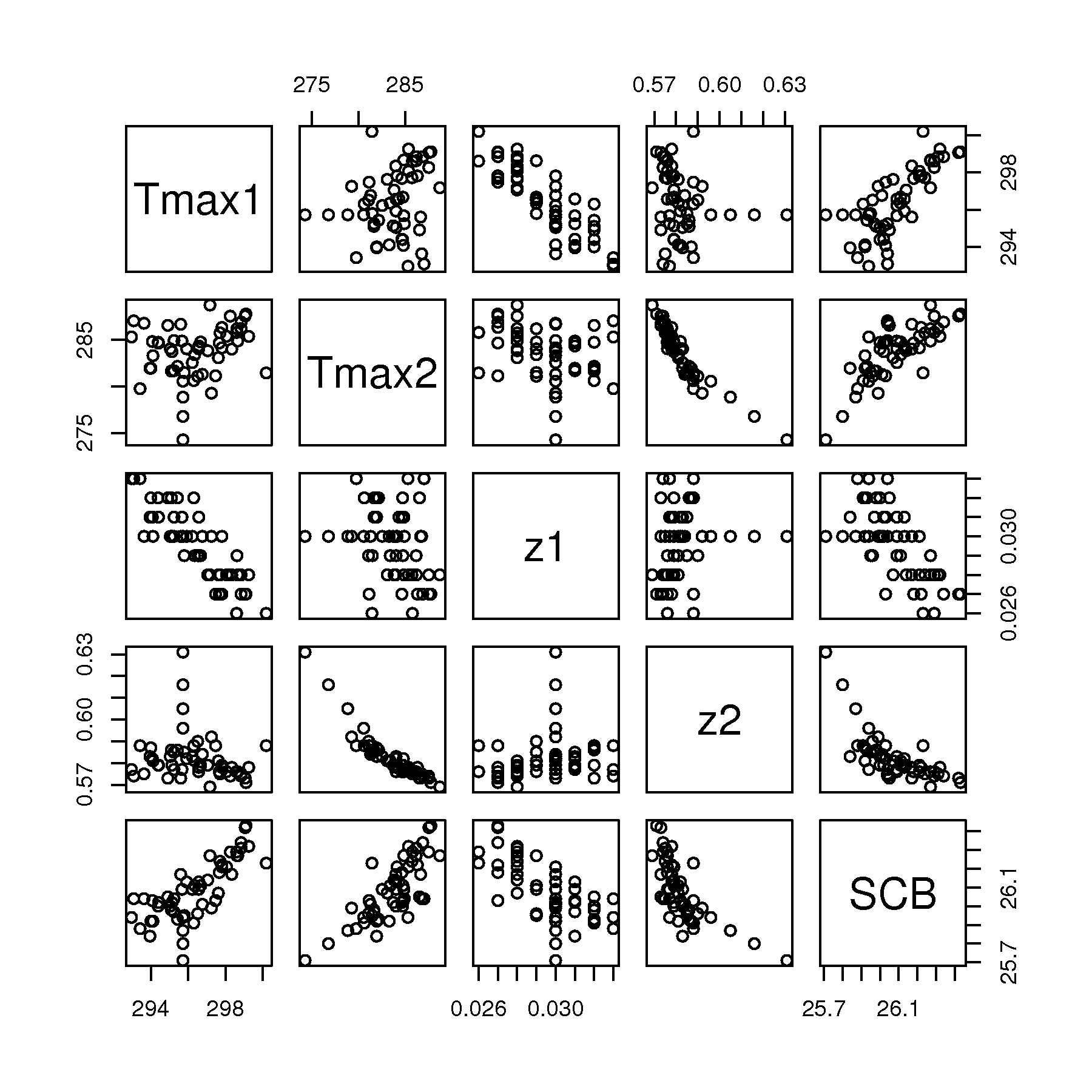
Tmax1andz1show a strongish negative correlationTmax1andSCBshow a strong positive correlationTmax2andz2have a really strong negative correlation, and the 4 outliers are very clearly revealed in almost any plot withz2z1andSCBhave a negative correlationTmax2andSCBhave a negative correlationVery little relationship appears between
Tmax1andTmax2, which is expected, given how/where these 2 data variables are recorded.Similarly for
Tmax2andz2.
A linear model between
z2andSCB: \(\widehat{\text{SCB}} = 32.23 - 10.6 z_2\)First start with a plot of the raw data with this regression line superimposed:

which helps when we look at the q-q plot of the Studentized residuals to see the positive and the negative residuals:
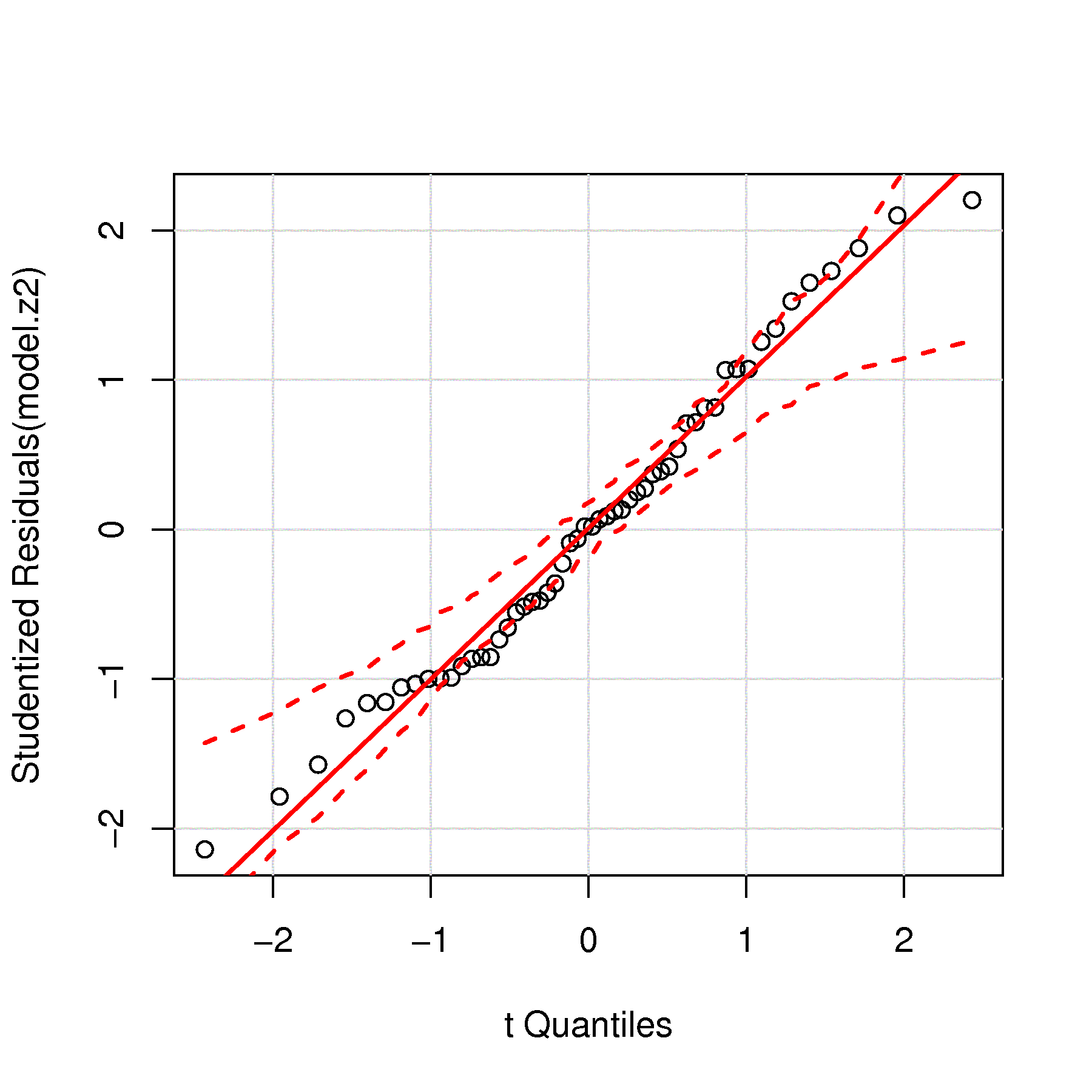
We notice there is no strong evidence of non-normality, however, we can see a trend in the tails on both sides (there are large positive residuals and large negative residuals). The identified points in the two plots help understand which points affect the residual tails.
This model’s standard error is \(S_E = 0.114\), which should be compared to the range of the \(y\)-axis, 0.70 units, to get an idea whether this is large or small, so about 15% of the range. Given that a conservative estimate of the prediction interval is \(\pm 2 S_E\), or a total range of \(4S_E\), this is quite large.
The residuals in time-order
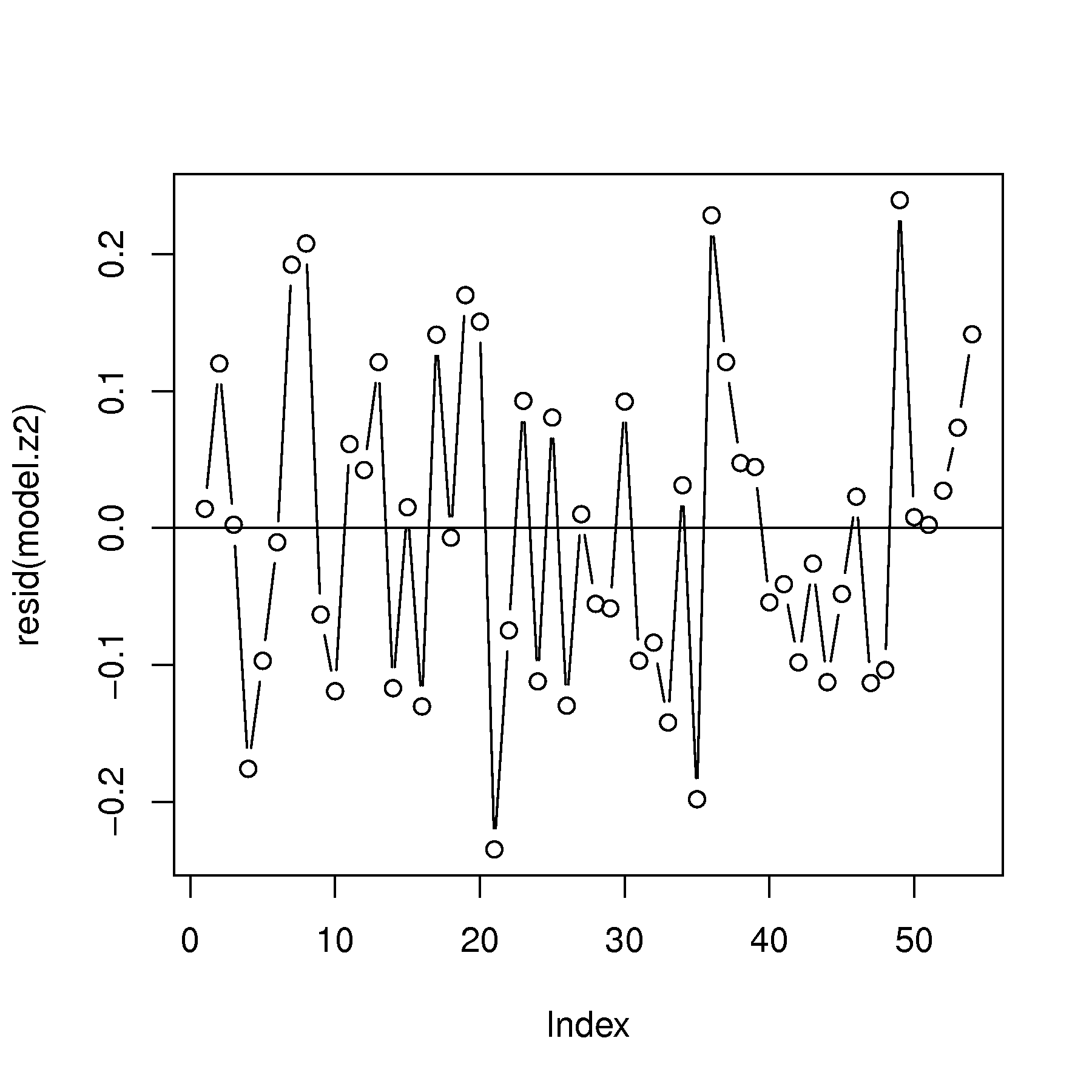
Show no consistent structure, however we do see the short upward trend in the last 4 points. The autocorrelation function (not shown here), shows there is no autocorrelation, i.e. the residuals appear independent.
Three plots that do show a problem with the linear model:
Predictions vs residuals: definite structure in the residuals. We expect to see no structure, but a definite trend, formed by the 4 points is noticeable, as well as a negative correlation at high predicted
SCB.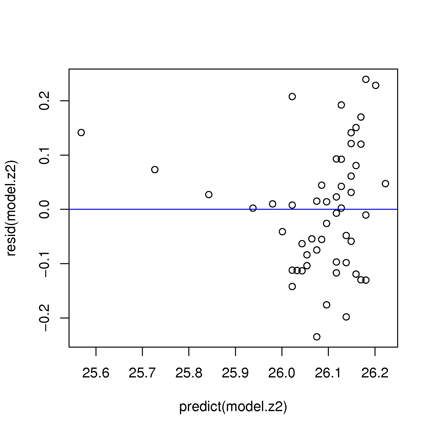
\(x\)-variable vs residuals: definite structure in the residuals, which is similar to the above plot.
Predicted vs measured \(y\): we expect to see a strong trend about a 45° line (shown in blue). The strong departure from this line indicates there is a problem with the model
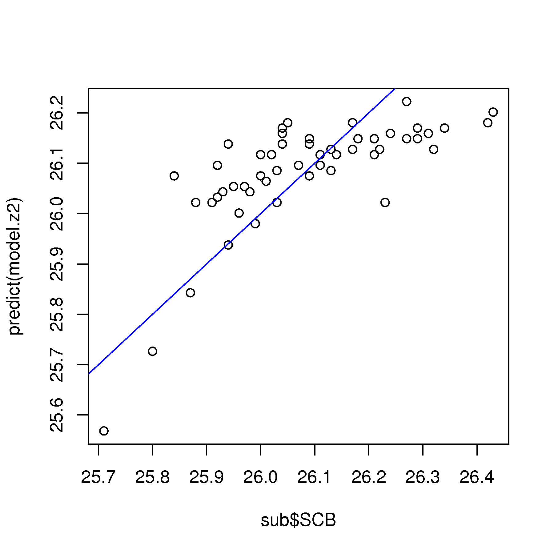
We can consider removing the 4 points that strongly bias the observed vs predicted plot above.
A plot of the hat-values (leverage) from the regression of
SCBonz2is: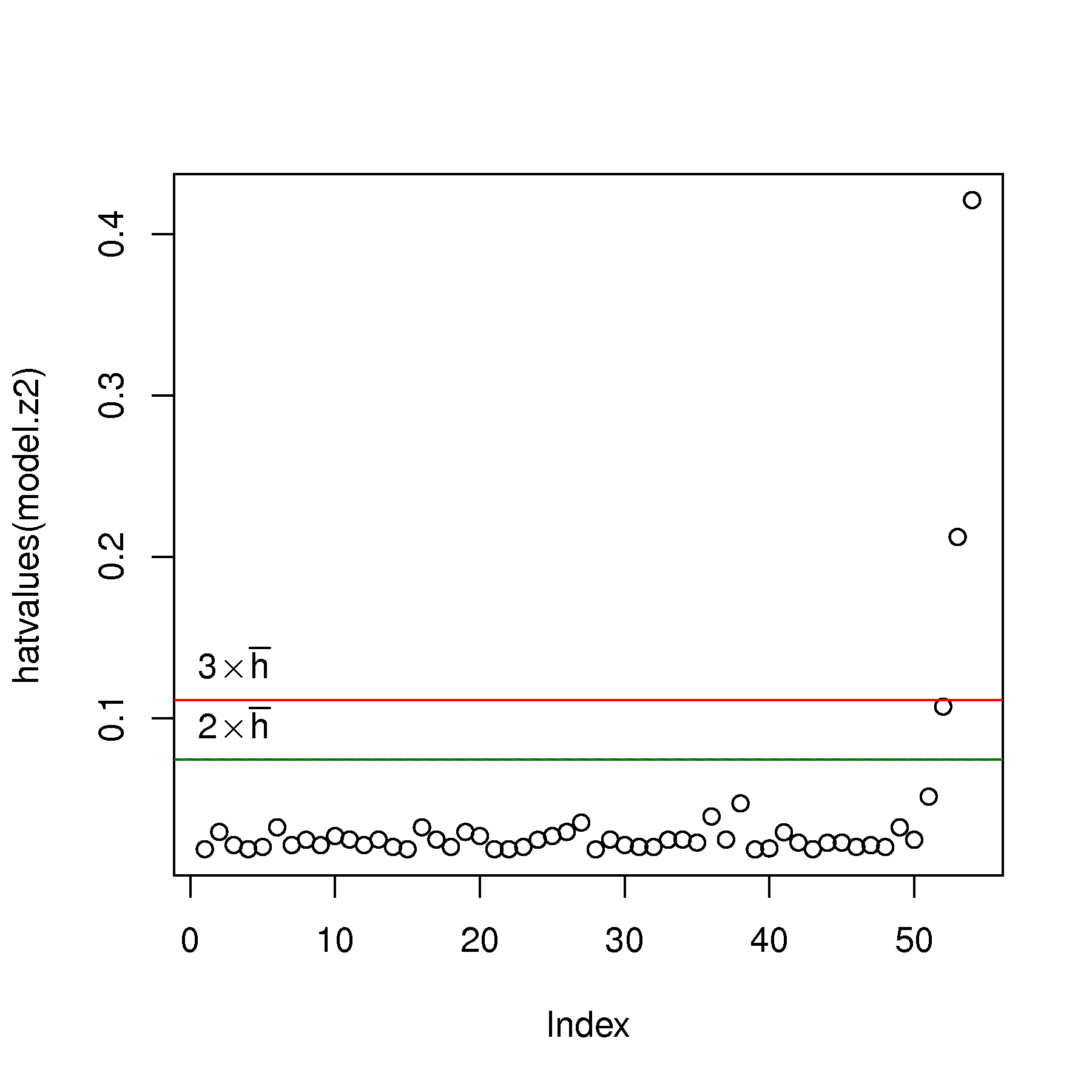
with 2 and 3 times the average hat value shown for reference. Points 52, 53 and 54 have leverage that is excessive, confirming what we saw in the previous part of this question.
Once these points are removed, the model was rebuilt, and this time showed point 51 as an high-leverage outlier. This point was removed and the model rebuilt.
The hat values from this updated model are:

which is reasonable to stop at, since the problem has mostly gone away. If you keep omitting points, you will likely deplete all the data. At some point, especially when there is no obvious structure in the residuals, it is time to stop interrogating (i.e. investigating) and removing outliers.
The updated model has a slightly improved standard error \(S_E = 0.11\) and the least squares model fit (see the R code) appears much more reasonable in the data.
The influence index plots for the model with all 54 points is shown first, followed by the influence index plot of the model with only the first 50 points.

The increasing leverage, as the abnormal process operation develops is clearly apparent. This leverage is not “bad” (i.e. influential) initially, because it is “in-line” with the regression slope. But by observation 54, there is significant deviation that observation 54 has high residuals distance, and therefore a combined high influence on the model (high Cook’s D).

The updated model shows only point 8 as an influential observation, due to its moderate leverage and large residual. However, this point does not warrant removal: its Cook’s distance is only marginally above the rule-of-thumb cut-off value of \(4/(n-k) = 4/(50-2) = 0.083\), and a point just past a rule of thumb is not, on its own, a reason to discard it.
The other large hat values don’t have large Studentized residuals, so they are not influential on the model.
Notice how the residuals in the updated model are all a little smaller than in the initial model.
All the code for this question is given here:
S, 112 lines
LDPE <- read.csv('http://openmv.net/file/LDPE.csv')
summary(LDPE)
N <- nrow(LDPE)

sub <- data.frame(cbind(LDPE$Tmax1, LDPE$Tmax2, LDPE$z1, LDPE$z2, LDPE$SCB))
colnames(sub) <- c("Tmax1", "Tmax2", "z1", "z2", "SCB")

bitmap('ldpe-scatterplot-matrix.png', type="png256",
        width=6, height=6, res=300, pointsize=14)
plot(sub)
dev.off()

model.z2 <- lm(sub$SCB ~ sub$z2)
summary(model.z2)

# Plot raw data
bitmap('ldpe-z2-SCB-raw-data.png', type="png256",
        width=6, height=6, res=300, pointsize=14)
plot(sub$z2, sub$SCB)
abline(model.z2)
identify(sub$z2, sub$SCB)
dev.off()

# Residuals normal? Yes, but have heavy tails
bitmap('ldpe-z2-SCB-resids-qqplot.png', type="png256",
        width=6, height=6, res=300, pointsize=14)
library(car)
qqPlot(model.z2, id.method="identify")
dev.off()

# Residual plots in time order: no problems detected
# Also plotted the acf(...): no problems there either
bitmap('ldpe-z2-SCB-raw-resids-in-order.png', type="png256",
        width=6, height=6, res=300, pointsize=14)
plot(resid(model.z2), type='b')
abline(h=0)
dev.off()

acf(resid(model.z2))

# Predictions vs residuals: definite structure in the residuals!
bitmap('ldpe-z2-SCB-predictions-vs-residuals.png', type="png256",
        width=6, height=6, res=300, pointsize=14)
plot(predict(model.z2), resid(model.z2))
abline(h=0, col="blue")
dev.off()

# x-data vs residuals: definite structure in the residuals!
bitmap('ldpe-z2-SCB-residual-structure.png', type="png256",
        width=6, height=6, res=300, pointsize=14)
plot(sub$Tmax2, resid(model.z2))
abline(h=0, col="blue")
identify(sub$z2, resid(model.z2))
dev.off()

# Predictions-vs-y
bitmap('ldpe-z2-SCB-predictions-vs-actual.png', type="png256",
        width=6, height=6, res=300, pointsize=14)
plot(sub$SCB, predict(model.z2))
abline(a=0, b=1, col="blue")
identify(sub$SCB, predict(model.z2))
dev.off()

# Plot hatvalues
bitmap('ldpe-z2-SCB-hat-values.png', type="png256",
        width=6, height=6, res=300, pointsize=14)
plot(hatvalues(model.z2))
avg.hat <- 2/N
abline(h=2*avg.hat, col="darkgreen")
abline(h=3*avg.hat, col="red")
text(3, y=2*avg.hat, expression(2 %*% bar(h)), pos=3)
text(3, y=3*avg.hat, expression(3 %*% bar(h)), pos=3)
identify(hatvalues(model.z2))
dev.off()

# Remove observations (observation 51 was actually detected after
# the first iteration of removing 52, 53, and 54: high-leverage points)
build <- seq(1,N)
remove <- -c(51, 52, 53, 54)
model.z2.update <- lm(model.z2, subset=build[remove])

# Plot updated hatvalues
plot(hatvalues(model.z2.update))
N <- length(model.z2.update$residuals)
avg.hat <- 2/N
abline(h=2*avg.hat, col="darkgreen")
abline(h=3*avg.hat, col="red")
identify(hatvalues(model.z2.update))
# Observation 27 still has high leverage: but only 1 point

# Problem in the residuals gone? Yes
plot(predict(model.z2.update), resid(model.z2.update))
abline(h=0, col="blue")

# Does the least squares line fit the data better?
plot(sub$z2, sub$SCB)
abline(model.z2.update)

# Finally, show an influence plot
influencePlot(model.z2, id.method="identify")
influencePlot(model.z2.update, id.method="identify")

# Or the influence index plots
influenceIndexPlot(model.z2, id.method="identify")
influenceIndexPlot(model.z2.update, id.method="identify")


#-------- Use all variables in an MLR (not required for question)

model.all <- lm(sub$SCB ~ sub$z1 + sub$z2 + sub$Tmax1 + sub$Tmax2)
summary(model.all)
confint(model.all)
Question
A concrete slump test is used to test for the fluidity, or workability, of concrete. It’s a crude, but quick test often used to measure the effect of polymer additives that are mixed with the concrete to improve workability.
The concrete mixture is prepared with a polymer additive. The mixture is placed in a mold and filled to the top. The mold is inverted and removed. The height of the mold minus the height of the remaining concrete pile is called the “slump”.
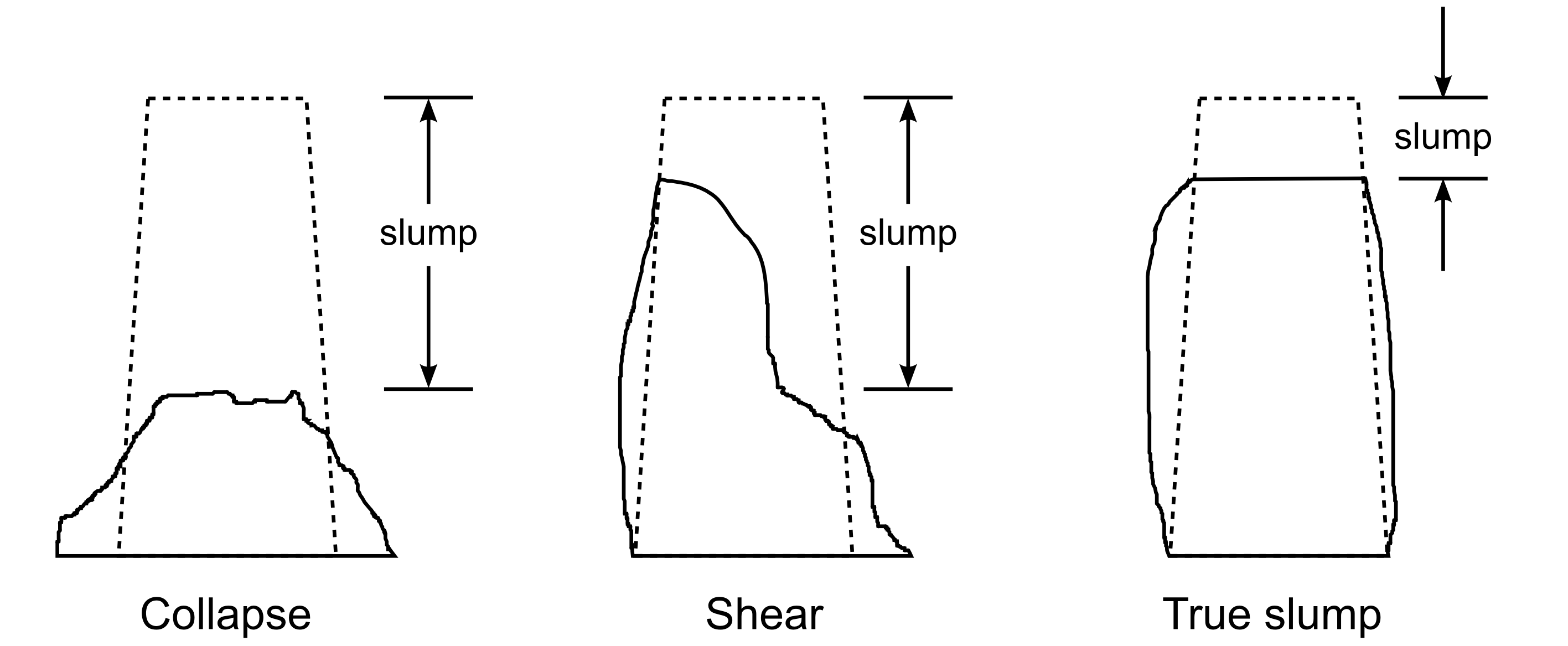
Figure from Wikipedia

Your company provides the polymer additive, and you are developing an improved polymer formulation, call it B, that hopefully provides the same slump values as your existing polymer, call it A. Formulation B costs less money than A, but you don’t want to upset, or lose, customers by varying the slump value too much.
The following slump values were recorded over the course of the day:
Additive
Slump value [cm]
A
5.2
A
3.3
B
5.8
A
4.6
B
6.3
A
5.8
A
4.1
B
6.0
B
5.5
B
4.5
You can derive the 95% confidence interval for the true, but unknown, difference between the effect of the two additives:
\[\begin{split}\begin{array}{rcccl} -c_t &\leq& z &\leq & +c_t \\ (\overline{x}_B - \overline{x}_A) - c_t \sqrt{s_P^2 \left(\frac{1}{n_B} + \frac{1}{n_A}\right)} &\leq& \mu_B - \mu_A &\leq & (\overline{x}_B - \overline{x}_A) + c_t \sqrt{s_P^2 \left(\frac{1}{n_B} + \frac{1}{n_A}\right)}\\ 1.02 - 2.306 \sqrt{0.706 \left(\frac{1}{5} + \frac{1}{5}\right)} &\leq& \mu_B - \mu_A &\leq& 1.02 + 2.306 \sqrt{0.706 \left(\frac{1}{5} + \frac{1}{5}\right)} \\ -0.205 &\leq& \mu_B - \mu_A &\leq& 2.245 \end{array}\end{split}\]
Fit a least squares model to the data using an integer variable, \(x_A = 0\) for additive A, and \(x_A = 1\) for additive B. The model should include an intercept term also: \(y = b_0 + b_A x_A\). Hint: use R to build the model, and search the R tutorial with the term categorical variable or integer variable for assistance.
Show that the 95% confidence interval for \(b_A\) gives exactly the same lower and upper bounds, as derived above with the traditional approach for tests of differences.
Solution
This short piece of R code shows the expected result when regressing the slump value onto the binary factor variable:
S, 7 lines
additive <- as.factor(c("A", "A", "B", "A", "B", "A", "A", "B", "B", "B"))
slump <- c(5.2, 3.3, 5.8, 4.6, 6.3, 5.8, 4.1, 6.0, 5.5, 4.5)
confint(lm(slump ~ additive))

                 2.5 %   97.5 %
(Intercept)  3.7334823 5.466518
additive    -0.2054411 2.245441
Note that this approach works only if your coding has a one unit difference between the two levels. For example, you can code \(A = 17\) and \(B = 18\) and still get the same result. Usually though \(A=0\) and \(B=1\) or the \(A = 1\) and \(B = 2\) coding is the most natural, but all 3 of these codings would give the same confidence interval (the intercept changes though).
Question
Some data were collected from tests where the compressive strength, \(x\), used to form concrete was measured, as well as the intrinsic permeability of the product, \(y\). There were 16 data points collected. The mean \(x\)-value was \(\overline{x} = 3.1\) and the variance of the \(x\)-values was 1.52. The average \(y\)-value was 40.9. The estimated covariance between \(x\) and \(y\) was \(-5.5\).
The least squares estimate of the slope and intercept was: \(y = 52.1 - 3.6 x\).
What is the expected permeability when the compressive strength is at 5.8 units?
Calculate the 95% confidence interval for the slope if the standard error from the model was 4.5 units. Is the slope coefficient statistically significant?
Provide a rough estimate of the 95% prediction interval when the compressive strength is at 5.8 units (same level as for part 1). What assumptions did you make to provide this estimate?
Now provide a more accurate, calculated 95% prediction confidence interval for the previous part.
Solution
It is \(\hat{y} = 52.1 - 3.6(5.8) = 31.22\)
From the definition:
\[\begin{split}S_E^2(b_i) &= \dfrac{S_E^2}{\sum_j{\left( x_j - \overline{\mathrm{x}} \right)^2}} \\ &= \dfrac{4.5^2}{\sum_j{\left( x_j - \overline{\mathrm{x}} \right)^2}}\end{split}\]We need the denominator term, which can be found by back-calculation:
\[\begin{split}\mathcal{V}(x) = 1.52 &= \frac{\sum_j{(x_j - \overline{\mathrm{x}})^2}}{n-1} \\ \sum_j{(x_j - \overline{\mathrm{x}})^2} &= 1.52 \times (16-1) = 22.8\end{split}\]So the 95% confidence interval for the slope, \(b_i\):
\[\begin{split}b_i &\pm c_t S_E(b_i) \\ -3.6 &\pm 2.14 \sqrt{\dfrac{4.5^2}{22.8}}\\ -3.6 &\pm 2.02\end{split}\]where \(c_t = 2.14\) from the \(t\)-distribution with \(n-k = 16-2\) degrees of freedom.
Since this confidence interval does not span zero, we conclude the slope coefficient is statistically significant.
A rough estimate would be at \(\hat{y} \pm 2 S_E\), in other words, \(31.2 \pm 9.0\), which is \([22.2, 40.2]\)
A more accurate prediction interval is given by \(\hat{y}_i \pm c_t \sqrt{V\{\hat{y}_i\}}\), where:
\[\begin{split}V\{\hat{y}_i\} &= S_E^2 \left(1 + \dfrac{1}{n} + \dfrac{(x_i - \overline{\mathrm{x}})^2}{\sum_j{\left( x_j - \overline{\mathrm{x}} \right)^2}}\right)\\ &= 4.5^2 \left(1 + \dfrac{1}{16} + \dfrac{(5.8 - 3.1)^2}{22.8}\right)\\ &= 27.99\end{split}\]and represents the variance of the predicted \(\hat{y}_i\) at the given value of \(x_i = 5.8\).
The prediction interval for this \(\hat{y}_i\) is \(\pm c_t \sqrt{V\{\hat{y}_i\}} = \pm 2.14 \sqrt{27.99} = \pm 11.3\), a bit larger than the rough estimate above.
Question
A simple linear model relating reactor temperature to polymer viscosity is desirable, because measuring viscosity online, in real time is far too costly, and inaccurate. Temperature, on the other hand, is quick and inexpensive. This is the concept of soft sensors, also known as inferential sensors.
Data were collected from a rented online viscosity unit and a least squares model build:
where the viscosity, \(v\), is measured in Pa.s (Pascal seconds) and the temperature is in Kelvin. A reasonably linear trend was observed over the 86 data points collected. Temperature values were taken over the range of normal operation: 430 to 480 K and the raw temperature data had a sample standard deviation of 8.2 K.
The output from a certain commercial software package was:
Output, 9 lines
                    Analysis of Variance
---------------------------------------------------------
                                    Sum of           Mean
Source                   DF        Squares         Square
Model                     1         9532.7         9532.7
Error                    84         9963.7          118.6
Total                    85        19496.4
Root MSE              XXXXX
R-Square              XXXXX
Which is the causal direction: does a change in viscosity cause a change in temperature, or does a change in temperature cause a change in viscosity?
Calculate the
Root MSE, what we have called standard error, \(S_E\) in this course.What is the \(R^2\) value that would have been reported in the above output?
What is the interpretation of the slope coefficient, -3.75, and what are its units?
What is the viscosity prediction at 430K? And at 480K?
In the future you plan to use this model to adjust temperature, in order to meet a certain viscosity target. To do that you must be sure the change in temperature will lead to the desired change in viscosity.
What is the 95% confidence interval for the slope coefficient, and interpret this confidence interval in the context of how you plan to use this model.
The standard error features prominently in all derivations related to least squares. Provide an interpretation of it and be specific in any assumption(s) you require to make this interpretation.
Solution
The causal direction is that a change in temperature causes a change in viscosity.
The
Root MSE\(= S_E = \displaystyle \sqrt{\frac{\sum{e_i^2}}{n-k}} = \sqrt{\frac{\displaystyle 9963.7}{84}} = \bf{10.9}\) Pa.s.\(R^2 = \displaystyle \frac{\text{RegSS}}{\text{TSS}} = \frac{9532.7}{19496.4} = \bf{0.49}\)
The slope coefficient is \(-3.75 \frac{\text{Pa.s}}{\text{}K}\) and implies that the viscosity is expected to decrease by 3.75 Pa.s for every one degree increase in temperature.
The viscosity prediction at 430K is \(1977 - 3.75 \times 430 = \bf{364.5}\) Pa.s and is \(\bf{177}\) Pa.s at 480 K.
The confidence interval is
\[\begin{split}b_1 & \pm c_t S_E(b_1)\\ -3.75 & \pm 1.99\displaystyle \sqrt{\frac{S_E^2}{\sum_{j}{\left(x_j - \overline{x}\right)^2}}} \\ -3.75 & \pm 1.99\sqrt{\frac{118.6}{5715}}\\ -3.75 & \pm 0.29\end{split}\]where the raw temperature data had a sample standard deviation of 8.2 K, so \(\displaystyle \sum_j \left(x_j - \overline{x}\right)^2 = 8.2^2 \times (n-1) = 8.2^2 \times 85 = 5715\,\text{K}^2\) (though any reasonable value/attempt to get this value should be acceptable) and \(c_t = 1.99\), using \(n-k = 84\) degrees of freedom at 95% confidence.
Interpretation: this interval is narrow relative to the slope estimate of \(-3.75\), i.e. our slope estimate is precise. We can be sure that any change made to the temperature in our system will have the desired effect on viscosity in the feedback control system.
The standard error, \(S_E = 10.9\) Pa.s is interpreted as the amount of spread in the residuals. In addition, if we assume the residuals to be normally distributed (easily confirmed with a q-q plot) and independent. If that is true, then \(S_E\) is the one-sigma standard deviation for the residuals and we can say 95% of the residuals are expected within a range of \(\pm 2 S_E\).