3.9. The industrial practice of process monitoring
This preceding section of the book is only intended to give an overview of the concepts of process monitoring. As you move into an industrial environment you will find there are many such systems already in place. Higher levels of management track statistics from a different point of view, often summarizing data from an entire plant, geographic region, or country. The techniques learned in this book, while focusing mainly on unit operations, are equally applicable though to data from a plant, region, or country.
You may come across systems called dashboards, which are often part of enterprise resource planning (ERP) systems. These dashboards are supposed to monitor the pulse of a company and are tracked like any other monitoring chart discussed above. Another area is called business intelligence (BI) systems. These typically track sales and other financial information.
Yet another acronym is the KPI, key performance indicator, which is a summary variable, such as profit per hour, or energy cost per unit of production. These are often monitored and acted on by site managers on a daily or weekly basis. Sites in a global company with the lowest KPIs receive the greatest scrutiny.
But at the unit operation and plant level, you will likely find the hardest part of getting a monitoring chart implemented is the part where you need access to the data. Getting data out of most database systems is not easy, though it has improved quite a bit in the last few years.
It is critical that your monitoring chart display the quantity as close to real-time as possible. It is almost as if the monetary value of the information in a monitoring chart decays exponentially from the time an event occurs. It is hard to diagnose and correct a problem detected yesterday, and harder still if the problem occurred last week or month.
You will also realize that good operator training to interpret and act on the monitoring chart is time-consuming; operators are often cycled between different units or plants, so frequent re-training is required. Concepts from the data visualization section are helpful to minimize training effort - make sure the online plots contain the right level of information, without clutter, so they can be acted on accurately.
Another side effect of large quantities of data are that you will have to work with IT groups to manipulate large chunks of data on dedicated networks, separate from the rest of the plant. The last thing you want to be responsible for is clogging the company network with your traffic. Most industries now have a “production” network running in parallel to the “corporate” network. The production network carries real-time data, images from cameras and so forth, while the company network carries office email and web traffic.
3.9.1. Approach to implement a monitoring chart in an industrial setting
Here is some general guidance; feel free to adjust the steps as required for your unique situation.
Identify the variable(s) to monitor. Make sure each variable shows different, uncorrelated phenomena to avoid redundancy. If unsure which variables to select, use a multivariate monitoring system.
Retrieve historical data from your computer systems, or lab data, or paper records.
Import the data and just plot it. Do you see any time trends, outliers, spikes, missing data gaps? Investigate these (to learn more about your process), but then remove them to create the phase 1 data set.
Locate any regions of data which are from generally stable operation. Remove spikes and outliers that will bias your control limits calculations. In other words, find regions of common-cause operation.
Split your phase 1 data into say a 60% and 40% split. Set aside 40% of the cleaned portion to use as phase 1 testing data later on. Keep the data from outliers, spikes and unstable process operation aside as another testing data set (to ensure that these problems are actually detectable).
Using the cleaned 60% portion, estimate limits that you would expect to contain this stable region of operation just by looking at the plots.
On the 60% portion, calculate preliminary control limits (UCL, LCL), using the formulas shown in this section. They should agree with limits in the previous step.
How does your chart work? Test your chart on the 40% cleaned portion. These testing data should not raise many alarms. Any alarms raised will be type I errors, so you can quantify your type I error rate from the fraction of false alarms raised.
Test your chart on the unusual data you found earlier. You can quantify the type II error by counting the fraction of this bad data that went undetected by your chart.
Adjust the limits and monitoring chart parameters (e.g.
) if necessary, to achieve the required type I and type II balance that is acceptable to your operation staff. You may even have to resort to using a different chart, or monitoring based on a different variable. Test the chart on your desktop computer for a couple of days. When you detect an unusual event, go and check with the process operators and verify the event. Would they have reacted to it, had they known about it? Or, would this have been a false alarm? You may need to refine your limits, or the value you are plotting again.
Remember that this form of charting is not an expert system - it will not diagnose problems: you have to use your engineering knowledge by looking at patterns in the chart, and use knowledge of other process events.
Demonstrate the system to your colleagues and manager. But show them economic estimates of the value of early detection. They are usually not interested in the plots alone, so convert the statistics into monetary values. For example, dollars saved if we had detected that problem in real-time, rather than waiting till later.
Installation and operator training will take time. This assumes that you have real-time data acquisition systems and real-time processing systems in place - most companies do. You will have to work with your company’s IT staff to get this implemented.
Listen to your operators for what they want to see. Use principles of good data visualization to reduce unnecessary information. Make your plots interactive - if you click on an unusual point it should “drill-down” and give you more details and historical context.
Future monitoring charts are easier to get going, once the first system is in place.
3.10. Industrial case study
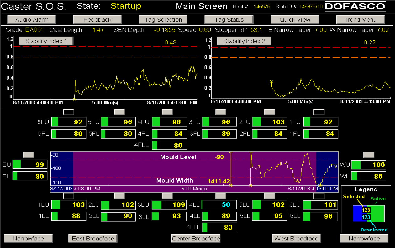
ArcelorMittal’s steel mill in Hamilton, Ontario, (formerly called Dofasco) has used multivariate process monitoring tools in many areas of their plant for decades now. One of their most successful applications is that applied to their casting operation. In this section we only focus on the application; the sort of multivariate calculations used by this system are discussed later on.
The computer screenshot shows the monitoring system, called Caster SOS (Stable Operation Supervisor), which is followed by the operators. There are several charts on the screen: two charts, called “Stability Index 1” and “Stability Index 2”, are one-sided monitoring charts. Notice the warning limits and the action limits. In the middle is a two-sided chart. A wealth of information is presented on the screen - their design was heavily influenced and iterated on several times, working with the operators. The screen shot is used with permission of Dr. John MacGregor.
The economics of monitoring charts cannot be overstated. The ArcelorMittal example above was introduced around 1997. The calculations required by this system are complex - however the computer systems performs them in near real-time, allowing the operators to take corrective action within a few seconds. The data show a significant reduction in breakouts since 1997 (used with permission of Dr. John MacGregor).
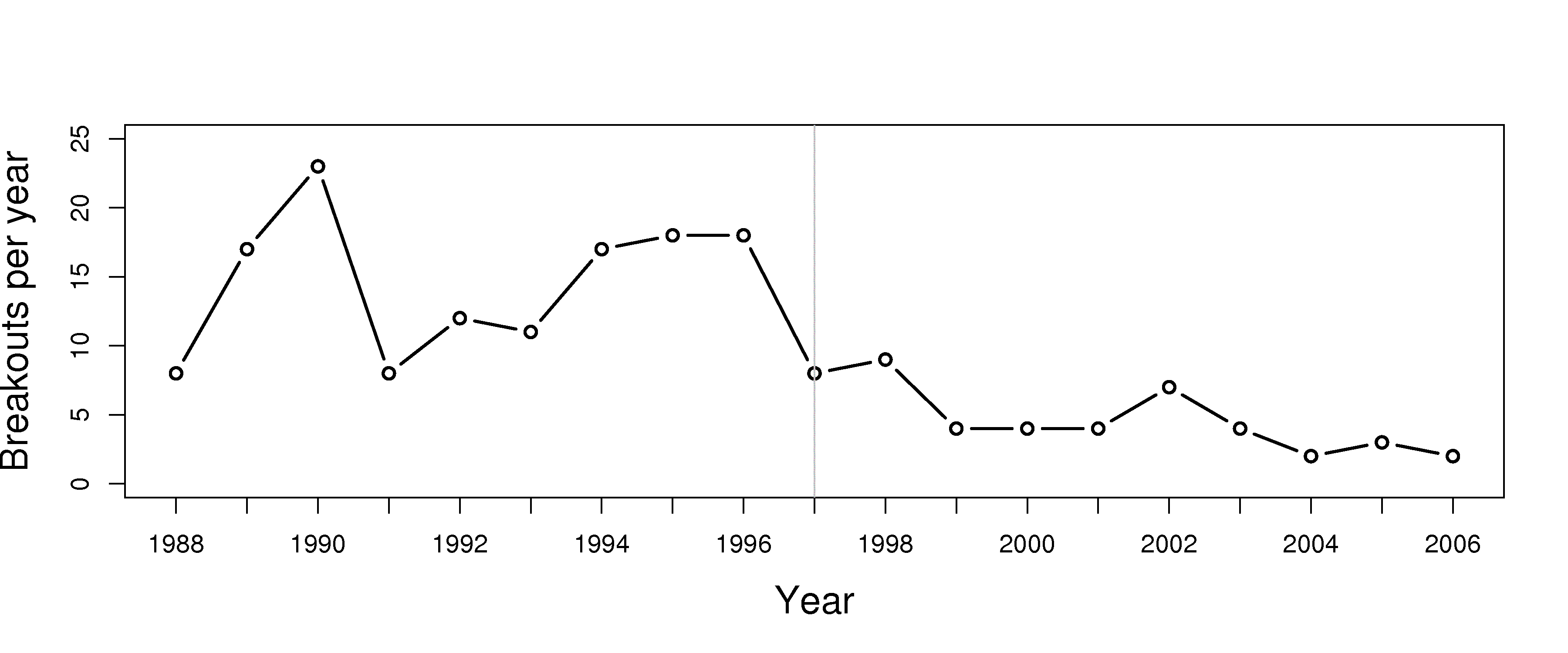
The economic savings and increased productivity is in the millions of dollars per year, as each breakout costs around $200,000 to $500,000 due to process shutdowns and/or equipment damage.