
 Download PDF of entire book
1.10. Exercises
Question
The data shown here are the number of visits to a university website for a particular statistics course. There are 90 students in the class.

What are the names (type) of the 2 plots shown?
List any 2 interesting features in these data.
Solution
The plots are a time-series plot and a sparkline. The sparkline shows exactly the same data, just a more compact form (without the labelling on the axes).
Features shown in the data are:
A noticeable weekly cycle; probably assignments are due the next day!
A sustained, high level of traffic in the first week of February - maybe a midterm test.
Some days have more than 90 visits, indicating that students visit the site more than once per day, or due to external visitors to the site.
Question
What are the names of the axes on a bar plot?
Solution
The category axis and value axis.
Question
Which types of features can the human eye easily pick out of a time-series plot?
Solution
Features such as sinusoids, spikes, gaps (missing values), upward and downward trends are quickly picked out by the human eye, even in a poorly drawn plot.
Question
Why is the principle of minimizing “data ink” so important in an effective visualization? Give a scientific or engineering example of why this is important.
Solution
It reduces the time or work to interpret that plot, by eliminating elements that are non-essential to the plot’s interpretation. Situations which are time or safety critical are examples, for example in an operator control room, or medical facility (operating room).
Question
Describe what the main difference(s) between a bar chart and a histogram are.
Solution
The solution is taken directly from: https://www.forbes.com/sites/naomirobbins/2012/01/04/a-histogram-is-not-a-bar-chart/
Histograms are used to show distributions of variables while bar charts are used to compare variables.
Histograms plot quantitative data with ranges of the data grouped into bins or intervals while bar charts plot categorical data.
Bars can be reordered in bar charts but not in histograms.
There are no spaces between the bars of a histogram since there are no gaps between the bins. An exception would occur if there were no values in a given bin but in that case the value is zero rather than a space. On the other hand, there are spaces between the variables of a bar chart.
The bars of bar charts typically have the same width. The widths of the bars in a histogram need not be the same as long as the total area is one hundred percent if percents are used or the total count if counts are used. Therefore, values in bar charts are given by the length of the bar while values in histograms are given by areas.
Question
Write out a list of any features that can turn a plot into a poor visualization. Think carefully about plots you encountered in textbooks and scientific publications, or the lab reports you might have recently created for a university or college course.
Question
The following graphics were shown in the print issue of The Economist in the 28 November 2009 issue, page 85. The article attempts to argue that there are enough similarities between Japan’s stagnant economic experience in the 1990’s (known as “Japan’s Lost Decade”), and the current experience in the “rich world” western countries to give their policymakers pause for concern. You can read the full article here. What problems do you notice with the graphics?

Solution
There are several problems with this graphical comparison, but the main concerns are with showing time trends as bar plots, and the alignment of the time trends.
The purpose of the plot is to show the similarities between Japan in the 1990’s to the current trends (2000’s) in Britain and USA. The data from 2000 onwards for Japan is therefore irrelevant in this case.
The data are time-based: a bar-plot is a poor choice to show time-based trends.
Notice the symmetry above and below the zero line: in colours: “light blue + grey = dark blue”, i.e. “General government balance + Net capital inflow = Private financial balance”. Given this constraint, only 2 of the 3 variables are required. As I’m not an economics expert, I have no idea which 2 of the 3 would be most relevant.
The data for Japan from the 1990’s should be shown on the same plot for USA and Britain for the 2000’s, since that was the purpose - to show a comparison between Japan’s experience and the USA/Britain experience. One way to do this: plot three lines on a time-series chart: one for each of Japan, Britain and USA for “General government balance”. Then have a second plot, similar to the first, showing the “Private financial balance”.
Minor problems are:
The colour scheme is poor: four different shades of blue are used (two background shades, and two of the time-based parameters)
The use of stacked bar plots is almost always problematic: the reader cannot tell whether the bars show cumulative or incremental amounts, unless they know the subject matter or read the accompanying text.
Question
This figure is a screenshot from a Toronto Star article about mortgage payments as a function of the interest rate. Redraw the same information in a more suitable form.

Solution
The data from this article are needlessly embellished with a picture of a house, a $20,000 bill and a stake in the ground.
A simple annotated table will show the data well enough. A bar chart, horizontally or vertically aligned is not suitable.

Some people have suggested using a scatter plot - I never thought of that, but it works. It shows a straight line relationship between interest rate and the monthly payment. I suppose the advantage of that plot is that you can see (a) the relationship is linear, which it should be, and (b) you can visually interpolate the monthly payment given any interest rate between 2 and 5%.
A key point though: the mortgage amount and the amortization period must be shown with the plot or table. The cost of the house and the downpayment are actually irrelevant. You are paying interest on the mortgage amount, where \(\text{mortgage amount} = \text{cost of the house} + \text{mortgage insurance} - \text{downpayment}\). The table or the plot will change if either of those two variables change. Your monthly payment is higher for shorter amortization periods, and for larger mortgage amounts.
Question
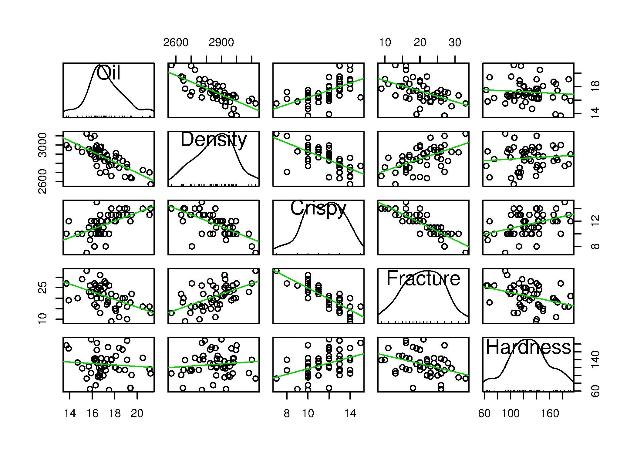
This question is an extension to visualizing more than 3 variables. Investigate on your own the term “scatterplot matrix”, and draw one for the Food texture data set. See the car library in R to create an effective scatterplot matrix with the scatterplotMatrix function. List some bullet-points that interpret the plot.
Solution
Python, 8 lines
import pandas as pd
import plotly.express as px

data_file = 'https://openmv.net/file/food-texture.csv'
food = pd.read_csv(data_file)

fig = px.scatter_matrix(food, dimensions=food.columns[1:6])
fig.show()
Plotly plots each variable against itself on the diagonal, giving a straight line. The figure above instead follows the R version, which puts the distribution of each variable there.
R, 6 lines
library(car)
data_file = 'https://openmv.net/file/food-texture.csv'
food <- read.csv(data_file)

# Hide the smoother and its confidence bounds
scatterplotMatrix(food[,2:6], smoother=FALSE)
From this plot we see the 5 univariate distributions on the diagonal, each drawn as a smooth density curve over a rug: a short vertical tick for every value recorded. Each off-diagonal plot is a bivariate scatter plot for one combination of two variables. The trend line (solid orange) shows the linear regression between the two variables. The lower-triangular part of the plot is a 90 degree rotation of the upper-triangular part. Some software packages will just draw either the upper or lower part.
From these plots we quickly gain an insight into the data:
Most of the 5 variables have a normal-like distribution, except for
Crispy, but notice the ticks in the rug below the middle curve: they are equally spaced, indicating the variable is not continuous; it is quantized. TheFracturevariable also displays this quantization. The density curve on its own would smooth this over, which is why the rug is drawn as well.There is a strong negative correlation with oiliness and density: oilier pastries are less dense (to be expected).
There is a positive correlation with oiliness and crispiness: oilier pastries are more crisp (to be expected).
There is no relationship between the oiliness and hardness of the pastry.
There is a negative correlation between density and crispiness (consistent with the prior relationships with
Oil): less dense pastries (e.g. more air in them) are crispier.There is a positive correlation between
DensityandFracture. As described in the dataset file,Fractureis the angle by which the pastry can be bent, before it breaks; more dense pastries have a higher fracture angle.Similarly, a very strong negative correlation between
CrispyandFracture, indicating the expected effect that very crispy pastries have a low fracture angle.The pastry’s hardness seems to be uncorrelated to all the other 4 variables.
Question
Using the Website traffic data set
Create a chart that shows the variability in website traffic for each day of the week.
Use the same data set to describe any time-based trends that are apparent.
Solution
A suitable chart for displaying variability on a per-day basis is the boxplot, one box for each day of the week. This allows you to see between-day variation when comparing the boxes side by side, and to get an impression of the variability within each day, by examining how each box’s horizontal lines are spread out (the 25th, 50th and 75th percentiles).
Python, 15 lines
import pandas as pd
pd.options.plotting.backend = "plotly"

web = pd.read_csv('https://openmv.net/file/website-traffic.csv')

# Re-order the days
day_names = ["Saturday", "Sunday", "Monday", "Tuesday",
             "Wednesday", "Thursday", "Friday"]
web["DayOfWeek"] = pd.Categorical(web["DayOfWeek"],
                                 categories=day_names,
                                 ordered=True)
web = web.sort_values("DayOfWeek")

fig = web.plot.box(x="DayOfWeek", y="Visits")
fig.show()
R, 7 lines
web = read.csv('https://openmv.net/file/website-traffic.csv')

# Re-order the factors in this order
day.names = c("Saturday", "Sunday", "Monday", "Tuesday",
              "Wednesday","Thursday", "Friday" )
days = factor(web$DayOfWeek, levels=day.names)
boxplot(web$Visits ~ days)
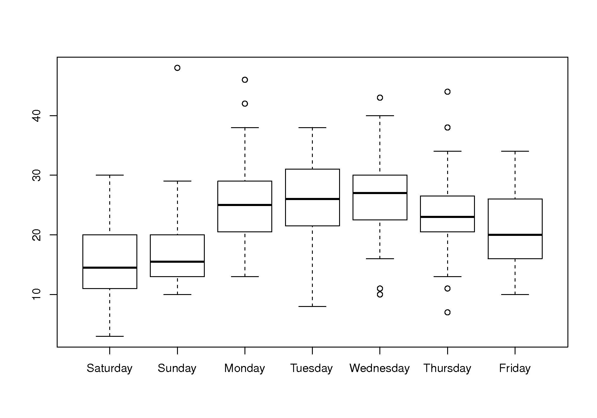
The box plot shows:
Much less website traffic on Saturdays and Sundays, especially Sunday which has less spread than Saturday.
Visits increase during the weekday, peaking on Wednesday and then dropping down by Friday.
All week days seem to have about the same level of spread, except Friday, which is more variable.
This is a website of academic interest, so these trends are expected.
A time-series plot of the data shows increased visits in September and October, and declining visits in November and December. This coincides with the phases of the academic term. A plot of the total number of visits within each month will show this effect clearly. The lowest number of visits were recorded in late June and July.

The best way to draw the time-series plot is to use proper time-based labelling on the x-axis, but we won’t cover that topic here. If you are interested, read up about the xts package (see the R tutorial) and its plot command; in Python, convert the column to a real date with pd.to_datetime and plot against that. Both approaches are shown in the code below:
Python, 19 lines
import pandas as pd pd.options.plotting.backend = "plotly" web = pd.read_csv('https://openmv.net/file/website-traffic.csv') # Sequence plot of the raw integer index fig = web["Visits"].plot.line(markers=True) fig.update_layout(xaxis_title_text="Sequence order", yaxis_title_text="Visits") fig.show() # A better plot using a real date axis web["Date"] = pd.to_datetime(web["MonthDay"].str.strip(), format="%B %d") web = web.sort_values("Date").set_index("Date") fig = web["Visits"].plot.line() fig.update_xaxes(tickformat="%b") fig.update_layout(yaxis_title_text="Visits") fig.show()R, 10 lines
web = read.csv('https://openmv.net/file/website-traffic.csv')

layout(matrix(c(1,2), 1, 2))
plot(web$Visits, type="o")

# A better plot using the xts library
library(xts)
date.order = as.Date(web$MonthDay, format=" %B %d")
web.visits = xts(web$Visits, order.by=date.order)
plot(web.visits, major.format="%b")
Question

What type of plot is shown here?
Describe the two phenomena displayed.
Which plot type asks you to draw a cause and effect relationship between two variables?
Use rough values from the given plot to construct an approximate example of the plot you proposed in part 3.
What advantage is there to the plot given here, over the type in your answer to part 3?
Solution
A time-series plot.
The rate of cellphone usage (expected to be proportional to number of mobile phone antennae) has increased in Colombia, especially since 2002. Likely this is the usual case where the price comes down, leading to greater use. Though some other political or economic change may have taken place in 2002 leading to increased phone use.
The rate of kidnappings peaked in 2000, at a rate of 8 per 100,000 residents, and has steadily decreased since that peak.
A scatter plot.
A scatter plot, from approximate values on the plot, is generated by the following code (you may use any software to construct your plot)
Python, 18 lines
# Approximate values read off the time-series plot, 1996 to 2007.
import pandas as pd

pd.options.plotting.backend = "plotly"

colombia = pd.DataFrame({
    "Year": range(1996, 2008),
    "Kidnap": [4, 5, 6.5, 7.5, 8.75, 7, 7, 5, 3.25, 2, 1.5, 1.25],
    "Mobile": [0.3, 0.4, 0.5, 0.6, 0.7, 0.8, 0.9, 2, 3.5, 4.25, 6.5, 7.25],
})

fig = colombia.plot.scatter(x="Mobile", y="Kidnap", text="Year")
fig.update_traces(mode="markers")
fig.update_layout(
    xaxis_title_text="Mobile phone antennae [thousands]",
    yaxis_title_text="Kidnappings per 100,000 residents",
)
fig.show()
or the equivalent in R:
S, 5 lines
# Data from 1996 to 2007
kidnap <- c(  4,   5, 6.5, 7.5, 8.75,   7,   7, 5, 3.25,    2, 1.5, 1.25)
mobile <- c(0.3, 0.4, 0.5, 0.6,  0.7, 0.8, 0.9, 2,  3.5, 4.25, 6.5, 7.25)
plot(mobile, kidnap, type='p', xlab="Mobile phone antennae [thousands]",
     ylab="Kidnappings per 100,000 residents")

The advantage of the time-series plot is that you are able to clearly see any time-based trends - those are lost in the scatter plot (though you can recover some time-based information when you connect the dots in time order).
Comment:
The general negative correlation in the scatter plot, and the trends observed in the time-series plots ask you to infer a relationship between the two trajectories. In this case the plot’s author would like you to infer that increased cellphone penetration in the population has been (partly) responsible for the reduction in kidnappings.
This relationship may, or may not be, causal in nature. The only way to ascertain causality would be to do an experiment: in this case, you would remove cellphone antennae and see if kidnappings increased again. This example outlines the problem with trends and data observed from society - we can never be sure the phenomena are causal:
firstly we couldn’t possibly perform that experiment of removing cell towers, and
even if we could, the time scales are too long to control the experimental conditions: something else would change while we were doing the experiment.
To compensate for that, social science studies compare similar countries - for example the original article from The Economist’s website shows how the same data from Mexico and Venezuela were compared to Colombia’s data. The article also shows how much of the trend was due to political changes in the country that were happening at the same time: in particular a 3rd factor not shown in the plots was largely responsible for the decrease in kidnappings. Kidnappings would probably have remained at the same level if it were not also for the increase in the number of police officers, who are able to respond to citizens’ cellphone calls.
Fortunately in engineering situations we deal with much shorter time scales, and are able to better control our experiments. However the case of an uncertain 3rd factor is prevalent and must be guarded against - we’ll learn about this in the section on design of experiments.
Question
Load the room temperature dataset into R, Python or MATLAB, or whichever software tool you prefer to plot with.
Plot the 4 trajectories,
FrontLeft,FrontRight,BackLeftandBackRighton the same plot.Comment on any features you observe in your plot.
Be specific and describe how sparklines of these same data would improve the message the data is showing.
Solution
You could use the following code to plot the data:
Python, 18 lines
import pandas as pd
pd.options.plotting.backend = "plotly"

data_file = 'https://openmv.net/file/room-temperature.csv'
roomtemp = pd.read_csv(data_file)
roomtemp.describe()

fig = roomtemp[["FrontLeft", "FrontRight",
                "BackLeft", "BackRight"]].plot.line(
    color_discrete_sequence=["blue", "royalblue",
                             "black", "dimgray"],
)
fig.update_layout(
    yaxis_range=[290, 300],
    xaxis_title_text="Sequence order",
    yaxis_title_text="Room temperature [K]",
)
fig.show()
R, 32 lines
data_file = 'https://openmv.net/file/room-temperature.csv'
roomtemp <- read.csv(data_file)
summary(roomtemp)
ylim = c(290, 300)

plot(roomtemp$FrontLeft,
         type='l',
         col="blue",
         ylim=c(290, 300),
         xlab="Sequence order",
         ylab="Room temperature [K]")
lines(roomtemp$FrontRight,
         type='b',
         pch='o',
         col="blue")
lines(roomtemp$BackLeft,
         type='l',
         col="black")
lines(roomtemp$BackRight,
         type='b',
         pch='o',
         col="black")

legend(20, 300,
         legend=c("Front left",
                  "Front right",
                  "Back left",
                  "Back right"),
        col=c("blue", "blue",
              "black", "black"),
        lwd=2,
        pch=c(NA, "o", NA, "o"))
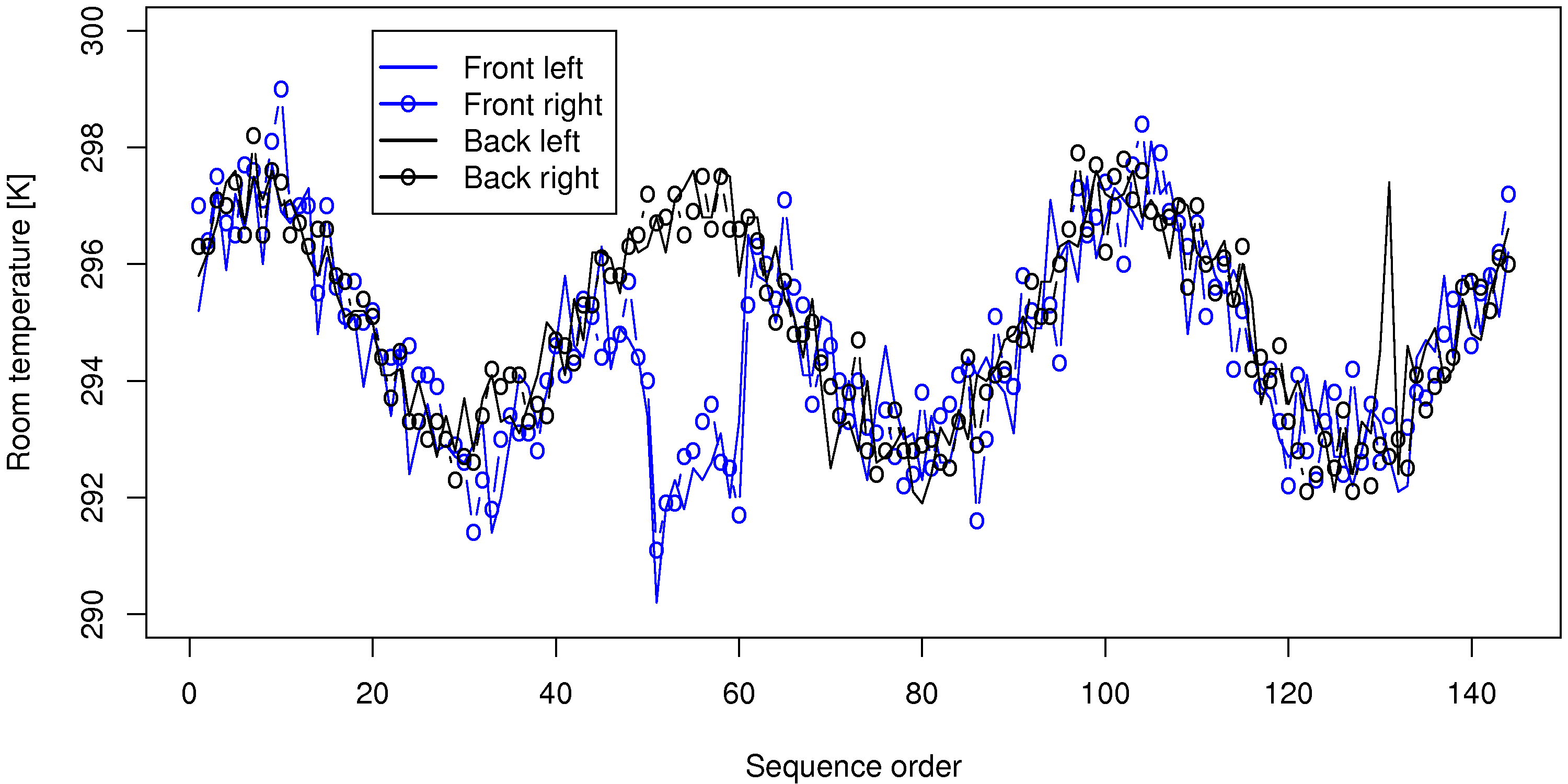
A sequence plot of the data is good enough, though a time-based plot is better.
Oscillations, with a period of roughly 48 to 50 samples (corresponding to 24 hours), show a daily cycle in the temperature.
All 4 temperatures are correlated (move together).
There is a break in the correlation around samples 50 to 60 on the front temperatures (maybe a door or window was left open?). Notice that the oscillatory trend still continues within the offset region - just shifted lower.
A spike up in the room’s back left temperature, around sample 135.
The above plot was requested to be on one axis, which leads to some clutter in the presentation. Sparklines show each trajectory on their own axis, so it is less cluttered, but the same features would still be observed when the 4 tiny plots are stacked one on top of each other.
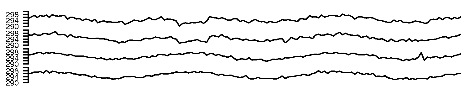
If you looked around for how to generate sparklines in R you may have come across this website. Notice in the top left corner that the
sparklinesfunction comes from theYaleToolkit, which is an add-on package to R. We show how to install packages in the tutorial. Once installed, you can try out thatsparklinesfunction:First load the library:
library(YaleToolkit)Then see the help for the function:
help(sparklines)to see how to generate your sparklines
Question
Load the six point board thickness dataset, available from datasets website.
Plot a boxplot of the first 100 rows of data to match the figure in these notes
Explain why the thick center line in the box plot is not symmetrical with the outer edges of the box.
Solution
The following code will load the data, and plot a boxplot for the first 100 rows:
Python, 12 lines
import pandas as pd
pd.options.plotting.backend = "plotly"

data_file = 'https://openmv.net/file/six-point-board-thickness.csv'
boards = pd.read_csv(data_file)
boards.describe()

# Ignore the first date/time column; use only Pos1...Pos6
first100 = boards.iloc[:100, 1:7]
fig = first100.plot.box()
fig.update_layout(yaxis_title_text="Thickness [mils]")
fig.show()
R, 10 lines
data_file = 'https://openmv.net/file/six-point-board-thickness.csv'
boards <- read.csv(data_file)
summary(boards)

plot(boards[1:100,2], type='l')
plot(boards[1:100,5], type='l')
first100 <- boards[1:100, 2:7]

# Ignore the first date/time column: using only Pos1, Pos2, ... Pos6 columns
boxplot(first100, ylab="Thickness [mils]")
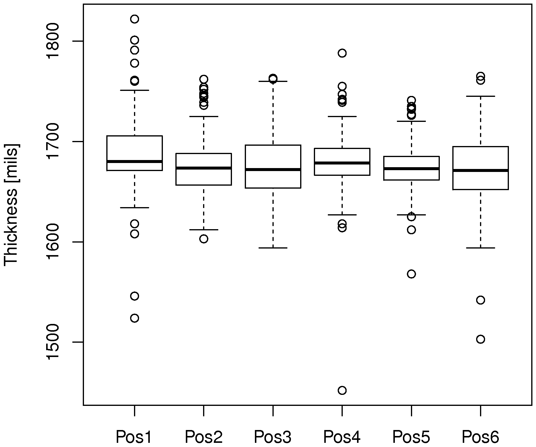
The thick center line on each boxplot is the median (50th percentile) of that variable. The bottom and top edges of the box are at the 25th and 75th percentiles, respectively. If the data are from a symmetric distribution, such as the \(t\) or normal distribution, then the median should be approximately centered between those 2 percentiles. The fact that it is not, especially for position 1, indicates the data are skewed: either to the left (median closer to the upper edge) or to the right (median closer to the lower edge).
Question
Consider this plot from the Economist article regarding “Working hours”
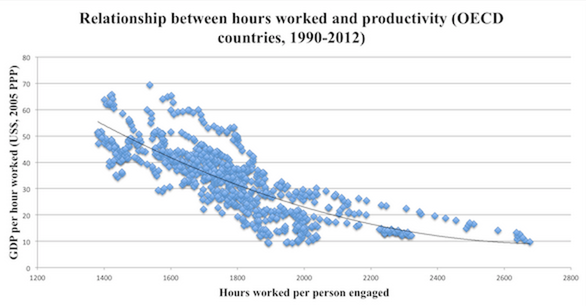
What is the plot’s author trying to convey with this scatter plot?
Do you believe this an effective and complete message (i.e. could you improve it somehow?)
Is there a causal mechanism at play between the two variables?
How would you confirm or disprove the message the plot’s author is making?
Solution
The message is likely that longer working hours do not translate into greater earnings (measured with GDP) as might be expected. In fact, the opposite holds: longer working hours are correlated with lower earnings (we say: “there’s a negative correlation between working hours and earnings”). The axes have been scaled to account for purchasing power.
As the original article alludes, there are differences between countries; and given the large number of points on the plot (well over 200) it is safe to assume that there are several points per country, showing the shifts over time. As a result, colour coding, or using different markers to show each country’s shift and change over time will provide some additional insight. For example, the line of points stretching from 2200 to 2600 on the x-axis: is that due to one country and in which direction is it moving over time (left or right)?
Some students rightly pointed out that policy shifts occurred during this period; some countries joined the EU, and that may have led to a change in the plots. So the picture is by no means complete. However, the picture is almost never complete for any data set.
This is a tough one to answer. The data are compelling in their lack of scatter. Usually systems with dubious correlations show a high degree of scatter. As before, colour or shape codes for each country will give a better idea of cause and effect. I suspect this plot shows a strong correlation simply because there are small clusters for each country that are close together, but the negative trend simply comes from a country-to-country difference.
As emphasized before in this course, we can only truly tell causality by doing an experiment. Here there are no major ethical obligations, however it is unlikely that you would be able to convince companies to enforce short vs long working hours so you can observe productivity. The time before the change also takes effect is likely very long.
So the answer is yes, maybe there is a causal mechanism here that is plausible (we’ve often heard that people whose work-life balance is better are more productive), but we cannot test it explicitly.
Also see the prior answer: it would require experiments over a broad range of employment types and regions, using shorter and longer working hours, and measuring the corresponding earnings.
Question
Read the short, clearly written article by Stephen Few on the pitfalls of pie charts: Save the pies for dessert, https://www.perceptualedge.com/articles/08-21-07.pdf. The article presents an easy-to-read argument against pie charts that will hopefully convince you.
Here’s a great example that proves his point from the Canada Revenue Agency.
Question
Enrichment:
Watch this 20 minute video that shows how a 2-dimensional plot comes alive to show 5 dimensions of data. What are the 5 dimensions?
A condensed version from this, 4 minute YouTube video shows Hans Rosling giving a new perspective on the same data. This Economist article has some interesting background on Dr. Rosling, as does this page, giving a selection of his work.