
 Download PDF of entire book
1.6. Relational graphs: scatter plots
This is a plot many people are comfortable using. It helps you understand the relationship between two variables - a bivariate plot - as opposed to the previous charts that are univariate. A scatter plot is a collection of points shown inside a box formed by two axes at 90 degrees to each other. The marker’s position is located at the intersection of the values shown on the horizontal (x) axis and vertical (y) axis.
The unspoken intention of a scatter plot is usually to ask the reader to draw a causal relationship between the two variables. However, not all scatter plots actually show causal phenomena, as the figure below tries to convince you:
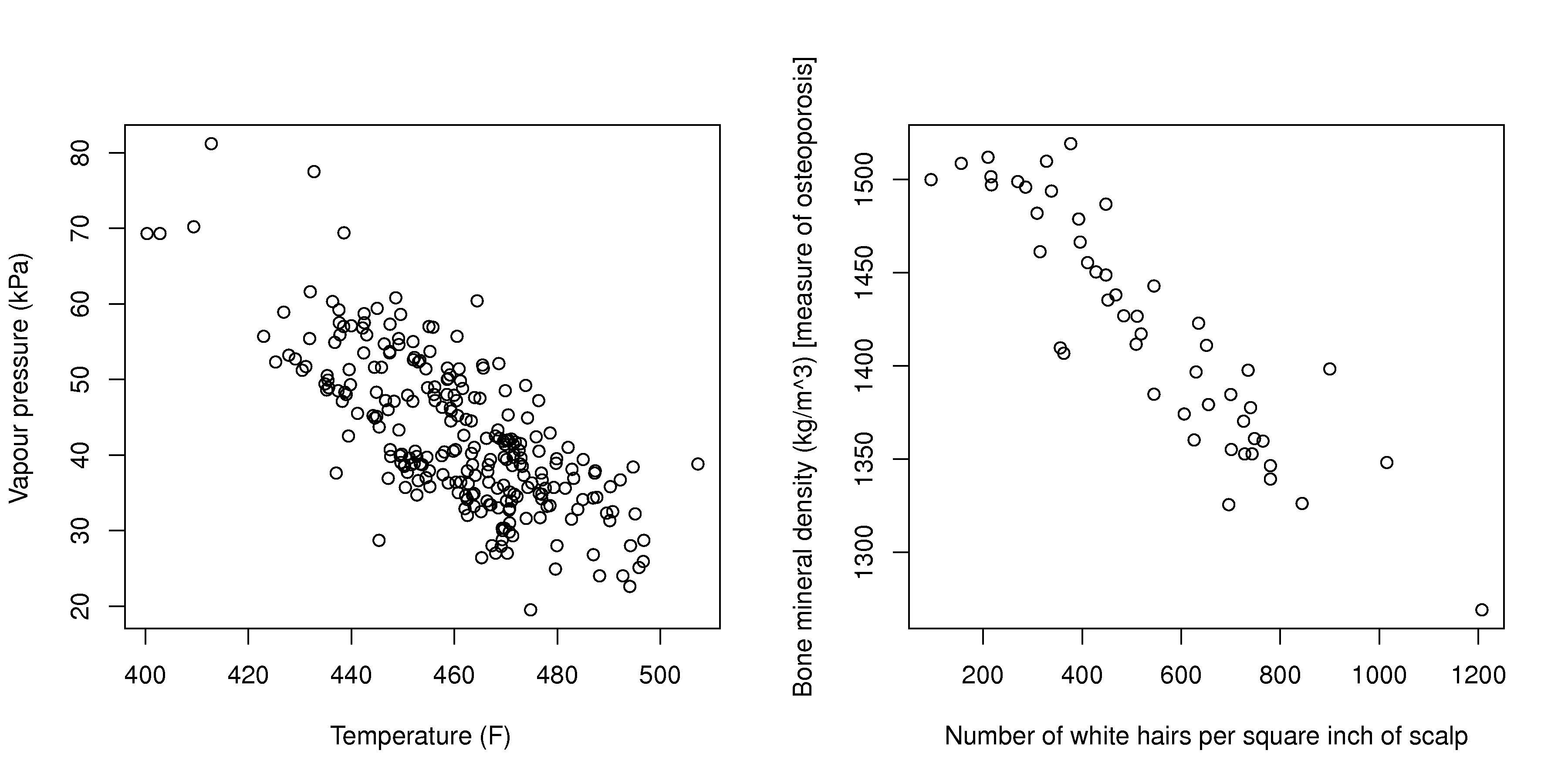
The left-hand plot shows measurements from a distillation column: the temperature on a tray and the vapour pressure of the product move together because of a real physical mechanism. The right-hand plot shows (simulated) data of the number of white hairs on a person’s scalp against their bone mineral density. The negative correlation is just as clear, yet neither variable causes the other: both change with a third variable that is not on the plot, the person’s age. Such a hidden third variable is called a lurking variable. A scatter plot shows the association between two variables; it cannot, on its own, tell you whether that association is causal. Establishing causality requires deliberately changing one variable and observing the response, which is the subject of the chapter on designed experiments.
This source code generates similar, but not identical, figures to those shown here in the text.
Python, 34 lines
import numpy as np
import pandas as pd

pd.options.plotting.backend = "plotly"

# Plot of temperature vs vapour pressure.
data_file = "http://openmv.net/file/distillation-tower.csv"
distillation = pd.read_csv(data_file)
fig = distillation.plot.scatter(x="Temp9", y="VapourPressure")
fig.update_layout(
    xaxis_title_text="Temperature (F)",
    yaxis_title_text="Vapour pressure (kPa)",
)
fig.show()

# Plot of white hairs vs BMD.
#   Osteoporosis (fake) data: number of white
#   hairs per square inch vs bone mineral
#   density (measurement of osteoporosis)
#   in kg/m^3 (1500 kg/m3 is typical).
N = 50
white_hairs = np.round(np.random.normal(loc=500, scale=150, size=N))
bone_mineral_density = (
    -0.25 * white_hairs + 1550 + np.random.normal(loc=0, scale=25, size=N)
)
osteo = pd.DataFrame(
    {"white_hairs": white_hairs, "bone_mineral_density": bone_mineral_density}
)
fig = osteo.plot.scatter(x="white_hairs", y="bone_mineral_density")
fig.update_layout(
    xaxis_title_text="Number of white hairs per square inch of scalp",
    yaxis_title_text="Bone mineral density (kg/m^3) [measure of osteoporosis]",
)
fig.show()
The equivalent code in R:
R, 23 lines
# Plot of temperature vs vapour pressure
data_file = "http://openmv.net/file/distillation-tower.csv"
distillation = read.csv(data_file)

plot(distillation$Temp9,
     distillation$VapourPressure,
     xlab="Temperature (F)",
     ylab="Vapour pressure (kPa)")

# Plot of white hairs vs BMD
#    Osteoporosis (fake) data: number of white
#    hairs per square inch vs bone mineral
#    density (measurement of osteoporosis)
#    vs kg/m^3 (1500 kg/m3 is typical)
N = 50
white.hairs = round(rnorm(N,
                    mean=500,
                    sd=150))
bone.mineral.density = -0.25 * white.hairs + 1550 + rnorm(N, mean=0, sd=25)

plot(white.hairs, bone.mineral.density,
     xlab = "Number of white hairs per square inch of scalp",
     ylab = "Bone mineral density (kg/m^3) [measure of osteoporosis]")
Strive for graphical excellence by doing the following:
Make each axis as tight as possible.
Avoid heavy grid lines.
Use the least amount of ink.
Do not distort the axes.
There is an unfounded fear that others won’t understand your 2D scatter plot. Tufte (2001) (Visual Display of Quantitative Information, p 83) shows that there are no scatter plots in a sample (1974 to 1980) of U.S., German and British dailies, despite studies showing that 12-year-olds can interpret such plots: Japanese newspapers frequently use them.
You will see this in industrial settings as well. The next time you go into an industrial control room (or look carefully at some screens in online videos), try finding any scatter plots. The audience is not to blame: it is the producers of these charts who assume the audience is incapable of interpreting them.
Note
Assume that if you can understand the plot, so will your audience.
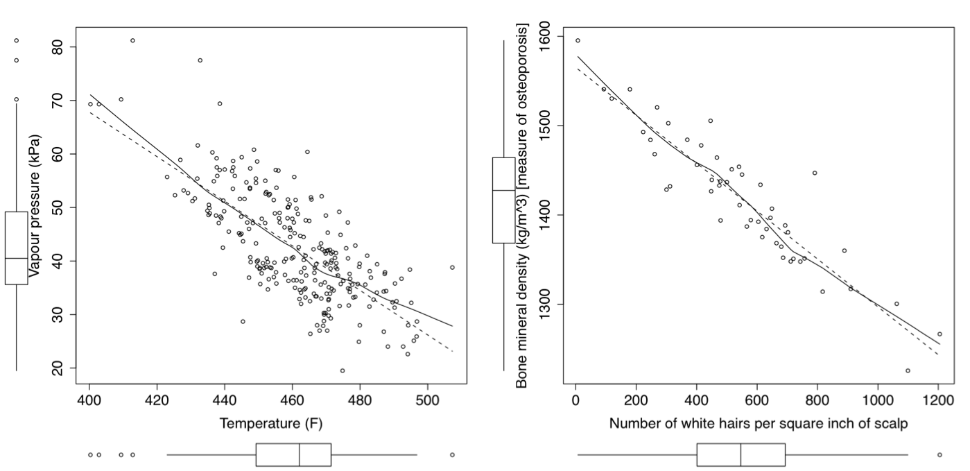
Further improvements can be made to your scatter plots. For example, extend the frames only as far as your data, and add a regression line where appropriate:
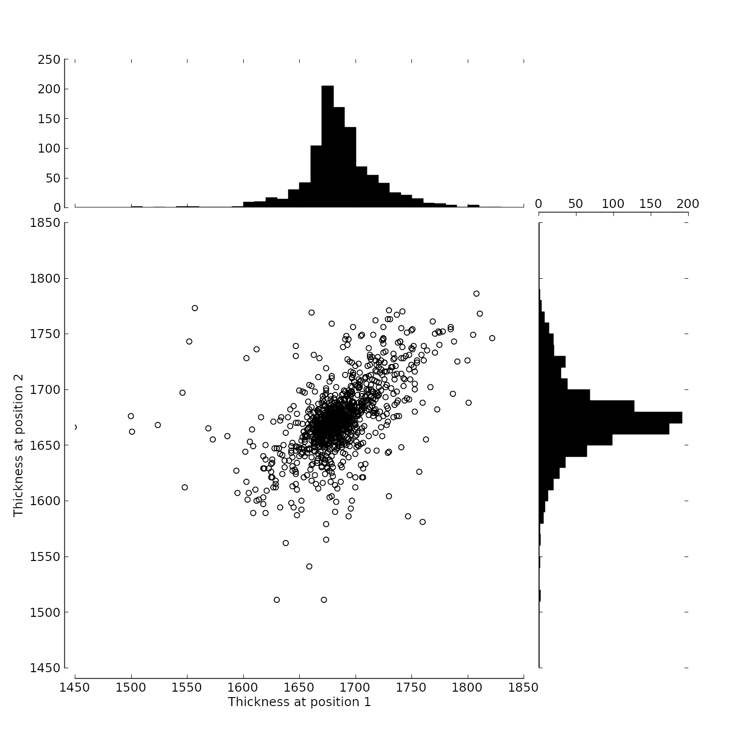
You can add box plots and histograms to the side of the axes to aid interpretation:
Add a third variable to the plot by adjusting the marker size, and add a fourth variable with the use of colour:
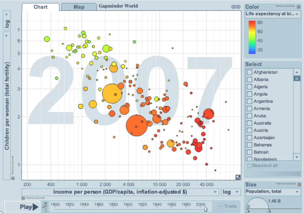
This example, from GapMinder (https://gapminder.org), shows data until 2007 for:
income per person (x-axis);
against fertility (y-axis);
the size of each data point is proportional to the country’s population;
the marker colour shows life expectancy at birth (years);
and the GapMinder website allows you to “play” the graph over time, effectively adding a fifth dimension to the 2D plot.
So 5 dimensions are shown on a 2D surface. A 6th dimension could be added with a technology such as a virtual-reality display, using the third spatial dimension to show another variable from the data set.
Use the hyperlink above to see how countries move towards higher income and lower fertility over time.