
 Download PDF of entire book
6.5.21. PCA Exercises
Each exercise introduces a new topic or highlights some interesting aspect of PCA.
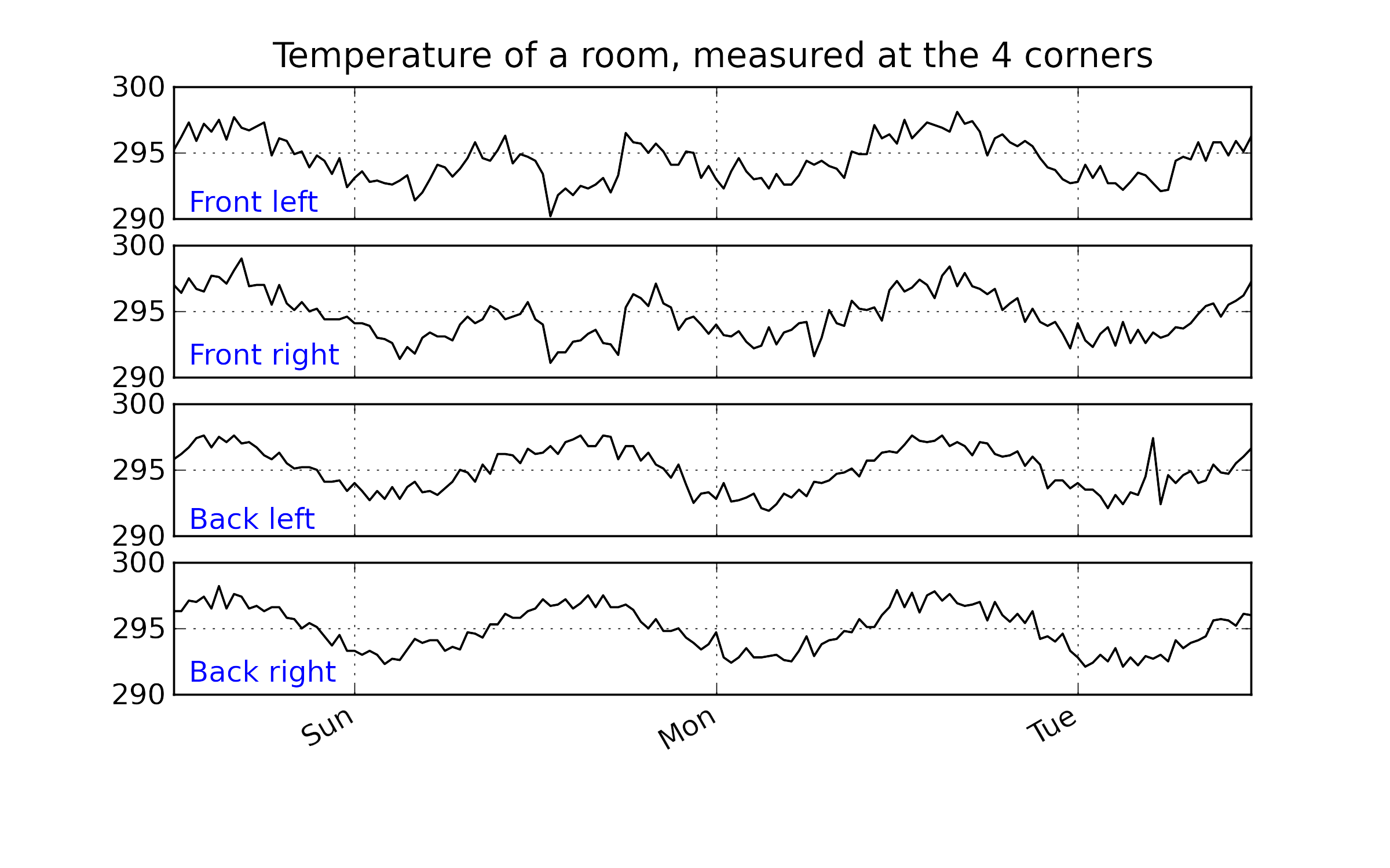
6.5.21.1. Room temperature data
\(N = 144\)
\(K = 4\) + 1 column containing the date and time at which the 4 temperatures were recorded
Web address: https://openmv.net/info/room-temperature
Description: Temperature measurements from 4 corners of a room
Objectives
Before even fitting the model:
How many latent variables do you expect to use in this model? Why?.
What do you expect the first loading vector to look like?
Now build a PCA model using any software package.
How much variation was explained by the first and second latent variables? Is this result surprising, given the earlier description of the dataset?
Plot a time series plot (also called a line plot) of \(t_1\). Did this match your expectations? Why/why not?
Plot a bar plot of the loadings for the second component. Given this bar plot, what are the characteristics of an observation with a large, positive value of \(t_2\); and a large, negative \(t_2\) value?
Now plot the time series plot for \(t_2\). Again, does this plot match your expectations?
Now use the concept of brushing to interrogate and learn from the model.
Plot a score plot of \(t_1\) against \(t_2\).
Also plot the time series plot of the raw data.
Select a cluster of interest in the score plot and see the brushed values in the raw data. Are these the values you expected to be highlighted?
Next plot the Hotelling’s \(T^2\) line plot, as described earlier. Does the 95% limit in the Hotelling’s \(T^2\) line plot correspond to the 95% limit in the score plot?
Also plot the SPE line plot. Brush the outlier in the SPE plot and find its location in the score plot.
Why does this point have a large SPE value?
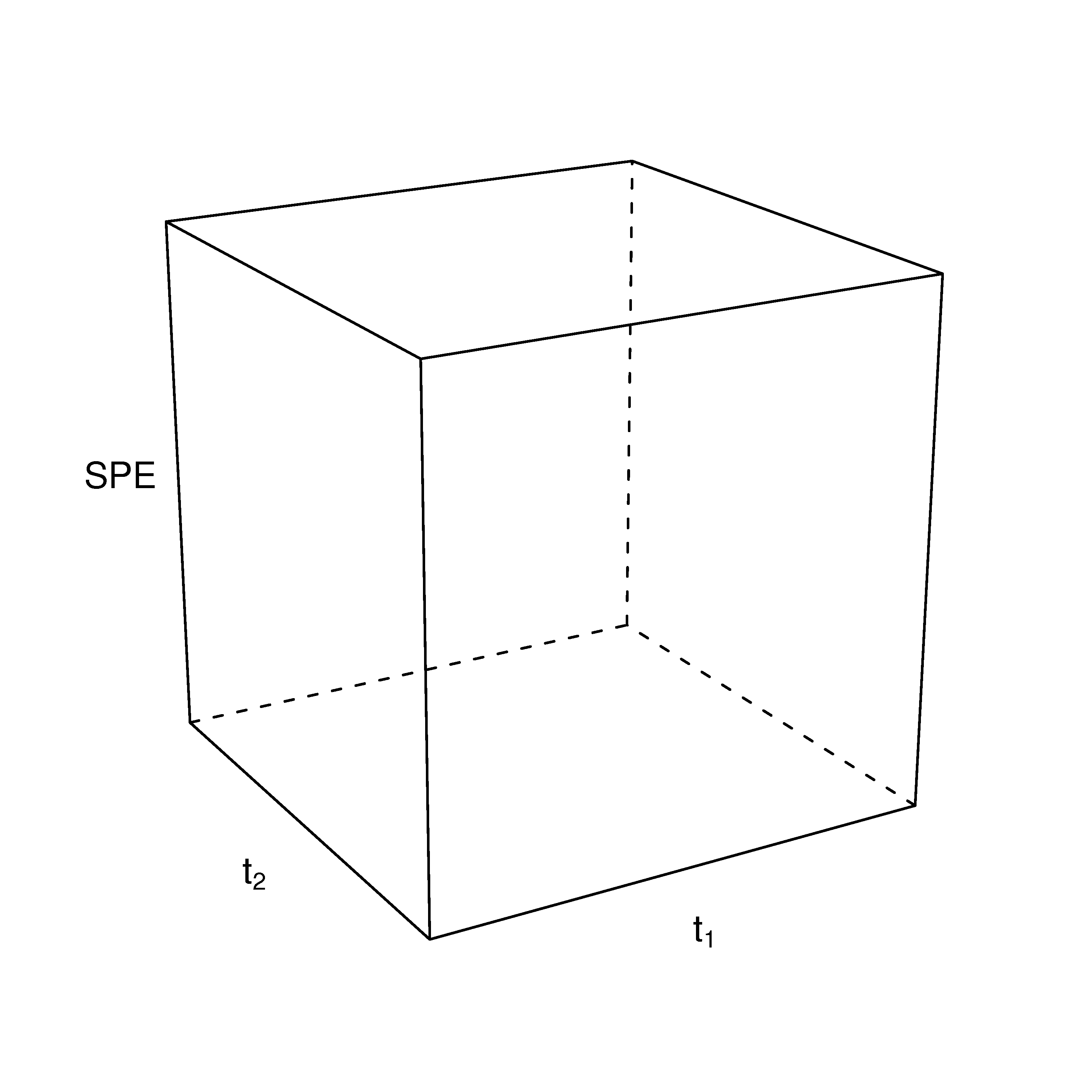
Describe how a 3-D scatter plot would look with \(t_1\) and \(t_2\) as the \((x,y)\) axes, and SPE as the \(z\)-axis.
What have we learned?
Interpreted that a latent variable is often a true driving force in the system under investigation.
How to interpret a loadings vector and its corresponding score vector.
Brushing multivariate and raw data plots to confirm our understanding of the model.
Learned about Hotelling’s \(T^2\), whether we plot it as a line plot, or as an ellipse on a scatter plot.
We have confirmed how the scores are on the model plane, and the SPE is the distance from the model plane to the actual observation.
6.5.21.2. Food texture data set
\(N = 50\)
\(K = 5\) + 1 column containing the labels for each batch
Web address: https://openmv.net/info/food-texture
Description: Data from a food manufacturer making a pastry product. Each row contains the 5 quality attributes of a batch of product.
Fit a PCA model.
Report the \(R^2\) values for the overall model and the \(R^2\) values for each variable, on a per-component basis for components 1, 2, and 3. Comment on what each latent variable is explaining and by how much.
Plot the loadings plot as a bar plot for \(p_1\). Does this match the values given earlier? Interpret what kind of pastry would have a large positive \(t_1\) value?
What feature(s) of the raw data does the second component explain? Plot sequence-ordered plots of the raw data to confirm your answer.
Look for any observations that are unusual. Are there any unusual scores? SPE values? Plot contribution plots for the unusual observations and interpret them.
Replicate the \(t_1\) score for pastry “B758” by hand. Pastry “B758” is row 36 of the dataset, with raw values
Oil = 21.2,Density = 2570,Crispy = 14,Fracture = 13,Hardness = 105. Using the centring vector \(\bar{x} = [17.2, 2857.6, 11.5, 20.9, 128.2]\) and the standard-deviation vector \([1.6, 124.5, 1.78, 5.47, 31.1]\) from the worked example, scale each variable, then form \(t_1 = 0.46\,x_\text{oil} - 0.48\,x_\text{density} + 0.53\,x_\text{crispy} - 0.50\,x_\text{fract} + 0.15\,x_\text{hard}\). You should get \(t_1 \approx 3.6\). Describe what a pastry with that profile looks like in terms of its five attributes.Repeat for sample 33, with raw values
Oil = 15.5,Density = 3125,Crispy = 7,Fracture = 33,Hardness = 92. You should get \(t_1 \approx -4.14\) by hand; the fitted model reports \(-4.17\), and the gap comes from the rounded loadings, means and standard deviations used in the hand calculation. Contrast this attribute profile against pastry B758. Which contributions to \(t_1\) (variable-by-variable) are largest in magnitude for each of the two pastries, and what does that tell you about which raw measurements drive the first component?
Reproducing this analysis in Python
The block below runs the whole analysis end-to-end, including the hand-calculation verifications for questions 6 and 7. It uses the same
process-improve package and plotly idiom as the rest of the book.
Python, 68 lines
import numpy as np
import pandas as pd
import plotly.graph_objects as go
from plotly.subplots import make_subplots
from process_improve.multivariate import PCA, MCUVScaler

food = pd.read_csv("https://openmv.net/file/food-texture.csv", index_col=0)

scaler = MCUVScaler().fit(food)
model = PCA(n_components=2).fit(scaler.transform(food))

# Q2: R^2 cumulative and per variable
print("R^2 cumulative:", model.r2_cumulative_.values)
print("R^2 per variable (after 2 components):",
        model.r2_per_variable_.iloc[:, -1].to_dict())

# Q3: bar plot of the first loading p1
p1 = model.loadings_.iloc[:, 0]
fig = go.Figure(go.Bar(x=p1.index, y=p1.values,
        marker_color=["#1f77b4" if v >= 0 else "#d62728" for v in p1.values]))
fig.add_hline(y=0, line_color="black", line_width=0.6)
fig.update_layout(yaxis_title="p1 loading", height=380,
        margin=dict(l=70, r=20, t=20, b=60))
fig.show()

# Q4: scores plot t1 vs t2, and the raw data in sequence order
fig = model.score_plot(pc_horiz=1, pc_vert=2)
fig.show()

sample = np.arange(len(food))
fig = make_subplots(rows=5, cols=1, shared_xaxes=True, vertical_spacing=0.03,
        subplot_titles=list(food.columns))
for k, col in enumerate(food.columns, start=1):
        fig.add_trace(go.Scatter(x=sample, y=food[col], mode="lines",
                showlegend=False), row=k, col=1)
fig.update_xaxes(title_text="Sample number", row=5, col=1)
fig.update_layout(height=720, margin=dict(l=70, r=20, t=40, b=40))
fig.show()

# Q5: Hotelling's T^2 and SPE
model.t2_plot().show()
model.spe_plot().show()

# Q6: hand calculation of t1 for B758 (row 36, i.e. iloc[35])
xbar_pub = np.array([17.2, 2857.6, 11.5, 20.9, 128.2])
sd_pub = np.array([1.6, 124.5, 1.78, 5.47, 31.1])
p1_pub = np.array([0.46, -0.48, 0.53, -0.50, 0.15])

b758_raw = food.iloc[35].values
b758_scaled = (b758_raw - xbar_pub) / sd_pub
t1_b758 = float(np.dot(b758_scaled, p1_pub))
print(f"Hand-computed t1 for B758: {t1_b758:.2f}  (expect approx 3.6)")
print(f"Model t1 for B758:          {model.scores_.iloc[35, 0]:.2f}")

# Q7: repeat for sample 33 (iloc[32])
s33_raw = food.iloc[32].values
s33_scaled = (s33_raw - xbar_pub) / sd_pub
t1_s33 = float(np.dot(s33_scaled, p1_pub))
print(f"Hand-computed t1 for sample 33: {t1_s33:.2f}  (expect approx -4.14)")
print(f"Model t1 for sample 33:          {model.scores_.iloc[32, 0]:.2f}")

# Variable-by-variable contributions for each pastry, for the comparison
# requested in Q7.
contributions = pd.DataFrame({
        "B758": b758_scaled * p1_pub,
        "Sample 33": s33_scaled * p1_pub,
}, index=food.columns)
print(contributions.round(2))
6.5.21.3. Food consumption data set
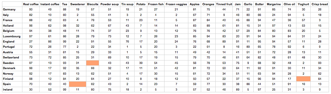
This data set has become a classic data set when learning about multivariate data analysis. It consists of
\(N=16\) countries in the European area
\(K=20\) food items
Missing data: yes
Web address: https://openmv.net/info/food-consumption
Description: The data table lists for each country the relative consumption of certain food items, such as tea, jam, coffee, yoghurt, and others.
Fit a PCA model to the data using 2 components.
Plot a loadings plot of \(p_1\) against \(p_2\). Which are the important variables in the first component? And the second component?
Since each column represents food consumption, how would you interpret a country with a high (positive or negative) \(t_1\) value? Find countries that meet this criterion. Verify that this country does indeed have this interpretation (hint: use a contribution plot and examine the raw data in the table).
Now plot SPE after 2 components (don’t plot the default SPE, make sure it is the SPE only after two components). Use a contribution plot to interpret any interesting outliers.
Now add a third component and plot SPE after 3 components. What has happened to the observations you identified in the previous question? Investigate the loadings plot for the third component now (as a bar plot) and see which variables are heavily loaded in the 3rd component.
Also plot the \(R^2\) values for each variable, after two components, and after 3 components. Which variables are modelled by the 3rd component? Does this match with your interpretation of the loadings bar plot in the previous question?
Now plot a score plot of the 3rd component against the 1st component. Generate a contribution plot in the score from the interesting observation(s) you selected in part 4. Does this match up with your interpretation of what the 3rd component is modelling?
What we learned:
Further practice of our skills in interpreting score plots and loading plots.
How to relate contribution plots to the loadings and the \(R^2\) values for a particular component.
6.5.21.4. Silicon wafer thickness
\(N=184\)
\(K=9\)
Web address: https://openmv.net/info/silicon-wafer-thickness
Description: These are nine thickness measurements recorded from various batches of silicon wafers. One wafer is removed from each batch and the thickness of the wafer is measured at the nine locations, as shown in the illustration.

Build a PCA model on all the data.
Plot the scores for the first two components. What do you notice? Investigate the outliers, and the raw data for each of these unusual observations. What do you conclude about those observations?
Exclude the unusual observations and refit the model.
Now plot the scores plot again; do things look better? Record the \(R^2\) and \(Q^2\) values (from cross-validation) for the first three components. Are the \(R^2\) and \(Q^2\) values close to each other; what does this mean?
Plot a loadings plot for the first component. What is your interpretation of \(p_1\)? Given the \(R^2\) and \(Q^2\) values for this first component (previous question), what is your interpretation about the variability in this process?
And the interpretation of \(p_2\)? From a quality control perspective, if you could remove the variability due to \(p_2\), how much of the variability would you be removing from the process?
Also plot the corresponding time series plot for \(t_1\). What do you notice in the sequence of score values?
Repeat the above question for the second component.
Finally, plot both the \(t_1\) and \(t_2\) series overlaid on the same plot, in time-order, to see the smaller variance that \(t_2\) explains.
Train / test split. Rebuild the model using only the first 100 observations. Then apply that model to all 184 rows as test data, in time order, and plot the Hotelling’s \(T^2\) and SPE traces over the full 184-sample span with a vertical line at sample 100 marking the train / test boundary.
Outlier persistence. Do the wafers you flagged as outliers earlier still appear extreme on this train-on-100 model? Do new outliers surface in samples 101-184? For any sample that crosses the 95% \(T^2\) or SPE limit, plot a contribution plot and report which of the nine grid locations is driving the alarm.
Reproducing this analysis in Python
The block below runs the full exercise end-to-end: an initial all-184 model for outlier scouting, then the train-on-100 / test-on-all-184 variant for questions 10 and 11.
Python, 73 lines
import numpy as np
import pandas as pd
import plotly.graph_objects as go
from process_improve.multivariate import PCA, MCUVScaler

wafer = pd.read_csv("https://openmv.net/file/silicon-wafer-thickness.csv")

# Q1-Q9: PCA on the whole dataset
scaler = MCUVScaler().fit(wafer)
model = PCA(n_components=2).fit(scaler.transform(wafer))
print("R^2 cumulative (all 184):", model.r2_cumulative_.values)

model.score_plot(pc_horiz=1, pc_vert=2).show()
model.t2_plot().show()
model.spe_plot().show()

for a in (1, 2):
        p = model.loadings_.iloc[:, a - 1]
        fig = go.Figure(go.Bar(x=p.index, y=p.values,
                marker_color=["#1f77b4" if v >= 0 else "#d62728" for v in p.values]))
        fig.add_hline(y=0, line_color="black", line_width=0.6)
        fig.update_layout(yaxis_title=f"p{a} loading", height=380,
                margin=dict(l=70, r=20, t=20, b=60))
        fig.show()

sample = np.arange(len(wafer))
fig = go.Figure()
fig.add_trace(go.Scatter(x=sample, y=model.scores_.iloc[:, 0],
        mode="lines", name="t1", line=dict(color="#1f77b4")))
fig.add_trace(go.Scatter(x=sample, y=model.scores_.iloc[:, 1],
        mode="lines", name="t2", line=dict(color="#d62728", dash="dash")))
fig.update_layout(xaxis_title="Sample (wafer index)",
        yaxis_title="Score", height=380)
fig.show()

# Q10: train on the first 100, test on all 184.
train = wafer.iloc[:100]
scaler_t = MCUVScaler().fit(train)
model_t = PCA(n_components=2).fit(scaler_t.transform(train))
result = model_t.diagnose(scaler_t.transform(wafer))

t2 = result.hotellings_t2.iloc[:, -1]
spe = result.spe
t2_limit = float(model_t.hotellings_t2_limit(conf_level=0.95))
spe_limit = float(model_t.spe_limit(conf_level=0.95))

fig = go.Figure()
fig.add_trace(go.Scatter(x=t2.index, y=t2.values, mode="lines",
        name="T^2 (cumulative)"))
fig.add_hline(y=t2_limit, line_color="red", line_dash="dash",
        annotation_text="95% limit")
fig.add_vline(x=99.5, line_color="grey", line_dash="dot",
        annotation_text="train / test boundary")
fig.update_layout(xaxis_title="Sample (wafer index)",
        yaxis_title="Hotelling's T^2", height=380)
fig.show()

fig = go.Figure()
fig.add_trace(go.Scatter(x=spe.index, y=spe.values, mode="lines",
        name="SPE"))
fig.add_hline(y=spe_limit, line_color="red", line_dash="dash",
        annotation_text="95% limit")
fig.add_vline(x=99.5, line_color="grey", line_dash="dot",
        annotation_text="train / test boundary")
fig.update_layout(xaxis_title="Sample (wafer index)",
        yaxis_title="SPE", height=380)
fig.show()

# Q11: which samples cross the 95% limits, in each half of the data?
flagged_t2 = t2[t2 > t2_limit].index.tolist()
flagged_spe = spe[spe > spe_limit].index.tolist()
print("Flagged by T^2:", flagged_t2)
print("Flagged by SPE:", flagged_spe)
What we learned:
Identifying outliers; removing them and refitting the model.
Variability in a process can very often be interpreted. The \(R^2\) and \(Q^2\) values for each component show which part of the variability in the system is due the particular phenomenon modelled by that component.
Splitting the data into a model-building portion (the first 100 wafers) and a held-out portion (the remaining 84) is what tells you whether the structure the model has captured generalises beyond the period it was fit on; new outliers showing up in the held-out portion are the early warning that the process has shifted.
6.5.21.5. Process troubleshooting
Recent trends show that the yield of your company’s flagship product is declining. You are uncertain if the supplier of a key raw material is to blame, or if it is due to a change in your process conditions. You begin by investigating the raw material supplier.
The data available has:
\(N = 24\)
\(K = 6\) + 1 designation of process outcome
Web address: https://openmv.net/info/raw-material-characterization
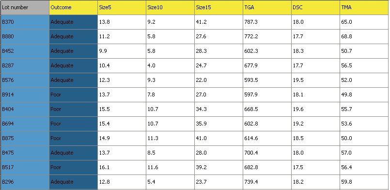
Description: 3 of the 6 measurements are size values for the plastic pellets, while the other 3 are the outputs from thermogravimetric analysis (TGA), differential scanning calorimetry (DSC) and thermomechanical analysis (TMA), measured in a laboratory. These 6 measurements are thought to adequately characterize the raw material. Also provided is a designation
AdequateorPoorthat reflects the process engineer’s opinion of the yield from that lot of materials.
Import the data, and set the Outcome variable as a secondary identifier for each observation, as shown in the illustration below. The observation’s primary identifier is its batch number.
Build a latent variable model for all observations and use auto-fit to determine the number of components. If your software does not have and auto-fit features (cross-validation), then use a Pareto plot of the eigenvalues to decide on the number of components.
Interpret component 1, 2 and 3 separately (using the loadings bar plot).
Now plot the score plot for components 1 and 2, and colour code the score plot with the
Outcomevariable. Interpret why observations withPooroutcome are at their locations in the score plot (use a contribution plot).What would be your recommendations to your manager to get more of your batches classified as
Adequaterather thanPoor?Now build a model only on the observations marked as
Adequatein the Outcome variable.Re-interpret the loadings plot for \(p_1\) and \(p_2\). Is there a substantial difference between this new loadings plot and the previous one?
What we learned:
How to use an indicator variable in the model to learn more from our score plot.
How to build a data set, and bring in new observations as testing data.