
 Download PDF of entire book
4.3. Covariance
You probably have an intuitive sense for what it means when two things are correlated. We will get to correlation next, but we start by first looking at covariance. Let’s take a look at an example to formalize this, and to see how we can learn from data.
Consider the measurements from a gas cylinder; temperature (K) and pressure (kPa). We know the ideal gas law applies under moderate conditions: \(pV = nRT\).
Fixed volume, \(V = 20 \times 10^{-3} \text{m}^3\) = 20 L
Moles of gas, \(n = 14.1\) mols of chlorine gas, molar mass = 70.9 g/mol, so this is 1 kg of gas
Gas constant, \(R = 8.314\) J/(mol.K)
Given these numbers, we can simplify the ideal gas law to: \(p=\beta_1 T\), where \(\beta_1 = \dfrac{nR}{V} > 0\). These data are collected from sampling the system:
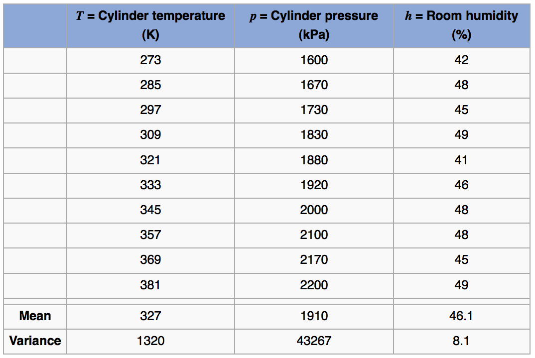
The formal definition for covariance between any two variables is: [terminology used here was defined in a previous section]
Use this to calculate the covariance between temperature and pressure by breaking the problem into steps:
First calculate deviation variables. They are called this because they are now the deviations from the mean: \(T - \overline{T}\) and \(p - \overline{p}\). Subtracting off the mean from each vector just centers their frame of reference to zero.
Next multiply the two vectors, element-by-element, to calculate a new vector \((T - \overline{T}) (p - \overline{p})\).
Python, 38 lines
import numpy as np temp = np.array([273, 285, 297, 309, 321, 333, 345, 357, 369, 381]) pres = np.array([1600, 1670, 1730, 1830, 1880, 1920, 2000, 2100, 2170, 2200]) humidity = np.array([42, 48, 45, 49, 41, 46, 48, 48, 45, 49]) temp_centered = temp - temp.mean() pres_centered = pres - pres.mean() product = temp_centered * pres_centered # numpy does element-by-element multiplication. Centring # turned the integers into floats, so the products print # with a trailing decimal point. print(product) # [16740. 10080. 5400. 1440. 180. # 60. 1620. 5700. 10920. 15660.] # Average of `product`: print(product.mean()) # 6780.0 # np.cov returns the covariance matrix; the # off-diagonal entry [0, 1] is Cov{temp, pres} # (with N-1 normalisation, matching R). # Calculated covariance is 7533.33 print("Covariance of temperature and " "pressure is = " f"{round(np.cov(temp, pres)[0, 1], 2)}") # The covariance of a variable with # itself is just the variance: print("Covariance with itself is = " f"{round(np.cov(temp, temp)[0, 1], 2)}") print("while the variance = " f"{round(temp.var(ddof=1), 2)}")R, 30 lines
temp <- c(273, 285, 297, 309, 321, 333,
          345, 357, 369, 381)
pres <- c(1600, 1670, 1730, 1830, 1880,
          1920, 2000, 2100, 2170, 2200)
humidity <- c(42, 48, 45, 49, 41, 46,
              48, 48, 45, 49)

temp.centered <- temp - mean(temp)
pres.centered <- pres - mean(pres)
product <- temp.centered * pres.centered

# R does element-by-element  multiplication in the above line
print(product)
# [1] 16740 10080  5400  1440   180
#        60  1620  5700 10920 15660

# Average of 'product':
mean(product)    # 6780

# Calculated covariance is 7533.33
paste0('Covariance of temperature and ',
       'pressure is = ',
       round(cov(temp, pres), 2))

# The covariance of a variable with
# itself is just the variance:
paste0('Covariance with itself is = ',
       round(cov(temp, temp), 2))
paste0('while the variance = ',
       round(var(temp), 2))
The expected value of this product can be estimated by using the average, or any other suitable measure of location. In this case
mean(product)in R gives 6780. This is the covariance value.More specifically, we should provide the units as well: the covariance between temperature and pressure is 6780 [K.kPa] in this example. Similarly the covariance between temperature and humidity is 35.4 [K.%].
In your own time calculate a rough numeric value and give the units of covariance for these cases:
\(x\)
\(y\)
\(x\) = age of married partner 1
\(y\) = age of married partner 2
\(x\) = gas pressure
\(y\) = gas volume at a fixed temperature
\(x\) = mid term mark for this course
\(y\) = final exam mark
\(x\) = hours worked per week
\(y\) = weekly take home pay
\(x\) = cigarettes smoked per month
\(y\) = age at death
\(x\) = temperature on top tray of distillation column
\(y\) = top product purity
Also describe what an outlier observation would mean in these cases.
One last point is that the covariance of a variable with itself is the variance: \(\text{Cov}\left\{x, x\right\} = \mathcal{V}(x) = \mathcal{E}\left\{ (x - \overline{x}) (x - \overline{x})\right\}\), a definition we saw earlier.
Using the cov(temp, pres) function in R gives 7533.333, while we calculated 6780. The difference comes from \(6780 \times \dfrac{N}{N-1}= 7533.33\), indicating that R divides by \(N-1\) rather than \(N\). This is because the variance function in R for a vector x is internally called as cov(x, x). Since R returns the unbiased estimate of the variance, it divides through by \(N-1\) (the same correction seen earlier for the sample variance). The difference between the two conventions shrinks as \(N\) grows, but it emphasizes that one should always read the documentation for the software being used.
Note that deviation variables are not affected by a shift in the raw data of \(x\) or \(y\). For example, measuring temperature in Celsius or Kelvin has no effect on the covariance number; but measuring it in Celsius vs Fahrenheit does change the covariance value.
4.4. Correlation
The variance and covariance values are units dependent. For example, you get a very different covariance when calculating it using grams vs kilograms. The correlation on the other hand removes the effect of scaling and arbitrary unit changes. It is defined as:
It takes the covariance value and divides through by the product of the standard deviations of \(x\) and \(y\), which carry the units of \(x\) and \(y\), to obtain a dimensionless result. The values of \(r(x,y)\) range from \(-1\) to \(+1\). Also note that \(r(x,y) = r(y,x)\).
So returning back to our example of the gas cylinder, the correlation between temperature and pressure, and temperature and humidity can be calculated now as:
Python, 23 lines
import numpy as np

temp = np.array([273, 285, 297, 309, 321, 333, 345,
                 357, 369, 381])
pres = np.array([1600, 1670, 1730, 1830, 1880, 1920,
                 2000, 2100, 2170, 2200])
humidity = np.array([42, 48, 45, 49, 41, 46, 48,
                     48, 45, 49])

# np.corrcoef returns the correlation matrix; the
# off-diagonal entry [0, 1] is r(x, y).

# Correlation between temperature
# and pressure is high: 0.9968355
np.corrcoef(temp, pres)[0, 1]

# Correlation between temperature
# and humidity is low: 0.3803919
np.corrcoef(temp, humidity)[0, 1]

# What is correlation of humidity
# and pressure?
np.corrcoef(___, ___)[0, 1]
R, 18 lines
temp <- c(273, 285, 297, 309, 321, 333, 345,
          357, 369, 381)
pres <- c(1600, 1670, 1730, 1830, 1880, 1920,
          2000, 2100, 2170, 2200)
humidity <- c(42, 48, 45, 49, 41, 46, 48,
              48, 45, 49)

# Correlation between temperature
# and pressure is high: 0.9968355
cor(temp, pres)

# Correlation between temperature
# and humidity is low: 0.3803919
cor(temp, humidity)

# What is correlation of humidity
# and pressure?
cor(___, ___)
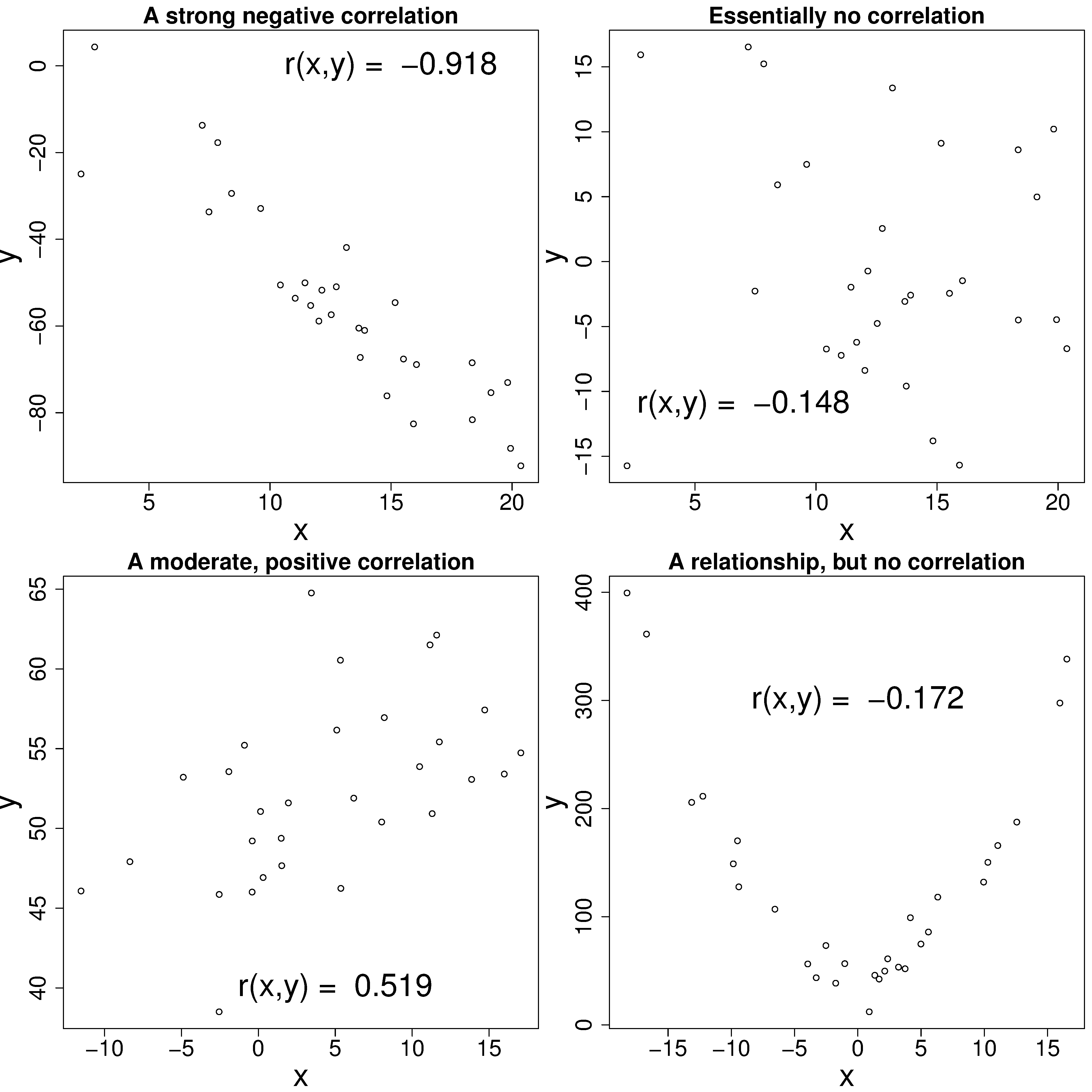
Note that correlation is the same whether we measure temperature in Celsius or Kelvin. Study the plots here to get a feeling for the correlation value and its interpretation:
4.4.1. The scatterplot matrix
A scatter plot handles one pair of variables at a time. A scatterplot matrix puts every pair into a single display, so a data set with \(K\) variables is read in one figure instead of \(K(K-1)/2\) separate ones. The layout used in this book carries:
the scatter plot for each pair below the diagonal;
the correlation coefficient \(r(x, y)\) for that same pair above the diagonal, sized and coloured by its magnitude;
and each variable on its own along the diagonal, drawn as a smooth density curve over a rug: a short tick for every value recorded.
The rug is worth drawing next to the curve, because it shows where the readings actually fall. A variable recorded in whole numbers, or one that a controller holds at a handful of set points, gives evenly spaced ticks that a smooth curve on its own would cover over.
The function below draws that display. It is used again further on in this section for two process data sets, so it is written once here:
Python, 72 lines
import pandas as pd
import plotly.graph_objects as go
from plotly.subplots import make_subplots

BLUE, VERMILLION = "#0072B2", "#D55E00"


def density(x, points=256):
    """Gaussian kernel density estimate; bandwidth from the nrd0 rule."""
    x = np.asarray(x, float)
    iqr = np.subtract(*np.percentile(x, [75, 25]))
    spread = min(x.std(ddof=1), iqr / 1.349) if iqr > 0 else x.std(ddof=1)
    bandwidth = 0.9 * spread * x.size**-0.2
    grid = np.linspace(x.min(), x.max(), points)
    return grid, np.exp(-0.5 * ((grid[:, None] - x) / bandwidth) ** 2).sum(axis=1)


def r_text(r):
    """Two decimals, unless that rounds an imperfect r up to 1.00."""
    text = f"{r:+.2f}"
    return f"{r:+.3f}" if text in {"+1.00", "-1.00"} and abs(r) != 1 else text


def scatterplot_matrix(data, marker_size=5, opacity=1.0):
    """Scatter plots below the diagonal, r above it, distributions on it."""
    names, corr = list(data.columns), data.corr()
    n = len(names)
    # Fade the rug in proportion to the number of readings, so that a few
    # thousand ticks show where values pile up instead of filling in solid.
    rug_opacity = float(np.clip(30 / len(data), 0.05, 1.0))
    fig = make_subplots(rows=n, cols=n, horizontal_spacing=0.012,
                        vertical_spacing=0.012)
    for i in range(n):
        for j in range(n):
            at = dict(row=i + 1, col=j + 1)
            if i == j:                                # density over a rug
                x = data[names[i]].to_numpy(float)
                grid, curve = density(x)
                fig.add_scatter(x=grid, y=curve / curve.max(), mode="lines",
                                line_color=BLUE, **at)
                fig.add_scatter(x=x, y=np.zeros_like(x), mode="markers", **at,
                                marker=dict(symbol="line-ns-open", size=7,
                                            color=BLUE, opacity=rug_opacity))
                fig.add_annotation(text=names[i], showarrow=False, **at,
                                   x=grid.mean(), y=1.35)
                fig.update_yaxes(range=[-0.08, 1.5], **at)
            elif i < j:                               # the r value itself
                r = corr.iloc[i, j]
                fig.add_annotation(text=r_text(r), showarrow=False, x=0, y=0,
                                   **at, font=dict(size=11 + 9 * abs(r),
                                   color=BLUE if r > 0 else VERMILLION))
            else:                                     # the data themselves
                fig.add_scatter(x=data[names[j]], y=data[names[i]],
                                mode="markers", **at,
                                marker=dict(size=marker_size, color=BLUE,
                                            opacity=opacity))
            fig.update_xaxes(showticklabels=(i == n - 1 and i != j),
                             visible=(i >= j), **at)
            fig.update_yaxes(showticklabels=(j == 0 and i != j),
                             visible=(i >= j), **at)
            if j == 0 and i > 0:
                fig.update_yaxes(title_text=names[i], **at)
            if i == n - 1 and j < n - 1:
                fig.update_xaxes(title_text=names[j], **at)
    fig.update_layout(showlegend=False, width=190 * n, height=180 * n,
                      margin=dict(l=70, r=20, t=20, b=60))
    return fig


cylinder = pd.DataFrame({"Temperature": temp, "Pressure": pres,
                         "Humidity": humidity})
scatterplot_matrix(cylinder, marker_size=8).show()

The ten cylinder readings. The two correlations calculated above appear in the top row: \(r(T, p) = 0.997\) and \(r(T, \text{humidity}) = 0.380\). Temperature and pressure lie almost on a straight line, which is what a correlation near \(+1\) describes. Neither shows any such alignment against humidity.
4.4.2. Visualizing the correlation matrix
Pandas computes every pairwise correlation in one call with .corr(), returning a square,
symmetric matrix with ones down the diagonal. The example below uses a flotation cell data set: five process tags, sampled every 30 seconds,
2922 samples in all. The first column holds the date and time; reading it in as the index leaves
.corr() with only the five numeric columns to work on.
Python, 10 lines
flot = pd.read_csv(
    "https://openmv.net/file/flotation-cell.csv", index_col=0
)
flot.shape                # (2922, 5)

# A square matrix of correlation values, one
# per pair of numeric columns:
flot.corr().round(3)

scatterplot_matrix(flot, marker_size=3, opacity=0.15).show()

The five flotation cell tags. The strongest correlation in the whole matrix is \(r = 0.44\), between the feed rate and the copper sulphate added; the rest are below 0.2. Two of the diagonals show what the rug is for: the air flow rate is recorded to two decimals, so its readings sit on a small number of discrete levels, and the copper sulphate dosage spends part of the record at zero.
The same matrix can be shown as a heat map: one coloured cell per pair, on a diverging scale running from \(-1\), through white at zero, to \(+1\). Reading the colour rather than the number means a near-zero correlation is pale whatever its sign, and the sign of a large correlation is read from the direction of the colour rather than from a minus sign.
Python, 21 lines
def correlation_heatmap(data, annotate=False, size=600, order=None):
    """The correlation matrix as a diverging colour map, red high, blue low.

    `order` optionally lists the column names in the order to show them;
    the default keeps the order they appear in the data set.
    """
    corr = data.corr()
    if order is not None:
        corr = corr.loc[order, order]
    fig = go.Figure(go.Heatmap(
        z=corr, x=corr.columns, y=corr.columns, zmin=-1, zmax=1,
        colorscale="RdBu_r", xgap=1, ygap=1,
        texttemplate="%{z:+.2f}" if annotate else None,
        colorbar=dict(title="r(x, y)", len=0.7),
    ))
    fig.update_yaxes(autorange="reversed", scaleanchor="x")
    fig.update_layout(width=size * 1.25, height=size)
    return fig


correlation_heatmap(flot, annotate=True).show()

The flotation cell correlation matrix as a heat map. With five variables the numbers still fit inside the cells, so this display and the printed matrix carry the same information. The diagonal is \(+1\) by construction, since \(r(x, x) = 1\).
The heat map earns its place as the number of variables grows. The distillation column data set has 27 variables recorded on 253 days,
where the goal is to predict VapourPressure from the process measurements. That is 351 distinct
pairs, more than can be read from a table of numbers.
The order of the rows and columns is a free choice, and it changes how much the display shows. Left in the order the variables appear in the file, related variables are scattered and the eye has to assemble the pattern. Reordering so that correlated variables sit next to each other gathers them into blocks along the diagonal. The reordering here comes from hierarchical clustering: the distance between two variables is taken as \(1 - r(x, y)\), which is 0 for a pair that moves exactly together and 2 for a pair that moves exactly opposite; variables are then merged into successively larger groups (average linkage), and the columns are read off in the order the resulting tree places its leaves. This is the “by cluster” ordering that the D3 Les Miserables co-occurrence matrix offers alongside ordering by name and by frequency.
Python, 22 lines
from scipy.cluster.hierarchy import leaves_list, linkage
from scipy.spatial.distance import squareform

distill = pd.read_csv(
    "https://openmv.net/file/distillation-tower.csv", index_col=0
)
distill.shape             # (253, 27)


def cluster_order(corr):
    """Variable names reordered so that correlated ones sit together."""
    distance = 1 - corr.to_numpy()      # 0 when r = +1, 2 when r = -1
    np.fill_diagonal(distance, 0.0)
    # squareform wants the condensed upper triangle; the matrix is
    # symmetric up to floating-point noise, which checks=False allows.
    tree = linkage(squareform(distance, checks=False), method="average",
                   optimal_ordering=True)
    return [corr.columns[i] for i in leaves_list(tree)]


correlation_heatmap(distill, size=800,
                    order=cluster_order(distill.corr())).show()

The 27 distillation column variables, with rows and columns reordered by hierarchical
clustering. The nine tray temperatures from Temp8 through to Temp2 form the dark red
core, correlated at \(0.65\) and above with each other. VapourPressure sits with the
three InvTemp columns in a group of its own, correlated at \(0.87\) and above
internally and between \(-0.65\) and \(-0.998\) against those nine temperatures: this
is the block of dark blue in the upper right. The five flow measurements from FlowC1 to
FlowC4 are correlated at \(0.70\) and above among themselves and more loosely with the
temperature core, reaching \(0.75\) at most. Temp1, TempC3 and Temp4 form a
small group correlated \(0.84\) and above with each other but no more than \(0.14\)
with anything else in the data set. FlowC2 joins nothing: its strongest correlation
anywhere is \(0.41\).
Because the distance is \(1 - r\), a pair that moves exactly opposite is treated as the
furthest apart two variables can be, so a strongly negative pair ends up at opposite ends of the
ordering rather than side by side. InvPressure1 and PressureC1 at \(r = -0.998\) are
the clearest case: they are the first and the twenty-fourth column, and their cell is the dark blue
square in the top right. Use \(1 - |r(x, y)|\) as the distance instead when the direction of
the relationship does not matter and such pairs should be grouped together.
That freedom cuts both ways. The correlation values are fixed by the data, but which of them the
reader notices is set by the ordering, and the ordering is chosen by whoever draws the figure.
Ordering by \(1 - r\) produces the blocks above; ordering by \(1 - |r|\) produces
different blocks from the same numbers; ordering by each variable’s correlation with
VapourPressure puts the predictors of interest at one end and says nothing about how they
relate to each other; and an order chosen to separate variables that belong together can make a
clear structure look like noise. None of these is wrong, and none can be checked from the picture
alone, so state which ordering a heat map uses whenever it is not the order the variables appear
in the data set.
The flotation cell heat map was left in the order the variables appear in the file. With five variables there is little for a reordering to reveal, and the labels are easier to find when they stay where the data set puts them.
A scatterplot matrix of all 27 variables would need 351 panels and would not be readable at any printable size. The usual approach is to select a few columns and show those. When the goal is to model a particular outcome variable, the row of the correlation matrix belonging to that outcome ranks every potential predictor by how strongly it correlates with the outcome.
Python, 19 lines
# How each variable correlates with the outcome
# variable, VapourPressure, strongest first:
outcome = distill.corr()["VapourPressure"].drop("VapourPressure")
outcome.reindex(
    outcome.abs().sort_values(ascending=False).index
).round(3)
# InvTemp3        0.927
# Temp9          -0.918
# InvTemp1        0.912
# ...
# TempC3         -0.018
# InvPressure1   -0.015
# PressureC1      0.005

# Five columns spanning that range, from the strongest
# negative correlation with VapourPressure through to
# the strongest positive one:
subset = ["Temp9", "Temp7", "OC1", "InvTemp3", "VapourPressure"]
scatterplot_matrix(distill[subset], marker_size=4, opacity=0.55).show()

Five of the 27 distillation column variables, ordered from the strongest negative correlation
with VapourPressure through to the strongest positive one. The bottom row shows what each
of those correlations corresponds to in the data: a tight band for InvTemp3 at
\(r = +0.93\), a looser one for Temp9 at \(r = -0.92\), and no visible alignment
for OC1 at \(r = +0.33\).
One pair in that figure is worth a second look. InvTemp3 and Temp9 have
\(r = -0.998\), and their product is 1000 to within a rounding error: InvTemp3 is
\(1000 / \text{Temp9}\), a column derived from another one rather than a separate measurement.
The reciprocal is not a linear function, but over the narrow range these temperatures cover it is
close enough to one that the correlation is nearly perfect. Wide process data sets often carry
engineered columns of this sort, and the cells near \(\pm 1\) in the heat map are where they
show up.
4.4.3. What does a near-zero correlation look like?
The cylinder-pressure and distillation-tower examples both contain strong correlations, and the
flotation-cell example only weak ones. It is just as
important to develop intuition for what \(r \approx 0\) looks like in a data set with two
variables and nothing else to distract from them. The unlimited-time-test data set serves as that counter-example: 80
students were given as much time as they wanted to write an open-book exam, and there are two
columns, the Time taken to finish and the Grade achieved.
Python, 13 lines
grades = pd.read_csv(
    "https://openmv.net/file/unlimited-time-test.csv"
)

# Correlation of -0.044: essentially zero.
grades.corr().round(3)

fig = go.Figure(go.Scatter(x=grades["Time"], y=grades["Grade"],
                           mode="markers"))
fig.update_layout(xaxis_title="Time to finish the test [minutes]",
                  yaxis_title="Grade achieved [%]",
                  width=800, height=600)
fig.show()

Time taken against grade achieved for 80 students writing an open-book exam with no time limit. Grades in the 70s and 90s appear at every finishing time, and the slowest finishers are spread over the full range of grades.
The scatter plot shows no visible pattern, and the correlation matrix agrees: \(r = -0.044\). Two things are worth noting from this example:
The correlation is symmetric: \(r(\text{Time}, \text{Grade}) = r(\text{Grade}, \text{Time}) = -0.044\). There is no notion of an \(x\)- or \(y\)-variable yet.
The \(R^2\) value commonly reported with a least-squares model is just \(r^2\). So without fitting any model we already know that a straight line through these data would have \(R^2 = (-0.044)^2 \approx 0.002\). Said differently:
Timewould explain about 0.2% of the variation inGrade. That the \(R^2\) is available before any model is fitted is one of two properties of R-squared returned to later in this chapter.
Compare this against the cheddar-cheese exercise in the exercises section (\(r\) around 0.5 to 0.8 between flavour and the chemical predictors), and against the cylinder-pressure example where \(r = 0.997\). Looking at the scatter plots alongside the correlation values for these three regimes (near-zero, moderate, near-one) is the fastest way to develop a calibrated visual sense of what a correlation coefficient really means.
4.5. Some definitions
Be sure that you can derive (and interpret!) these relationships, which are derived from the definition of the covariance and correlation:
\(\mathcal{E}\{x\} = \overline{x}\)
\(\mathcal{E}\{x+y\} = \mathcal{E}\{x\} + \mathcal{E}\{y\} = \overline{x} + \overline{y}\)
\(\mathcal{V}\{x\} = \mathcal{E}\{(x-\overline{x})^2\}\)
\(\mathcal{V}\{cx\} = c^2\mathcal{V}\{x\}\)
\(\text{Cov}\{x,y\} = \mathcal{E}\{(x-\overline{x})(y-\overline{y})\}\) which we take as the definition for covariance
\(\mathcal{V}\{x+x\} = 2\mathcal{V}\{x\} + 2\text{Cov}\{x,x\} = 4\mathcal{V}\{x\}\)
\(\text{Cov}\{x,y\} = \mathcal{E}\{xy\} - \mathcal{E}\{x\}\mathcal{E}\{y\}\)
\(\text{Cov}\{x,c\} = 0\)
\(\text{Cov}\{x+a, y+b\} = \text{Cov}\{x,y\}\)
\(\text{Cov}\{ax, by\} = ab \cdot \text{Cov}\{x,y\}\)
\(\mathcal{V}\{x+y\} \neq \mathcal{V}\{x\} + \mathcal{V}\{y\}\), which is counter to what might be expected.
Rather:
(3)¶\[\begin{split}\mathcal{V}\{x+y\} &= \mathcal{E}\{ \left( x+y-\overline{x}-\overline{y} \right)^2 \} \\ &= \mathcal{E}\{ \left( (x-\overline{x}) + (y-\overline{y}) \right)^2 \} \\ &= \mathcal{E}\{ (x-\overline{x})^2 + 2(x-\overline{x})(y-\overline{y}) + (y-\overline{y})^2 \}\\ &= \mathcal{E}\{ (x-\overline{x})^2 \} + 2\mathcal{E}\{(x-\overline{x})(y-\overline{y})\} + \mathcal{E}\{(y-\overline{y})^2 \} \\ &= \mathcal{V}\{ x \} + 2\text{Cov}\{x,y\} + \mathcal{V}\{ y \}\\ \mathcal{V}\{x+y\} &= \mathcal{V}\{x\} + \mathcal{V}\{y\}, \qquad\text{only if $x$ and $y$ are uncorrelated, i.e. } \text{Cov}\{x,y\} = 0\end{split}\]