
 Download PDF of entire book
2.4. Histograms and probability distributions
The previous section has hopefully convinced you that variation in a process is inevitable. This section aims to show how we can visualize and quantify any variability in a recorded vector of data.
A histogram is a summary of the variation in a measured variable. It shows the number of samples that occur in a category: this is called a frequency distribution. For example: number of children born, categorized against the sex recorded at birth: male or female.
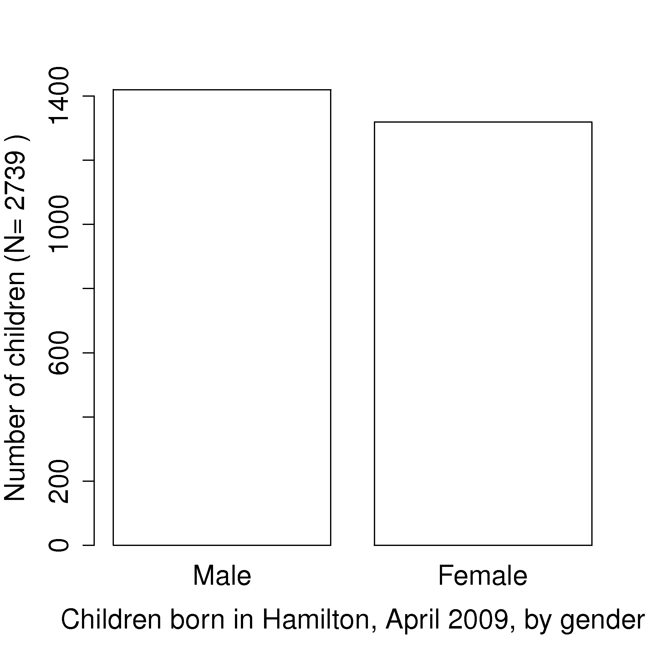
The raw data in the above example was a vector that consisted of 2739 text entries, with 1420 of them as Male and 1319 of them as Female. In this case Female and Male represent the two categories.
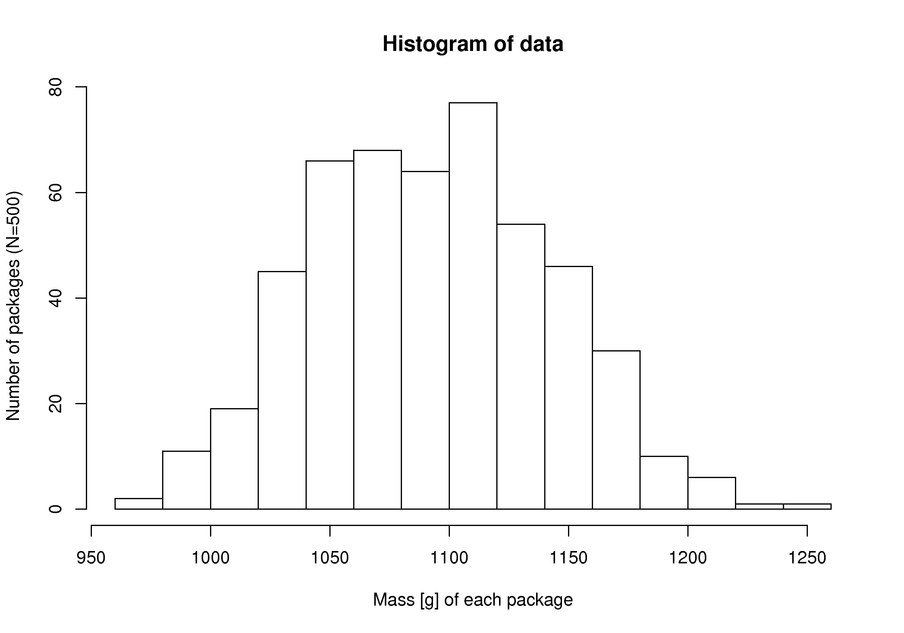
Histograms make sense for categorical variables, but a histogram can also be derived from a continuous variable. Here is an example showing the mass of cartons of 1 kg of flour. The continuous variable, mass, is divided into equal-size bins that cover the range of the available data. Notice how the packaging system has to overfill each carton so that the vast majority of packages weigh over 1 kg (what is the average package mass?). If the variability in the packaging system could be reduced - the spread of the data made narrower - then the histogram can be shifted to the left, thereby reducing overfill.
Python, 18 lines
# Create 500 normally distributed points
# with a mean of 1100 and standard deviation
# of 50 units.
import numpy as np
import pandas as pd

pd.options.plotting.backend = "plotly"

N = 500
values = pd.Series(np.random.normal(loc=1100, scale=50, size=N))

fig = values.plot.hist(nbins=8)
fig.update_layout(
    xaxis_title_text="Mass [g] of each package",
    yaxis_title_text=f"Number of packages (N={N})",
    showlegend=False,
)
fig.show()
R, 7 lines
# Create 500 normally distributed points
# with a mean of 1100 and standard deviation
# of 50 units.
data = rnorm(500, mean=1100, sd=50)
hist(data,
     xlab="Mass [g] of each package",
     ylab="Number of packages (N=500)")
Try creating a fictitious histogram for each of the following situations:
The grades for a class for a really easy test.
The numbers thrown from a 6-sided die.
The annual income for people in your country.
Analytical measurements taken in a laboratory, by the same person or computerized process.
In preparing the above histograms, what have you implicitly inferred about time-scales? These histograms show the long-term distribution (probabilities) of the system being considered. This is why concepts of chance and random phenomena can be use to described systems and processes. Probabilities can be used to describe our long-term expectations. Let us contrast some long-term and short-term expectations next:
The long-term sex ratio at birth 1.06:1 (boy:girl) is expected in Canada; but a newly pregnant mother would not know the sex.
The long-term data from a process shows an 85% output yield from our batch reactor; but tomorrow it could be 59% and the day after that 86%.
We know that a fair die has a 16.67% chance of showing a 4 when thrown, but we cannot predict the value of the next throw.
Even if we have complete mechanistic knowledge of our process, the concepts from probability and statistics are useful to summarize and communicate information about past behaviour, and the expected future behaviour.
Steps to creating a frequency distribution, illustrated with 4 examples, labelled A, B, C, and D.
Decide what you are measuring:
acceptable or unacceptable metal appearance: yes/no
number of defects on a metal sheet: none, low, medium, high
yield from the batch reactor: somewhat continuous - quantized due to rounding to the closest integer
daily ambient temperature, in Kelvin: continuous values
Decide on a resolution for the measurement axis:
acceptable/unacceptable (1/0) code for the metal’s appearance
use a scale from 1 to 4 that grades the metal’s appearance
batch yield is measured in 1% increments, reported either as 78, 79, 80, 81%, etc.
temperature is measured to a 0.05 K precision, but we can report the values in bins of 5K
Report the number of observations in the sample or population that fall within each bin (resolution step):
number of metal pieces with appearance level “acceptable” and “unacceptable” are added up
number of pieces with defect level 1, 2, 3, 4 are counted
number of batches with yield inside each bin level are calculated
number of temperature values inside each bin level are computed
Plot the number of observations in category as a bar plot. If you plot the number of observations divided by the total number of observations, \(N\), then you are plotting the relative frequency.
The four cases are shown below. Notice how the resolution chosen in step 2 sets what the plot can show: A has two bars and can only report a proportion, B has four ordered grades, C is quantized to whole percentages so each bar is one distinct yield value, and D is a continuous measurement that only becomes a distribution once it is collected into bins.

Python, 55 lines
# The four cases from the recipe above, each with a different
# resolution on the measurement axis.
import numpy as np
import pandas as pd
import plotly.graph_objects as go
from plotly.subplots import make_subplots

rng = np.random.default_rng(19)

# A: acceptable or unacceptable metal appearance, coded 1 or 0.
appearance = rng.random(400) < 0.86

# B: number of defects on a metal sheet, graded 1 to 4.
grade = rng.choice([1, 2, 3, 4], size=400, p=[0.46, 0.30, 0.17, 0.07])

# C: batch yield, reported to the nearest whole percent.
yields = np.round(rng.normal(loc=80, scale=4.5, size=300)).astype(int)

# D: ambient temperature, measured to 0.05 K but binned every 5 K.
temperature = rng.normal(loc=284, scale=9, size=365)

fig = make_subplots(
    rows=2,
    cols=2,
    subplot_titles=(
        "A: metal appearance, yes or no",
        "B: defects on a metal sheet, four grades",
        "C: batch yield, rounded to 1%",
        "D: daily temperature, binned every 5 K",
    ),
)
fig.add_bar(
    x=["Unacceptable (0)", "Acceptable (1)"],
    y=[int((~appearance).sum()), int(appearance.sum())],
    row=1,
    col=1,
)
fig.add_bar(
    x=["1: none", "2: low", "3: medium", "4: high"],
    y=np.bincount(grade, minlength=5)[1:],
    row=1,
    col=2,
)
fig.add_histogram(x=yields, xbins={"size": 1}, row=2, col=1)
fig.add_histogram(x=temperature, xbins={"start": 255, "end": 315, "size": 5},
                  row=2, col=2)

fig.update_yaxes(title_text="Number of pieces", row=1, col=1)
fig.update_yaxes(title_text="Number of sheets", row=1, col=2)
fig.update_yaxes(title_text="Number of batches", row=2, col=1)
fig.update_yaxes(title_text="Number of days", row=2, col=2)
fig.update_xaxes(title_text="Yield [%]", row=2, col=1)
fig.update_xaxes(title_text="Ambient temperature [K]", row=2, col=2)
fig.update_layout(showlegend=False, height=800)
fig.show()
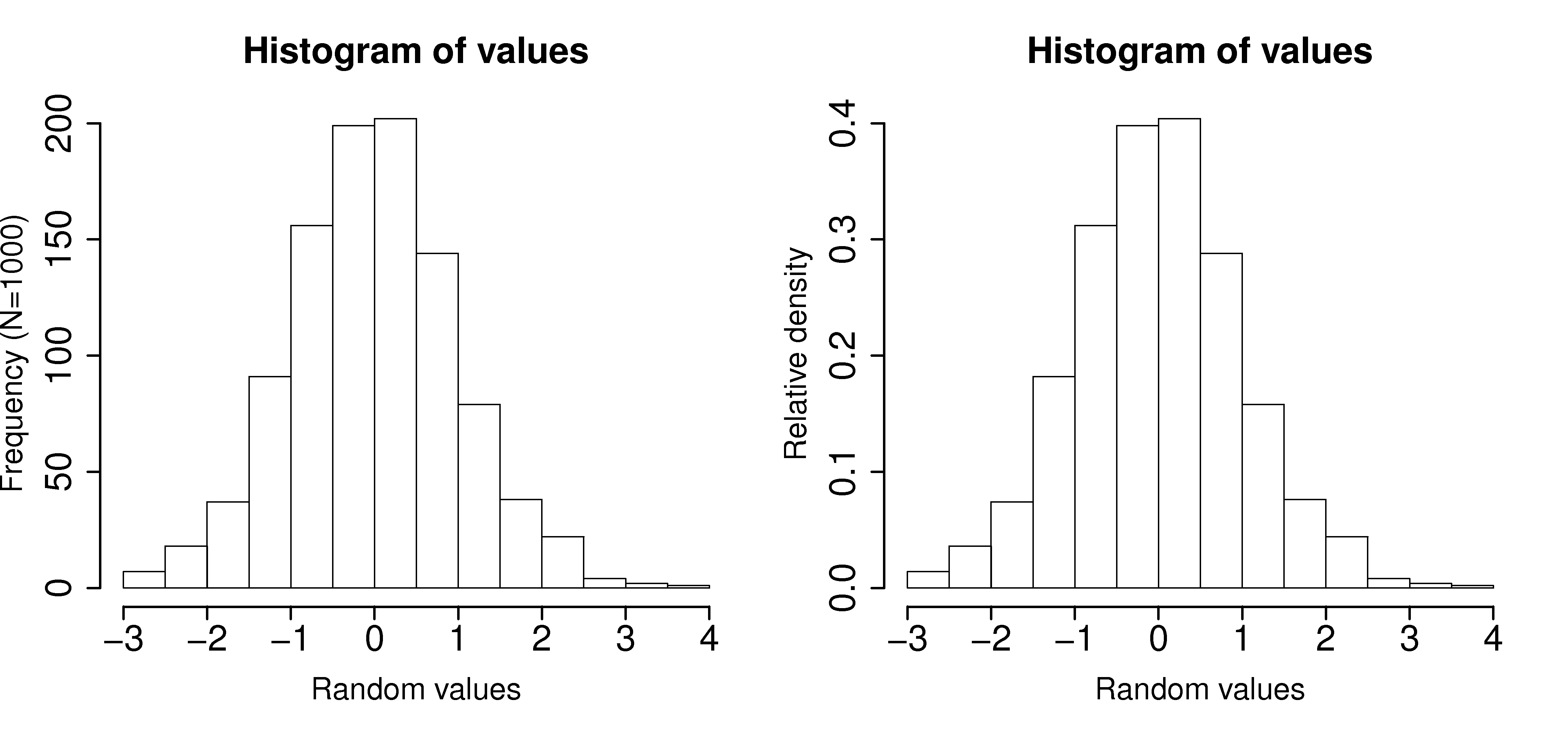
A relative frequency, also called density, is sometimes preferred:
we do not need to report the total number of observations, \(N\)
it can be compared to other distributions
if \(N\) is large enough, then the relative frequency histogram starts to resemble the population’s distribution
the area under the histogram is equal to 1, and related to probability
Python, 25 lines
# Create 1000 normally distributed points
# with mean of 0 and standard deviation of 1.
import numpy as np
import pandas as pd

pd.options.plotting.backend = "plotly"

N = 1000
values = pd.Series(np.random.normal(loc=0, scale=1, size=N))

# Frequency histogram (counts).
fig = values.plot.hist()
fig.update_layout(
    yaxis_title_text=f"Frequency (N={N})",
    showlegend=False,
)
fig.show()

# Relative-density histogram (area sums to 1).
fig = values.plot.hist(histnorm="probability density")
fig.update_layout(
    yaxis_title_text="Relative density",
    showlegend=False,
)
fig.show()
R, 14 lines
# 1000 normally distributed values
N = 1000
values = rnorm(N)
hist(values, freq=TRUE,  xlab="Random values",
        cex.lab=1.5, cex.main=1.8, lwd=2,
        cex.sub=1.8, cex.axis=1.8,
        ylab=paste0("Frequency (N=",N,")"))
hist(values, freq=FALSE, xlab="Random values",
        cex.lab=1.5, cex.main=1.8, lwd=2,
        cex.sub=1.8, cex.axis=1.8,
        ylab="Relative density")

# Compare the two plots: only the y-axis
# changes but the general shape remains.