
 Download PDF of entire book
4.11. Outliers: discrepancy, leverage, and influence of the observations
Unusual observations will influence the model parameters and also influence the analysis from the model (standard errors and confidence intervals). In this section we will examine how these outliers influence the model.
Outliers are in many cases the most interesting data in a data table. They indicate whether there was a problem with the data recording system, they indicate sometimes when the system is operating really well, though more likely, they occur when the system is operating under poor conditions. Nevertheless, outliers should be carefully studied for (a) why they occurred and (b) whether they should be retained in the model.
4.11.1. Background
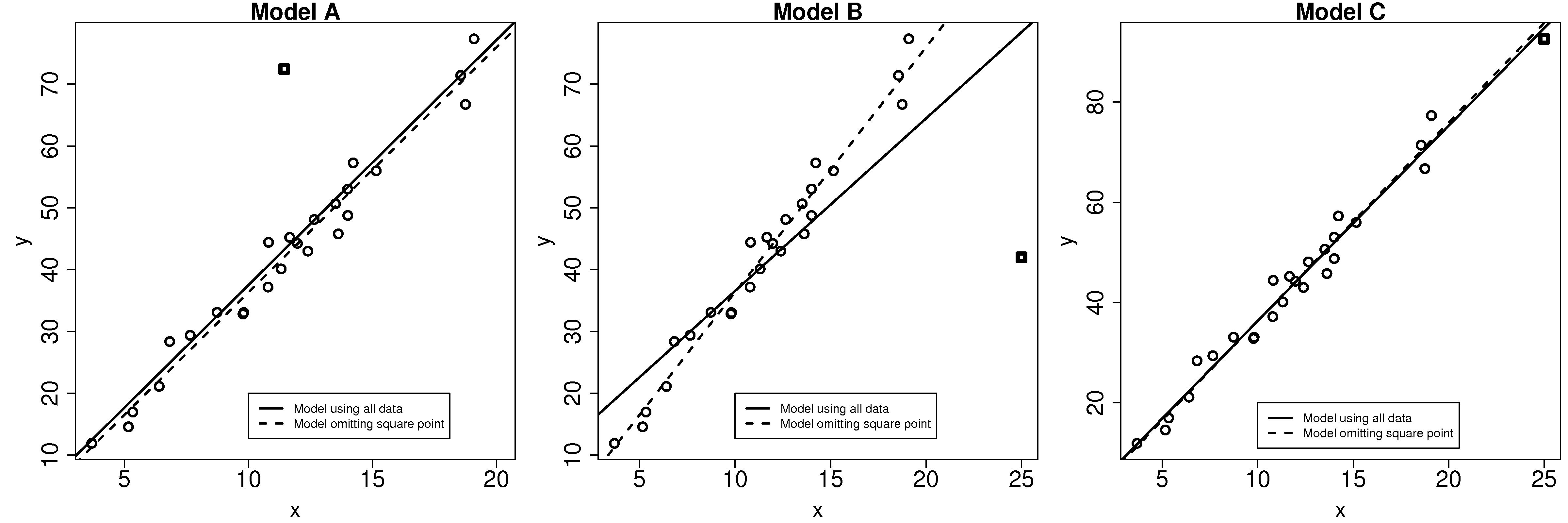
A discrepancy is a data point that is unusual in the context of the least squares model, as shown in the first figure here. On its own, from the perspective of either \(\mathrm{x}\) or \(\mathrm{y}\) alone, the square point is not unusual. But it is unusual in the context of the least squares model. When that square point is removed, the updated least squares line (dashed line) is obtained. This square point clearly has little influence on the model, even though it is discrepant.
The discrepant square point in model B has much more influence on the model. Given that the objective function aims to minimize the sum of squares of the deviations, it is not surprising that the slope is pulled towards this discrepant point. Removing that point gives a different dashed-line estimate of the slope and intercept.
In model C the square point is not discrepant in the context of the model. But it does have high leverage on the model: a small change in this point has the potential to be influential on the model.
Can we quantify how much influence these discrepancies have on the model; and what is leverage? The following general formula is helpful in the rest of this discussion:
\[\text{Leverage} \times \text{Discrepancy} = \text{Influence on the model}\]
4.11.2. Leverage
Leverage measures how much each observation contributes to the model’s prediction of \(\hat{y}_i\). It is also called the hat value, \(h_i\), and simply measures how far away the data point is from the center of the model, but it takes the model’s correlation into account:
\[h_i = \dfrac{1}{n} + \dfrac{\left(x_i -\overline{x}\right)^2}{\sum_{j=1}^{n}{\left(x_j -\overline{x}\right)^2}} \qquad \text{and}\qquad \overline{h} = \dfrac{k}{n} \qquad \text{and}\qquad \dfrac{1}{n} \leq h_i \leq 1.0\]
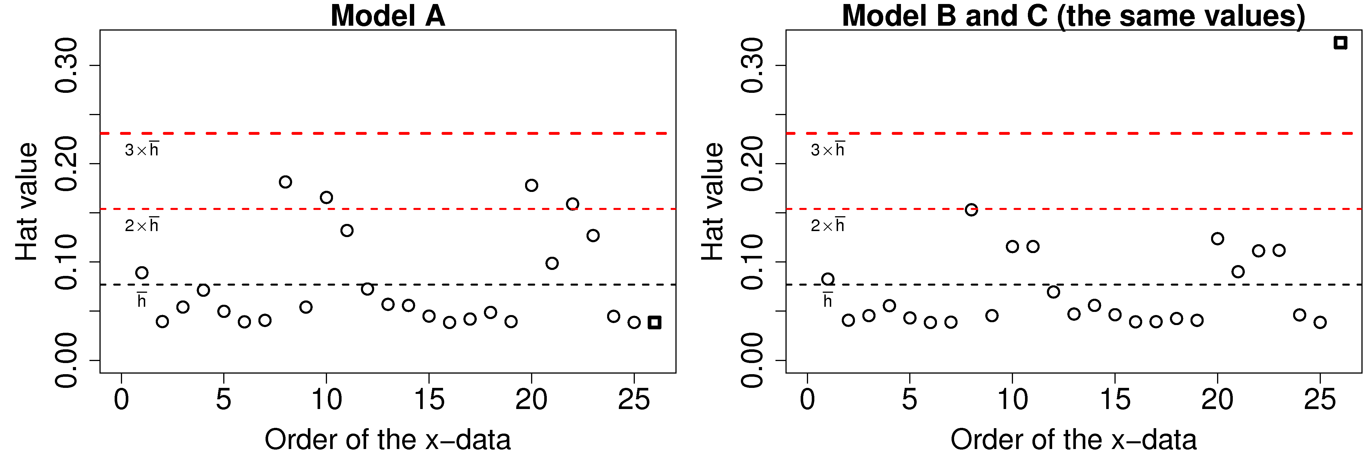
The average hat value can be calculated theoretically. While it is common to plot lines at 2 and 3 times the average hat value, always plot your data and judge for yourself what a large leverage means. Also notice that smallest hat value is always positive and greater or equal to \(1/n\), while the largest hat value possible is 1.0. Continuing the example of models A, B and C: the hat values for models B and C are the same, and are shown here. The last point has very high leverage.
4.11.3. Discrepancy
Discrepancy can be measured by the residual distance. However the residual is not a complete measure of discrepancy. We can imagine cases where the point has such high leverage that it drags the entire model towards it, leaving it only with a small residual. One way then to isolate these points is to rescale each residual by a factor involving its leverage, \(\sqrt{1 - h_i}\), which is small for high-leverage points and so inflates their rescaled residual. So we introduce a new way to quantify the residuals here, called studentized residuals:
\[e_i^* = \dfrac{e_i}{S_{E(-i)}\sqrt{1-h_i}}\]
Where \(e_i\) is the residual for the \(i^\text{th}\) point, as usual, but \(S_{E(-i)}\) is the standard error of the model when deleting the \(i^\text{th}\) point and refitting the model. This studentized residual accounts for the fact that high leverage observations pull the model towards themselves. In practice the model is not recalculated by omitting each point one at a time, rather there are shortcut formula that implement this efficiently. Use the rstudent(lm(y~x)) function in R to compute the studentized residuals from a given model.
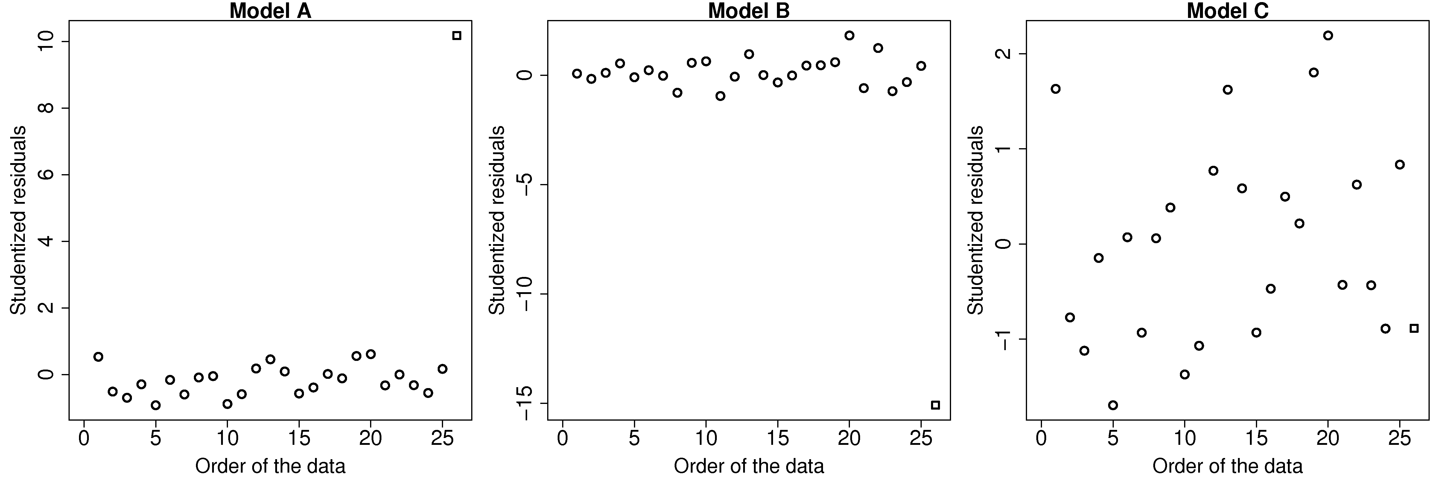
This figure illustrates how the square point in model A and B is highly discrepant, while in model C it does not have a high discrepancy.
4.11.4. Influence
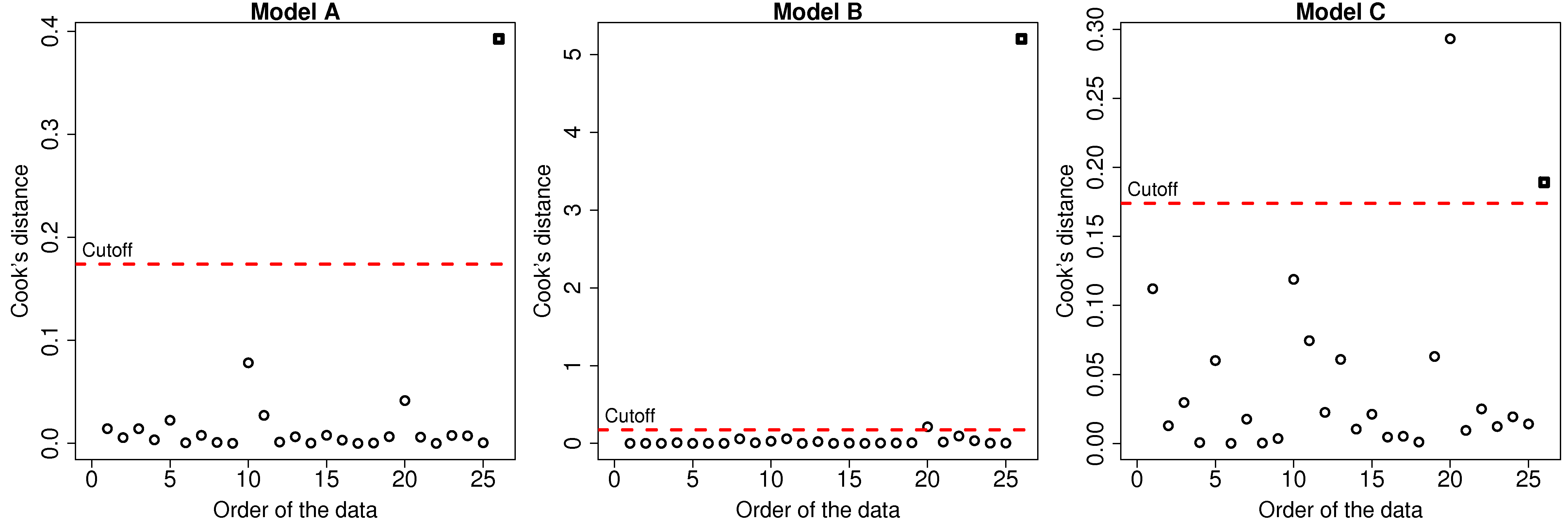
The influence of each data point can be quantified by seeing how much the model changes when we omit that data point. The influence of a point is a combination its leverage and its discrepancy. In model A, the square point had large discrepancy but low leverage, so its influence on the model parameters (slope and intercept) was small. For model C, the square point had high leverage, but low discrepancy, so again the change in the slope and intercept of the model was small. However model B had both large discrepancy and high leverage, so its influence is large.
One measure is called Cook’s statistic, usually called \(D_i\), and often referred to just as Cook’s D. Conceptually, it can be viewed as the change in the model coefficients when omitting an observation, however it is much more convenient to calculate it as follows:
\[D_i = \dfrac{e_i^2}{k \times S_E^2} \times \dfrac{h_i}{\left(1-h_i\right)^2}\]
where \(S_E^2 = \dfrac{\sum{e_i^2}}{n-k}\) is the mean square error of the model, and \(k\) is the number of parameters estimated (2 for a straight line). The first factor grows with the size of the residual (the discrepancy), and the second factor grows with the leverage, so it is easy to see here now why influence is the product of discrepancy and leverage. This is the formula implemented by R’s cooks.distance(model) and by statsmodels in Python.
The values of \(D_i\) are conveniently calculated in R using the cooks.distance(model) function. The results for the 3 models are shown. Interestingly for model C there is a point with even higher influence than the square point. Can you locate that point in the least squares plot?
4.11.5. Computing these diagnostics in Python
The leverage and influence values are computed by standard libraries; you do not need to program
the formulas yourself. The example below uses the same OLS class introduced in the
single-x section, on the
11-point example used throughout this chapter. The fitted model
object provides the hat values in model.leverage_ and the Cook’s D values in
model.influence_; printing the model shows a summary in the same layout as R’s
summary(lm(...)). Up to and including version 1.78 the two attributes were computed only for a
model with a single predictor and an intercept, and held a single nan otherwise; from version
1.79 they are computed from the hat matrix of whatever model was fitted, so they are available for
multiple regression and with or without an intercept.
Python, 31 lines
import numpy as np
import plotly.graph_objects as go
from plotly.subplots import make_subplots
from process_improve.regression import OLS

x = np.array([10, 8, 13, 9, 11, 14,
              6, 4, 12, 7, 5], dtype=float)
y = np.array([8.04, 6.95, 7.58, 8.81, 8.33, 9.96,
              7.24, 4.26, 10.84, 4.82, 5.68])

model = OLS().fit(x.reshape(-1, 1), y)
print(model)  # summary in the style of R's lm()

n = len(x)
k = 2  # parameters in the model: intercept and slope
leverage = np.asarray(model.leverage_)
cooks_d = np.asarray(model.influence_)

fig = make_subplots(
    rows=1, cols=2,
    subplot_titles=("Leverage (hat values)", "Cook's D"),
)
fig.add_bar(x=np.arange(1, n + 1), y=leverage,
            row=1, col=1, showlegend=False)
fig.add_hline(y=2 * k / n, line_dash="dash", row=1, col=1)
fig.add_hline(y=3 * k / n, line_dash="dot", row=1, col=1)
fig.add_bar(x=np.arange(1, n + 1), y=cooks_d,
            row=1, col=2, showlegend=False)
fig.add_hline(y=4 / (n - k), line_dash="dash", row=1, col=2)
fig.update_xaxes(title_text="Observation number")
fig.show()
For these 11 observations the average hat value is \(\overline{h} = k/n = 2/11 = 0.18\). The two observations furthest from \(\overline{\mathrm{x}} = 9\), at \(x = 4\) and \(x = 14\), tie for the largest leverage, \(h_i = 0.32\) each. The observation at \(x = 14\) is not discrepant, so its Cook’s D is near zero: despite its leverage it has little influence on the model. The observation at \(x = 13\) (\(y = 7.58\)) has the largest Cook’s D, at 0.49: it combines moderate leverage (\(h_i = 0.24\)) with the largest studentized residual. The dashed line at \(4/(n-k)\) on the Cook’s D panel is a rule of thumb for which observations to investigate further; as with the hat-value cut-offs at 2 and 3 times \(\overline{h}\), judge the values in the plot rather than applying the rule mechanically.
4.11.6. The influence plot
The three diagnostics can be combined in a single display, called an influence plot: the studentized residual (discrepancy) on the vertical
axis, the hat value (leverage) on the horizontal axis, and each marker drawn with an area
proportional to that observation’s Cook’s D (influence). R draws this display with the
influencePlot(model) function in the car package. The code below builds the same display
with plotly, reusing leverage and cooks_d from the previous code block; the studentized
residuals come from statsmodels, which implements the leave-one-out shortcut formula for the
studentized residuals.
Python, 30 lines
import statsmodels.api as sm
from statsmodels.stats.outliers_influence import OLSInfluence

infl = OLSInfluence(sm.OLS(y, sm.add_constant(x)).fit())
student_resid = infl.resid_studentized_external

fig = go.Figure(
    go.Scatter(
        x=leverage,
        y=student_resid,
        mode="markers+text",
        text=[str(i) for i in range(1, n + 1)],
        textposition="top center",
        # Marker diameter proportional to the square
        # root of Cook's D, so marker AREA is
        # proportional to Cook's D itself:
        marker=dict(size=8 + 60 * np.sqrt(cooks_d),
                    opacity=0.6),
        showlegend=False,
    )
)
fig.add_vline(x=2 * k / n, line_dash="dash")
fig.add_vline(x=3 * k / n, line_dash="dot")
fig.add_hline(y=-2, line_dash="dash")
fig.add_hline(y=2, line_dash="dash")
fig.update_layout(
    xaxis_title="Leverage (hat value)",
    yaxis_title="Studentized residual",
)
fig.show()
Observation 3 (the point at \(x = 13\)) sits low on the plot with the largest marker: moderate leverage combined with the largest studentized residual (\(-2.08\)) gives it the largest Cook’s D. Observation 6 (the point at \(x = 14\)) sits at the far right with a studentized residual near zero, so its marker is barely visible: high leverage alone does not make an observation influential. The reference lines are the same cut-offs as in the bar charts: vertical lines at 2 and 3 times \(\overline{h}\), and horizontal lines at studentized residuals of \(\pm 2\).