
 Download PDF of entire book
3.6. EWMA charts
The two previous charts highlight 2 extremes of monitoring charts. On the one hand, a Shewhart chart assumes each subgroup sample is independent (unrelated) to the next - implying there is no “memory” in the chart. On the other hand, a CUSUM chart has an infinite memory, all the way back to the time the chart was started or reset at \(t=0\) (see the equation in the prior section).
We will see that the EWMA (exponentially weighted moving average) chart spans these two extremes through a single adjustable weight, \(\lambda\), chosen between 0 and 1. As \(\lambda \rightarrow 1\), the EWMA chart behaves more as a Shewhart chart, giving only weight to the most recent observation. As \(\lambda \rightarrow 0\), the EWMA chart starts to have an infinite memory, like a CUSUM chart. Depending on the weight \(\lambda\), the user can pick where between these two extremes to operate. The rest of this section derives the chart, shows how \(\lambda\) sets the weight given to past data, and gives the control limits.
3.6.1. From the moving average to the EWMA
As a stepping stone to the EWMA chart, consider first the simple moving average (MA) chart. This chart is used just like a Shewhart chart, except the samples that make up each subgroup are calculated using a moving window of width \(n\). The case of \(n=5\) is shown below.
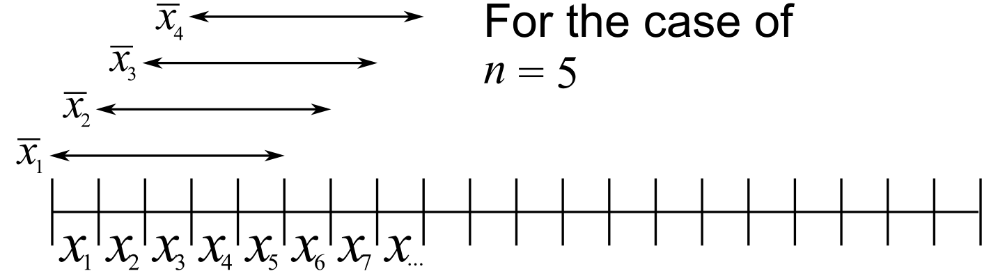
The MA chart plots values of \(\overline{x}_t\), calculated from groups of size \(n\), using equal weight for each of the \(n\) most recent raw data.
The EWMA chart is similar to the MA chart, but uses different weights; heavier weights for more recent observations, tailing off exponentially to very small weights further back in history. Let’s take a look at a derivation.
Define the process target as \(T\) and define \(x_t\) as a new data measurement arriving now. We then try to create an estimate of that incoming value, giving some weight, \(\lambda\), to the actual measured value, and the rest of the weight, \(1-\lambda\), to the prior estimate.
Let us write this estimate as \(\hat{x}_t\), with the \(\wedge\) mark above the \(x_t\) to indicate that it is the EWMA estimate of the level at time \(t\): a smoothed value that blends the latest measurement with the running history. The prior estimate is therefore written as \(\hat{x}_{t-1}\). As shown below, this same smoothed value also serves as the one-step-ahead forecast of the next measurement.
So putting into equation form that “an estimate of that incoming value, is given by some weight, \(\lambda\) and the rest of the weight, \(1-\lambda\), to the prior estimate”:
To start the EWMA sequence we define the value for \(\hat{x}_0 = T\) and \(\hat{x}_1 = \lambda x_1 + T \left(1-\lambda \right)\). A worked example is given further on in this section.
The last line in the equation group above shows that a 1-step-ahead prediction for \(x\) at time \(t+1\) is a weighted sum of two components: the current measured value, \(x_t\), and secondly the predicted value, \(\hat{x}_t\), with the weights summing up to 1. This gives a way to experimentally find a suitable \(\lambda\) value from historical data: adjust it up and down until the differences between \(\hat{x}_{t+1}\) and the actual measured values of \(x_{t+1}\) are small.
To see why \(\hat{x}_{t}\) represents historical data, you can recursively substitute and show that:
which emphasizes that the prediction is a just a weighted sum of the raw measurements, with weights declining in time.
As a small example, take \(\lambda=0.5\) and \(t=7\). The weight on each of the eight measurements \(x_0\) to \(x_7\) is \(w_i = \lambda(1-\lambda)^{t-i} = 0.5 \times 0.5^{\,7-i}\), so each weight is half the next more recent one:
i |
0 |
1 |
2 |
3 |
4 |
5 |
6 |
7 |
|---|---|---|---|---|---|---|---|---|
w_i |
0.0039 |
0.0078 |
0.0156 |
0.0313 |
0.0625 |
0.1250 |
0.2500 |
0.5000 |
These eight weights sum to 0.9961; the remaining 0.0039 is the weight \((1-\lambda)^{t+1} = 0.5^{8}\) carried by the starting value \(\hat{x}_0 = T\), so the weights total 1.
The code here shows one way of calculating the EWMA values for a vector of data. Once you have defined the function, use it as ewma(x, lam=..., target=...). It is reused below, both to generate the comparison figures and in the worked example at the end of this section.
Python, 16 lines
import numpy as np

def ewma(x, lam, target=None):
    if target is None:
        target = x[0]
    y = np.zeros(len(x))
    previous = target
    for k in range(len(x)):
        y[k] = lam * x[k] + (1 - lam) * previous
        previous = y[k]
    return y

# Try using this function now. It reproduces the
# worked-example table at the end of this section:
x = np.array([200, 210, 190, 190, 190, 190])
ewma(x, lam=0.3, target=200)
R, 15 lines
ewma <- function(x, lambda, target=x[1]){
    N <- length(x)
    y <- numeric(N)
    previous <- target
    for (k in 1:N){
        y[k] = lambda*x[k] + (1 - lambda)*previous
        previous = y[k]
    }
return(y)
}

# Try using this function now. It reproduces the
# worked-example table at the end of this section:
x <- c(200, 210, 190, 190, 190, 190)
ewma(x, lambda = 0.3, target = 200)
3.6.2. The EWMA weights
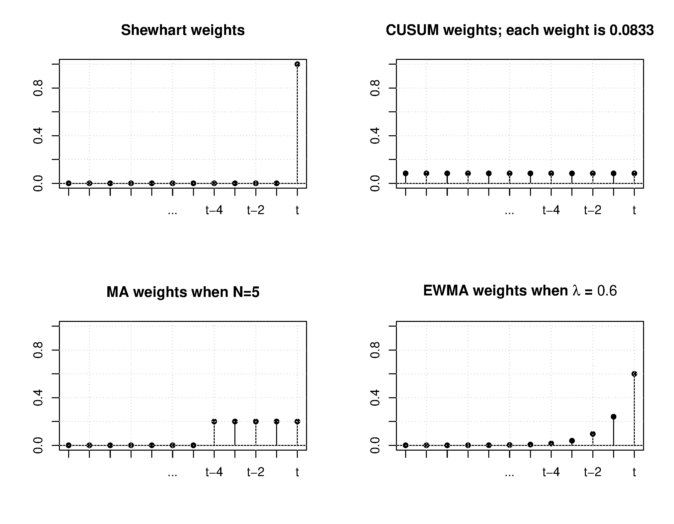
The next figure compares the weights each chart gives to past observations, for the four charts studied so far. There are 12 data points used in the example, so the CUSUM ‘weight’ is one twelfth, or \(\approx 0.0833\), spread equally over all points. The EWMA weights (here with \(\lambda=0.4\)) decay geometrically, while the Shewhart chart places all its weight on the single most recent point. The figure makes concrete the trade-off previewed at the start of this section: \(\lambda\) slides the EWMA between the Shewhart and CUSUM extremes.
Python, 23 lines
import numpy as np
import plotly.graph_objects as go
from plotly.subplots import make_subplots

# Weight given to each past observation, newest at lag 0,
# for the four charts, using 12 data points and lambda = 0.4.
n_points, lam = 12, 0.4
lags = np.arange(n_points)
weights = {
    "Shewhart": np.where(lags == 0, 1.0, 0.0),
    "Moving average (n=5)": np.where(lags < 5, 1 / 5, 0.0),
    f"EWMA (lambda={lam})": lam * (1 - lam) ** lags,
    "CUSUM": np.full(n_points, 1 / n_points),  # 1/12 = 0.0833
}

fig = make_subplots(rows=2, cols=2, subplot_titles=list(weights))
for i, (name, w) in enumerate(weights.items()):
    row, col = divmod(i, 2)
    fig.add_trace(go.Bar(x=lags, y=w), row=row + 1, col=col + 1)
fig.update_layout(showlegend=False,
                  title="Weight given to each past observation "
                        "(lag 0 = most recent)")
fig.show()
3.6.3. Control limits for the EWMA chart
The upper and lower control limits for the EWMA plot are plotted in the same way as the Shewhart limits, but calculated differently:
where \(\sigma_{\text{Shewhart}}\) represents the standard deviation as calculated for the Shewhart chart; for individual observations (subgroup size 1, as in the example below) this is simply the process standard deviation \(\sigma\). The multiplier \(L\) is usually a value of 3, similar to the 3 standard deviations used in a Shewhart chart, but can of course be set to any level that balances the type I (false alarms) and type II errors (not detecting a deviation which is present already). We write \(L\) rather than \(K\) to avoid a clash with the CUSUM reference value \(K\) of the previous section.
The limits in equation (2) are the steady-state limits. For the first few points the exact standard deviation of \(\hat{x}_t\) is smaller, by the factor \(\sqrt{1-(1-\lambda)^{2t}}\), so many software packages draw limits that start narrower and widen to the steady-state value within a handful of samples.
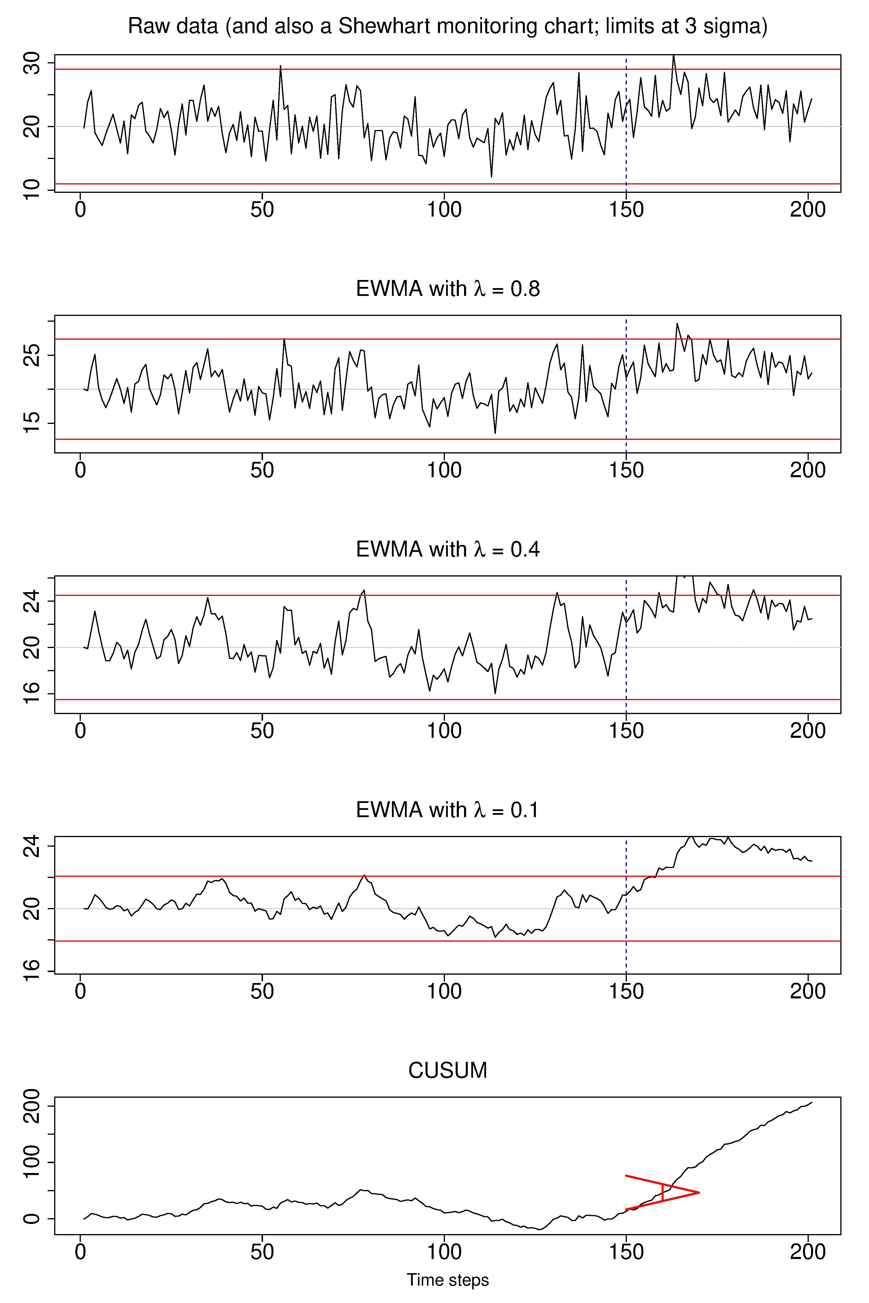
The next plot shows visually what happens as the weight of \(\lambda\) is changed. In this example a shift of \(\Delta = 1\sigma = 3\) units occurs abruptly at \(t=150\). This is of course not known in practice, but the purpose here is to illustrate the effects of choosing \(\lambda\). Prior to that change the process mean is \(\mu=20\) and the raw data has \(\sigma = 3\).
The first chart is the raw data and also a Shewhart chart with subgroup size of 1; the control limits are at \(\pm 3\) times the standard deviation, so at 11.0 and 29.0 units. This control chart barely picks up the shift, as was explained in a prior section.
The second, third and fourth charts are EWMA charts with different values of \(\lambda\); the line is the value on the left-hand side of equation (1), in other words it is \(\hat{x}_{t+1}\), the EWMA value at time \(t\). We see that as \(\lambda\) decreases, the charts are smoother, since the averaging effect is greater: more and more weight is given to the history, \(\hat{x}_{t}\), and less weight to the current data point, \(x_t\). The control limits also become narrower as \(\lambda\) decreases: the half-width in equation (2) above is proportional to \(\sqrt{\lambda/(2-\lambda)}\), which shrinks as \(\lambda \rightarrow 0\).
The final chart of the sequence of 5 charts is a CUSUM chart, which is the ideal chart for picking up such an abrupt shift in the level.
Python, 24 lines
# Reuse the seeded series (base, mu, sigma, shift_at) from the
# CUSUM section, now with a larger shift of 1 sigma = 3 units.
data_shift = base.copy()
data_shift[shift_at:] += 1.0 * sigma

titles = ("Raw data (also a Shewhart chart, subgroup size 1)",
          "EWMA with lambda = 0.8", "EWMA with lambda = 0.4",
          "EWMA with lambda = 0.1", "CUSUM")
fig = make_subplots(rows=5, cols=1, subplot_titles=titles)
fig.add_trace(go.Scatter(y=data_shift, mode="lines"), row=1, col=1)
fig.add_hline(y=mu - 3 * sigma, line_color="red", row=1, col=1)
fig.add_hline(y=mu + 3 * sigma, line_color="red", row=1, col=1)
for row, lam in ((2, 0.8), (3, 0.4), (4, 0.1)):
    half_width = 3 * sigma * np.sqrt(lam / (2 - lam))
    fig.add_trace(go.Scatter(y=ewma(data_shift, lam, target=mu),
                             mode="lines"), row=row, col=1)
    fig.add_hline(y=mu - half_width, line_color="red", row=row, col=1)
    fig.add_hline(y=mu + half_width, line_color="red", row=row, col=1)
fig.add_trace(go.Scatter(y=np.cumsum(data_shift - mu), mode="lines"),
              row=5, col=1)
for row in range(1, 6):
    fig.add_vline(x=shift_at, line_dash="dash", row=row, col=1)
fig.update_layout(height=1200, showlegend=False)
fig.show()
An interesting implementation can be to show both the Shewhart and EWMA plot on the same chart, with both sets of limits. The EWMA value plotted is actually the one-step ahead prediction of the next \(x\)-value, which can be informative for slow-moving processes.
3.6.4. Worked example
Here is a worked example, starting with the assumption the process is at the target value of \(T = 200\) units, and \(\lambda=0.3\). We intentionally show what happens if the new value stays fixed at 190: you see the value plotted gets only a weight of 0.3, while the 0.7 weight is for the prior historical value. Slowly the value plotted catches up, but there is always a lag. The value plotted on the chart is from the first equation in the set of (1), namely \(\hat{x}_t = \lambda x_t + (1-\lambda)\hat{x}_{t-1}\).
Sample number |
Raw data \(x_t\) |
Value plotted on chart: \(\hat{x}_t\) |
|---|---|---|
0 |
NA |
200 |
1 |
200 |
\(0.3 \times 200 + 0.7 \times 200 = 200\) |
2 |
210 |
\(0.3 \times 210 + 0.7 \times 200 = 203\) |
3 |
190 |
\(0.3 \times 190 + 0.7 \times 203 = 199.1\) |
4 |
190 |
\(0.3 \times 190 + 0.7 \times 199.1 = 196.4\) |
5 |
190 |
\(0.3 \times 190 + 0.7 \times 196.4 = 194.5\) |
6 |
190 |
\(0.3 \times 190 + 0.7 \times 194.5 = 193.1\) |