3.12. Exercises
Question 1
Is it fair to say that a monitoring chart is like an online version of a confidence interval? Explain your answer.
Question 2
Use the batch yields data and construct a monitoring chart using the 300 yield values. Use a subgroup of size 5. Report your target value, lower control limit and upper control limit, showing the calculations you made. I recommend that you write your code so that you can reuse it for other questions.
Solution Click to show answer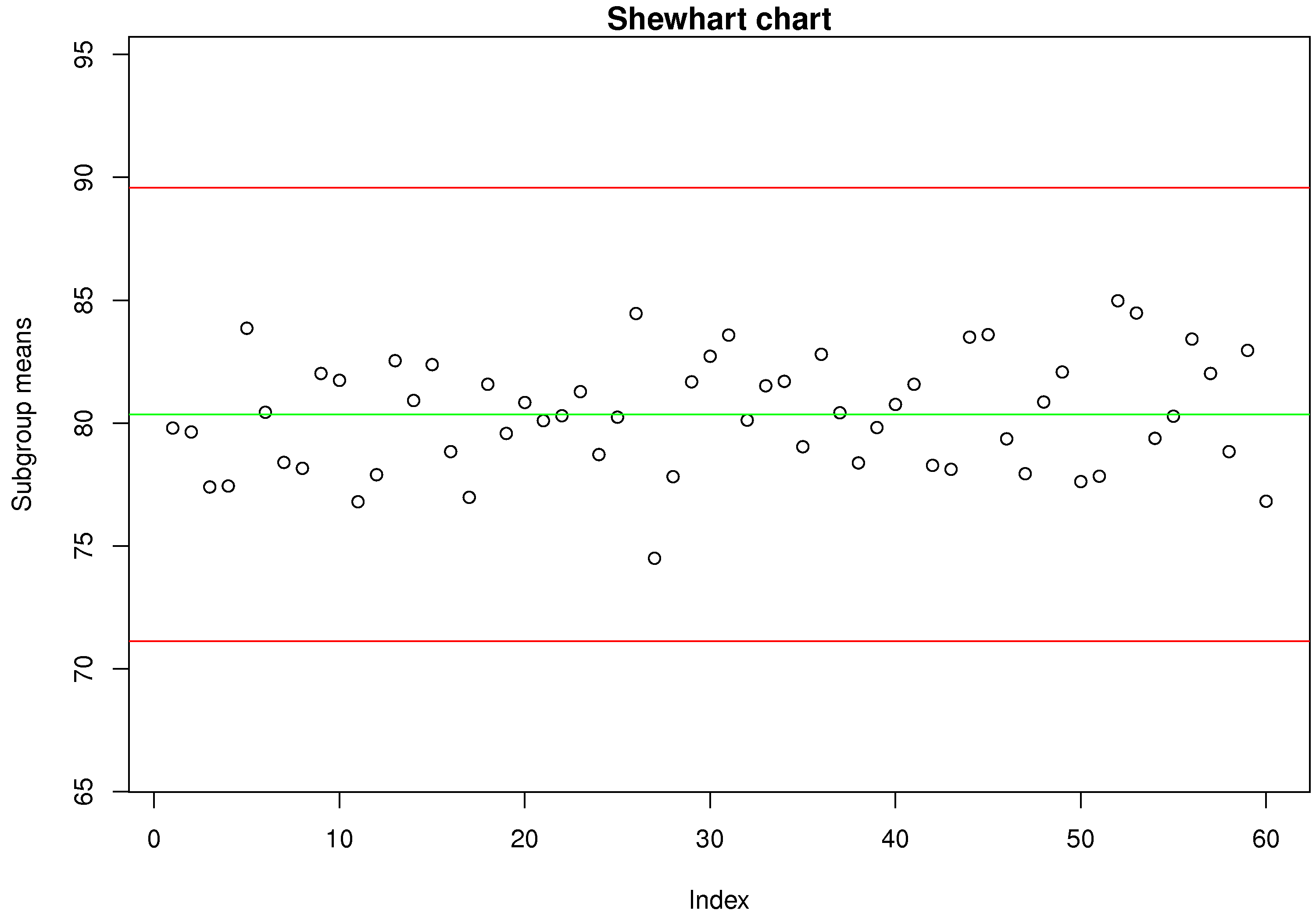
Question 3
The boards data on the website are from a line which cuts spruce, pine and fir (SPF) to produce general quality lumber that you could purchase at Rona, Home Depot, etc. The price that a saw mill receives for its lumber is strongly dependent on how accurate the cut is made. Use the data for the 2 by 6 boards (each row is one board) and develop a monitoring system using these steps.
Plot all the data.
Now assume that boards 1 to 500 are the phase 1 data; identify any boards in this subset that appear to be unusual (where the board thickness is not consistent with most of the other operation)
Remove those unusual boards from the phase 1 data. Calculate the Shewhart monitoring limits and show the phase 1 data with these limits. Note: choose a subgroup size of 7 boards.
Test the Shewhart chart on boards 501 to 2000, the phase 2 data. Show the plot and calculate the type I error rate (
) from the phase 2 data; assuming, of course, that all the phase 2 data are from in-control operation. Calculate the ARL and look at the chart to see if the number looks about right. Use the time information in the raw data and your ARL value to calculate how many minutes between a false alarm. Will the operators be happy with this?
Describe how you might calculate the consumer’s risk (
). How would you monitor if the saws are slowly going out of alignment?
Question 4
Your process with Cpk of 2.0 experiences a drift of
Question 5
Which type of monitoring chart would be appropriate to detect unusual spikes (outliers) in your production process?
Solution Click to show answerQuestion 6
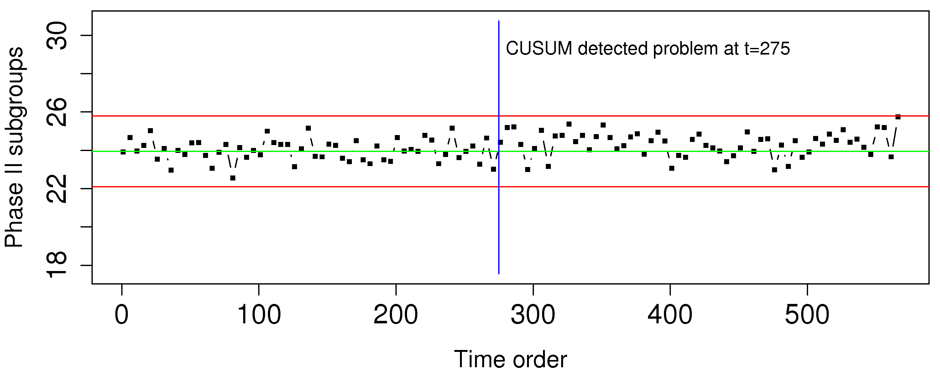
A tank uses small air bubbles to keep solid particles in suspension. If too much air is blown into the tank, then excessive foaming and loss of valuable solid product occurs; if too little air is blown into the tank the particles sink and drop out of suspension.
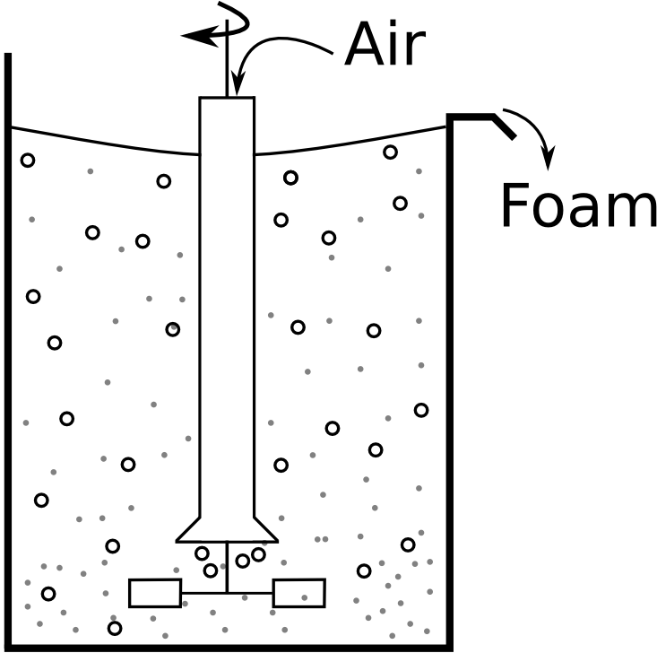
Which monitoring chart would you use to ensure the airflow is always near target?
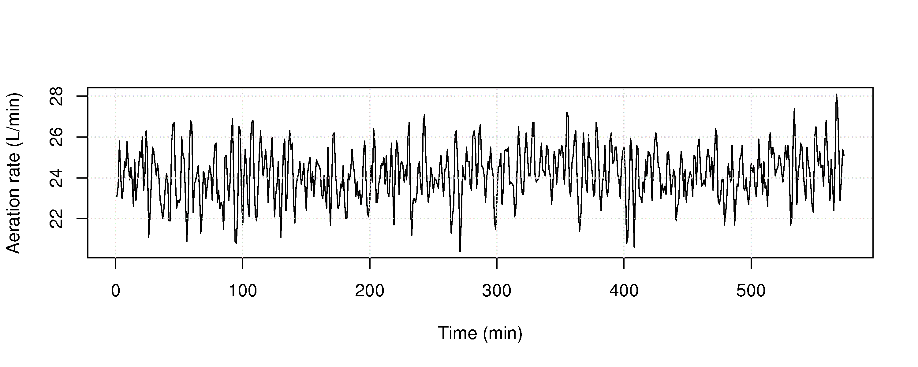
Use the aeration rate dataset from the website and plot the raw data (total litres of air added in a 1 minute period). Are you able to detect any problems?
Construct the chart you described in part 1, and show it’s performance on all the data. Make any necessary assumptions to construct the chart.
At what point in time are you able to detect the problem, using this chart?
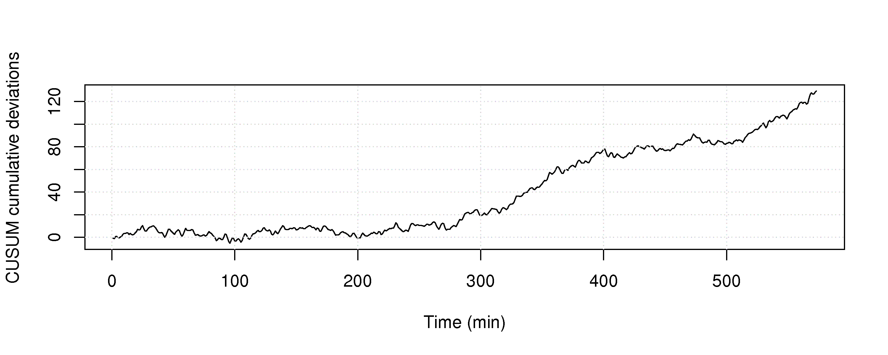
Construct a Shewhart chart, choosing appropriate data for phase 1, and calculate the Shewhart limits. Then use the entire dataset as if it were phase 2 data.
Show this phase 2 Shewhart chart.
Compare the Shewhart chart’s performance to the chart in part 3 of this question.
Question 7
Do you think a Shewhart chart would be suitable for monitoring the closing price of a stock on the stock market? Please explain your answer if you agree, or describe an alternative if you disagree.
Solution Click to show answerQuestion 8
Describe how a monitoring chart could be used to prevent over-control of a batch-to-batch process. (A batch-to-batch process is one where a batch of materials is processed, followed by another batch, and so on).
Solution Click to show answerQuestion 9
You need to construct a Shewhart chart. You go to your company’s database and extract data from 10 periods of time lasting 6 hours each. Each time period is taken approximately 1 month apart so that you get a representative data set that covers roughly 1 year of process operation. You choose these time periods so that you are confident each one was from in control operation. Putting these 10 periods of data together, you get one long vector that now represents your phase 1 data.
There are 8900 samples of data in this phase 1 data vector.
You form subgroups: there are 4 samples per subgroup and 2225 subgroups.
You calculate the mean within each subgroup (i.e. 2225 means). The mean of those 2225 means is 714.
The standard deviation within each subgroup is calculated; the mean of those 2225 standard deviations is 98.
Give an unbiased estimate of the process standard deviation?
Calculate lower and upper control limits for operation at
Operators like warning limits on their charts, so they don’t have to wait until an action limit alarm occurs. Discussions with the operators indicate that lines at 590 and 820 might be good warning limits. What percentage of in control operation will lie inside the proposed warning limit region?
Question 10
If an exponentially weighted moving average (EWMA) chart can be made to approximate either a CUSUM or a Shewhart chart by adjusting the value of
Question 11
The most recent estimate of the process capability ratio for a key quality variable was 1.30, and the average quality value was 64.0. Your process operates closer to the lower specification limit of 56.0. The upper specification limit is 93.0.
What are the two parameters of the system you could adjust, and by how much, to achieve a capability ratio of 1.67, required by recent safety regulations. Assume you can adjust these parameters independently.
Question 12
A bagging system fills bags with a target weight of 37.4 grams and the lower specification limit is 35.0 grams. Assume the bagging system fills the bags with a standard deviation of 0.8 grams:
What is the current Cpk of the process?
To what target weight would you have to set the bagging system to obtain Cpk=1.3?
How can you adjust the Cpk to 1.3 without adjusting the target weight (i.e. keep the target weight at 37.4 grams)?
Question 13
Plastic sheets are manufactured on your blown film line. The Cp value is 1.7. You sell the plastic sheets to your customers with specification of 2 mm
List three important assumptions you must make to interpret the Cp value.
What is the theoretical process standard deviation,
? What would be the Shewhart chart limits for this system using subgroups of size
? Illustrate your answer from part 2 and 3 of this question on a diagram of the normal distribution.
Question 14
The following charts show the weight of feed entering your reactor. The variation in product quality leaving the reactor was unacceptably high during this period of time.
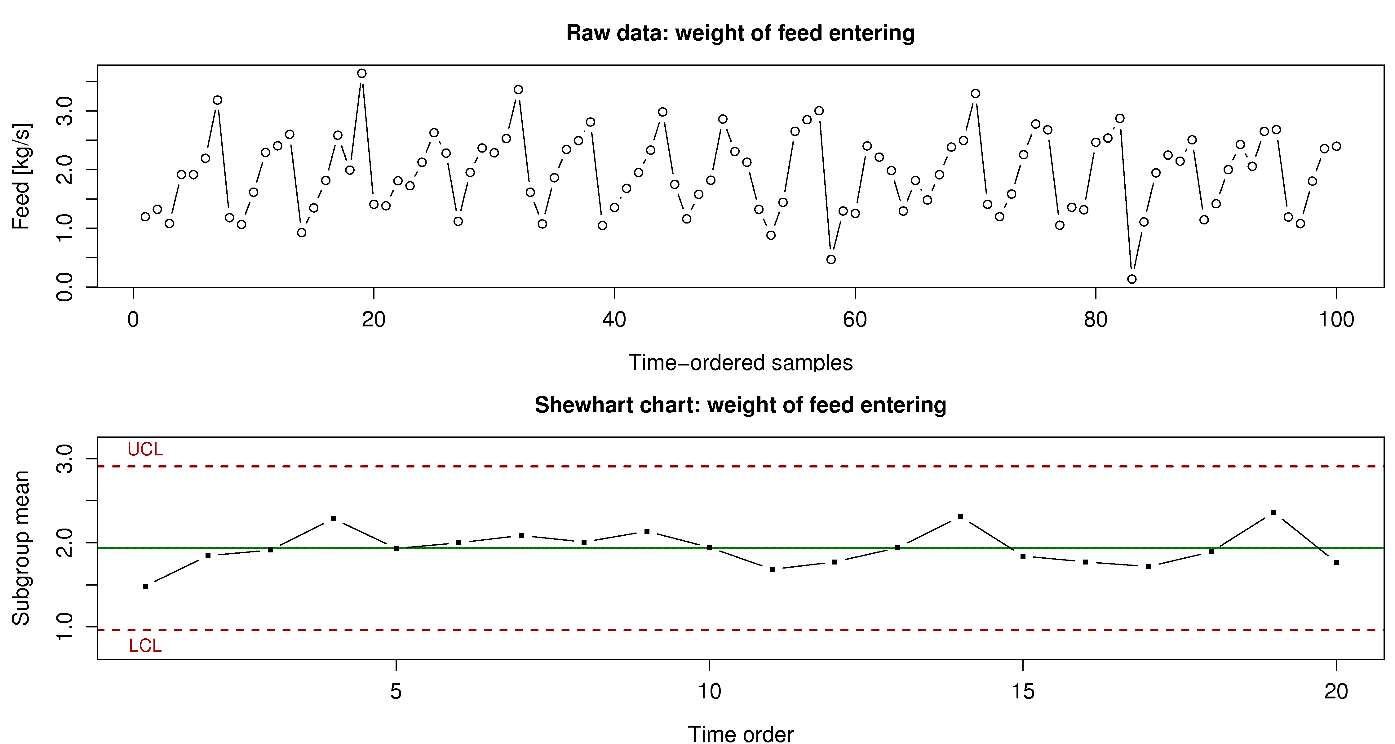
What can your group of process engineers learn about the problem, using the time-series plot (100 consecutive measurements, taken 1 minute apart).
Why is this variability not seen in the Shewhart chart?
Using concepts described elsewhere in this book, why might this sort of input to the reactor have an effect on the quality of the product leaving the reactor?
Question 15
You will come across these terms in the workplace. Investigate one of these topics, using the Wikipedia link below to kick-start your research. Write a paragraph that (a) describes what your topic is and (b) how it can be used when you start working in a company after you graduate, or how you can use it now if you are currently working.
Six sigma and the DMAIC cycle. See the list of companies that use six sigma tools.
Kaizen (a component of The Toyota Way)
Genchi Genbutsu (also a component of The Toyota Way)
In early 2010 Toyota experienced some of its worst press coverage on this very topic. Here is an article in case you missed it.
Question 16
The Kappa number is a widely used measurement in the pulp and paper industry. It can be measured on-line, and indicates the severity of chemical treatment that must be applied to a wood pulp to obtain a given level of whiteness (i.e. the pulp’s bleachability). Data on the website contain the Kappa values from a pulp mill. Use the first 2000 data points to construct a Shewhart monitoring chart for the Kappa number. You may use any subgroup size you like. Then use the remaining data as your phase 2 (testing) data. Does the chart perform as expected?
Short answer: Click to show answerQuestion 17
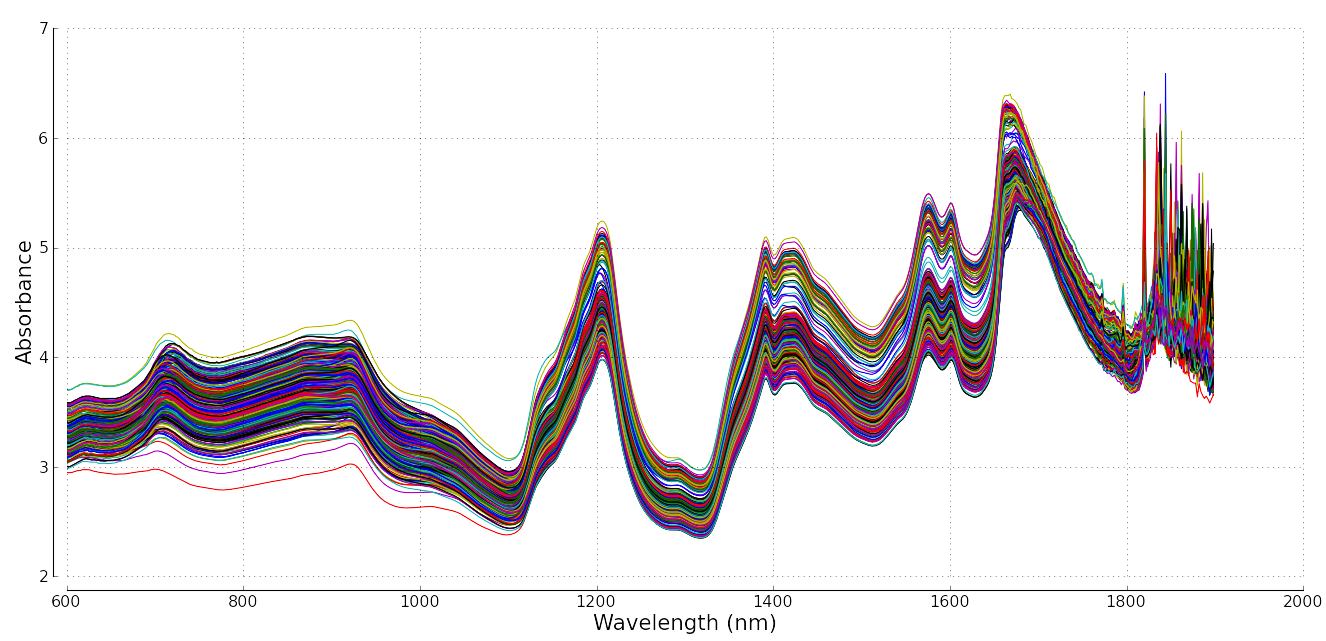
In this section we showed how one can monitor any variable in a process. Modern instrumentation though capture a wider variety of data. It is common to measure point values, e.g. temperature, pressure, concentration and other hard-to-measure values. But it is increasingly common to measure spectral data. These spectral data are a vector of numbers instead of a single number.
Below is an example from a pharmaceutical process: a complete spectrum can be acquired many times per minute, and it gives a complete chemical fingerprint or signature of the system. There are 460 spectra in figure below; they could have come, for example, from a process where they are measured 5 seconds apart. It is common to find fibre optic probes embedded into pipelines and reactors to monitor the progress of a reaction or mixing.
Write a few bullet points how you might monitor a process where a spectrum (a vector) is your data source, and not a “traditional” single point measurement, like a temperature value.
Question 18
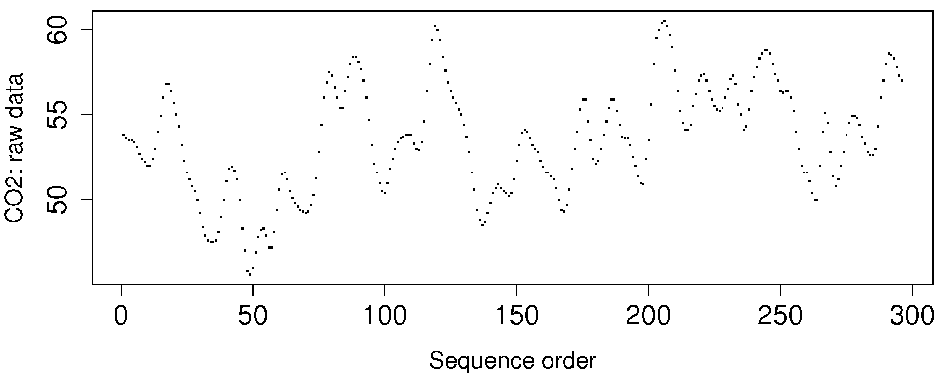
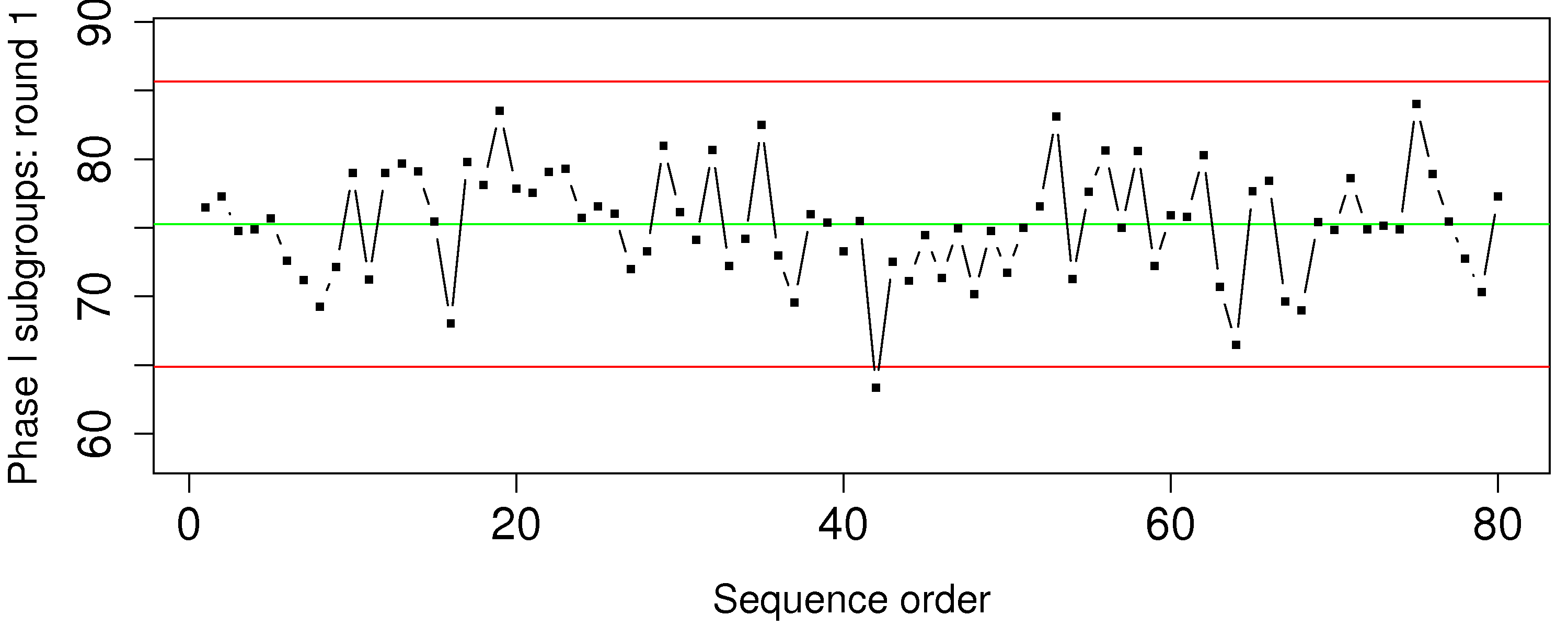
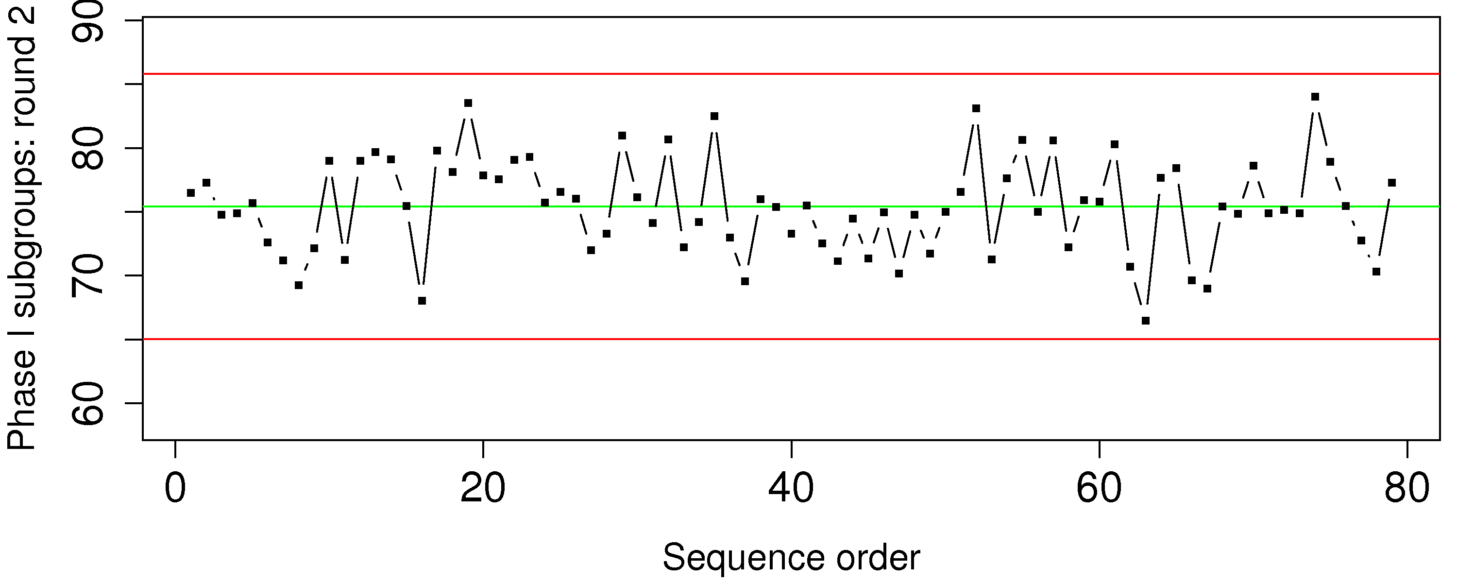
The carbon dioxide measurement is available from a gas-fired furnace. These data are from phase 1 operation.
Calculate the Shewhart chart upper and lower control limits that you would use during phase 2 with a subgroup size of
Is this a useful monitoring chart? What is going in this data?
How can you fix the problem?
Question 19
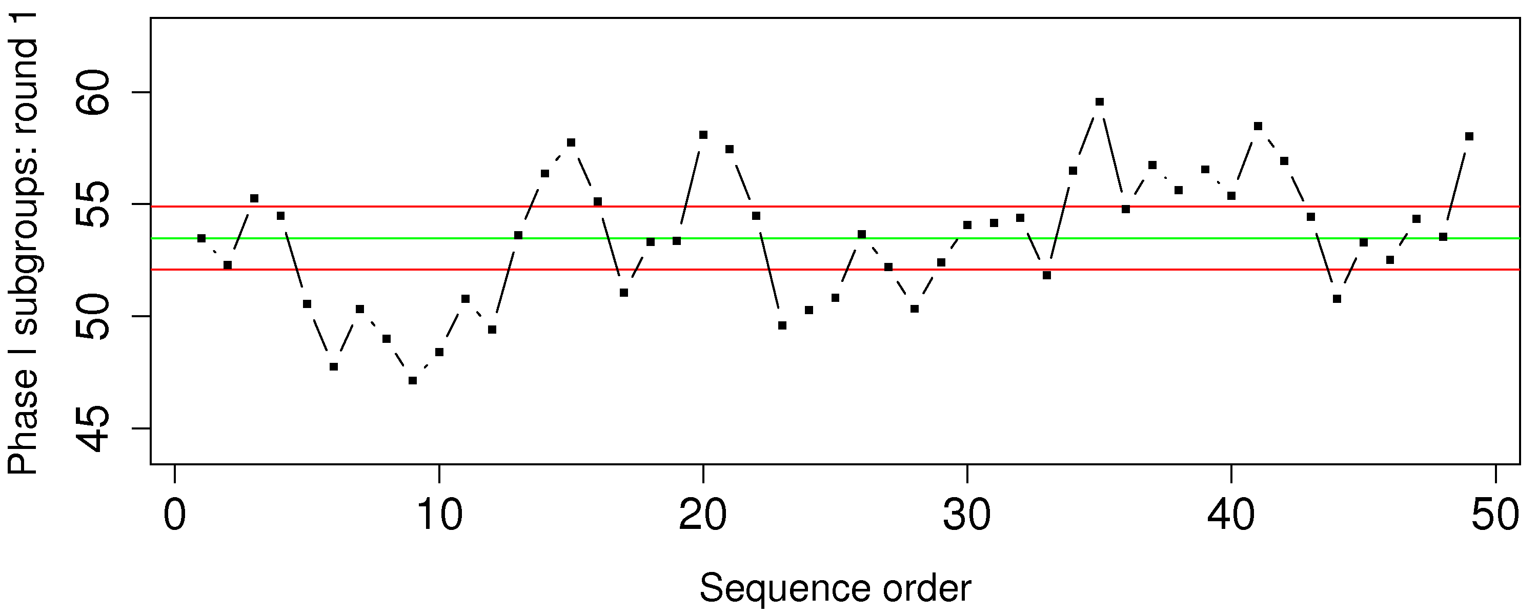
The percentage yield from a batch reactor, and the purity of the feedstock are available as the Batch yield and purity data set. Assume these data are from phase 1 operation and calculate the Shewhart chart upper and lower control limits that you would use during phase 2. Use a subgroup size of
What is phase 1?
What is phase 2?
Show your calculations for the upper and lower control limits for the Shewhart chart on the yield value.
Show a plot of the Shewhart chart on these phase 1 data.
Question 20
You will hear about 6-sigma processes frequently in your career. What does it mean exactly that a process is “6-sigma capable”? Draw a diagram to help illustrate your answer.