3.4. Shewhart charts
A Shewhart chart, named after Walter Shewhart from Bell Telephone and Western Electric, monitors that a process variable remains on target and within given upper and lower limits. It is a monitoring chart for location. It answers the question whether the variable’s location is stable over time. It does not track anything else about the measurement, such as its standard deviation. Looking ahead: we show later that a pure Shewhart chart needs extra rules to help monitor the location of a variable effectively.
The defining characteristics of a Shewhart chart are: a target, upper and lower control limits (UCL and LCL). These action limits are defined so that no action is required as long as the variable plotted remains within the limits. In other words a special cause is not likely present if the points remain within the UCL and LCL.
3.4.1. Derivation using theoretical parameters
Define the variable of interest as
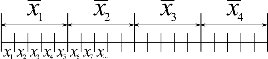
So by taking subgroups of size
Assuming we know
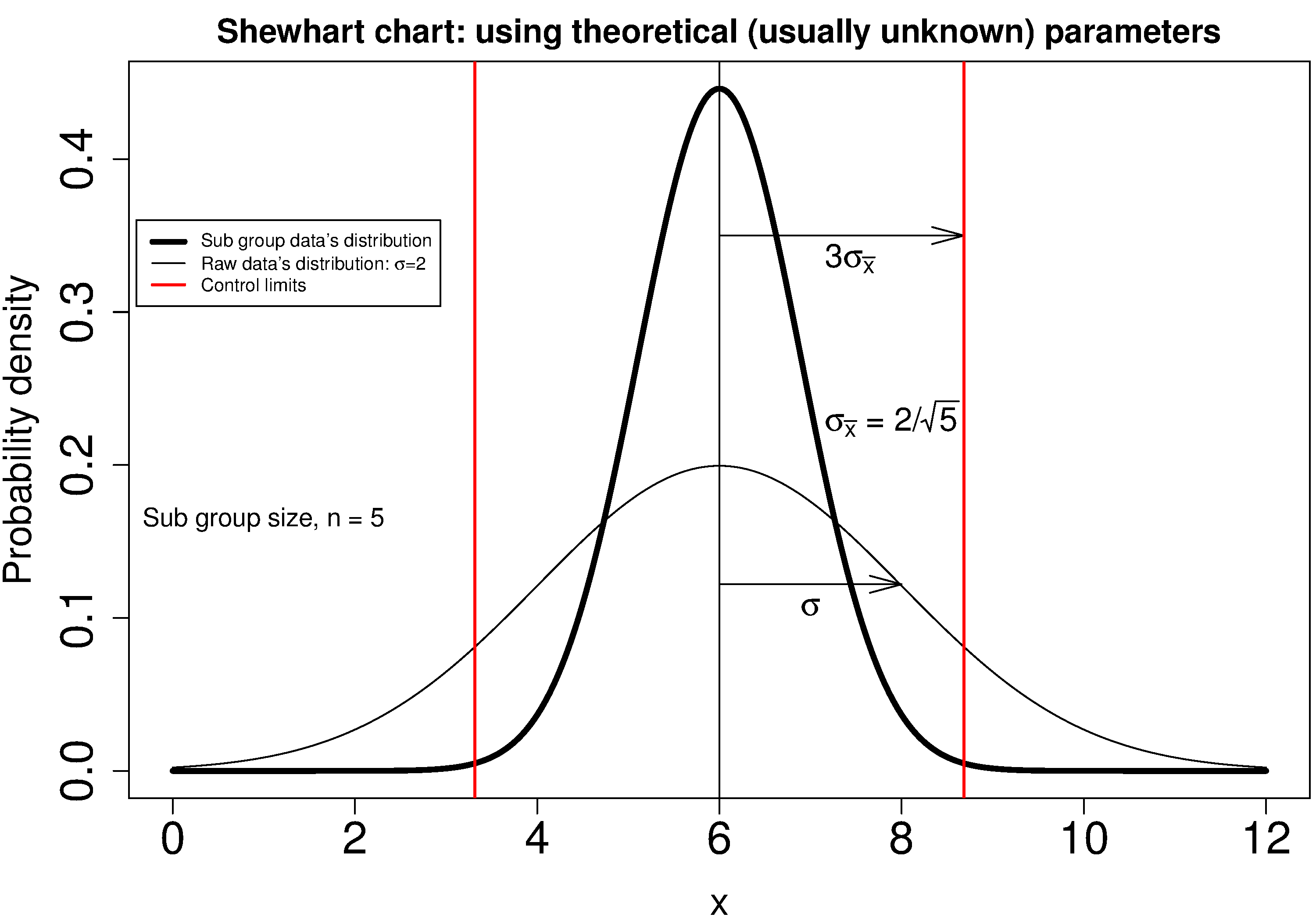
The reason for pnorm(+3) - pnorm(-3) gives 0.9973). So it is highly unlikely, a chance of 1 in 370, that a data point,
The following illustration should help connect the concepts: the raw data’s distribution happens to have a mean of 6 and standard deviation of 2, while it is clear the distribution of the subgroups of 5 samples (thicker line) is much narrower.
3.4.2. Using estimated parameters instead
The derivation in equation (1) requires knowing the population variance,
Let’s take a look at phase 1, the step where we are building the monitoring chart’s limits from historical data. Create a new variable
The next hurdle is
2 |
3 |
4 |
5 |
6 |
7 |
8 |
10 |
15 |
|
0.7979 |
0.8862 |
0.9213 |
0.9400 |
0.9515 |
0.9594 |
0.9650 |
0.9727 |
0.9823 |
More generally, using the gamma(...) in R or MATLAB, or math.gamma(...) in Python, you can reproduce the above
Notice how the
It is highly unlikely that all the data chosen to calculate the phase 1 limits actually lie within these calculated LCL and UCLs. Those portions of data not from stable operation, which are outside the limits, should not have been used to calculate these limits. Those unstable data bias the limits to be wider than required.
Exclude these outlier data points and recompute the LCL and UCLs. Usually this process is repeated 2 to 3 times. It is wise to investigate the data being excluded to ensure they truly are from unstable operation. If they are from stable operation, then they should not be excluded. These data may be violating the assumption of independence. One may consider using wider limits, or use an EWMA control chart.
Example
Bales of rubber are being produced, with every 10th bale automatically removed from the line for testing. Measurements of colour intensity are made on 5 sides of that bale, using calibrated digital cameras under controlled lighting conditions. The rubber compound is used for medical devices, so it needs to have the correct colour, as measured on a scale from 0 to 255. The average of the 5 colour measurements is to be plotted on a Shewhart chart. So we have a new data point appearing on the monitoring chart after every 10th bale.
In the above example the raw data are the bale’s colour. There are
The data below represent the average of the
The overall average is
Calculate the lower and upper control limits for this Shewhart chart.
Were there any points in the phase 1 data (training phase) that exceeded these limits?
LCL =
UCL =
The group with
That
In source code:
3.4.3. Judging the chart’s performance
There are 2 ways to judge performance of a monitoring chart. In particular here we discuss the Shewhart chart:
1. Error probability.
We define two types of errors, Type I and Type II, which are a function of the lower and upper control limits (LCL and UCL).
You make a type I error when your sample is typical of normal operation, yet, it falls outside the UCL or LCL limits. We showed in the theoretical derivation that the area covered by the upper and lower control limits is 99.73%. The probability of making a type I error, usually denoted as
Synonyms for a type I error: false alarm, false positive (used mainly for testing of diseases), producer’s risk (used for acceptance sampling, because here as the producer you will be rejecting an acceptable sample), false rejection rate, or alpha.
You make a type II error when your sample really is abnormal, but falls within the the UCL and LCL limits and is therefore not detected. This error rate is denoted by
Synonyms for a type II error: false negative (used mainly for testing of diseases), consumer’s risk (used for acceptance sampling, because your consumer will be receiving available product which is defective), false acceptance rate, or beta.
To quantify the probability
The table highlights that beta <- pnorm(3 - delta*sqrt(n)) - pnorm(-3 - delta*sqrt(n))
0.25 |
0.50 |
0.75 |
1.00 |
1.50 |
2.00 |
|
0.9936 |
0.9772 |
0.9332 |
0.8413 |
0.5000 |
0.1587 |
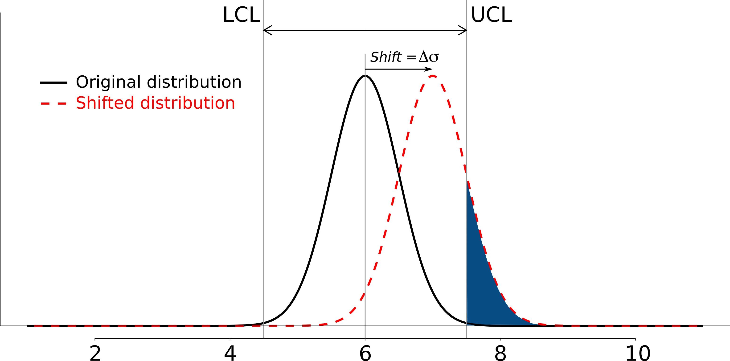
The key point you should note from the table is that a Shewhart chart is not good (it is slow) at detecting a change in the location (level) of a variable. This is surprising given the intention of the plot is to monitor the variable’s location. Even a moderate shift of
It is straightforward to see how the type I,
However what happens to the type II error rate as the LCL and UCL bounds are shifted away from the target? Imagine the case where you want to have
2. Using the average run length (ARL)
The average run length (ARL) is defined as the average number of sequential samples we expect before seeing an out-of-bounds, or out-of-control signal. This is given by the inverse of
3.4.4. Extensions to the basic Shewhart chart to help monitor stability of the location
The Western Electric rules: we saw above how sluggish the Shewhart chart is in detecting a small shift in the process mean, from
Two out of 3 points lie beyond
Four out of 5 points lie beyond
Eight successive points lie on the same side of the center line
However, an alternative chart, the CUSUM chart is more effective at detecting a shift in the mean. Notice also that the theoretical ARL,
Adding robustness: the phase I derivation of a monitoring chart is iterative. If you find a point that violates the LCL and UCL limits, then the approach is to remove that point, and recompute the LCL and UCL values. That is because the LCL and UCL limits would have been biased up or down by these unusual points
This iterative approach can be tiresome with data that has spikes, missing values, outliers, and other problems typical of data pulled from a process database (historian). Robust monitoring charts are procedures to calculate the limits so the LCL and UCL are resistant to the effect of outliers. For example, a robust procedure might use the medians and MAD instead of the mean and standard deviation. An examination of various robust procedures, especially that of the interquartile range, is given in the paper by D. M. Rocke, Robust Control Charts, Technometrics, 31 (2), p 173 - 184, 1989.
Note: do not use robust methods to calculate the values plotted on the charts during phase 2, only use robust methods to calculate the chart limits in phase 1!
Warning limits: it is common to see warning limits on a monitoring chart at
Adjusting the limits: The
Changing the subgroup size: It is perhaps a counterintuitive result that increasing the subgroup size,
3.4.5. Mistakes to avoid
Imagine you are monitoring an aspect of the final product’s quality, e.g. viscosity, and you have a product specification that requires that viscosity to be within, say 40 to 60 cP. It is a mistake to place those specification limits on the monitoring chart as a guide when to take action. It is also a mistake to use the required specification limits instead of the LCL and UCL. The monitoring chart is to detect abnormal variation in the process and gives a signal on when to take action, not to inspect for quality specifications. You can certainly have another chart for that, but the process monitoring chart’s limits are intended to monitor process stability, and these Shewhart stability limits are calculated differently. Ideally the specification limits lie beyond the LCL and UCL action limits.
Shewhart chart limits were calculated with the assumption of independent subgroups (e.g. subgroup
Using Shewhart charts on two or more highly correlated quality variables, usually on your final product measurement, can increase your type II (consumer’s risk) dramatically. We will come back to this very important topic in the section on latent variable models, where we will counterintuitively prove that even having individual charts each within their respective limits can result where it is outside the joint limits.