Download PDF of entire book
1.3. Time-series plots
We start off by considering a plot most often seen in engineering applications: the time-series plot. The time-series plot is a univariate plot: it shows only one variable. It is a 2-dimensional plot in which one axis, the time-axis, shows graduations at an appropriate scale (seconds, minutes, weeks, quarters, years), while the other axis shows the numeric values. Usually, the time-axis is displayed horizontally, but this is not a requirement: some interesting analysis can be done with time running vertically.
Many statistical packages call this a line plot, as it can be used generally to display any sort of sequence, whether it is along time or some other ordering. The time-series plot is an excellent way to visualize long sequences of data. It tells a visual story along the sequence axis, and the human brain is remarkably good at absorbing this high density of data, locating patterns in the data such as sinusoids, spikes, and outliers, and separating any noise from signal.
Here are some tips for effective time-series plots:
The software should have horizontal and vertical zooming ability. Once zoomed in, there must be tools to scroll up, down, left and right.
Always label the x-axis appropriately with (time) units that make sense.
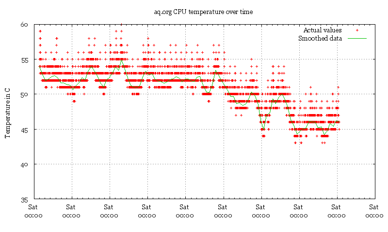
This plot, found on the Internet, shows a computer’s CPU temperature with time. There are several problems with the plot, but the key issue here is the x-axis. This plot is probably the result of poor default settings in the software, but as you will start to realize, bad defaults are very common in most software packages. They waste your time when you have to repeatedly modify the charts, especially if you are just starting out with exploring the data. Good software will sensibly label the time-based axis for you.
The Python code below shows how to do this correctly: a real
pd.DatetimeIndex, a Plotly time axis formatted with month/year tick labels, and a rolling-mean overlay that helps separate signal from noise.Python, 47 lines
import pandas as pd
import plotly.graph_objects as go

pd.options.plotting.backend = "plotly"

# Real ammonia concentrations from a waste-water treatment plant.
waste = pd.read_csv("https://openmv.net/file/ammonia.csv")

# Give the x-axis real time units rather than raw integer indices.
# The CSV ships without a timestamp; attach an hourly index that
# starts at the beginning of 2010 so the time axis is meaningful.
waste.index = pd.date_range(
    start="2010-01-01", periods=len(waste), freq="h"
)

# A clean line plot of the raw signal, with month/year tick labels.
fig = waste["Ammonia"].plot.line()
fig.update_layout(
    xaxis_title_text="Date",
    yaxis_title_text="Ammonia [mmol/L]",
    width=800,
    height=400,
    showlegend=False,
)
fig.update_xaxes(tickformat="%b %Y")
fig.show()

# Overlay a 5-day rolling mean to separate signal from noise.
rolling = waste["Ammonia"].rolling("5D", center=True).mean()
fig = go.Figure()
fig.add_trace(go.Scatter(x=waste.index, y=waste["Ammonia"], name="Ammonia"))
fig.add_trace(
    go.Scatter(
        x=waste.index,
        y=rolling,
        name="5-day rolling mean",
        line_color="black",
    )
)
fig.update_layout(
    xaxis_title_text="Date",
    yaxis_title_text="Ammonia [mmol/L]",
    width=800,
    height=400,
)
fig.update_xaxes(tickformat="%b %Y")
fig.show()
When plotting more than one trajectory (a vector of values) against time, it is helpful if the lines do not cross or jumble too much. This allows you to clearly see the relationship with other variables. A second y-axis on the right-hand side is sometimes used when plotting two trajectories that have different units or ranges. Interpret such plots with care: the two vertical scales are chosen independently of each other, so the point where the lines cross, and how strongly the lines appear to move together, depends on the scaling and is not a property of the data. When plotting three or more trajectories that are in the same numeric range, it is better to use several parallel axes.
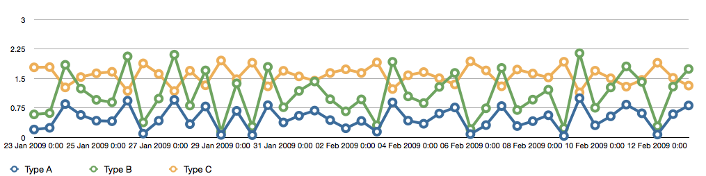
The previous figure shows this jumbled result, drawn with the default settings of a spreadsheet package (Apple iWork’s Numbers, 2009). Differently coloured lines and/or markers may work in selected instances, but with three trajectories the lines already clutter each other.
Using different markers, improving the axis labelling, tightening up the axis ranges, and thinning out the ink improves the chart slightly, as shown next. This took about 3 minutes extra in the software, because I had not used the software before and had to find the settings.
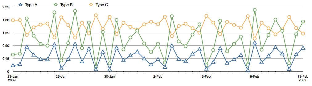
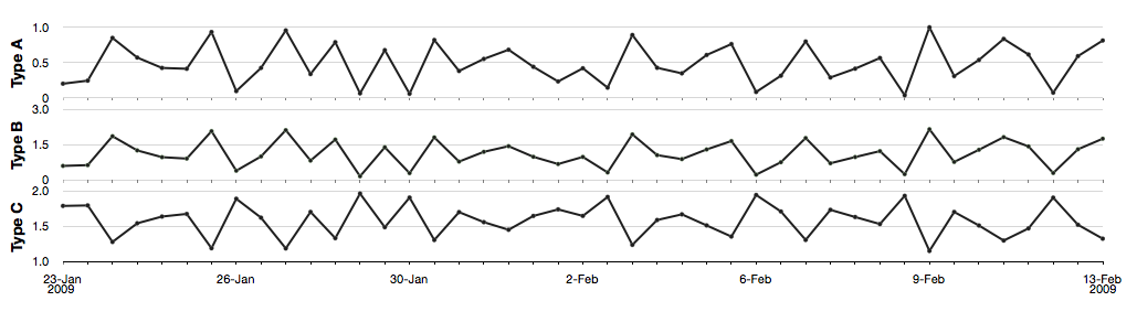
The version below, with parallel axes, is greatly improved. It took about 10 minutes to assemble, and would likely take a similar amount of time to format in MATLAB, Excel, Python or other packages. The results are clearer to interpret: variables “Type A” and “Type B” move up and down together, while variable “Type C” moves in the opposite direction. Note how the y-axis for “Type C” is rescaled to start from its minimum value, rather than a value of zero. Use tight limits on the y-axis, so that the vertical space is used to show the data.
Using the same data as in the previous tip, a much improved visualization technique is to use sparklines to represent the sequence of data.
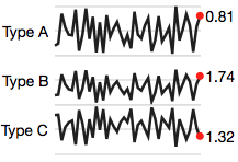
Sparklines are small graphics that carry a high density of information. Tufte, who introduced them, estimates that the human eye can comfortably resolve around 100 points per linear centimeter, and around 10000 points per square centimeter. These sparklines show the same data as the previous plots in a fraction of the space, and are easy to consume on hand-held devices such as cellphones and tablet computing devices that are common in chemical plants and other engineering facilities. Read more about them in Tufte’s essay on sparklines.
When plotting money values over time (e.g. sales of your product over the past 10 years), adjust for inflation effects by dividing by the consumer price index or an appropriate factor. Distortions due to the time value of money can be very misleading, as this example of retail sales shows. For Canadians, here is a Canadian inflation calculator from the Bank of Canada that can help you. For most countries you can almost certainly find something similar from the country’s national bank or a government office.
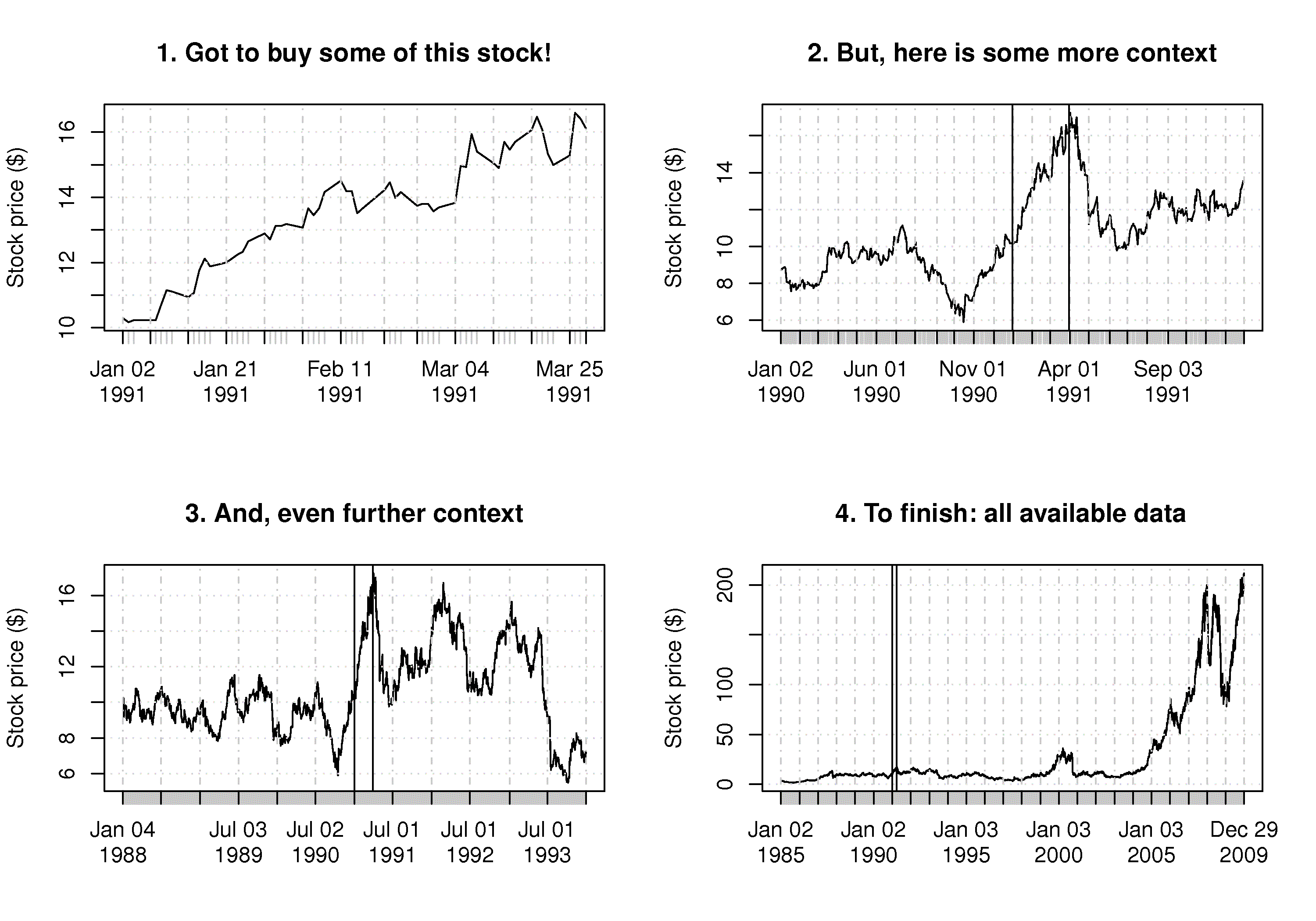
If you ever ask yourself, “Why are we being shown so little?” then you must request more data before and after the time period or current sequence shown. A typical example is stock-price data (see example figure of Apple’s stock). There are numerous graphical “lies” in magazines and reports where the plot shows a drastic change in trend, but in the context of prior data, that trend is a small aberration. Again, this brings into play the brain’s remarkable power to discern signal from noise, but to do this, our brains require context. Ask for the extra context, or look for it, if not provided.