
 Download PDF of entire book
7.3. Multivariate process monitoring case studies
Chapter 3 introduced the toolkit of univariate process monitoring – the Shewhart chart, CUSUM and EWMA – and applied them one variable at a time. That works when the process problem appears as a change in a single tag, but real industrial faults usually distort several variables at once, in directions that respect the correlation structure of the process. A chart that watches each tag on its own does not see the joint shift; it can either miss the fault entirely or, more often, raise the alarm only after the disturbance has grown large enough to be visible in one variable. The first part of this section sets out what a latent variable model lets us monitor and how the monitoring charts are built; the rest is a worked example on the same mineral flotation cell mentioned in an earlier chapter, where we build a Shewhart chart on a single variable, then a multivariate-statistical-process-control (MSPC) chart on all five variables, and compare what each one detects.
7.3.1. Monitoring with latent variable methods
Any variable can be monitored using control charts, as we saw in the earlier section on process monitoring. The main purpose of these charts is to rapidly distinguish between two types of operation: in-control and out-of-control. We also aim to have a minimum number of false alarms (type I error: we raise an alarm when one isn’t necessary) and the lowest number of false negatives possible (type II error, when an alarm should be raised, but we don’t pick up the problem with the chart). We used Shewhart charts, CUSUM and EWMA charts to achieve these goals.
Consider the case of two variables, called \(x_1\) and \(x_2\), shown on the right, on the two horizontal axes. These could be time-oriented data, or just measurements from various sequential batches of material. The main point is that each variable’s \(3\sigma\) Shewhart control limits indicate that all observations are within control. It may not be apparent, but these two variables are negatively correlated with each other: as \(x_1\) increases, the \(x_2\) value decreases.
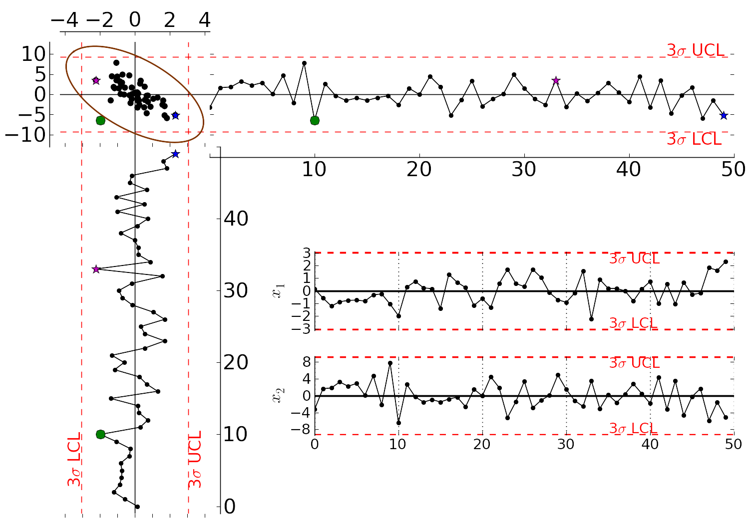
Rearranging the axes at 90 degrees to each other, and plotting the joint scatter plot of the two variables in the upper left corner reveals the negative correlation, if you didn’t notice it initially. Ignore the ellipse for now. It is clear that sample 11, marked and labelled in all three panels, is very different from the other samples. It is not an outlier from the perspective of \(x_1\), nor of \(x_2\), but jointly it is an outlier. This particular batch of materials would result in very different process operation and final product quality to the other samples. Yet a producer using separate control charts for \(x_1\) and \(x_2\) would not pick up this problem.
Sample 30, marked in the same three panels, shows the disagreement running the other way. Its \(x_1\) value falls outside that variable’s own \(3\sigma\) limit, so the \(x_1\) chart raises an alarm, while its \(x_2\) value is unremarkable. Jointly, though, it sits inside the ellipse. A low \(x_1\) together with a high \(x_2\) is the direction in which these two variables move anyway, and the ellipse reaches furthest in that direction, so the pair of measurements is ordinary even though one of them on its own is not. Reacting to that alarm means stopping a process that is behaving normally: a type I error, and a cost paid in lost production rather than in lost quality.
So the two views disagree in both directions. A sample can be inside every univariate limit and still be jointly unusual, as sample 11 is, and a sample can breach a univariate limit and still be jointly ordinary, as sample 30 is. The limits are different shapes: the univariate charts together mark out a rectangle, while the joint limit is an ellipse tilted along the correlation. Neither shape contains the other.
While using univariate control charts is necessary to pick up problems, univariate charts are not sufficient to pick up all quality problems if the variables are correlated. The key point here is that quality is a multivariate attribute. All our measurements on a system must be jointly within in the limits of common operation. Using only univariate control charts will raise the type II error: an alarm should be raised, but we don’t pick up the problem with the charts.
Let’s take a look at how process monitoring can be improved when dealing with many attributes (many variables). We note here that the same charts are used: Shewhart, CUSUM and EWMA charts, the only difference is that we replace the variables in the charts with variables from a latent variable model. We monitor instead the:
scores from the model, \(t_1, t_2, \ldots, t_A\)
Hotelling’s \(T^2 = \displaystyle \sum_{a=1}^{a=A}{\left(\dfrac{t_{a}}{s_a}\right)^2}\)
SPE value
The last two values are particularly appealing: they measure the on-the-plane and off-the-plane variation respectively, compressing \(K\) measurements into 2 very compact summaries of the process.
There are a few other good reasons to use latent variables models:
The scores are orthogonal, totally uncorrelated to each other. The scores are also unrelated to the SPE: this means that we are not going to inflate our type II error rate, which happens when using correlated variables.
There are far fewer scores than original variables on the process, yet the scores capture all the essential variation in the original data, leading to fewer monitoring charts on the operators’ screens.
We can calculate the scores, \(T^2\) and SPE values even if there are missing data present; conversely, univariate charts have gaps when sensors go off-line.
Rather than waiting for laboratory final quality checks, we can use the automated measurements from our process. There are many more of these measurements, so they will be correlated – we have to use latent variable tools. The process data are usually measured with greater accuracy than the lab values, and they are measured at higher frequency (often once per second). Furthermore, if a problem is detected in the lab values, then we would have to come back to these process data anyway to uncover the reason for the problem.
But by far, one of the most valuable attributes of the process data is the fact that they are measured in real-time. The residence time in complex processes can be in the order of hours to days, going from start to end. Having to wait till much later in time to detect problems, based on lab measurements can lead to monetary losses as off-spec product must be discarded or reworked. Conversely, having the large quantity of data available in real-time means we can detect faults as they occur (making it much easier to decode what went wrong). But we need to use a tool that handles these highly correlated measurements.
A paper that outlines the reasons for multivariate monitoring is by John MacGregor, “Using on-line process data to improve quality: Challenges for statisticians”, International Statistical Review, 65, p 309-323, 1997.
We will look at the steps for phase I (building the monitoring charts) and phase II (using the monitoring charts).
7.3.1.1. Phase I: building the control chart
The procedure for building a multivariate monitoring chart, i.e. the phase I steps:
Collect the relevant process data for the system being monitored. The preference is to collect the measurements of all attributes that characterize the system being monitored. Some of these are direct measurements, others might have to be calculated first.
Assemble these measurements into a matrix \(\mathbf{X}\).
As we did with univariate control charts, remove observations (rows) from \(\mathbf{X}\) that are from out-of control operation, then build a latent variable model (either PCA or PLS). The objective is to build a model using only data that is from in-control operation.
In all real cases the practitioner seldom knows which observations are from in-control operation, so this is an iterative step.
Prune out observations which have high \(T^2\) and SPE (after verifying they are outliers).
Prune out variables in \(\mathbf{X}\) that have low \(R^2\).
The observations that are pruned out are excellent testing data that can be set aside and used later to verify the detection limits for the scores, \(T^2\) and SPE.
The control limits depend on the type of variable:
Each score has variance of \(s_a^2\), so this can be used to derive the Shewhart or EWMA control limits. Recall that Shewhart limits are typically placed at \(\pm 3 \sigma/\sqrt{n}\), for subgroups of size \(n\).
Hotelling’s \(T^2\) and SPE have limits provided by the software (we do not derive here how these limits are calculated, though its not difficult).
However, do not feel that these control limits are fixed. Adjust them up or down, using your testing data to find the desirable levels of type I and type II error.
Keep in reserve some “known good” data to test what the type I error level is; also keep some “known out-of-control” data to assess the type II error level.
7.3.1.2. Phase II: using the control chart
The phase II steps, when we now wish to apply this quality chart on-line, are similar to the phase II steps for univariate control charts. Calculate the scores, SPE and Hotelling’s \(T^2\) for the new observation, \(\mathbf{x}'_\text{new}\), as described in the section on using an existing PCA model. Then plot these new quantities, rather than the original variables. The only other difference is how to deal with an alarm.
The usual phase II approach when an alarm is raised is to investigate the variable that raised the alarm, and use your engineering knowledge of the process to understand why it was raised. When using scores, SPE and \(T^2\), we actually have a bit more information, but the approach is generally the same: use your engineering knowledge, in conjunction with the relevant contribution plot.
A score variable, e.g. \(t_a\) raised the alarm. We derived earlier that the contribution to each score was \(t_{\text{new},a} = x_{\text{new},1} \,\, p_{1,a} + x_{\text{new},2} \,\, p_{2,a} + \ldots + x_{\text{new},k} \,\, p_{k,a} + \ldots + x_{\text{new},K} \,\, p_{K,a}\). It indicates which of the original \(K\) variables contributed most to the very high or very low score value.
SPE alarm. The contribution to SPE for a new observation was derived in an earlier section as well; it is conveniently shown using a barplot of the \(K\) elements in the vector below. These are the variables most associated with the broken correlation structure.
\[\begin{split}\mathbf{e}'_{\text{new}} &= \mathbf{x}'_\text{new} - \hat{\mathbf{x}}'_\text{new} = \mathbf{x}'_\text{new} - \mathbf{t}'_\text{new} \mathbf{P}'\\ &= \begin{bmatrix}(x_{\text{new},1} - \hat{x}_{\text{new},1}) & (x_{\text{new},2} - \hat{x}_{\text{new},2}) & \ldots & (x_{\text{new},k} - \hat{x}_{\text{new},k}) & \ldots & (x_{\text{new},K} - \hat{x}_{\text{new},K})\end{bmatrix}\end{split}\]\(T^2\) alarm: an alarm in \(T^2\) implies one or more scores are large. In many cases it is sufficient to go investigate the score(s) that caused the value of \(T^2_\text{new}\) to be large. Though as long as the SPE value is below its alarm level, many practitioners will argue that a high \(T^2\) value really isn’t an alarm at all; it indicates that the observation is multivariately in-control (on the plane), but beyond the boundaries of what has been observed when the model was built. My advice is to consider this point tentative: investigate it further (it might well be an interesting operating point that still produces good product).
7.3.2. The flotation cell
Flotation is the workhorse separation step in mineral processing. Crushed ore is mixed with water and a collector reagent into a slurry, fed into an agitated tank, and aerated from below. Hydrophobic particles (the valuable mineral) attach to the rising bubbles and concentrate in the froth at the surface; hydrophilic particles (the gangue) sink and leave through the tailings stream. The product is the froth that overflows. Five process tags are recorded every 30 seconds:
Feed rate– slurry feed into the cell (tonnes per hour),Upstream pH– pH of the upstream conditioner where collector dosing happens,CuSO4 added– copper sulphate dose, an activator used to make the target mineral more responsive to the collector,Pulp level– froth-pulp interface depth inside the cell,Air flow rate– aeration rate into the bottom of the cell.
The dataset is a 30-second sampling of those five tags over two consecutive days. The first 479 observations (all of 15 December 2004 and the first sample of 16 December) were visibly unsettled and make a poor in-control reference, so we discard them entirely. Phase 1 is the next 1000 observations (125 4-minute subgroups of 8 samples, plenty for fitting a 2-component PCA model on five variables) and phase 2 is everything after that (1443 observations). Both the univariate chart limits and the multivariate model are built on phase 1, and both charts are then evaluated on phase 2.
Loading the data and setting up the phase split:
Python, 14 lines
import numpy as np
import pandas as pd
import plotly.graph_objects as go
from plotly.subplots import make_subplots
from process_improve.multivariate import PCA, MCUVScaler

flot = pd.read_csv("https://openmv.net/file/flotation-cell.csv")
num = flot.drop(columns=["Date and time"])

N_DROP = 479           # discard the unsettled startup stretch
N_PHASE1_RAW = 1000    # next 1000 raw obs (125 subgroups of 8)
phase1 = num.iloc[N_DROP : N_DROP + N_PHASE1_RAW].reset_index(drop=True)
phase2 = num.iloc[N_DROP + N_PHASE1_RAW :].reset_index(drop=True)
print(f"phase1 shape: {phase1.shape}  phase2 shape: {phase2.shape}")
This gives 1000 raw phase-1 observations and 1443 raw phase-2 observations.
7.3.3. Univariate Shewhart chart on the pulp level
For the univariate side of the comparison we pick the Pulp level tag –
the froth-pulp interface depth inside the cell, which is the variable an
operator most directly tunes to control the residence time and recovery.
Before fixing a subgroup size we look at how autocorrelated the raw
30-second observations are; Shewhart limits assume the underlying noise is
independent between samples, and an inflated false-alarm rate from
ignoring autocorrelation would not be informative. Here is the
autocorrelation function of Pulp level on phase 1, with the
\(\pm 1.96/\sqrt{N}\) band drawn in for the standard 95% noise
envelope:
Python, 19 lines
def acf(x, nlags):
    xc = np.asarray(x, dtype=float) - float(np.mean(x))
    var = float((xc ** 2).sum())
    return np.array([(xc[: len(xc) - k] * xc[k:]).sum() / var
                     for k in range(nlags + 1)])

nlags = 40
rho = acf(phase1["Pulp level"].values, nlags)
ci = 1.96 / np.sqrt(len(phase1))

fig = go.Figure(go.Bar(x=list(range(len(rho))), y=rho, marker_color="#4c72b0"))
fig.add_hline(y=0, line_color="black", line_width=0.6)
fig.add_hline(y=ci, line_color="red", line_dash="dash",
        annotation_text=f"95% noise band (±{ci:.3f})")
fig.add_hline(y=-ci, line_color="red", line_dash="dash")
fig.update_layout(xaxis_title="Lag (30-second samples)", yaxis_title="ACF",
        title="Autocorrelation of Pulp level on phase 1",
        height=380, margin=dict(l=70, r=20, t=50, b=50))
fig.show()

Sample autocorrelation function of Pulp level on the 1000 raw
phase-1 observations. The lag-to-lag autocorrelation first falls
within the \(\pm 1.96/\sqrt{N}\) noise band around lag 9, then
there is a slow negative-then-positive oscillation that reflects
real periodic structure in the flotation cell, not noise.
The short-range autocorrelation is large (\(\rho_1\) is 0.89, and \(\rho_k\) does not drop within the noise band until \(k \approx 9\)) so monitoring the raw 30-second samples with Shewhart limits would over-flag. Averaging each block of \(n = 8\) consecutive samples into a 4-minute subgroup mean takes us through the most autocorrelated lags; the residual oscillation at longer lags is process behaviour that we want the chart to see, not noise we want to smooth out. We therefore use \(n_\text{sub} = 8\) throughout the case study, for both the univariate chart below and the multivariate model in the next section.
With the subgroup size fixed, we follow the same recipe as in the Shewhart chapter: compute the phase-1 subgroup means and standard deviations, turn them into target / lower / upper limits, and apply those limits to the phase-2 subgroups:
Python, 26 lines
from math import gamma, sqrt

def subgroup(x, n_sub):
    """Reshape a 1-D time series into (n_groups, n_sub) without the
    trailing partial subgroup."""
    n_groups = len(x) // n_sub
    return np.asarray(x[: n_groups * n_sub]).reshape((n_groups, n_sub))

n_sub = 8
sub_p1 = subgroup(phase1["Pulp level"].values, n_sub)
sub_p2 = subgroup(phase2["Pulp level"].values, n_sub)

xbar_p1 = sub_p1.mean(axis=1)
s_p1 = sub_p1.std(axis=1, ddof=1)
xbar_p2 = sub_p2.mean(axis=1)

target = xbar_p1.mean()
sbar = s_p1.mean()
a_n = sqrt(2) * gamma(n_sub / 2) / (sqrt(n_sub - 1) * gamma((n_sub - 1) / 2))
sigma_hat = sbar / a_n
lcl = target - 3 * sigma_hat / sqrt(n_sub)
ucl = target + 3 * sigma_hat / sqrt(n_sub)
print(f"Pulp level Shewhart: target={target:.2f}  LCL={lcl:.2f}  UCL={ucl:.2f}")

first_alarm_p2 = int(np.where((xbar_p2 < lcl) | (xbar_p2 > ucl))[0][0])
print(f"first phase-2 alarm at subgroup index {first_alarm_p2}")
The 99.7% Shewhart limits on Pulp level come out at \(30.12 \pm 2.72\) (LCL = 27.40, UCL = 32.83), and the first phase-2 alarm appears at subgroup 2, about eight minutes into the monitoring period. The limits are tight, though: 54 of the 125 phase-1 subgroup means, the data the limits were estimated from, fall outside them. That is the autocorrelation at work. The half-width is built from the within-subgroup standard deviation (2.47 on average), and consecutive 30-second samples inside a subgroup stay close to each other, so that figure understates how much the subgroup means move from one subgroup to the next (their standard deviation is 3.55). A chart with these limits alarms on 43% of its own reference period, so its phase-2 alarm at subgroup 2 carries little weight on its own.
Python, 14 lines
outside_p1 = int(((xbar_p1 < lcl) | (xbar_p1 > ucl)).sum())
print(f"phase-1 subgroups outside the limits: {outside_p1} of {len(xbar_p1)}")
# phase-1 subgroups outside the limits: 54 of 125

# Estimate the spread from the subgroup means themselves; this carries
# the between-subgroup movement the within-subgroup deviation misses.
sigma_between = xbar_p1.std(ddof=1)
lcl_b, ucl_b = target - 3 * sigma_between, target + 3 * sigma_between
outside_p1_b = int(((xbar_p1 < lcl_b) | (xbar_p1 > ucl_b)).sum())
outside_p2_b = int(((xbar_p2 < lcl_b) | (xbar_p2 > ucl_b)).sum())
print(f"between-subgroup limits: LCL={lcl_b:.2f}  UCL={ucl_b:.2f}")
# between-subgroup limits: LCL=19.45  UCL=40.78
print(f"outside in phase 1: {outside_p1_b}; outside in phase 2: {outside_p2_b}")
# outside in phase 1: 1; outside in phase 2: 0
One remedy is to estimate the spread from the subgroup means rather than from within the subgroups. The limits then widen to \(30.12 \pm 10.66\) (LCL = 19.45, UCL = 40.78): one phase-1 subgroup falls outside them, and no phase-2 subgroup does. Which construction to prefer depends on the purpose of the chart. Limits from the within-subgroup spread react quickly and alarm often; limits from the between-subgroup spread are quiet in phase 1 and do not flag the phase-2 upset on this tag at all. The figure below keeps the within-subgroup limits, the textbook construction, and shows the phase-1 subgroups (in black) and the phase-2 subgroups (in blue) with those limits carried across; the comparison with the multivariate chart returns to the difference.
Python, 23 lines
x_all = np.concatenate([xbar_p1, xbar_p2])
idx_p1 = np.arange(len(xbar_p1))
idx_p2 = np.arange(len(xbar_p1), len(x_all))

fig = go.Figure()
fig.add_trace(go.Scatter(x=idx_p1, y=xbar_p1, mode="lines+markers",
        line=dict(color="black"), marker=dict(size=4, color="black"),
        name="Phase 1 (training, 125 subgroups)"))
fig.add_trace(go.Scatter(x=idx_p2, y=xbar_p2, mode="lines+markers",
        line=dict(color="#1f77b4"), marker=dict(size=4, color="#1f77b4"),
        name="Phase 2 (monitoring, 180 subgroups)"))
fig.add_hline(y=target, line_color="grey", line_dash="dot",
        annotation_text="target")
fig.add_hline(y=ucl, line_color="red", line_dash="dash",
        annotation_text="UCL (3 sigma)")
fig.add_hline(y=lcl, line_color="red", line_dash="dash",
        annotation_text="LCL (3 sigma)")
fig.add_vline(x=len(xbar_p1) - 0.5, line_color="grey", line_dash="dot",
        annotation_text="phase 1 / 2")
fig.update_layout(xaxis_title="Subgroup index (4 min each)",
        yaxis_title="Pulp level (subgroup mean)", height=380,
        margin=dict(l=70, r=20, t=40, b=50))
fig.show()

Shewhart chart on Pulp level (subgroup size 8, 4-minute aggregation):
phase-1 subgroups in black, phase-2 subgroups in blue, 3-sigma limits
(LCL = 27.40 and UCL = 32.83) carried across from phase 1. The
first phase-2 alarm sits at subgroup 2; 54 of the 125 phase-1 subgroups
are also outside the limits, because the within-subgroup spread that set
them understates the movement between subgroups.
So a univariate chart on a well-chosen single tag, with limits set the textbook way, does flag this upset, and quickly, at the price of flagging much of the reference period too. The question for the multivariate model is no longer “can we detect faster than this?” but “what does watching all five tags jointly tell us that watching one of them cannot?”.
7.3.4. Multivariate model on phase 1
For a like-for-like comparison with the Shewhart chart above, the multivariate analysis uses the same \(n_\text{sub} = 8\) aggregation: each block of eight consecutive 30-second observations becomes one 4-minute subgroup mean, and we fit and monitor on those. Otherwise the multivariate machinery would be picking up within-subgroup noise that the Shewhart chart has averaged away, and the timing comparison later in the section would be unfair.
Python, 9 lines
def subgroup_means(df, n_sub):
    """Average each block of n_sub consecutive rows into a single row."""
    n_groups = len(df) // n_sub
    arr = df.values[: n_groups * n_sub].reshape((n_groups, n_sub, df.shape[1]))
    return pd.DataFrame(arr.mean(axis=1), columns=df.columns)

p1_sub = subgroup_means(phase1, n_sub)
p2_sub = subgroup_means(phase2, n_sub)
print(f"phase 1 subgroups: {p1_sub.shape}   phase 2 subgroups: {p2_sub.shape}")
This gives 125 phase-1 subgroups and 180 phase-2 subgroups. We centre and scale the 5 tags using their phase-1 subgroup means and standard deviations, then fit a \(A\)-component PCA on phase 1 only. The cumulative \(R^2_X\) tells us how much joint variability each latent variable picks up:
Python, 6 lines
scaler = MCUVScaler().fit(p1_sub)
model = PCA(n_components=2).fit(scaler.transform(p1_sub))
print("R^2 cumulative (2 components):", model.r2_cumulative_.values)

model3 = PCA(n_components=3).fit(scaler.transform(p1_sub))
print("R^2 cumulative (3 components):", model3.r2_cumulative_.values)
A 2-component model captures \(R^2_X \approx [0.36, 0.66]\) (36% and an extra 30%, for a cumulative 66%), and a third component adds another 15%. Two components are enough to demonstrate the monitoring idea, so we proceed with the 2-component model.
The score plot of phase 1 with the 95% Hotelling’s \(T^2\) ellipse shows where the in-control operating region lies in score space:
Python, 1 line
model.score_plot(pc_horiz=1, pc_vert=2).show()

Phase-1 score plot (125 subgroup means from the training stretch) with the 95% \(T^2\) ellipse drawn in. The in-control cloud sits inside the ellipse and is roughly centred at the origin.
The phase-1 cloud is roughly elliptical and centred at the origin – exactly what we want from a stable operating period. The loadings tell us which raw tags align with each latent direction:
Python, 7 lines
for a in (1, 2):
    p = model.loadings_.iloc[:, a - 1]
    fig = go.Figure(go.Bar(x=p.index, y=p.values, marker_color="#4c72b0"))
    fig.add_hline(y=0, line_color="black", line_width=0.6)
    fig.update_layout(yaxis_title=f"p{a} loading", height=320,
        margin=dict(l=70, r=20, t=20, b=80))
    fig.show()

First and second loading vectors as bar plots. All five loadings on
\(p_1\) are positive and of similar size (0.34 to 0.52): it is the
direction along which every tag rises and falls together, the overall
operating level of the cell. \(p_2\) contrasts Feed rate and
CuSO4 added (positive, 0.46 and 0.51) with Pulp level,
Upstream pH and Air flow rate (negative, -0.49 to -0.37): the
reagent-and-throughput side of the cell against its froth-and-aeration
side.
7.3.5. Monitoring phase 2 with \(T^2\) and SPE
To monitor phase 2, we project each new subgroup mean onto the model and read out two diagnostics:
the Hotelling’s \(T^2\) score on the model plane (how unusual the subgroup is within the in-control subspace), and
the squared prediction error SPE (how far off the model plane the subgroup sits – i.e. how much of the joint structure is not explained by the model).
process_improvereports SPE on the square-root scale, as a distance from the plane, and itsspe_limitis on the same scale.
PCA.diagnose returns both, alongside the per-subgroup scores:
Python, 14 lines
result = model.diagnose(scaler.transform(p2_sub))
t2 = result.hotellings_t2.iloc[:, -1]
spe = result.spe
t2_lim = float(model.hotellings_t2_limit(conf_level=0.95))
spe_lim = float(model.spe_limit(conf_level=0.95))
print(f"95% T^2 limit: {t2_lim:.2f}")
print(f"95% SPE limit: {spe_lim:.2f}")

flagged_t2 = t2[t2 > t2_lim]
flagged_spe = spe[spe > spe_lim]
first_t2 = int(flagged_t2.index[0]) if len(flagged_t2) else None
first_spe = int(flagged_spe.index[0]) if len(flagged_spe) else None
print(f"first T^2 alarm at phase-2 subgroup {first_t2}")
print(f"first SPE alarm at phase-2 subgroup {first_spe}")
The 95% T² limit is 6.24 and the 95% SPE limit is 2.26. The first phase-2 SPE alarm comes at subgroup 0 and the first T² alarm at subgroup 3 – the SPE chart fires on the very first monitored subgroup, and the T² chart fires one subgroup behind the univariate Pulp-level Shewhart (which fired at subgroup 2). Drawing the two multivariate traces side by side with their 95% limits:
Python, 17 lines
fig = make_subplots(rows=2, cols=1, shared_xaxes=True, vertical_spacing=0.07,
        subplot_titles=("Hotelling's T^2 on phase 2", "SPE on phase 2"))
fig.add_trace(go.Scatter(x=t2.index, y=t2.values, mode="lines",
        line=dict(color="#1f77b4"), name="T^2", showlegend=False),
        row=1, col=1)
fig.add_hline(y=t2_lim, line_color="red", line_dash="dash",
        annotation_text="95%", row=1, col=1)
fig.add_trace(go.Scatter(x=spe.index, y=spe.values, mode="lines",
        line=dict(color="#d62728"), name="SPE", showlegend=False),
        row=2, col=1)
fig.add_hline(y=spe_lim, line_color="red", line_dash="dash",
        annotation_text="95%", row=2, col=1)
fig.update_xaxes(title_text="Phase-2 subgroup index (4 min each)", row=2, col=1)
fig.update_yaxes(title_text="T^2", row=1, col=1)
fig.update_yaxes(title_text="SPE", row=2, col=1)
fig.update_layout(height=560, margin=dict(l=70, r=20, t=60, b=50))
fig.show()

Hotelling’s \(T^2\) (top, 95% limit at 6.24) and SPE (bottom, 95% limit at 2.26) on the 180 phase-2 subgroups. The SPE first crosses its limit at subgroup 0, the \(T^2\) at subgroup 3; both stay elevated through the rest of the monitoring period.
Both diagnostics rise within the first few subgroups and stay elevated for the rest of phase 2. The SPE chart is the fastest of the three charts considered here (univariate Shewhart, multivariate T², SPE); the T² chart is the slowest of the three but still keeps up to within one subgroup of the univariate.
7.3.6. Diagnosing the alarm: contribution plot
The \(T^2\) and SPE statistics tell us that the operation has moved
off-spec; the contribution plot tells us which tags carry the alarm.
PCA.t2_contributions(X) splits each subgroup’s \(T^2\) into one
signed term per variable: the subgroup’s scaled value for that variable,
multiplied by the sum over the components of the score divided by its
variance and the variable’s loading. The terms of a row add up to that
row’s \(T^2\), so a bar chart of the row at the alarm shows where the
statistic comes from. The method takes the preprocessed data rather than
the score vector, because the decomposition needs the subgroup’s own
values:
Python, 16 lines
first_alarm = int(flagged_t2.index[0])
contribs = model.t2_contributions(scaler.transform(p2_sub)).loc[first_alarm]
print(contribs.round(2).to_dict())
# {'Feed rate': 0.48, 'Upstream pH': 6.44, 'CuSO4 added': 2.22,
# 'Pulp level': 0.68, 'Air flow rate': -0.49}
print(round(float(contribs.sum()), 2), round(float(t2.loc[first_alarm]), 2))
# 9.32 9.32

fig = go.Figure(go.Bar(x=contribs.index, y=contribs.values,
        marker_color="#4c72b0"))
fig.add_hline(y=0, line_color="black", line_width=0.6)
fig.update_layout(
        title=f"T^2 contributions at phase-2 subgroup {first_alarm} (first T^2 alarm)",
        yaxis_title="Contribution to T^2", height=380,
        margin=dict(l=70, r=20, t=60, b=80))
fig.show()

Per-variable contributions to \(T^2\) at phase-2 subgroup 3 (first
\(T^2\) alarm; \(T^2 = 9.3\) against a 95% limit of 6.24).
Upstream pH carries 6.4 of the 9.3 and CuSO4 added 2.2; the
other three tags contribute less than 0.7 each. Air flow rate is
slightly negative: it sits on the opposite side of the model centre
from where the other tags pull.
At the first \(T^2\) alarm the shift is not spread evenly over the
five tags. Upstream pH is 5.9 scaled standard deviations above its
phase-1 mean and CuSO4 added is 2.8 above; Pulp level, the tag the
univariate chart watches, is only 0.7 above. The contribution plot points
the operator at the pH measurement and the collector dosing first, from a
chart that was not built around either tag. That is the step a univariate
chart cannot take: a limit on one tag can report that the tag is off, but
not which of the other four moved with it, or by how much relative to their
normal spread.
7.3.7. What the multivariate chart catches that the univariate chart misses
To make the comparison concrete we plot the Pulp level subgroup mean
(left axis, blue) and the multivariate Hotelling’s \(T^2\) (right
axis, red) on the same time axis – 180 phase-2 subgroups, each four
minutes apart:
Python, 20 lines
fig = make_subplots(specs=[[{"secondary_y": True}]])
x = np.arange(len(t2))
univ_p2 = subgroup_means(phase2[["Pulp level"]], n_sub)["Pulp level"].values
fig.add_trace(go.Scatter(x=x, y=univ_p2, mode="lines+markers",
        line=dict(color="#1f77b4"), marker=dict(size=3),
        name="Pulp level (subgroup mean, left)"), secondary_y=False)
fig.add_hline(y=target, line_color="#1f77b4", line_dash="dot", opacity=0.6)
fig.add_hline(y=ucl, line_color="#1f77b4", line_dash="dash", opacity=0.6)
fig.add_hline(y=lcl, line_color="#1f77b4", line_dash="dash", opacity=0.6)

fig.add_trace(go.Scatter(x=x, y=t2.values, mode="lines+markers",
        line=dict(color="#d62728"), marker=dict(size=3),
        name="Hotelling's T^2 (right)"), secondary_y=True)
fig.add_hline(y=t2_lim, line_color="#d62728", line_dash="dash", opacity=0.6)

fig.update_yaxes(title_text="Pulp level", color="#1f77b4", secondary_y=False)
fig.update_yaxes(title_text="Hotelling's T^2", color="#d62728", secondary_y=True)
fig.update_xaxes(title_text="Phase-2 subgroup index (4 min each)")
fig.update_layout(height=440, margin=dict(l=70, r=70, t=40, b=60))
fig.show()

Phase-2 Pulp level subgroup mean (left axis, blue) and Hotelling’s
\(T^2\) of the 5-variable subgroup mean (right axis, red), on a
shared subgroup-index x-axis. Dashed lines on each axis are the 95%
limits; vertical dotted lines mark the first alarm on each chart.
Both charts fire within the first few subgroups – Pulp level Shewhart
at subgroup 2, multivariate \(T^2\) at subgroup 3 – and the SPE
(not on this plot) fires at subgroup 0.
Putting the three stories side by side:
The univariate Pulp-level Shewhart, with limits from the within-subgroup spread, first alarms at subgroup 2 of phase 2, about eight minutes into the monitoring period; it also alarms on 54 of the 125 phase-1 subgroups. With limits from the between-subgroup spread it alarms once in phase 1 and not at all in phase 2.
The multivariate \(T^2\) – on the same 4-minute subgroups – alarms at subgroup 3, and on 1 of the 125 phase-1 subgroups (its limit is set at 95%, so about 6 would be expected).
The multivariate SPE – the off-plane residual – alarms on the very first phase-2 subgroup, and on 6 of the 125 phase-1 subgroups.
Two observations:
Whether the multivariate chart is faster depends on how the univariate limits were set. Against the tight within-subgroup limits, the \(T^2\) statistic, which projects onto the in-control model plane, is one subgroup slower and SPE one or two subgroups faster, so the timing dividend is small either way. Against limits that respect the autocorrelation, the univariate chart on
Pulp leveldoes not flag the upset at all, while \(T^2\) and SPE do, with a phase-1 alarm rate close to their nominal 5%.What the multivariate chart adds is the diagnosis. The contribution decomposition at the first \(T^2\) alarm attributes most of the statistic to
Upstream pH, withCuSO4 addedsecond andPulp levela minor term. A univariate chart onPulp levelcan only report that pulp level is off; the multivariate model reports which tags moved, and by how much relative to their normal spread, from one statistic.
The fair-comparison qualifier matters: both univariate and multivariate charts are aggregating the same data into the same 4-minute subgroups, so the small SPE timing dividend cannot be explained away by saying “the multivariate chart just samples faster”. The off-plane signal comes from the disturbance breaking the correlation structure the model learned in phase 1, and SPE catches that violation directly.
This is the same pattern monitoring is not feedback control warned about in chapter 3: catching
the upset early gives the operator time to act before off-spec material
moves downstream. The price of admission is a model – not three chart
limits, but a 2-component PCA on a phase-1 stretch – and the running cost
is a single model.diagnose(scaler.transform(new_row)) per new
observation.
Note
A few practical considerations not pursued here but worth flagging:
Re-fitting. The phase-1 / phase-2 split is a static demonstration; in production the model has to be kept current. Several strategies are in routine use: re-fit periodically on the most recent stretch of fresh data; re-fit reactively when the alarm rate climbs above some threshold (simple, but it can produce frustrating false alarms if “alarm rate” is just measuring a real but slow drift the operator is already aware of); or use an adaptive model that updates continuously from a small rolling window of in-control data without a discrete re-fit step. Kadlec, Grbić and Gabrys (2011) review the trade-offs of the three approaches in detail. The same considerations apply to the Kappa soft sensor discussed in a later section.
Autocorrelation. The 30-second sampling makes consecutive observations highly correlated. A practical deployment usually monitors the 4-minute subgroup mean rather than every 30-second sample, exactly as the univariate Shewhart chart above does.
Contribution plots are correlational. A high contribution from
Pulp levelsays the variable is off-pattern relative to the others, not that it is the cause of the upset. Diagnosis is for the process engineer with knowledge of the unit operation.
7.3.8. Further reading
7.3.8.1. Foundational MSPC papers
James V. Kresta, John F. MacGregor and Thomas E. Marlin, “Multivariate statistical monitoring of process operating performance”, Canadian Journal of Chemical Engineering, 69, 35-47, 1991.
John F. MacGregor and Theodora Kourti, “Statistical process control of multivariate processes”, Control Engineering Practice, 3, 403-414, 1995.
Theodora Kourti and John F. MacGregor, “Process analysis, monitoring and diagnosis using multivariate projection methods”, Chemometrics and Intelligent Laboratory Systems, 28, 3-21, 1995.
Theodora Kourti and John F. MacGregor, “Multivariate SPC methods for process and product monitoring”, Journal of Quality Technology, 28, 409-428, 1996.
Johan A. Westerhuis, Theodora Kourti and John F. MacGregor, “Analysis of multiblock and hierarchical PCA and PLS models”, Journal of Chemometrics, 12, 301-321, 1998.
Theodora Kourti, “Process analysis and abnormal situation detection: From theory to practice”, IEEE Control Systems, 22, 10-25, 2002.
Theodora Kourti, “Abnormal situation detection, three-way data and projection methods; robust data archiving and modeling for industrial applications”, Annual Reviews in Control, 27, 131-139, 2003.
Theodora Kourti, “Application of latent variable methods to process control and multivariate statistical process control in industry”, International Journal of Adaptive Control and Signal Processing, 19, 213-246, 2005.
7.3.8.2. Fault detection and diagnosis
Seongkyu Yoon and John F. MacGregor, “Statistical and causal model-based approaches to fault detection and isolation”, AIChE Journal, 46, 1813-1824, 2000.
Seongkyu Yoon and John F. MacGregor, “Fault diagnosis with multivariate statistical models part I: Using steady state fault signatures”, Journal of Process Control, 11, 387-400, 2001.
Paige Miller, Ronald E. Swanson and Charles E. Heckler, “Contribution plots: A missing link in multivariate quality control”, Applied Mathematics and Computer Science, 8, 775-792, 1998.
Carlos R. Alvarez, Adriana Brandolin and Mabel C. Sánchez, “On the variable contributions to the D-statistic”, Chemometrics and Intelligent Laboratory Systems, 88, 189-196, 2007.
Roy De Maesschalck, Delphine Jouan-Rimbaud and D. Luc Massart, “The Mahalanobis distance”, Chemometrics and Intelligent Laboratory Systems, 50, 1-18, 2000.
Joe Qin, Sergio Valle and Michael J. Piovoso, “On unifying multiblock analysis with application to decentralized process monitoring”, Journal of Chemometrics, 15, 715-742, 2001.
7.3.8.3. Industrial troubleshooting case studies
Bert Skagerberg, John F. MacGregor and Costas Kiparissides, “Multivariate data analysis applied to low-density polyethylene reactors”, Chemometrics and Intelligent Laboratory Systems, 14, 341-356, 1992.
John F. MacGregor, Christiane M. Jaeckle, Costas Kiparissides and M. Koutoudi, “Process monitoring and diagnosis by multiblock PLS method”, AIChE Journal, 40, 826-838, 1994.
Salvador García-Muñoz, Theodora Kourti, John F. MacGregor, Arthur G. Mateos and Gerald Murphy, “Troubleshooting of an industrial batch process using multivariate methods”, Industrial and Engineering Chemistry Research, 42, 3592-3601, 2003.
Ivan Miletic, Shannon Quinn, Michael Dudzic, Vit Vaculik and Marc Champagne, “An industrial perspective on implementing on-line applications of multivariate statistics”, Journal of Process Control, 14, 821-836, 2004.
7.3.8.4. Theses (McMaster University)
Carol F. Slama, Multivariate statistical analysis of data from an industrial fluidized catalytic cracking process using PCA and PLS, Masters thesis, 1991.
Carl Duchesne, Improvement of processes and product quality through multivariate data analysis, Ph.D thesis, 2000.
François Yacoub, Learning from data using latent variable methods, Ph.D thesis, 2006.
Emily Nichols, Latent variable methods: Case studies in the food industry, Masters thesis, 2011.