
 Download PDF of entire book
7.2. Troubleshooting process problems
We already saw a troubleshooting example in the section on interpreting scores. In general, troubleshooting with latent variable methods uses this approach:
Collect data from all relevant parts of the process: do not exclude variables that you think might be unimportant; often the problems are due to unexpected sources. Include information on operators, weather, equipment age (e.g. days since pump replacement), raw material properties being processed at that time, raw material supplier (indicator variable). Because the PCA model disregards unimportant or noisy variables, these can later be pruned out, but they should be kept in for the initial analysis. (Note: this does not mean the uninformative variables are not important - they might only be uninformative during the period of data under observation).
Structure the data so that the majority of the data is from normal, common-cause operation. The reason is that the PCA model plane should be oriented in the directions of normal operation. The rest of the \(\mathbf{X}\) matrix should be from when the problem occurs and develops.
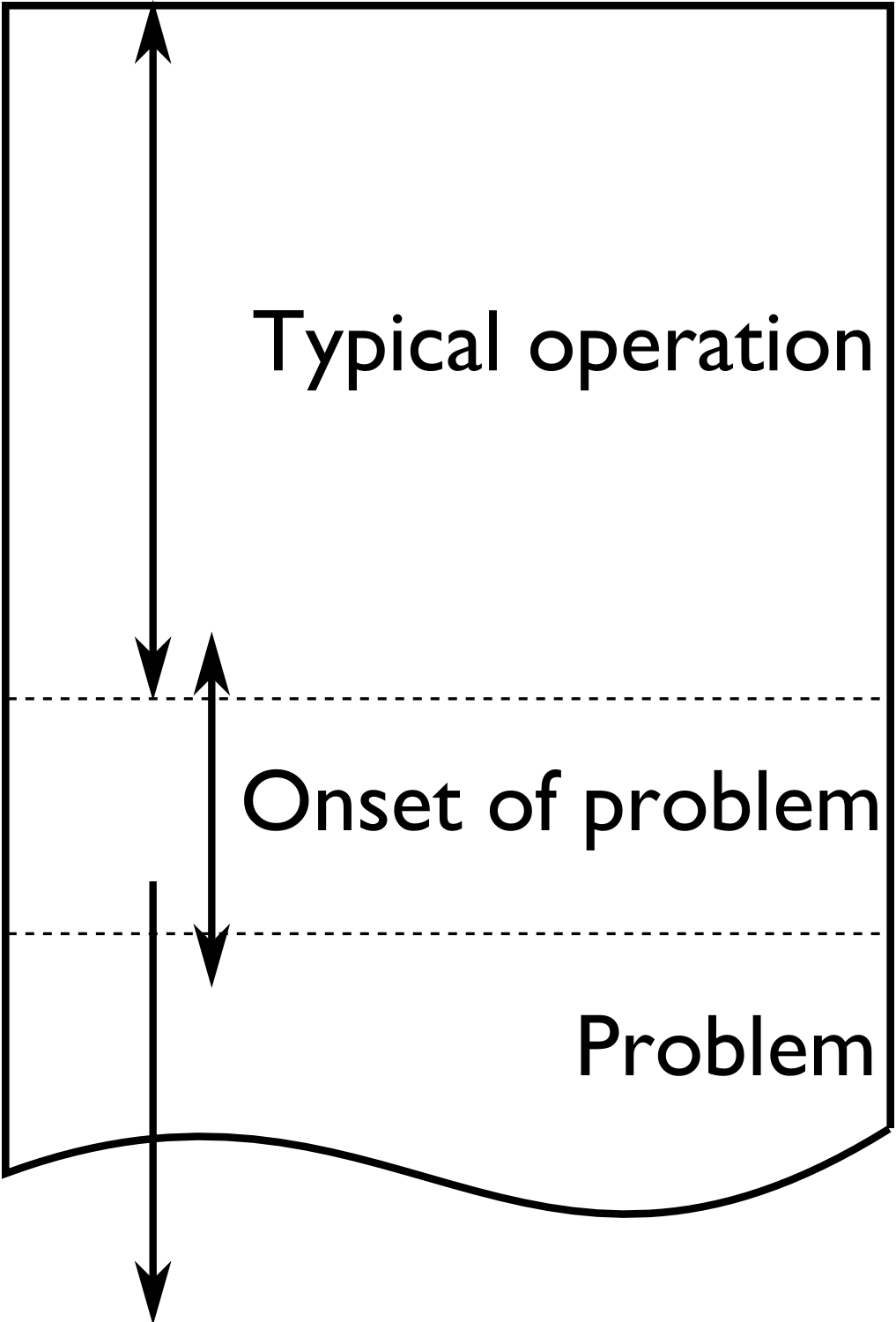
Given the wealth of data present on many processes these days, it is helpful to prune the \(\mathbf{X}\) matrix so that it is only several hundred rows in length. Simply subsample, or using averages of time; e.g. hourly averages. Later we can come back and look at a higher resolution. Even as few as 50 rows can often work well.
Build the PCA model. You should observe the abnormal operation appearing as outliers in the score plots and SPE plots. If not, use colours or different markers to highlight the regions of poor operation in the scores: they might be clustered in a region of the score plot, but not appear as obvious outliers.
Interrogate and think about the model. Use the loadings plots to understand the general trends between the variables. Use contribution plots to learn why clusters of observations are different from others. Use contribution plots to isolate the variables related to large SPE values.
It should be clear that this is all iterative work; the engineer has to be using her/his brain to formulate hypotheses, and then verify them in the data. The latent variable models help to reduce the size of the problem down, but they do not remove the requirement to think about the data and interpret the results.
Here is an example where the yield of a company’s product was declining. They suspected that their raw material was changing in some way, since no major changes had occurred on their process. They measured 6 characteristic values on each lot (batch) of raw materials: 3 of them were a size measurement on the plastic pellets, while the other 3 were the outputs from thermogravimetric analysis (TGA), differential scanning calorimetry (DSC) and thermomechanical analysis (TMA), measured in a laboratory. Also provided was an indication of the yield: “Adequate” or “Poor”. There were 24 samples in total, 17 batches of adequate yield and the rest the had poor yield.
The score plot (left) and loadings plot (right) help isolate potential reasons for the reduced yield. Batches with reduced yield have high, positive \(t_2\) values and low, negative \(t_1\) values. What factors lead to batches having score values with this combination of \(t_1\) and \(t_2\)? It would take batches with a combination of low values of TGA and TMA, and/or above average size5, size10 and size15 levels, and/or high DSC values to get these sort of score values. These would be the generally expected trends, based on an interpretation of the scores and loadings.
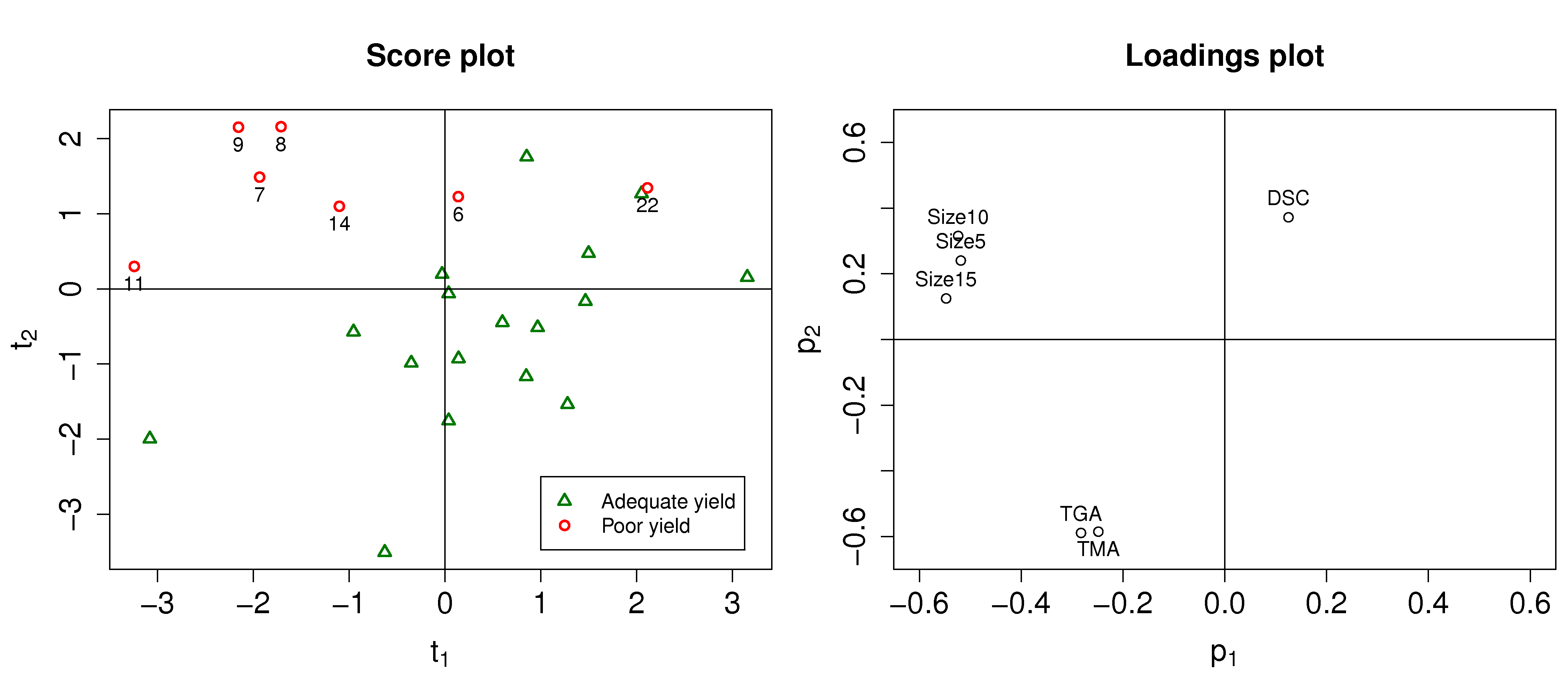
We can investigate specific batches and look at the contribution of each variable to the score values. Let’s look at the contributions for batch 8 for both the \(t_1\) and \(t_2\) scores.
Batch 8 is at its location in the score plot due to the low values of the 3 size variables (they have strong negative contributions to \(t_1\), and strong positive contributions to \(t_2\)); and also because of its low TGA value (the 0.57 contribution in \(t_2\)) and its above-average DSC value (the 0.37 contribution).
Batch 22 on the other hand had very low values of TGA and TMA, even though its size values were below average. Let’s take a look at the \(t_2\) value for batch 22 to see where we get this interpretation:
This illustrates that the actual contribution values are a more precise diagnostic tool that just interpreting the loadings.